https://github.com/realdah/vue-blockui
BlockUI for vue 2, similiar to jquery blockUI, can be used for loading screen.
https://github.com/realdah/vue-blockui
Last synced: about 1 year ago
JSON representation
BlockUI for vue 2, similiar to jquery blockUI, can be used for loading screen.
- Host: GitHub
- URL: https://github.com/realdah/vue-blockui
- Owner: realdah
- Created: 2017-08-14T17:26:27.000Z (over 8 years ago)
- Default Branch: master
- Last Pushed: 2018-05-15T01:23:50.000Z (almost 8 years ago)
- Last Synced: 2024-04-23T23:02:21.969Z (almost 2 years ago)
- Language: JavaScript
- Size: 252 KB
- Stars: 58
- Watchers: 4
- Forks: 5
- Open Issues: 0
-
Metadata Files:
- Readme: README.md
Awesome Lists containing this project
- awesome-vue - vue-blockui - BlockUI for vue 2, similar to jquery blockUI, can be used for loading screen. (Components & Libraries / UI Components)
- awesome-vue-zh - vue-blockui - 类似于jquery blockUI的vue 2的BlockUI可用于加载屏幕. (UI组件 / 装载机)
- awesome-vue - vue-blockui ★43 - BlockUI for vue 2, similar to jquery blockUI, can be used for loading screen. (UI Components / Loader)
- awesome-vue - vue-blockui - BlockUI for vue 2, similar to jquery blockUI, can be used for loading screen. (UI Components / Loader)
- awesome-vue - vue-blockui - BlockUI for vue 2, similiar to jquery blockUI, can be used for loading screen. ` 📝 3 years ago` (UI Components [🔝](#readme))
README
# vue-blockui
[ ](https://www.npmjs.com/package/vue-blockui)
[](https://vuejs.org/)
BlockUI for vue 2, similiar to jquery blockUI, can be used for loading screen.
## Table of contents
- [Installation](#installation)
- [Usage](#usage)
- [Demo Screens](#demo-screens)
# Installation
```
npm install --save vue-blockui
```
## Use Component
Install all the components:
```javascript
import Vue from 'vue'
import BlockUI from 'vue-blockui'
Vue.use(BlockUI)
```
**
⚠️ If You see some errors during webpack compilation, you might be missing the right configuration for loading css in your webpack.config.js.
**
Under "rules", you should have below configuration:
```
{
test: /\.css$/,
use: [ 'style-loader', 'css-loader' ]
}
```
* Be aware that you should have configured style-loader and css-loader in your package.json to support above rule.
```
npm install style-loader css-loader --save-dev
```
**⚠️ You might need to configure your bundler to support `.vue` files.** More info [in the official documentation](https://vuejs.org/v2/guide/single-file-components.html).
I would recommend you to create your VUE project using vue-cli, then it should included vue-loader in webpack by default.
# Usage
| Prop Name | Description |
| ------------- | ------------- |
| message | Message to be shown in loading screen |
| url | Optional Field, image including svg/gif/png/jpg etc, you can use any animated/static image supported by img tag. Please be aware that you'd better import the image resource then use it instead of directly using relative image path. Example can be found in this document. If url attribute presents and not empty, it will ignore html attribute|
| html | (Deprecated, suggest to use [slot] option instead), Optional Field, you can insert html template to icon area, this enables you to utilize external animated fonts/css libaries. eg. [fontawesome](http://fontawesome.io/examples/) or [Spinkit](https://github.com/tobiasahlin/SpinKit) etc. Don't forget to import related css & fonts into project by yourself
| [slot] | Directly use any html template or other Vue Component, it will replace the icon part, see examples in readme.
Then, you can combine with v-if/v-show to show or hide the BlockUI.
## In your Code
Please be aware, if you are using webpack and with file-loader to add finger print to your asserts,
You can not add relative image resouce path directly in BlockUI component.
Please use import to get the image, then pass it to the directive.
```
import Vue from 'vue'
import BlockUI from 'vue-blockui'
import loadingImage from './assets/logo.png'
Vue.use(BlockUI)
```
```
export default {
name: 'app',
data () {
return {
msg: 'Welcome to Your Vue.js App',
url : loadingImage //It is important to import the loading image then use here
}
}
}
```
or
```
export default {
name: 'app',
data () {
return {
msg: 'Welcome to Your Vue.js App',
html: '', //this line demostrate how to use fontawesome animation icon
}
}
}
```
Or using inline html or component **[slot example]**
```
export default {
name: 'app',
data () {
return {
msg: 'Welcome to Your Vue.js App',
}
}
}
```
## Styling Customization
You can override BlockUI sytlings based on your needs.
Check the class defined for BlockUI using develop tool in your favorite browser for more details.
The layout hierarchy desmostrated in below, I did not use simple class like "label" due to the risk of being polluted by other external css.
```
.loading-container {
.loading-backdrop {
//the backdrop falls in here, you can override the opacity etc.
}
.loading {
.loading-icon {
//the image or inserted html will be put here
}
.loading-label {
//the label showing on loading screen
}
}
}
```
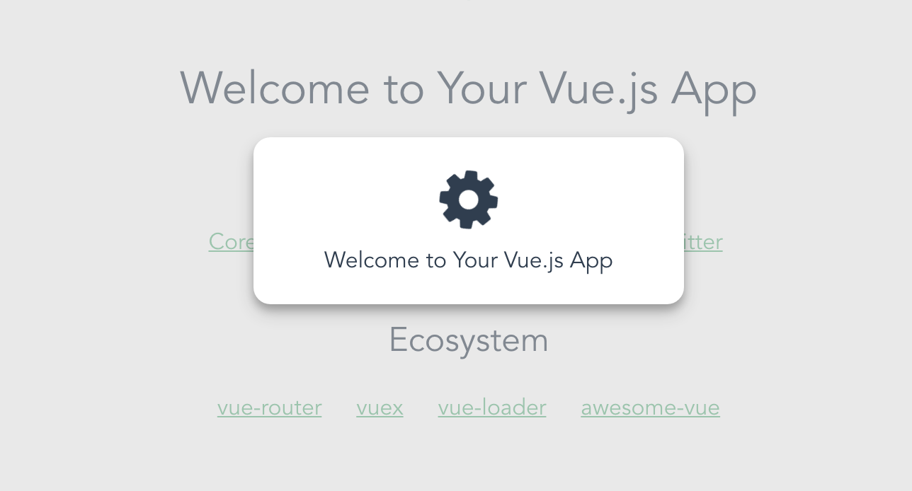
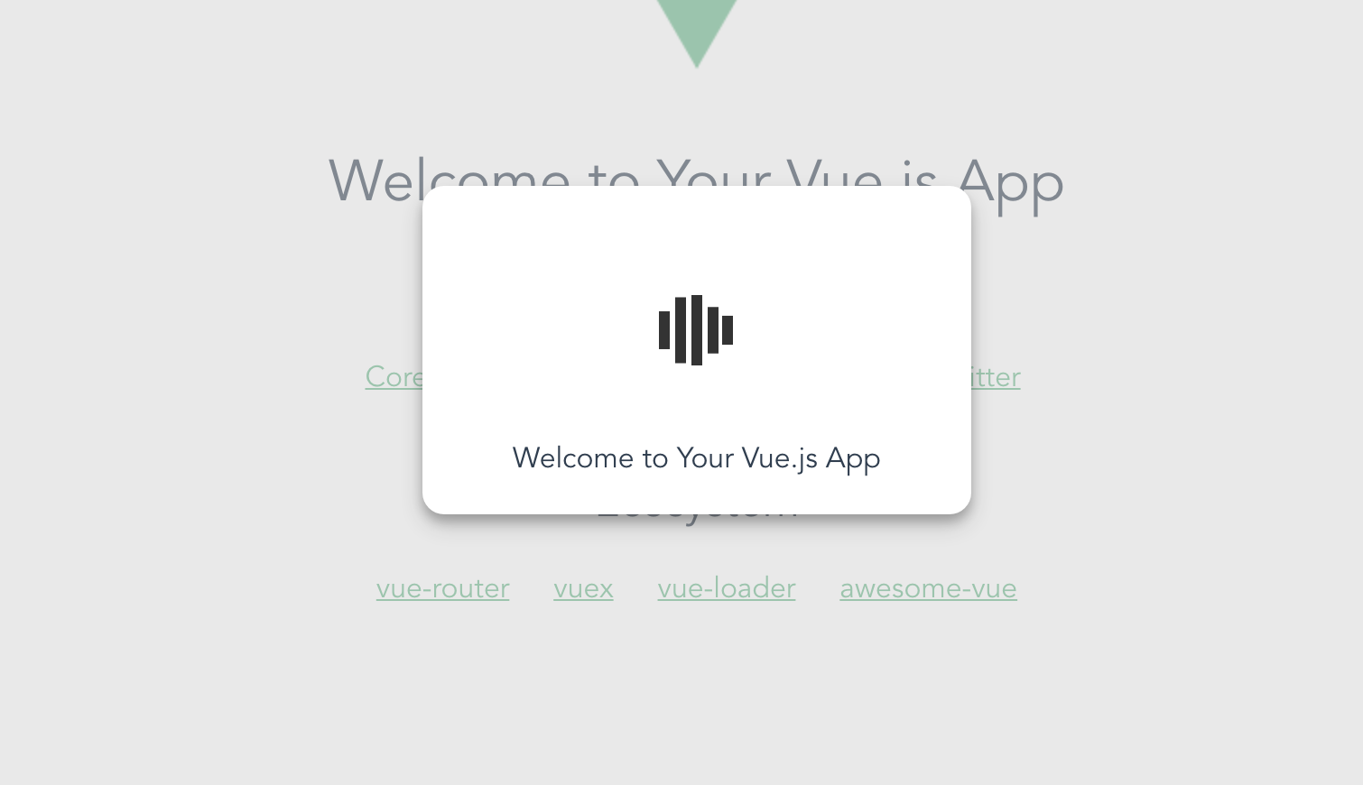
# Demo Screens
Check below screenshots (More to come):
Below screen is using animated gif/svg

Below screen is using font awesome css animation
Below screen is using spinkit css animation
Sample config for using spinkit css animation:
```
export default {
name: 'HelloWorld',
data () {
return {
msg: 'Welcome to Your Vue.js App',
}
}
}
```
# Plugin Development
## Installation
The first time you create or clone your plugin, you need to install the default dependencies:
```
npm install
```
## Watch and compile
This will run webpack in watching mode and output the compiled files in the `dist` folder.
```
npm run dev
```
## Use it in another project
While developping, you can follow the install instructions of your plugin and link it into the project that uses it.
In the plugin folder:
```
npm link
```
In the other project folder:
```
npm link vue-blockui
```
This will install it in the dependencies as a symlink, so that it gets any modifications made to the plugin.
## Publish to npm
You may have to login to npm before, with `npm adduser`. The plugin will be built in production mode before getting published on npm.
```
npm publish
```
## Manual build
This will build the plugin into the `dist` folder in production mode.
```
npm run build
```
---
## License
[MIT](http://opensource.org/licenses/MIT)