https://github.com/redpangilinan/credenza
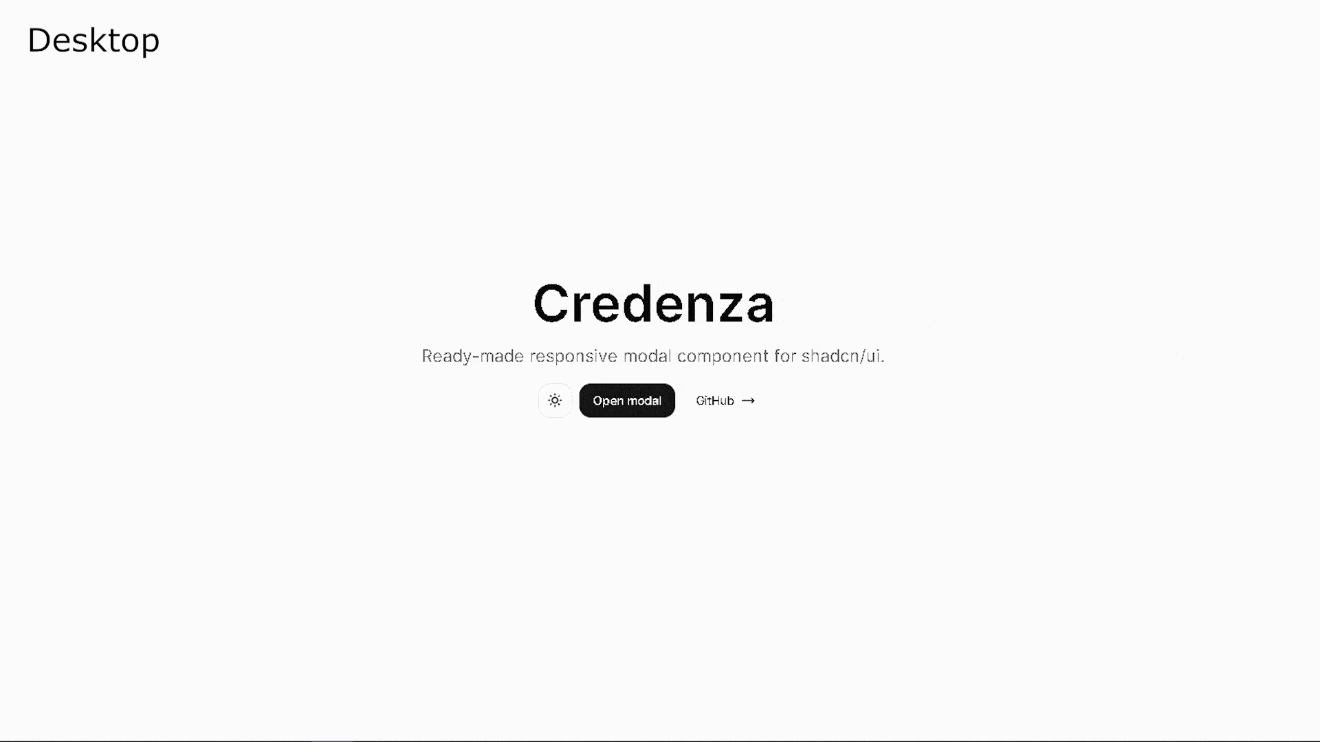
Ready-made responsive modal component for shadcn/ui.
https://github.com/redpangilinan/credenza
component drawer modal modal-dialog next-14 nextjs react shadcn-ui
Last synced: about 1 year ago
JSON representation
Ready-made responsive modal component for shadcn/ui.
- Host: GitHub
- URL: https://github.com/redpangilinan/credenza
- Owner: redpangilinan
- License: mit
- Created: 2023-12-30T09:35:48.000Z (over 2 years ago)
- Default Branch: main
- Last Pushed: 2025-04-04T03:16:23.000Z (over 1 year ago)
- Last Synced: 2025-04-14T16:57:11.562Z (over 1 year ago)
- Topics: component, drawer, modal, modal-dialog, next-14, nextjs, react, shadcn-ui
- Language: TypeScript
- Homepage: https://credenza.rdev.pro
- Size: 1.21 MB
- Stars: 746
- Watchers: 1
- Forks: 19
- Open Issues: 4
-
Metadata Files:
- Readme: README.md
- License: LICENSE
Awesome Lists containing this project
- awesome-shadcn-ui - credenza - Ready-made responsive modal component for shadcn/ui. (Libs and Components)
- awesome-shadcn-ui - Link - 06-07 | (Libs and Components)
- awesome-shadcnui - Github
- awesome-shadcn-ui-browser - Link - 06-07 | (Libs and Components)
README
# Credenza
A responsive modal component for shadcn/ui.
## Installation
### Using shadcn registry (Recommended)
The easiest way to install Credenza is through the shadcn registry:
```bash
pnpm dlx shadcn@latest add https://credenza.rdev.pro/r/credenza.json
```
You can also use npm:
```bash
npx shadcn@latest add https://credenza.rdev.pro/r/credenza.json
```
### Manual Installation
1. Copy the `dialog` and `drawer` component from shadcn/ui.
```bash
npx shadcn@latest add dialog drawer
```
Alternatively, if you are not using shadcn/ui cli, you can manually copy the components from [shadcn/ui](https://ui.shadcn.com/docs) or directly copy from [dialog.tsx](src/components/ui/dialog.tsx) and [drawer.tsx](src/components/ui/drawer.tsx).
If you copied the drawer component manually, make sure to install vaul.
```
npm install vaul
```
2. Copy the `useIsMobile` hook: [use-mobile.ts](src/hooks/use-mobile.ts)
```tsx
import * as React from "react"
const MOBILE_BREAKPOINT = 768
export function useIsMobile() {
const [isMobile, setIsMobile] = React.useState(undefined)
React.useEffect(() => {
const mql = window.matchMedia(`(max-width: ${MOBILE_BREAKPOINT - 1}px)`)
const onChange = () => {
setIsMobile(window.innerWidth < MOBILE_BREAKPOINT)
}
mql.addEventListener("change", onChange)
setIsMobile(window.innerWidth < MOBILE_BREAKPOINT)
return () => mql.removeEventListener("change", onChange)
}, [])
return !!isMobile
}
```
3. Copy the `credenza` component: [credenza.tsx](src/components/ui/credenza.tsx)
Click to show code
```tsx
"use client"
import * as React from "react"
import { cn } from "@/lib/utils"
import { useIsMobile } from "@/hooks/use-mobile"
import {
Dialog,
DialogClose,
DialogContent,
DialogDescription,
DialogFooter,
DialogHeader,
DialogTitle,
DialogTrigger,
} from "@/components/ui/dialog"
import {
Drawer,
DrawerClose,
DrawerContent,
DrawerDescription,
DrawerFooter,
DrawerHeader,
DrawerTitle,
DrawerTrigger,
} from "@/components/ui/drawer"
interface BaseProps {
children: React.ReactNode
}
interface RootCredenzaProps extends BaseProps {
open?: boolean
onOpenChange?: (open: boolean) => void
}
interface CredenzaProps extends BaseProps {
className?: string
asChild?: true
}
const CredenzaContext = React.createContext<{ isMobile: boolean }>({
isMobile: false,
})
const useCredenzaContext = () => {
const context = React.useContext(CredenzaContext)
if (!context) {
throw new Error(
"Credenza components cannot be rendered outside the Credenza Context"
)
}
return context
}
const Credenza = ({ children, ...props }: RootCredenzaProps) => {
const isMobile = useIsMobile()
const Credenza = isMobile ? Drawer : Dialog
return (
{children}
)
}
const CredenzaTrigger = ({ className, children, ...props }: CredenzaProps) => {
const { isMobile } = useCredenzaContext()
const CredenzaTrigger = isMobile ? DrawerTrigger : DialogTrigger
return (
{children}
)
}
const CredenzaClose = ({ className, children, ...props }: CredenzaProps) => {
const { isMobile } = useCredenzaContext()
const CredenzaClose = isMobile ? DrawerClose : DialogClose
return (
{children}
)
}
const CredenzaContent = ({ className, children, ...props }: CredenzaProps) => {
const { isMobile } = useCredenzaContext()
const CredenzaContent = isMobile ? DrawerContent : DialogContent
return (
{children}
)
}
const CredenzaDescription = ({
className,
children,
...props
}: CredenzaProps) => {
const { isMobile } = useCredenzaContext()
const CredenzaDescription = isMobile ? DrawerDescription : DialogDescription
return (
{children}
)
}
const CredenzaHeader = ({ className, children, ...props }: CredenzaProps) => {
const { isMobile } = useCredenzaContext()
const CredenzaHeader = isMobile ? DrawerHeader : DialogHeader
return (
{children}
)
}
const CredenzaTitle = ({ className, children, ...props }: CredenzaProps) => {
const { isMobile } = useCredenzaContext()
const CredenzaTitle = isMobile ? DrawerTitle : DialogTitle
return (
{children}
)
}
const CredenzaBody = ({ className, children, ...props }: CredenzaProps) => {
return (
{children}
)
}
const CredenzaFooter = ({ className, children, ...props }: CredenzaProps) => {
const { isMobile } = useCredenzaContext()
const CredenzaFooter = isMobile ? DrawerFooter : DialogFooter
return (
{children}
)
}
export {
Credenza,
CredenzaTrigger,
CredenzaClose,
CredenzaContent,
CredenzaDescription,
CredenzaHeader,
CredenzaTitle,
CredenzaBody,
CredenzaFooter,
}
```
4. Update the import paths based on your project structure.
5. If you want to enable background scaling, wrap your app with the `vaul-drawer-wrapper`.
```html
{children}
```
See my implementation at [layout.tsx](src/app/layout.tsx). Make sure to update the background color to match your project's theme.
## Usage
```tsx
import {
Credenza,
CredenzaBody,
CredenzaClose,
CredenzaContent,
CredenzaDescription,
CredenzaFooter,
CredenzaHeader,
CredenzaTitle,
CredenzaTrigger,
} from "@/components/ui/credenza"
```
Basic usage with `CredenzaTrigger`
```tsx
Open modal
Credenza
A responsive modal component for shadcn/ui.
This component is built using shadcn/ui's dialog and drawer
component, which is built on top of Vaul.
Close
```
Using state to open modal
```tsx
function StateModal() {
const [open, setOpen] = React.useState(false)
const handleOpen = () => {
setOpen(true)
}
return (
<>
Open with State
Credenza
A responsive modal component for shadcn/ui.
This modal got triggered using state
Close
>
)
}
```
## Credits
- [shadcn/ui](https://github.com/shadcn-ui/ui) by [shadcn](https://github.com/shadcn)
- [Vaul](https://github.com/emilkowalski/vaul) by [emilkowalski](https://github.com/emilkowalski)