https://github.com/reinbentdal/styled_widget
Simplifying widget style in Flutter.
https://github.com/reinbentdal/styled_widget
dart flutter package style widget widgets
Last synced: 11 months ago
JSON representation
Simplifying widget style in Flutter.
- Host: GitHub
- URL: https://github.com/reinbentdal/styled_widget
- Owner: ReinBentdal
- License: mit
- Created: 2019-11-26T18:59:03.000Z (over 6 years ago)
- Default Branch: master
- Last Pushed: 2023-09-14T03:59:03.000Z (over 2 years ago)
- Last Synced: 2025-04-14T15:00:32.712Z (12 months ago)
- Topics: dart, flutter, package, style, widget, widgets
- Language: Dart
- Homepage: https://pub.dev/packages/styled_widget
- Size: 17.8 MB
- Stars: 1,305
- Watchers: 15
- Forks: 102
- Open Issues: 21
-
Metadata Files:
- Readme: README.md
- Changelog: CHANGELOG.md
- Funding: .github/FUNDING.yml
- License: LICENSE
Awesome Lists containing this project
README
Simplifying your widget tree structure by defining widgets using methods.


Thanks to the introduction of [extension methods](https://dart.dev/guides/language/extension-methods) in Dart 2.7.0, `styled_widget` makes it possible to build widget tree\`s more readable and efficient.
`styled_widget` is build as a tool to enhance your Flutter development experience and to seamlessly integrate with your codebase.
### Showcase
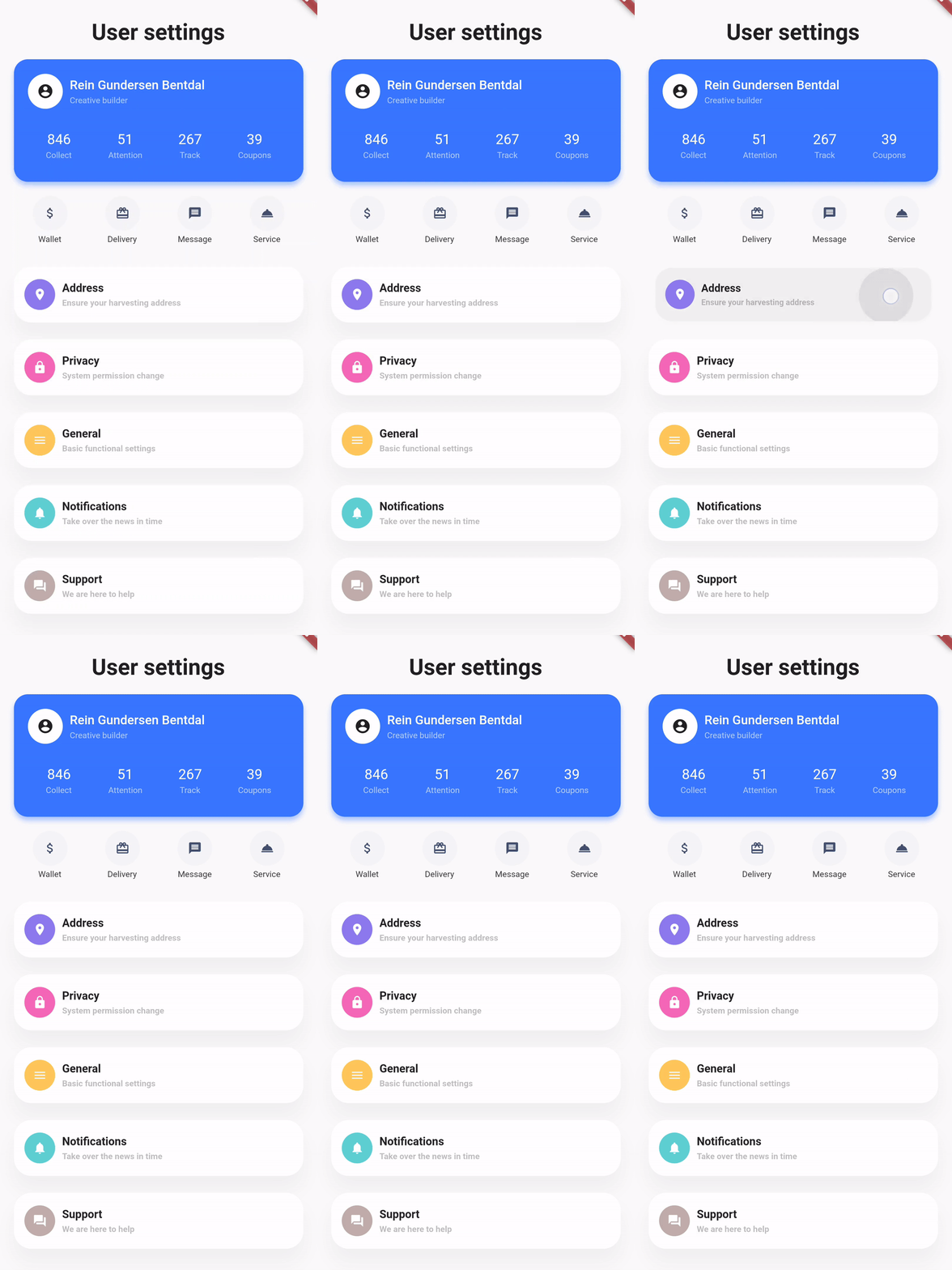
| [Design](https://dribbble.com/shots/6459693-Creative-layout-design), [Code](https://github.com/ReinBentdal/styled_widget/wiki/demo_app) | [Design](https://dribbble.com/shots/4514354-Sign-up), [Code](https://github.com/ReinBentdal/styled_widget/wiki/japan-style-example) | [Design](https://no.pinterest.com/pin/403283341630104104/), [Code](https://github.com/ReinBentdal/styled_widget/wiki/toggle) |
|-|-|-|
| |
| |
| |
|
### Basic example
`styled_widget` has a **bottom up** approach to building widget\`s. This means you start with the inner most element and layer widget\`s on top. The following example is structured as follows:
Icon -> blue circle -> light blue circle -> card -> background
```dart
Icon(OMIcons.home, color: Colors.white)
.padding(all: 10)
.decorated(color: Color(0xff7AC1E7), shape: BoxShape.circle)
.padding(all: 15)
.decorated(color: Color(0xffE8F2F7), shape: BoxShape.circle)
.padding(all: 20)
.card(
elevation: 10,
shape: RoundedRectangleBorder(
borderRadius: BorderRadius.circular(20),
),
)
.alignment(Alignment.center)
.backgroundColor(Color(0xffEBECF1));
```
Raw Flutter (click to show)
```dart
DecoratedBox(
decoration: BoxDecoration(
color: Color(0xffEBECF1),
),
child: Align(
alignment: Alignment.center,
child: Card(
elevation: 10,
shape: RoundedRectangleBorder(
borderRadius: BorderRadius.circular(20),
),
child: Padding(
padding: EdgeInsets.all(20),
child: DecoratedBox(
decoration: BoxDecoration(
color: Color(0xffE8F2F7),
shape: BoxShape.circle,
),
child: Padding(
padding: EdgeInsets.all(15),
child: DecoratedBox(
decoration: BoxDecoration(
color: Color(0xff7AC1E7),
shape: BoxShape.circle,
),
child: Padding(
padding: EdgeInsets.all(10),
child: Icon(
OMIcons.home,
color: Colors.white,
),
),
),
),
),
),
),
),
);
```

### Docs
See the documentation at [styled_widget/wiki](https://github.com/ReinBentdal/styled_widget/wiki) for more information about using `styled_widget`!
Quicklinks
* [Home](https://github.com/ReinBentdal/styled_widget/wiki)
* [Core concept](https://github.com/ReinBentdal/styled_widget/wiki/Core-concept)
* [Widgets](https://github.com/ReinBentdal/styled_widget/wiki/Widgets)
* [Animations](https://github.com/ReinBentdal/styled_widget/wiki/Animations)
* [List of methods](https://github.com/ReinBentdal/styled_widget/wiki/List-of-methods)
* [Examples](https://github.com/ReinBentdal/styled_widget/wiki/Examples)
* [demo app](https://github.com/ReinBentdal/styled_widget/wiki/demo_app)
* [japan style](https://github.com/ReinBentdal/styled_widget/wiki/japan-style-example)
* [toggle animation](https://github.com/ReinBentdal/styled_widget/wiki/toggle)
* [styled_widget logo](https://github.com/ReinBentdal/styled_widget/wiki/styled_widget-logo)
* [Basic text example](https://github.com/ReinBentdal/styled_widget/wiki/basic-text-example)
* [Contributing](https://github.com/ReinBentdal/styled_widget/wiki/Contributing)
