https://github.com/renddslow/moedim
A small React package for picking a single date from a calendar.
https://github.com/renddslow/moedim
Last synced: 6 months ago
JSON representation
A small React package for picking a single date from a calendar.
- Host: GitHub
- URL: https://github.com/renddslow/moedim
- Owner: Renddslow
- Created: 2022-09-12T15:50:57.000Z (over 2 years ago)
- Default Branch: main
- Last Pushed: 2022-09-23T18:13:08.000Z (over 2 years ago)
- Last Synced: 2024-10-16T06:33:35.736Z (7 months ago)
- Language: JavaScript
- Homepage: https://renddslow.github.io/moedim
- Size: 1.6 MB
- Stars: 6
- Watchers: 1
- Forks: 1
- Open Issues: 0
-
Metadata Files:
- Readme: README.md
Awesome Lists containing this project
README
# Moedim
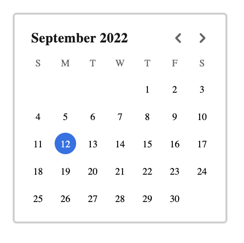
> A light-weight, localizable and customizable, styled React calendar component.
## Getting Started
```shell
npm i -s moedim
yarn add moedim
```
If your project doesn't already have [styled-components](https://styled-components.com/) installed, make sure you install that too. You'll need it.
## Usage
```jsx
import React, { useState } from 'react';
import Calendar from 'moedim';
const App = () => (
const [value, setValue] = useState(new Date())
setValue(d)} />
)
```
## API
The Calendar component takes only three props:
- `value` - The currently selected date. This must be a `Date` object.
- `onChange` - A callback function that will be called when the user selects a new date. The callback will be passed a `Date` object.
- `locale` - The locale to use for the calendar. Locale will drive everything displayed, from the order of weekdays, to what weekdays are called. Defaults to `en-US`.
### Styling
Moedim uses [styled-components](https://styled-components.com/) for styling. The main wrapping container (which has a border and some padding) is the target of the `classNames` prop which will allow you to wrap the component with styled-components.
One color is exposed as a CSS variable called `--moedim-primary` which is set on the container and can therefore be overridden through styled-components. The default value of `--moedim-primary` is `#1a73e8` and colors the border of focused dates and the background of selected dates.
```jsx
const StyledCalendar = styled(Calendar)`
--moedim-primary: #f00;
`;
```
All font families are set to `inherit` so while you can override them directly by wrapping the styled component, most situations should find the Calendar component adopting your application's font family.