https://github.com/romainl/vim-dichromatic
A dark Vim colorscheme for color blind vimmers. But not only.
https://github.com/romainl/vim-dichromatic
color-blindness colorscheme vim
Last synced: 5 months ago
JSON representation
A dark Vim colorscheme for color blind vimmers. But not only.
- Host: GitHub
- URL: https://github.com/romainl/vim-dichromatic
- Owner: romainl
- License: mit
- Created: 2015-06-29T19:54:04.000Z (over 10 years ago)
- Default Branch: master
- Last Pushed: 2023-02-14T18:07:25.000Z (about 3 years ago)
- Last Synced: 2025-10-10T10:07:12.467Z (5 months ago)
- Topics: color-blindness, colorscheme, vim
- Language: HTML
- Homepage: http://romainl.github.io/vim-dichromatic/
- Size: 1.66 MB
- Stars: 92
- Watchers: 4
- Forks: 12
- Open Issues: 1
-
Metadata Files:
- Readme: README.md
- License: LICENSE
Awesome Lists containing this project
README
# Dichromatic
A dark color scheme for color blind vimmers, but not only.
---
Humans are capable of perceiving a relatively large color spectrum thanks to special receptors in our retina called *cones*. Most of us have three types of cones to take care of the different wavelengths that compose visible light. That's called *trichromia*, it's the norm and most Vim color schemes are designed against that norm.
Some of us — as much as 8% of the male population in some parts of the world — have a missing or damaged cone, however, which prevents them from perceiving some colors. That condition is called *dichromia* or, coloquially, color blindness.
Color blindness comes in many forms, depending on what cones are missing or damaged or even if we are talking *rods*, but the end result is always the same: the person gets confused pretty easily when colors are too close to each other or fall into one of their blind spots or if there's not enough contrast. If that wasn't enough, dichromia itself comes in three forms: *protanopia*, *deuteranopia* and *tritanopia* which have varying effects. Choosing the right colors is a difficult task when designing for "normal" vision but it should be apparent by now that designing for color blind users is at another level entirely.
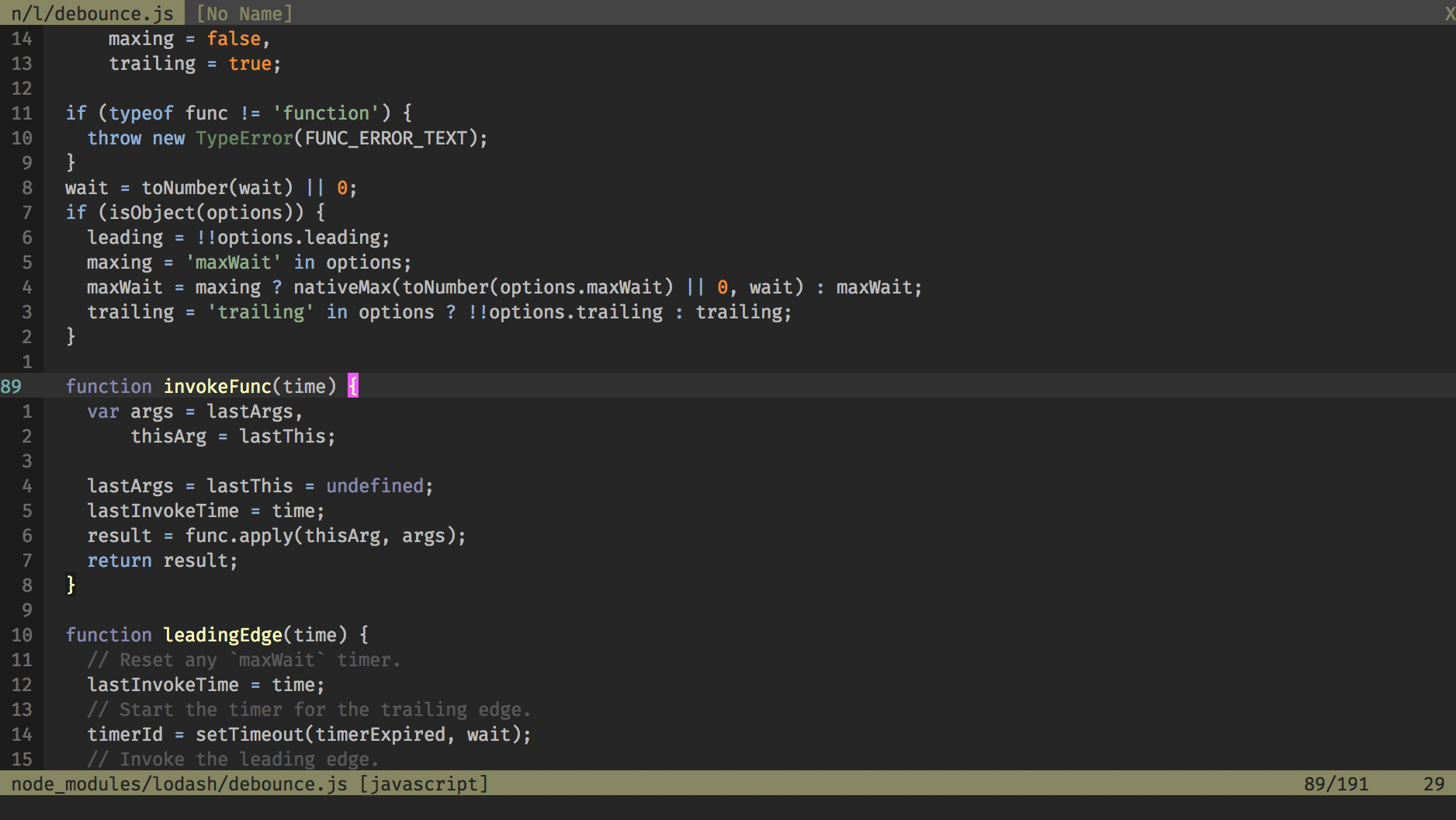
Here is a screenshot of another color scheme of mine illustrating the problem:
Normal vision:
Tritanopia:
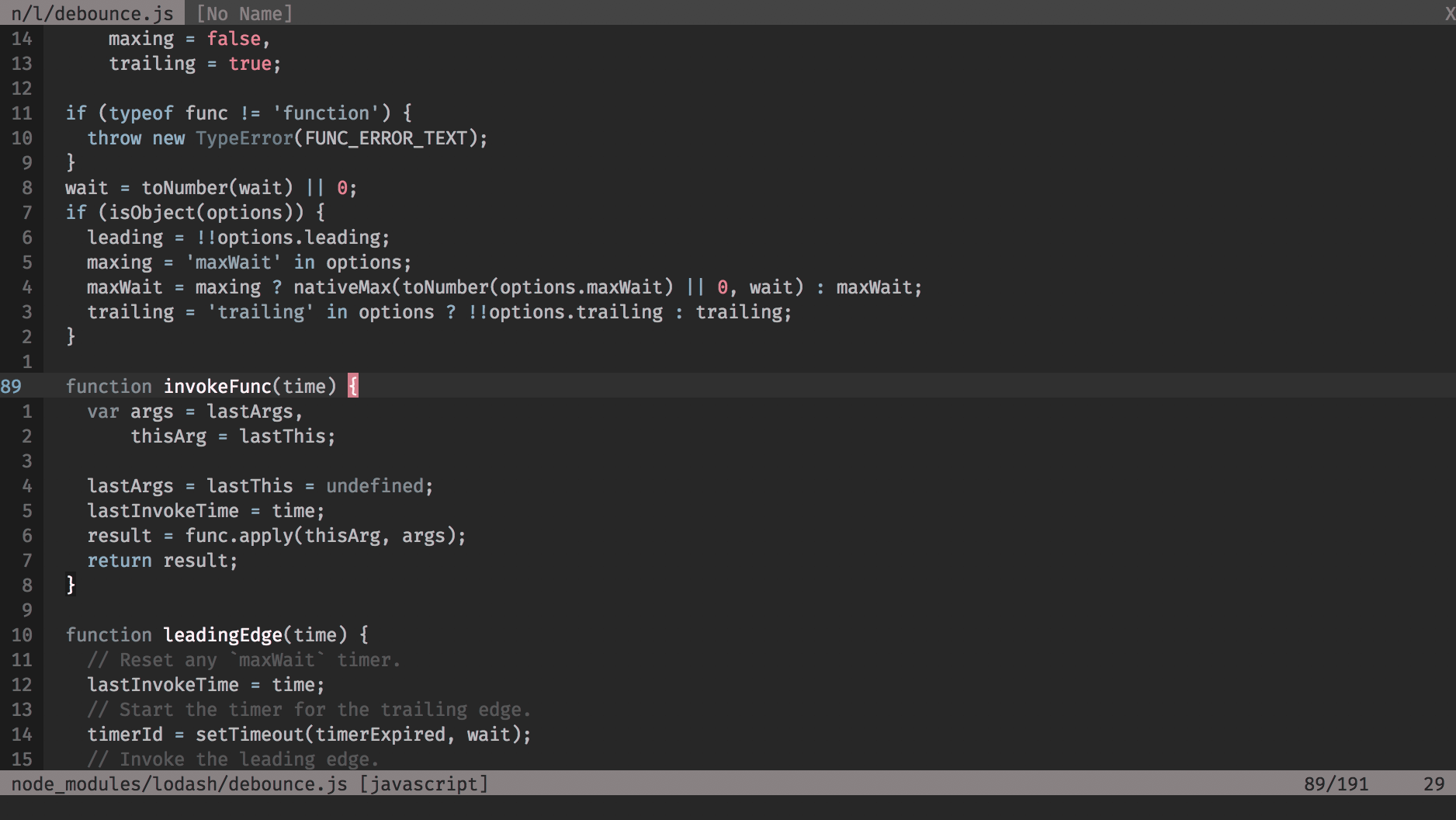
The colors in Apprentice are nice and all for us "normals" but they are obviously less than optimal for someone with, say… tritanopia. The problem is not limited to Vim, of course: maps, charts, traffic lights and all kinds of information systems are routinely designed without any thought for dichromia but that shouldn't be a comforting thought. We can do better.
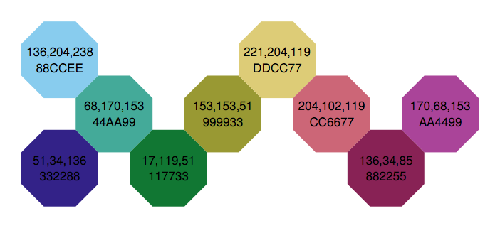
Thankfully, researchers across the world have been busy designing color palettes suitable for *anybody*, color blind or not. [One such effort](https://personal.sron.nl/~pault/) produced the palette I used as a basis for Dichromatic:
The image below shows the "final" palette used in Dichromatic, slightly modified from the colors above to fit in the standard [xterm palette](https://upload.wikimedia.org/wikipedia/en/1/15/Xterm_256color_chart.svg).
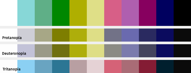
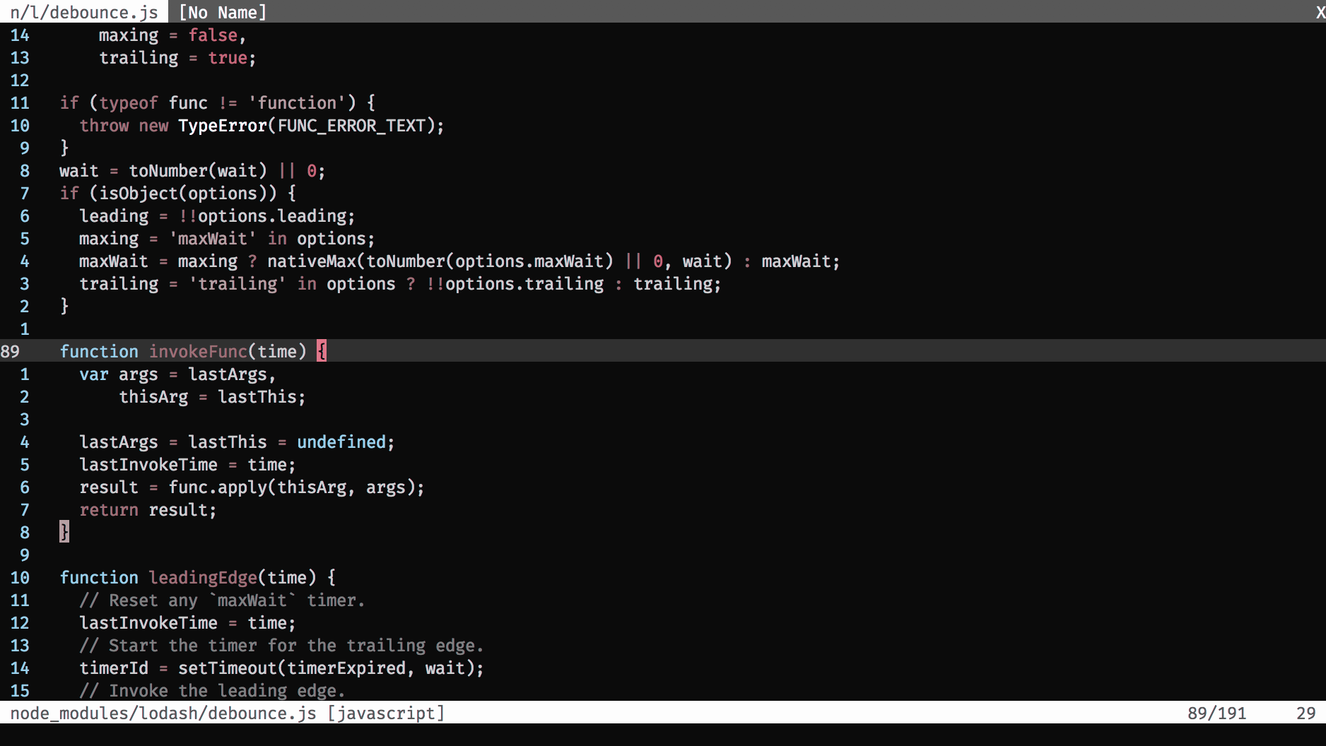
And here are screenshots of dichomatic, first without filter, for color blind users to form their opinion, then with various filters applied, for users with normal vision to get an idea of how color blind users may see it:
Normal vision:
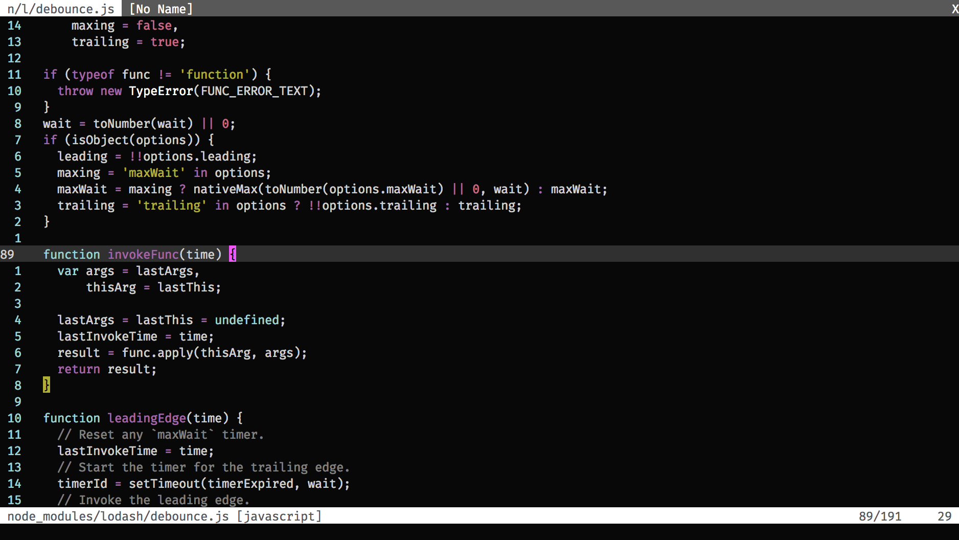
Deuteranopia (common):

Protanopia (rare):

Tritanopia (very rare):
## Configuration
This color scheme is pretty much compatible with any reasonably recent Vim executed in any correctly set-up environment. "Compatible" in the sense that it will not break anything but it is only guaranteed to work the way it's supposed to work in GUI Vim (GVim, MacVim) and in TUI Vim *in 256color-ready terminal emulators*. 8color-ready and 16color-ready terminal emulators are not directly supported at the moment but they may. Stay tuned.
### GVim/MacVim
GUI Vim is pretty much the bee's knees, color scheme-wise, so there's nothing to do here.
### 256 colors terminal emulators
Make sure your terminal emulator correctly tells Vim that it is capable of displaying 256 colors. It is usually done by setting the `TERM` environment variable to something like `xterm-256color` or `screen-256color`. How to do that depends on your terminal emulator so you should read its documentation if you are unsure about the exact method.
## Installation
Use your favorite plugin manager or drop `dichromatic.vim` into:
$HOME/.vim/colors/ on unix-like systems
%userprofile%\vimfiles\colors\ on Windows
## Usage
Make sure you have *either* of the following lines in your `vimrc`:
syntax on
syntax enable
Add the line below somewhere near the end of the file:
colorscheme dichromatic
## Hacking
The heavily commented template used for the creation of Dichromatic is available in the `colors/` directory. Feel free to play with it and send pull requests.
## Reference
* http://jfly.iam.u-tokyo.ac.jp/color/
* https://personal.sron.nl/~pault/
* http://www.somersault1824.com/tips-for-designing-scientific-figures-for-color-blind-readers/
* http://www.iamcal.com/toys/colors/
* https://en.wikipedia.org/wiki/Color_blindness