https://github.com/safdar-azeem/icon-picker
iconify Icon picker component for Vue 3
https://github.com/safdar-azeem/icon-picker
iconify iconpicker icons vue
Last synced: 11 months ago
JSON representation
iconify Icon picker component for Vue 3
- Host: GitHub
- URL: https://github.com/safdar-azeem/icon-picker
- Owner: safdar-azeem
- Created: 2025-05-18T20:00:41.000Z (about 1 year ago)
- Default Branch: main
- Last Pushed: 2025-07-19T22:03:15.000Z (11 months ago)
- Last Synced: 2025-07-20T00:51:33.937Z (11 months ago)
- Topics: iconify, iconpicker, icons, vue
- Language: Vue
- Homepage: https://www.npmjs.com/package/iconify-icon-picker
- Size: 48.8 KB
- Stars: 0
- Watchers: 1
- Forks: 0
- Open Issues: 0
-
Metadata Files:
- Readme: README.md
Awesome Lists containing this project
README
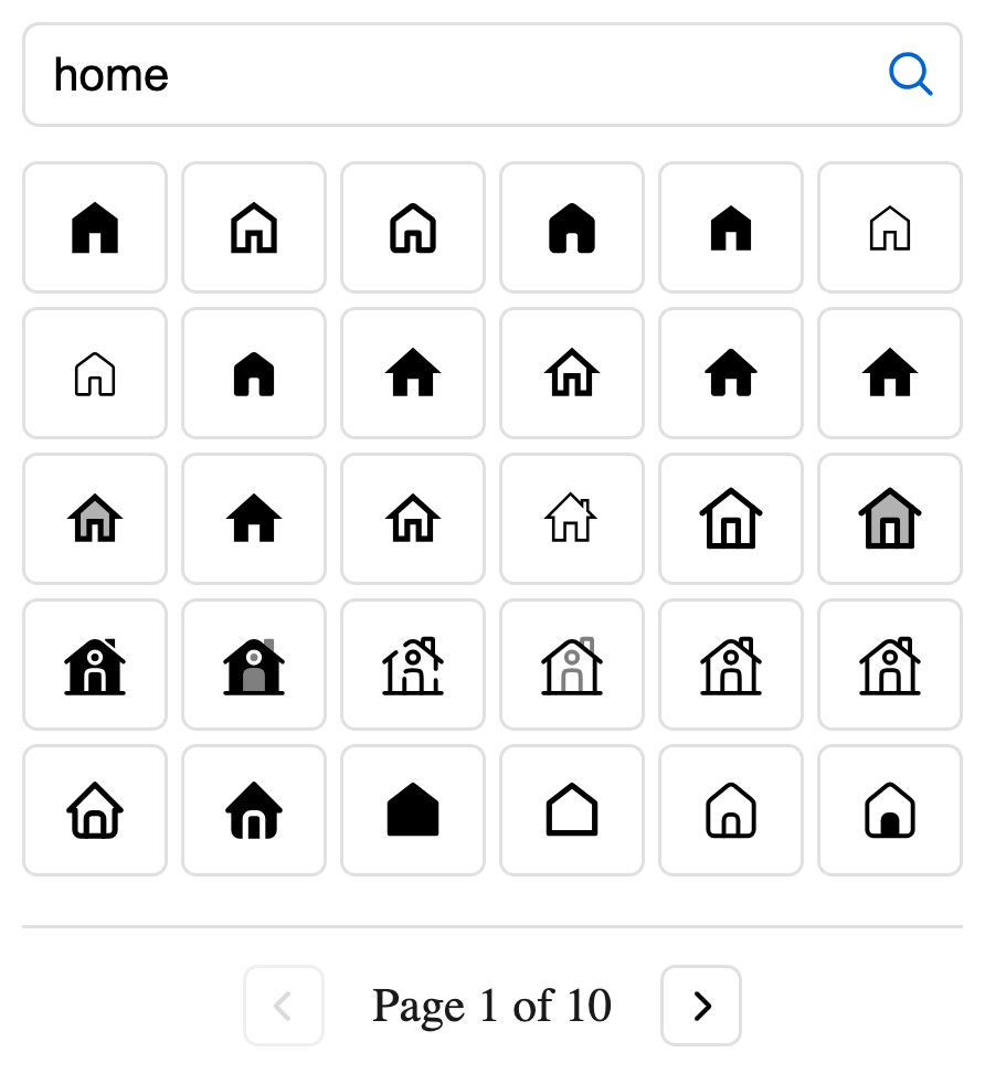
# Iconify Icon Picker
A lightweight and customizable Vue 3 component for searching and selecting icons from the Iconify icon library.
## Installation
```bash
# npm
npm install iconify-icon-picker @iconify/vue
# yarn
yarn add iconify-icon-picker @iconify/vue
# pnpm
pnpm add iconify-icon-picker @iconify/vue
```
## Usage
### Basic Usage
```vue
import { ref } from 'vue'
import IconPicker from 'iconify-icon-picker'
import 'iconify-icon-picker/style.css'
// Define a ref to store the selected icon
const selectedIcon = ref('')
Select an Icon
Selected icon: {{ selectedIcon }}
```
## Props
| Prop | Type | Default | Description |
| ---------------- | ------ | ------------------- | ------------------------------------------------------------------------------------- |
| `modelValue` | String | `undefined` | v-model binding for the selected icon |
| `value` | String | `undefined` | Selected icon (alternative to v-model) |
| `placeholder` | String | `'Search icons...'` | Placeholder text for the search input |
| `debounce` | Number | `300` | Debounce time (ms) for search input |
| `itemsPerPage` | Number | `30` | Number of icons displayed per page |
| `paginationText` | String | `'Page {0} of {1}'` | Text template for pagination (replace {0} with current page and {1} with total pages) |
## Events
| Event | Payload Type | Description |
| ---------- | ------------ | ----------------------------------- |
| `onSelect` | String | Emitted when a new icon is selected |
## Styling
The component can be customized using the following CSS variables:
```css
:root {
--iconPicker-text: #1a1a1a;
--iconPicker-border: #e0e0e0;
--iconPicker-primary: #0066cc;
--iconPicker-primary-fg: #0052a3;
--iconPicker-primary-hover: #0052a3;
--iconPicker-radius: 0.375em;
--iconPicker-gap: 0.25em;
--iconPicker-input-height: 2.125em;
--iconPicker-selected-bg: #e6f3ff;
--iconPicker-font-base: 16px;
--iconPicker-transition: all 0.2s ease;
}
```
## Author
[safdar-azeem](https://github.com/safdar-azeem)