https://github.com/saravieira/styled-loaders
Loaders Built with Preact and Styled Components
https://github.com/saravieira/styled-loaders
javascript preact styled-components
Last synced: about 1 year ago
JSON representation
Loaders Built with Preact and Styled Components
- Host: GitHub
- URL: https://github.com/saravieira/styled-loaders
- Owner: SaraVieira
- License: other
- Created: 2017-08-07T21:16:47.000Z (almost 9 years ago)
- Default Branch: master
- Last Pushed: 2020-10-02T11:19:26.000Z (almost 6 years ago)
- Last Synced: 2025-03-31T13:05:12.002Z (over 1 year ago)
- Topics: javascript, preact, styled-components
- Language: JavaScript
- Homepage: https://styled-loaders.now.sh/
- Size: 530 KB
- Stars: 208
- Watchers: 6
- Forks: 16
- Open Issues: 2
-
Metadata Files:
- Readme: Readme.md
- License: LICENSE
Awesome Lists containing this project
README
# Styled Loaders
[](https://travis-ci.org/SaraVieira/styled-loaders)
[](https://github.com/prettier/prettier)
[](https://npmjs.com/styled-loaders)
## [Demo](https://styled-loaders.now.sh/)
## [NPM](https://npmjs.com/styled-loaders)
Loaders Built with Preact and Styled Components ready for your next project because no one deserves to have to writes loadings all the time.
If you are looking for a React version you can find one [here](https://github.com/saisandeepvaddi/styled-loaders-react) by the awesome [Sai Sandeep Vaddi](https://github.com/saisandeepvaddi)
Credits and inspiration also belong heavily to the awesome work at [SpinKit](http://tobiasahlin.com/spinkit/)
As I work on more projects over time more, more loaders will be added here.
## Usage
```
npm i styled-loaders
or
yarn add styled-loaders
```
```js
import { h } from 'preact'
import { Cube } from 'styled-loaders'
const Page = ({ loading }) =>
{ loading ?
: 'Your Content'
}
```
### With Props
```js
import { h } from 'preact'
import { Block } from 'styled-loaders'
const Page = ({ loading }) =>
{ loading ?
: 'Your Content'
}
```
### Loaders
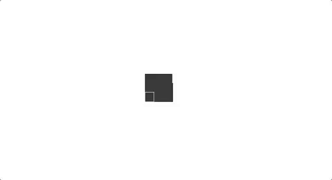
* Block

* Props
* color - Background of the spinner default is #333
* duration - Animation duration default is 1.2s
* size - Size of the spinner default is 40px
* Circular

* Props
* color - Background of the spinner default is #333
* size - Size of the spinner default is 40px
* Cube
* Props
* color - Background of the spinner default is #333
* size - Size of the spinner default is 40px
* cubeSize - Size of the each cube default is 15
* duration - Animation duration default is 1.2s
* CubeGrid
* Props
* color - Background of the spinner default is #333
* size - Size of the spinner default is 40px
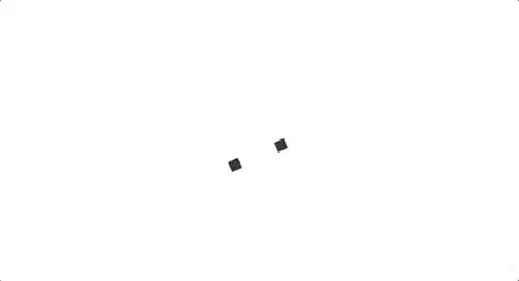
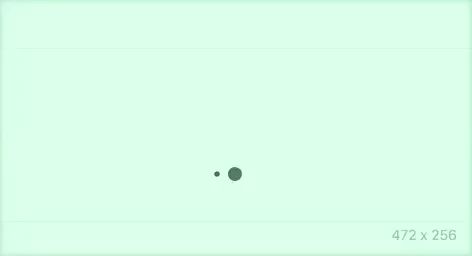
* DotScale
* Props
* color - Background of the spinner default is #333
* duration - Animation duration default is 1.2s
* size - Size of the spinner default is 40px
* dotSize - Size of the dots default is 18px
* Pulsate

* Props
* color - Background of the spinner default is #333
* duration - Animation duration default is 1.2s
* size - Size of the spinner default is 40px
* RotateScale
* Props
* color - Background of the spinner default is #333
* duration - Animation duration default is 1.2s
* size - Size of the spinner default is 40px
* Scale

* Props
* color - Background of the spinner default is #333
* duration - Animation duration default is 1.2s
* size - Size of the spinner default is 40px
* Stretch
* Props
* color - Background of the spinner default is #333
* duration - Animation duration default is 1.2s
* size - Size of the spinner default is 40px
* rectWidth - Width of each rectangle default is 6px
## License
MIT (2017 - Sara Vieira)