https://github.com/sarmad1995/react-native-easy-content-loader
A light weight and customisable content loader for react native apps, will work both on expo and init projects.
https://github.com/sarmad1995/react-native-easy-content-loader
Last synced: about 1 year ago
JSON representation
A light weight and customisable content loader for react native apps, will work both on expo and init projects.
- Host: GitHub
- URL: https://github.com/sarmad1995/react-native-easy-content-loader
- Owner: sarmad1995
- License: mit
- Created: 2019-01-29T18:09:25.000Z (over 7 years ago)
- Default Branch: master
- Last Pushed: 2023-03-04T05:16:10.000Z (over 3 years ago)
- Last Synced: 2024-12-01T09:35:50.718Z (over 1 year ago)
- Language: TypeScript
- Homepage:
- Size: 1.2 MB
- Stars: 230
- Watchers: 5
- Forks: 23
- Open Issues: 1
-
Metadata Files:
- Readme: README.md
- Changelog: CHANGE_LOG.md
- License: LICENSE
- Code of conduct: CODE_OF_CONDUCT.md
Awesome Lists containing this project
- awesome-react-native - react-native-easy-content-loader ★57 - React-Native light weight skeleton content loading. (Components / UI)
- awesome-react-native - react-native-easy-content-loader ★57 - React-Native light weight skeleton content loading. (Components / UI)
- fucking-awesome-react-native - react-native-easy-content-loader ★57 - React-Native light weight skeleton content loading. (Components / UI)
- awesome-react-native - react-native-easy-content-loader ★6 - React-Native light weight skeleton content loading. (Components / UI)
README
[![NPM Version][npm-image]][npm-url]
[![Downloads Stats][npm-downloads]][npm-url]
Provide a placeholder at the place which need waiting for loading,
Easy to implement and fun to use, this package is highly customizable, Please go through docs to find info :).
###
### I tried to move this package to @sarmad1995/react-native-content-loader, but seems like people are using this version a lot, so I will be maintaining this version from now, @sarmad1995/react-native-content-loader also has all the features.
## Features
- :gear: **Customizable:** Feel free to change the colors, speed, sizes, paragraphs, title and much more.
- ⚛️ **Lightweight:** Lightweight with only neccessory code.
- :tada: **Typescript:** Fully typed
## Index
- [Getting Started](#getting-started)
- [Usage](#usage)
- [Options](#options)
- [Examples](#examples)
## Getting Started
```sh
npm install react-native-easy-content-loader --save
yarn add react-native-easy-content-loader
```
## Examples
### Simple Example
```jsx
```
### With Avatar
```jsx
```
### With Loading State
```jsx
This would be rendered with loading is false
```
### Number of paragraphs
```jsx
```
### Different Widths for differnt paragrahs lines
```jsx
```
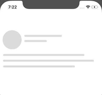
### Facebook and Instagram Style
These are also flexible and customizable
| Facebook loader | Instagram loader |
| :---------------------------------------------------------------------------------------------------------------------: | :----------------------------------------------------------------------------------------------------------------------: |
|  |  |
```jsx
import { FacebookLoader, InstagramLoader } from 'react-native-easy-content-loader';
```
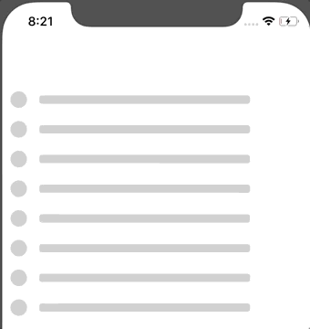
### Bullets Style
```jsx
```
### Default Style
## It is highly customizable, please refer the options sections.
```jsx
import ContentLoader from "react-native-easy-content-loader";
;
```
| Added custom heights and widths | Same with other loaders |
| :---------------------------------------------------------------------------------------------------------------------------: | :---------------------------------------------------------------------------------------------------------------------------: |
|  |
|  |
|
Some more examples,
```jsx
```
```jsx
```
| Default Loader | Colored |
| :--------------------------------------------------------------------------------------------------------------------------: | :--------------------------------------------------------------------------------------------------------------------------: |
|  |  |
## Usage
```jsx
import ContentLoader, {
FacebookLoader,
InstagramLoader,
Bullets
} from "react-native-easy-content-loader";
```
```jsx
```
## Options
## These Options are common with every component,
#### **`primaryColor?: string, rgba/hex`**
Defaults to `rgba(220, 220, 220, 1)`.
#### **`secondaryColor? string, rgba/hex`**
Defaults to `rgba(200, 200, 200, 1)`.
#### **`animationDuration? number`**
Defaults to `500`. The animation transition time from primaryColor to secondaryColor
#### **`loading?: bool | null`**
Defaults to `null`, If given a bool value, when false, it will return children (Works as a wrapper component)
#### **`active? bool`**
Defaults to `false`, `true` if you want to animate the compoennt.
#### **`title? bool`**
Defaults to `true`. If you want to show the title, **Works only with ContentLoader**.
#### **`titleStyles? object`**
Add styles to title.
#### **`listSize? number`**
Defaults to `1`. If you want to render a list of loaders, **Works with all the loaders**.
#### **`avatar? bool`**
Defaults to `false`. If you want to render the avatar.
#### **`aShape? string 'circle' | 'square'`**
Defaults to `circle`. shape of the avatar, can be circle or square.
#### **`aSize? string 'default' 'small' 'large' | number`**
Defaults to `default`. can be a specific number.
#### **`reverse? bool`**
Defaults to `false`. if you want to reverse the view.
#### **`containerStyles? object`**
If you want to add style to container.
## Title specific options.
#### **`tHeight? string | number`**
Used to change the title height.
#### **`tWidth? stirng | number`**
Used to change the title width.
#### **`sTHeight? string | number`**
Used to change the secondary title height **Works with only Facebook and Instagram**.
#### **`sTWidth? string | number`**
Used to change the secondary title width **Works with only Facebook and Instagram**.
#### **`titleStyles? object`**
Add styles to title.
#### **`secondaryTitleStyles? object`**
Add styles to secondaryTitle. **Works with only Facebook and Instagram**.
## Paragraph specific options.
#### **`pHeight? string | number | array`**
Paragraph line height,
Can specify same height with single value, Or could use array for different heights, eg ['100%', 200, 300], you can use pHeight and pWidth to achieve different shapes as well,
#### **`pWidth? string | number | array`**
Paragraph line width,
Can specify same width with single value, Or could use array for different widths, eg ['100%', 200, 300]
#### **`paragraphStyles? objecct`**
Add paragraph styles
## Instagram specific options.
#### **`imageHeight? number`**
Change the height of the image
#### **`imageStyles? number`**
Add styles to image
## Release History
See CHANGE_LOG.md.
## Contributing
Feel free to contribute, this is still in beta and I have plans to include more features in future :)
[npm-image]: https://img.shields.io/npm/v/react-native-easy-content-loader.svg
[npm-url]: https://www.npmjs.com/package/react-native-easy-content-loader
[npm-downloads]: https://img.shields.io/npm/dm/rn-placeholder.svg?style=flat-square