https://github.com/seangeng/glace
🧊 Beautiful frosted-glass toasts for React — an opinionated, themeable child of sonner with real glass, springy motion, and optional haptics.
https://github.com/seangeng/glace
dark-mode glassmorphism haptics notifications react sonner toast typescript ui
Last synced: about 1 month ago
JSON representation
🧊 Beautiful frosted-glass toasts for React — an opinionated, themeable child of sonner with real glass, springy motion, and optional haptics.
- Host: GitHub
- URL: https://github.com/seangeng/glace
- Owner: seangeng
- License: mit
- Created: 2026-06-08T14:08:39.000Z (about 2 months ago)
- Default Branch: main
- Last Pushed: 2026-06-08T16:17:36.000Z (about 2 months ago)
- Last Synced: 2026-06-08T16:18:32.935Z (about 2 months ago)
- Topics: dark-mode, glassmorphism, haptics, notifications, react, sonner, toast, typescript, ui
- Language: TypeScript
- Size: 61.5 KB
- Stars: 0
- Watchers: 0
- Forks: 0
- Open Issues: 0
-
Metadata Files:
- Readme: README.md
- License: LICENSE
Awesome Lists containing this project
README
# Glacé 🧊
**A frosted-glass UI kit for React.** Real edge refraction, springy motion, light/dark, and optional haptics — as a tiny, opinionated kit. Ships toasts, a glass button, and a `` surface primitive you can wrap anything in. Think [sonner](https://sonner.emilkowal.ski/), wearing glass.
**[glaceui.com](https://glaceui.com)** — live demo, playground, and docs.
[](https://glaceui.com/panels)
[](https://glaceui.com/primitives)
```bash
npm i glaceui
```
```tsx
import { Toaster, toast } from "glaceui";
import "glaceui/styles.css";
export default function App() {
return (
<>
toast.success("Saved to your library")}>Save
>
);
}
```
That's the whole setup: drop one `` near the root, call `toast()` from anywhere.
---
## Why
Most toast libraries are either gorgeous-but-rigid or flexible-but-plain. Glacé is opinionated about the *look* — proper frosted glass that blurs whatever's behind it, with a specular top edge, a faint grain, and a soft shadow — and unopinionated about everything else. It's themeable with plain CSS variables, has no styling dependency, and ships a single stylesheet, so it drops into a Tailwind/shadcn app or a plain one without touching your config.
## Features
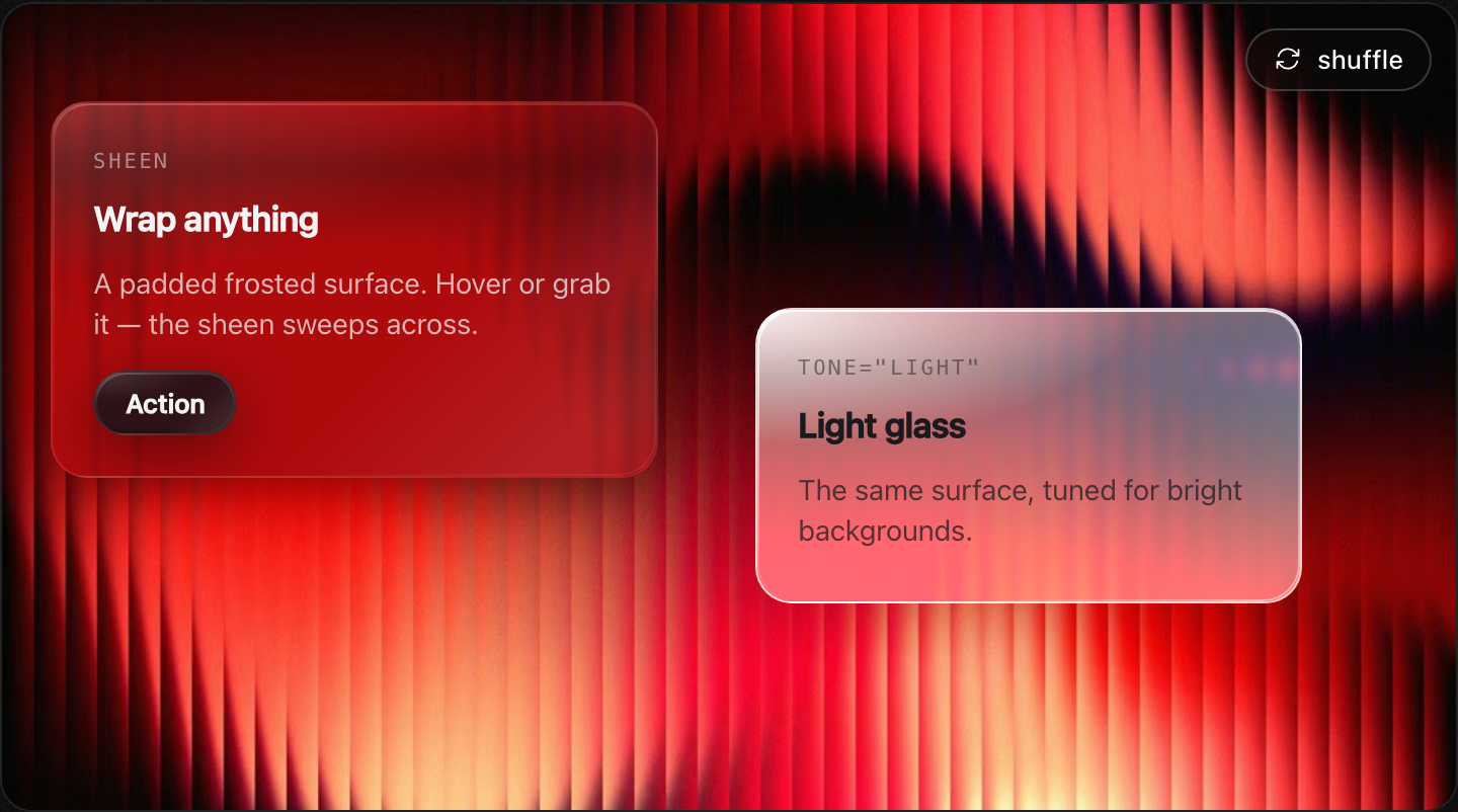
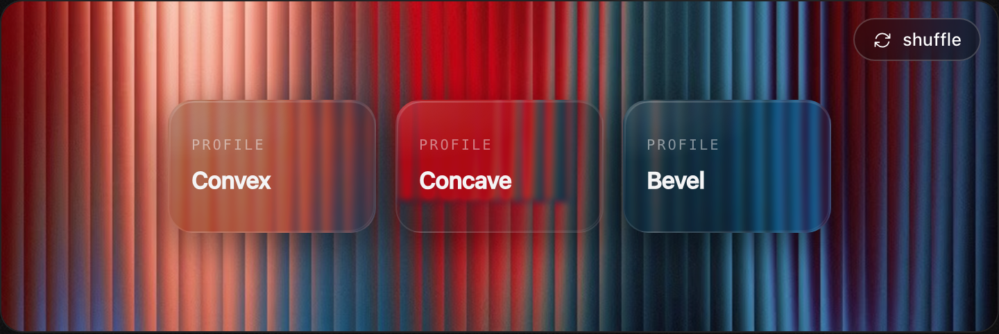
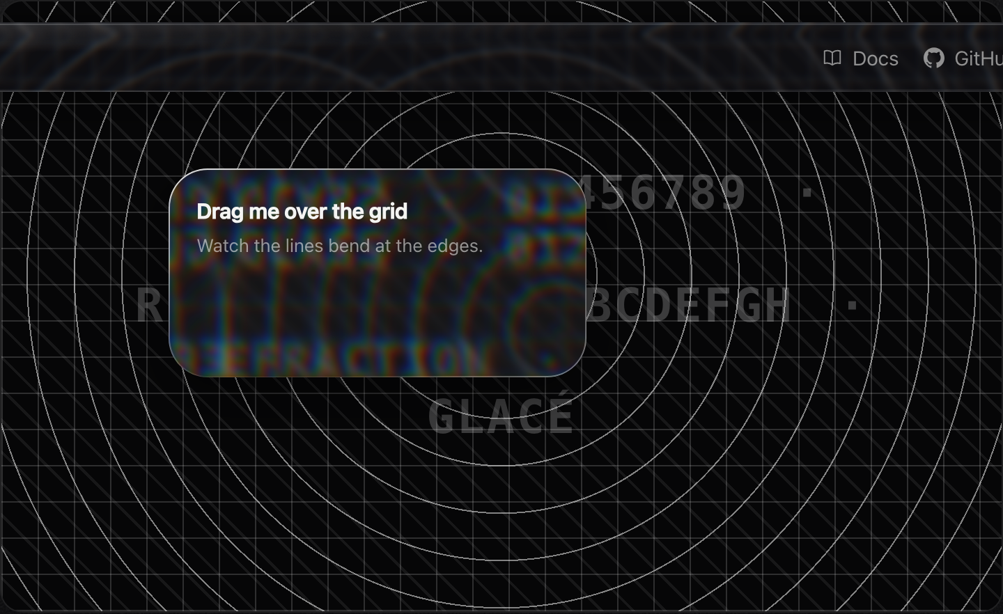
- 🧊 **Real glass** — edges that *refract*: an SVG displacement map bends the backdrop at the rim (the [Aave glass recipe](https://aave.com/design/building-glass-for-the-web)), with a specular highlight and only a little blur. Degrades to frosted blur where unsupported.
- 🌗 **Light / dark / system** — looks right on both, automatically.
- 🪄 **Springy stack** — toasts collapse behind each other and fan open on hover, sonner-style.
- 👆 **Swipe to dismiss** — pointer-driven, works on touch and trackpad.
- 📳 **Optional haptics** — a buzz on appear / action / dismiss where the device supports it (inspired by [web-haptics](https://github.com/lochie/web-haptics)).
- 🎨 **Themeable** — every color, blur, radius, and gap is a CSS variable.
- ⚡ **Tiny & dependency-free** — just React as a peer. Promise, loading, action buttons, custom render included.
- ♿ **Accessible** — `aria-live` region, reduced-motion aware.
## Toast API
```ts
toast("Plain message");
toast.success("Profile updated");
toast.error("Couldn't reach the server");
toast.warning("Storage almost full");
toast.info("New version available");
const id = toast.loading("Uploading…");
toast.success("Uploaded", { id }); // update in place
// with description + action
toast("Invite sent", {
description: "alex@acme.com will get an email.",
action: { label: "Undo", onClick: () => revoke() },
});
// promise — loading → success / error automatically
toast.promise(saveProfile(), {
loading: "Saving…",
success: (data) => `Saved ${data.name}`,
error: (err) => `Failed: ${err.message}`,
});
// render anything
toast.custom();
toast.dismiss(id); // or toast.dismiss() to clear all
```
## `` props
| Prop | Type | Default | |
|---|---|---|---|
| `position` | `top-left \| top-center \| top-right \| bottom-left \| bottom-center \| bottom-right` | `bottom-right` | where the stack sits |
| `theme` | `light \| dark \| system` | `system` | follows the OS unless pinned |
| `richColors` | `boolean` | `false` | tinted glass per type instead of neutral |
| `expand` | `boolean` | `true` | fan the stack open on hover |
| `visibleToasts` | `number` | `3` | how many show before older ones collapse out |
| `gap` | `number` | `14` | px between toasts when expanded |
| `offset` | `number` | `24` | px from the screen edge |
| `duration` | `number` | `4000` | default ms before auto-dismiss |
| `closeButton` | `boolean` | `false` | show an × on every toast |
| `blur` | `number` | `16` | glass blur radius in px |
| `haptics` | `boolean \| HapticsOptions` | `true` | vibration feedback (no-op where unsupported) |
| `toastOptions` | `{ duration, className, style, closeButton }` | — | defaults applied to every toast |
## Buttons — ``
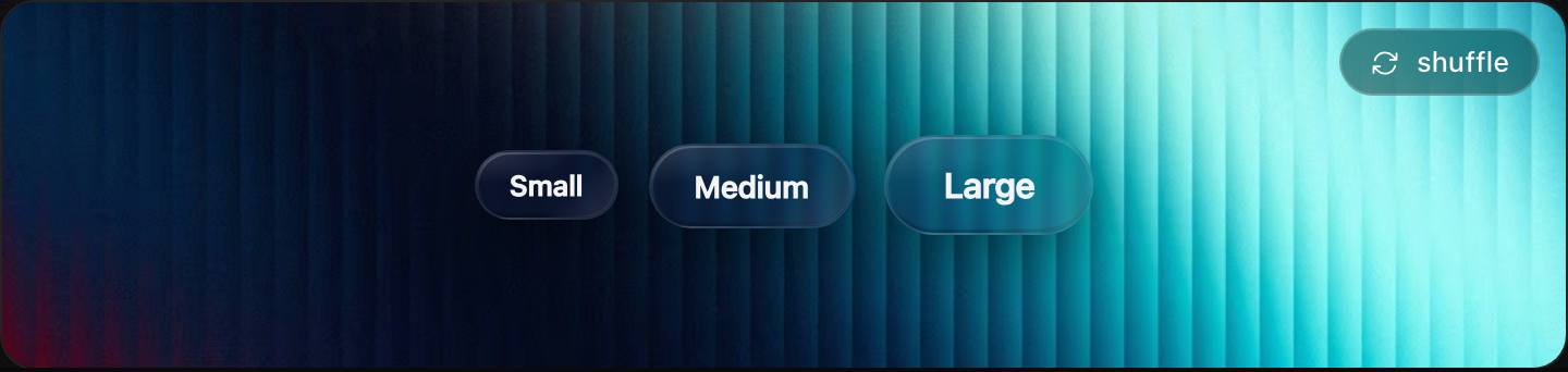
A frosted button on the glass surface, with a springy liquid press. Docs: [glaceui.com/buttons](https://glaceui.com/buttons).
```tsx
import { GlassButton } from "glaceui";
Save
Large light
{open ? "Collapse" : "Expand"} // width springs on change
```
Every button has a specular **sheen** that sweeps on hover and a **3D press** that tips the glass back. Props: `tone` (`light`/`dark`), `size` (`sm`/`md`/`lg`), `refract` (`false`/`true`/px), `aberration`, `bezel`, `saturation`, `morph`, plus all `` props.
`GlassCard` / `Glass` take a **`sheen`** prop for the same swept highlight on hover/press.
## Panels — ``
A padded glass container — drop anything inside. Docs: [glaceui.com/panels](https://glaceui.com/panels).
```tsx
import { GlassCard, GlassButton } from "glaceui";
Pricing
Wrap anything in real glass.
Upgrade
```
## Primitives — ``
The raw surface every component is built on. Render any element via `as`. Docs: [glaceui.com/primitives](https://glaceui.com/primitives).
```tsx
import { Glass, useGlassFilter } from "glaceui";
…
…liquid-resizes without distortion…
```
**Tuning the refraction** — the same knobs the [Glass Lab](https://glaceui.com/primitives) exposes are props on every surface (`Glass`, `GlassCard`, `GlassButton`, `Toaster`):
```tsx
```
Full `` props: `as` (default `div`), `tone`, `radius`, `refract` (`false`/`true`/px), `aberration` (1), `bezel` (0.16), `blur` (3), `saturation` (180), `fallbackBlur` (14), `interactive`, `morph`. Displacement maps + their SVG filters are generated per element size and **cached by size+tuning**, so every same-sized surface — including the toasts — shares one filter.
## Theming
Glacé is driven entirely by CSS variables on `[data-glace-toaster]`. Override any of them — they map cleanly onto shadcn's token system, so you can wire them to your existing palette:
```css
[data-glace-toaster][data-theme="dark"] {
--glace-bg: rgba(20, 20, 28, 0.55);
--glace-border: rgba(255, 255, 255, 0.1);
--glace-text: hsl(var(--foreground));
--glace-radius: 14px;
}
```
Per-toast styling is just `className` / `style`:
```tsx
toast("Custom", { className: "my-toast", style: { "--glace-radius": "22px" } });
```
## Haptics
On by default — a light buzz on appear / action / dismiss, a no-op where the
Vibration API isn't available (iOS Safari, most desktops). Pass `haptics={false}`
to turn it off, or tune the patterns:
```tsx
```
Uses the Vibration API where available (Android Chrome and others). iOS Safari doesn't expose it, so it's a progressive enhancement — never required, never throws.
## Credits
Standing on the shoulders of work I admire:
- [**sonner**](https://sonner.emilkowal.ski/) by Emil Kowalski — the toast API and stacking behavior this follows.
- [**Building glass for the web**](https://aave.com/design/building-glass-for-the-web) by Aave — the layered-glass recipe.
- [**Sileo**](https://sileo.aaryan.design/) by Aaryan — glass-notification aesthetic inspiration.
- [**web-haptics**](https://github.com/lochie/web-haptics) by Lochie — the case for tactile web feedback.
## License
MIT © [Sean Geng](https://seangeng.com)