https://github.com/selemondev/vscode-park-ui
Park UI VSCode extension to help you install and use Park UI components without leaving your IDE ✨.
https://github.com/selemondev/vscode-park-ui
panda-css park-ui park-ui-snippets react react-snippets react-typescript snippets ui-snippets vscode-snippets
Last synced: 5 months ago
JSON representation
Park UI VSCode extension to help you install and use Park UI components without leaving your IDE ✨.
- Host: GitHub
- URL: https://github.com/selemondev/vscode-park-ui
- Owner: selemondev
- License: mit
- Created: 2024-01-15T22:58:41.000Z (over 2 years ago)
- Default Branch: master
- Last Pushed: 2024-02-06T11:40:42.000Z (over 2 years ago)
- Last Synced: 2025-06-30T11:50:21.581Z (about 1 year ago)
- Topics: panda-css, park-ui, park-ui-snippets, react, react-snippets, react-typescript, snippets, ui-snippets, vscode-snippets
- Language: TypeScript
- Homepage: https://marketplace.visualstudio.com/items?itemName=Selemondev.vscode-park-ui
- Size: 1.95 MB
- Stars: 6
- Watchers: 2
- Forks: 0
- Open Issues: 0
-
Metadata Files:
- Readme: README.md
- Changelog: CHANGELOG.md
- Contributing: CONTRIBUTING.md
- License: LICENSE
- Code of conduct: CODE_OF_CONDUCT.md
- Codeowners: CODEOWNERS
Awesome Lists containing this project
README

Park UI
This VSCode Extension enables you to install [park/ui](https://park-ui.com/) components directly from your IDE ✨.
## Initialize the Park/UI CLI
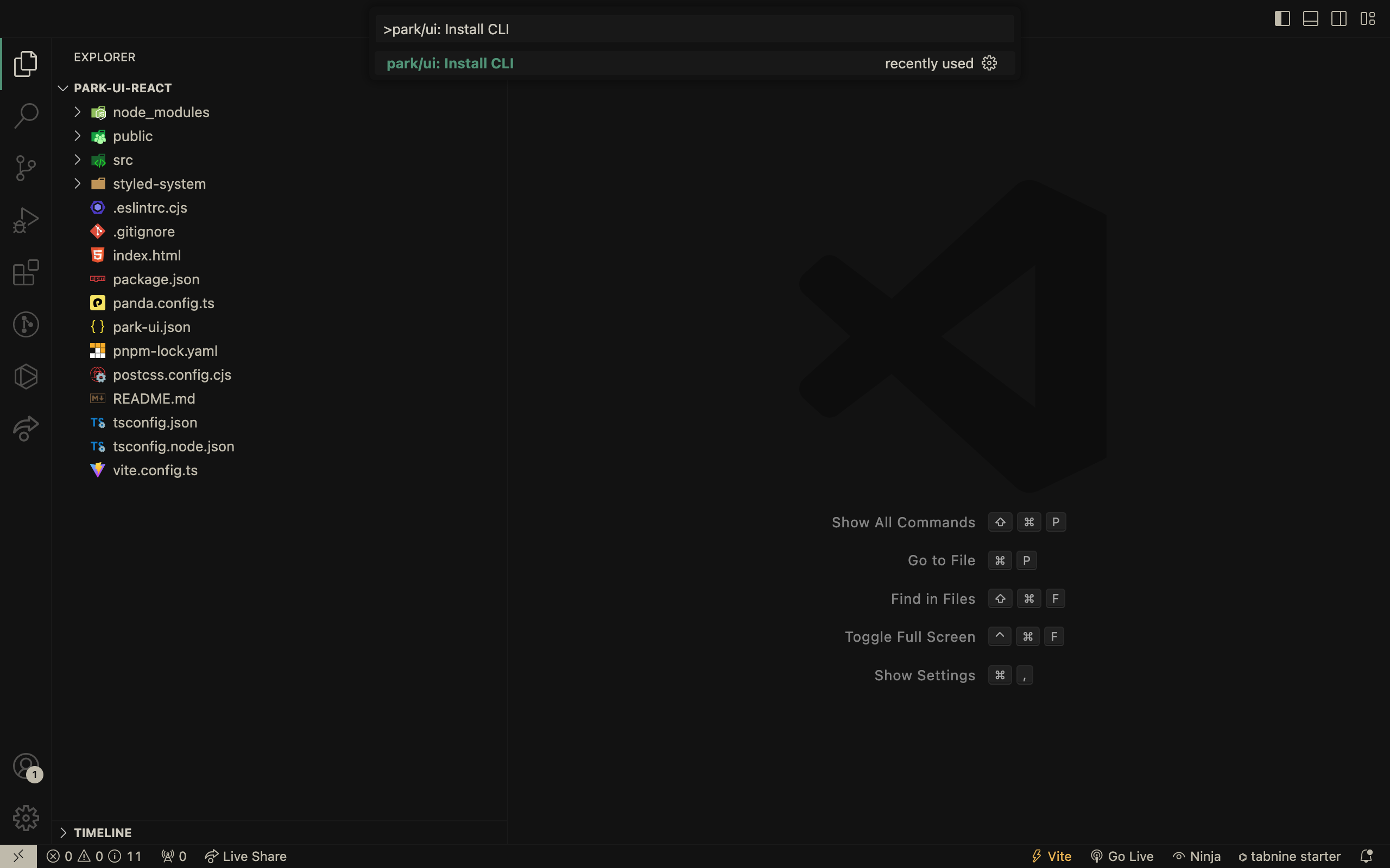
## Install components
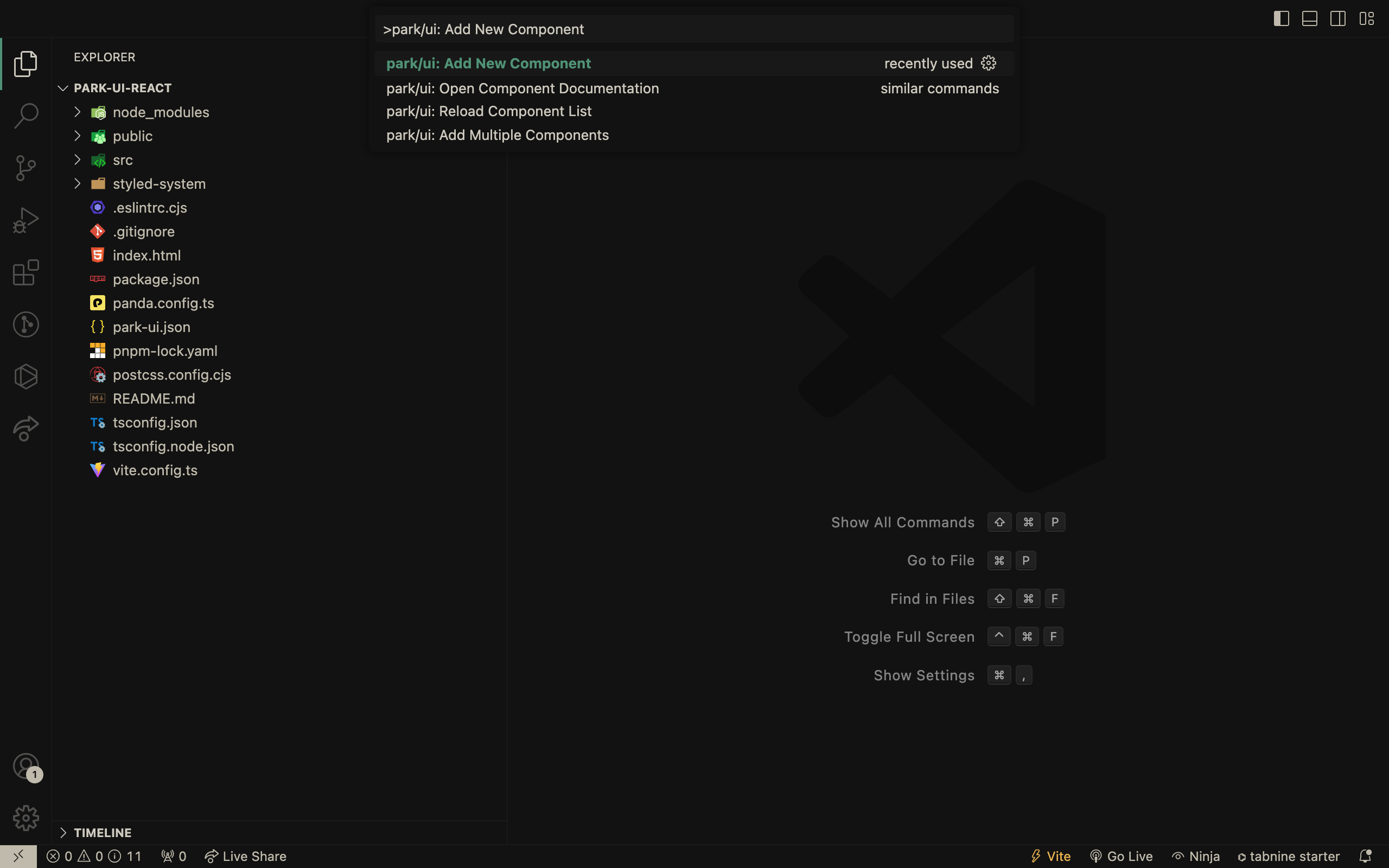
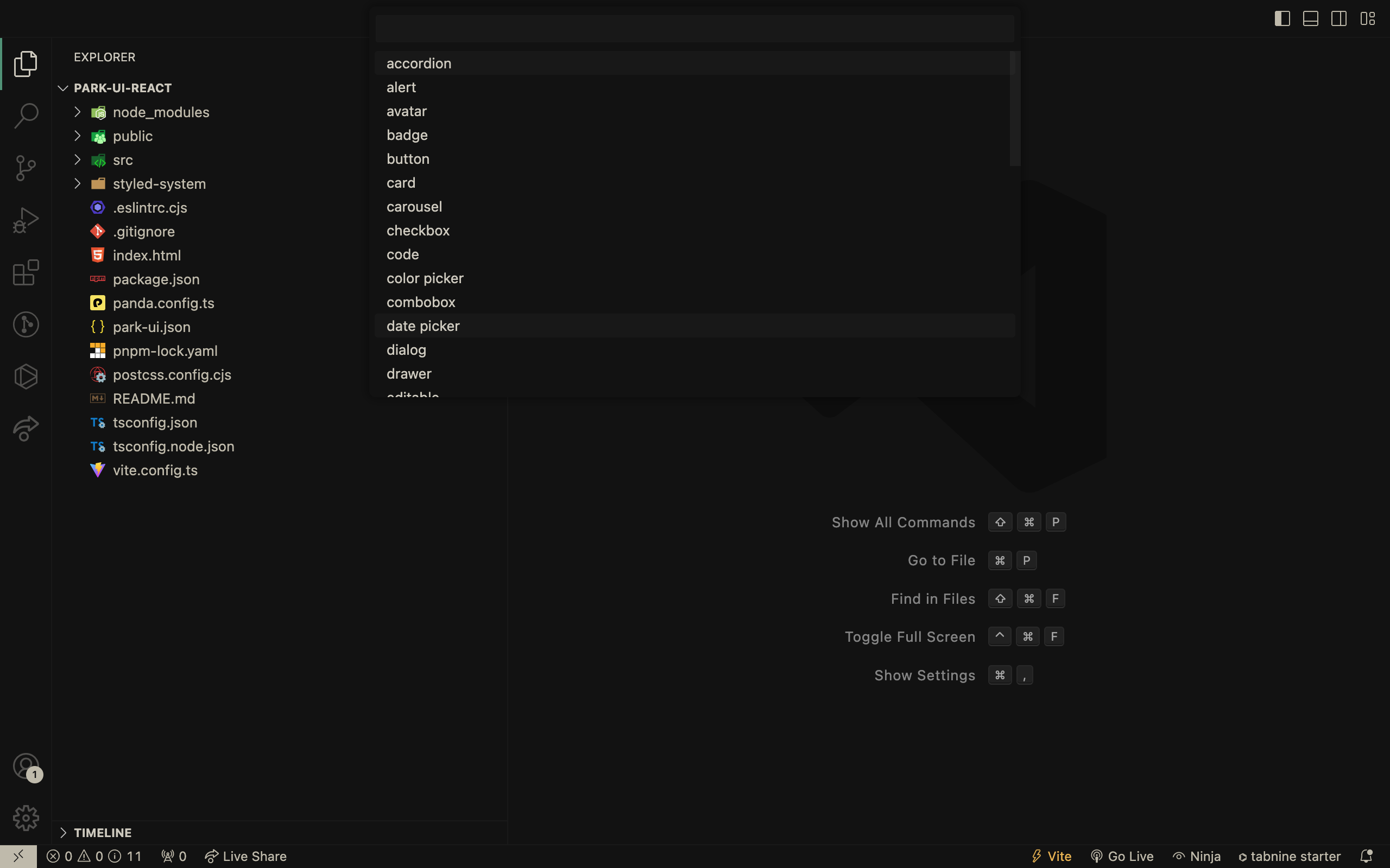
## Choose a component to install from the list
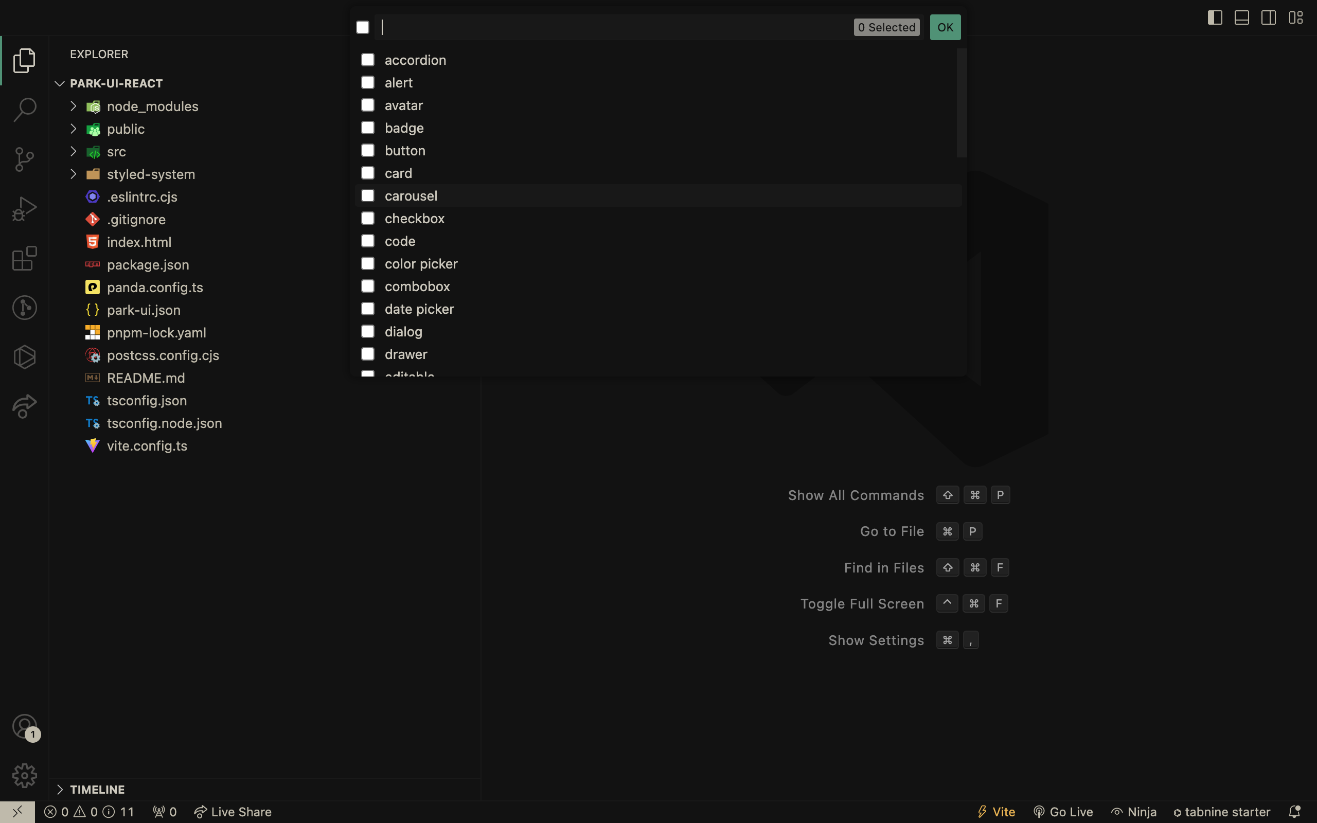
## Install multiple components
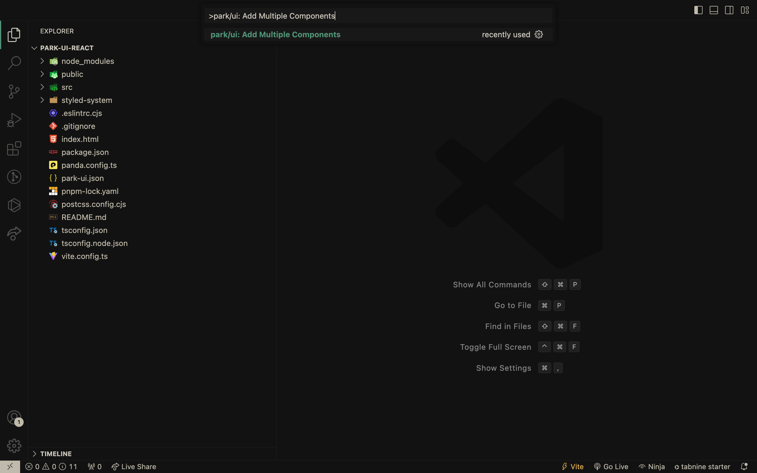
## Choose components to install from the list
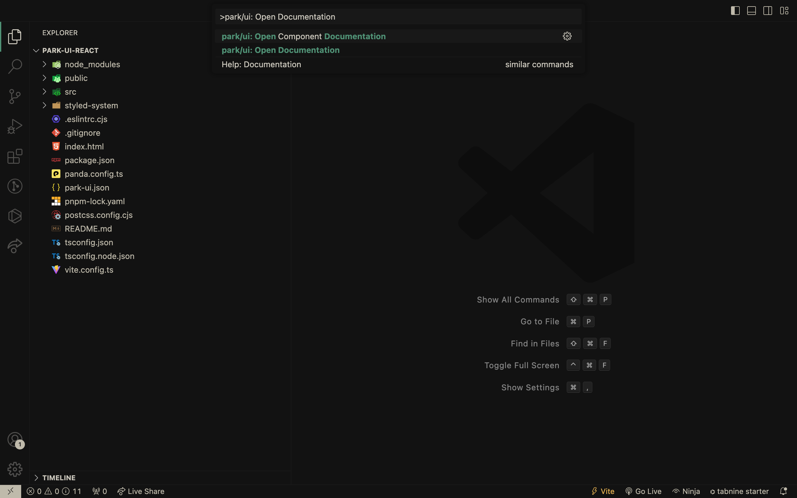
## Open the Park-UI documentation
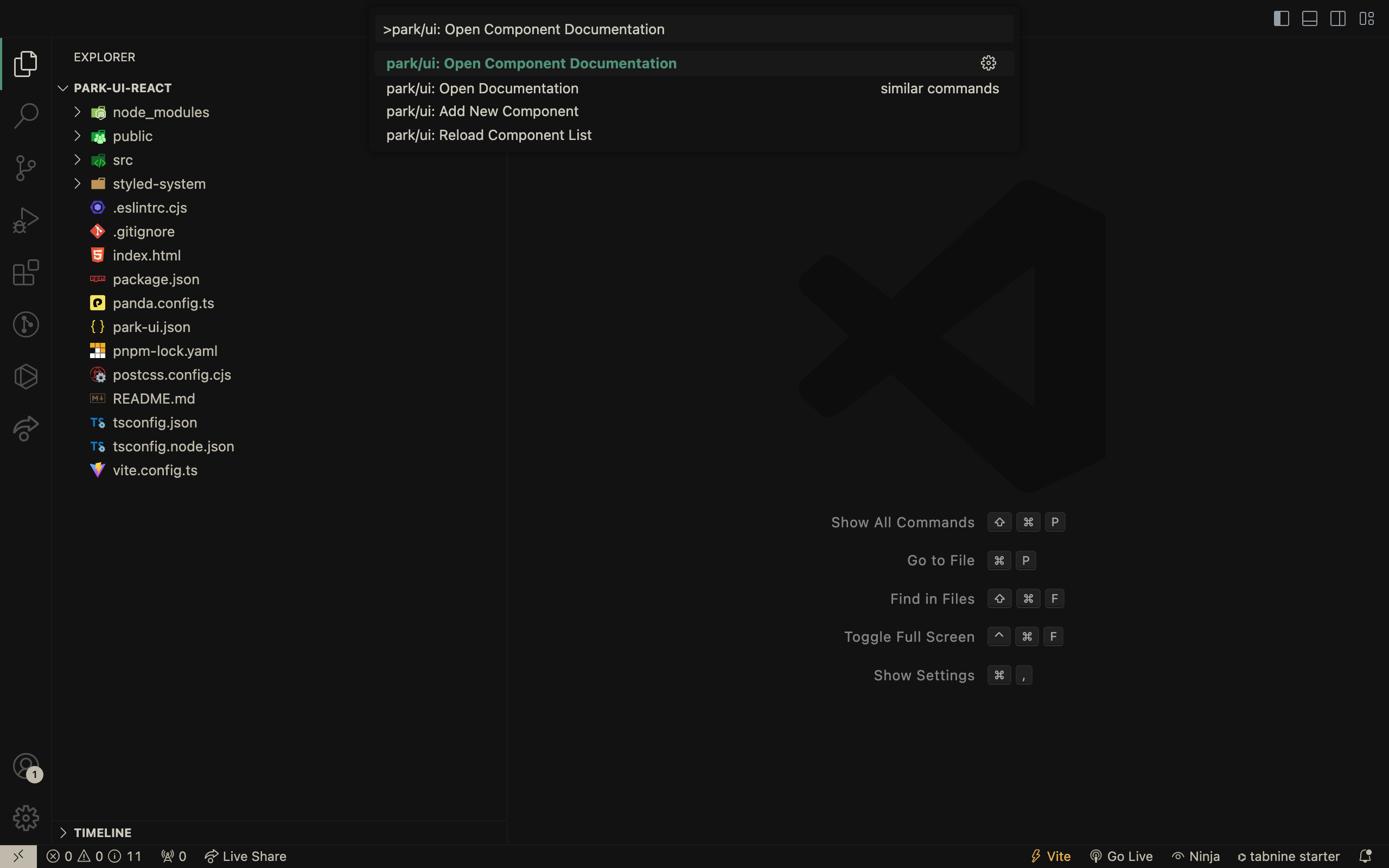
## Navigate to a particular component's documentation page
## Park/UI Snippets
Easily import and use park-suielte components with ease using snippets within VSCode. Just type `park-x` or `park-ui` in your jsx/tsx file and choose from an array of components to use.
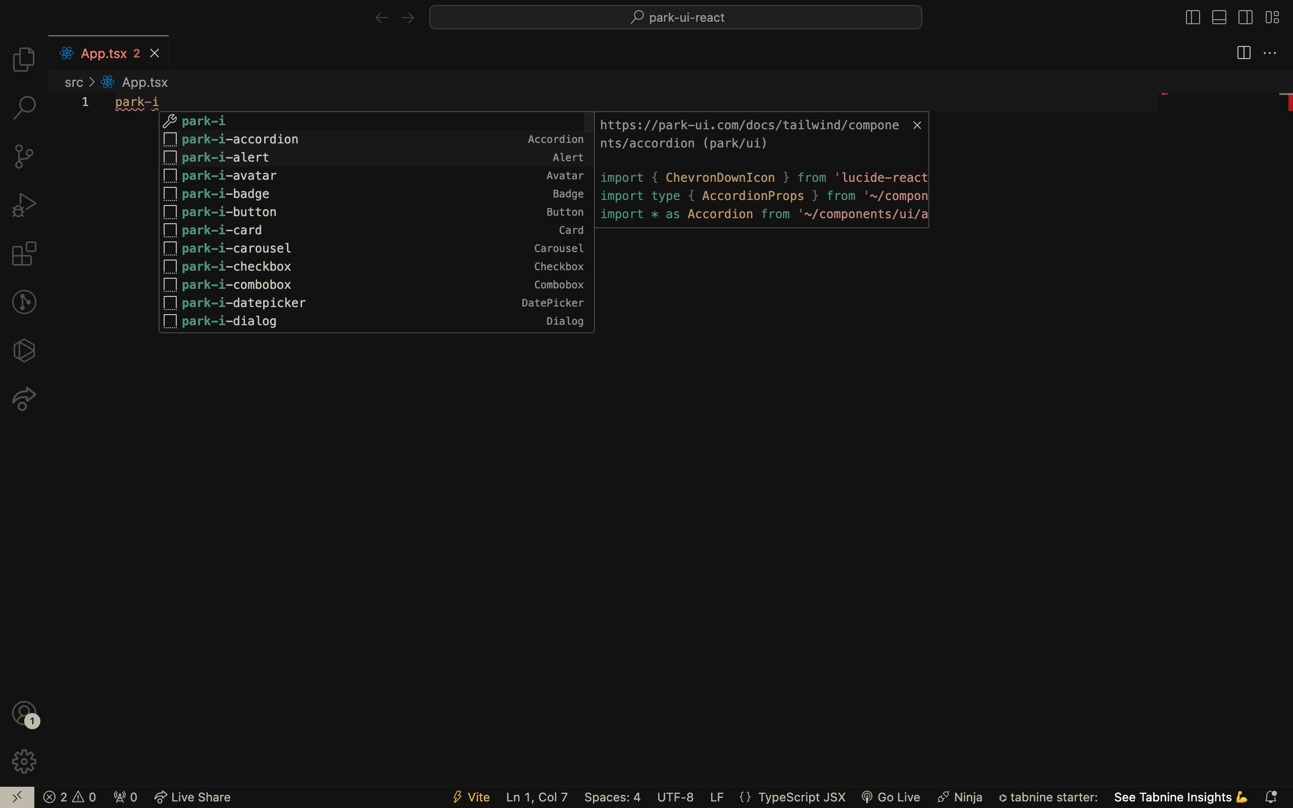
### How it works
| Snippet | Description |
| ----------------- | -------------------------------------- |
| `park-ui-help` | How to use park/ui snippets |
| `park-i-[component]`| Adds imports for the component |
| `park-ui-[component]`| Adds the markup for the jsx/tsx component|
### How to use?
1. Components
For `Alert` component, type `park-i-alert` to add imports in your jsx/tsx file, and to use the component, use `park-ui-alert`.
> Similarly, for any other component, use `park-i-[component]` to add imports and `park-ui-[component]` to use.
```tsx
// park-i-alert
import { InfoIcon } from 'lucide-react',
import type { AlertProps } from '~/components/ui/alert',
import * as Alert from '~/components/ui/alert'
// park-ui-alert
,
,
,
,
,
Browser Update available,
For the best experience, please update your browser.,
,
"
```
### How to contribute?
Contributions are welcome and encouraged! If you have any ideas or suggestions for new features, or if you encounter any bugs or issues, please open an issue or submit a pull request on the GitHub repository.
Developers interested in contributing should read the [Code of Conduct](./CODE_OF_CONDUCT.md) and the [Contributing Guide](./CONTRIBUTING.md).
Use this link - [Snippet Generation](https://snippet-generator.app/?description=https%3A%2F%2Fpark-ui.com%2Fdocs%2Ftailwind%2Fcomponents%2F&tabtrigger=park-&snippet=&mode=vscode) to generate snippets and add/update them to the `snippets` folder that is located in the `src` accordingly.
### Credits
All credits go to the creators of these amazing projects:
- The [Panda CSS](https://github.com/chakra-ui/panda) team.
- [Ark UI](https://github.com/chakra-ui/ark) for doing all the hard work to make sure components are accessible.
- [Park UI](https://park-ui.com/) for creating this amazing project.