https://github.com/selfishprimate/yojimbo
Animated border beam effect for React. A glowing light trail that travels along the border of any element. Named after the samurai — the beam cuts along edges like a blade catching light.
https://github.com/selfishprimate/yojimbo
Last synced: 13 days ago
JSON representation
Animated border beam effect for React. A glowing light trail that travels along the border of any element. Named after the samurai — the beam cuts along edges like a blade catching light.
- Host: GitHub
- URL: https://github.com/selfishprimate/yojimbo
- Owner: selfishprimate
- License: mit
- Created: 2026-04-04T13:19:21.000Z (2 months ago)
- Default Branch: main
- Last Pushed: 2026-04-04T19:36:05.000Z (2 months ago)
- Last Synced: 2026-04-04T21:53:31.650Z (2 months ago)
- Language: TypeScript
- Size: 2.15 MB
- Stars: 0
- Watchers: 0
- Forks: 0
- Open Issues: 0
-
Metadata Files:
- Readme: README.md
- Changelog: CHANGELOG.md
- Contributing: CONTRIBUTING.md
- License: LICENSE
- Code of conduct: CODE_OF_CONDUCT.md
Awesome Lists containing this project
README
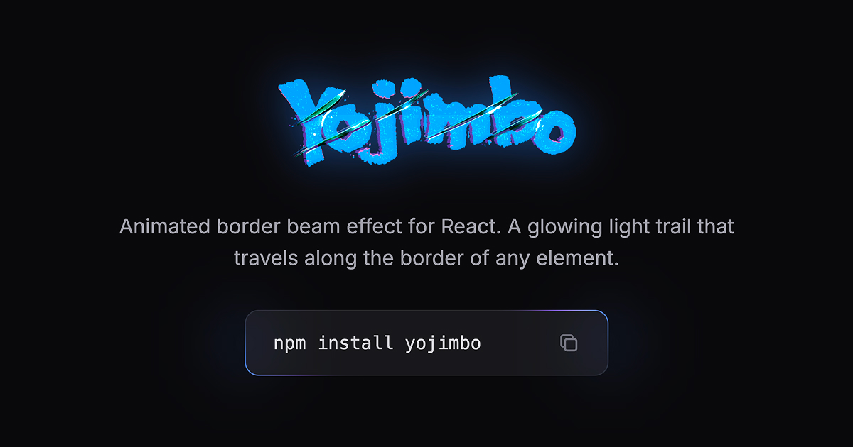
Animated border beam effect for React. A glowing light trail that travels along the border of any element.
Named after Akira Kurosawa's epic 1961 samurai film *Yojimbo*, starring the legendary Toshiro Mifune. The effect is inspired by the gleam of a samurai sword — a sharp, luminous edge that catches the light as it moves.
## Installation
```bash
npm install yojimbo
```
## Usage
Drop the `` component inside any element with `position: relative` and a `border-radius`. No CSS import needed — keyframes are injected automatically.
```tsx
import { Yojimbo } from "yojimbo";
function Card() {
return (
Your content here
);
}
```
### Custom colors
```tsx
```
### Single beam, slower
```tsx
```
### Counter-clockwise with larger glow
```tsx
```
### Custom blob sizes
```tsx
```
### No outer glow
```tsx
```
## Props
| Prop | Type | Default | Description |
|------|------|---------|-------------|
| `colorFrom` | `string` | `"#3B82F6"` | Leading edge color of the beam. Accepts any CSS color value (hex, rgb, rgba, hsl). |
| `colorTo` | `string` | `"#8B5CF6"` | Trailing edge color of the beam. Accepts any CSS color value. |
| `size` | `number` | `250` | Overall beam size in pixels. |
| `colorFromSize` | `number` | `size / 3` | Size of the leading color blob in pixels. |
| `colorToSize` | `number` | `size / 3` | Size of the trailing color blob in pixels. |
| `speed` | `number` | `20` | Duration of a full loop in seconds. Higher = slower. |
| `thickness` | `number` | `1` | Visible border thickness in pixels. |
| `blur` | `number` | `12` | Blur amount for the beam in pixels. |
| `glowBlur` | `number` | `30` | Blur amount for the outer glow in pixels. |
| `glowOpacity` | `number` | `0.7` | Opacity of the outer glow (0 to 1). |
| `glow` | `boolean` | `true` | Whether to show the outer glow effect. |
| `beams` | `1 \| 2` | `2` | Number of beams. Two beams are positioned on opposite sides. |
| `direction` | `"clockwise" \| "counterclockwise"` | `"clockwise"` | Direction of beam movement. |
| `className` | `string` | — | Additional CSS class name. |
## How it works
1. A frame div is positioned over the parent element with `overflow: hidden`
2. CSS `mask: content-box exclude` cuts out the interior, leaving only a thin border strip visible
3. Circular gradient blobs travel along the border using `offset-path: border-box`
4. Two blobs per beam (leading `colorFrom` + trailing `colorTo`) create the gradient trail
5. Optional outer glow orbs follow the same path with a larger blur for ambient light
## Requirements
- React 18+
- Works with Next.js (App Router & Pages Router), Vite, CRA, and any React setup
- The parent element must have `position: relative` and a `border-radius`
## Browser support
Uses CSS `offset-path: border-box` which is supported in all modern browsers (Chrome 116+, Firefox 125+, Safari 18+).
## License
MIT