https://github.com/shaack/bootstrap-show-notification
A jQuery plugin wrapper around Bootstrap Alerts, to create Notifications (Toasts)
https://github.com/shaack/bootstrap-show-notification
Last synced: about 1 year ago
JSON representation
A jQuery plugin wrapper around Bootstrap Alerts, to create Notifications (Toasts)
- Host: GitHub
- URL: https://github.com/shaack/bootstrap-show-notification
- Owner: shaack
- License: mit
- Created: 2020-07-14T20:33:38.000Z (almost 6 years ago)
- Default Branch: master
- Last Pushed: 2022-09-07T13:43:39.000Z (almost 4 years ago)
- Last Synced: 2024-08-09T12:12:20.164Z (almost 2 years ago)
- Language: JavaScript
- Homepage:
- Size: 126 KB
- Stars: 14
- Watchers: 4
- Forks: 4
- Open Issues: 1
-
Metadata Files:
- Readme: README.md
- License: LICENSE
Awesome Lists containing this project
README
# bootstrap-show-notification
> This component is Bootstrap 4 only. For a Bootstrap 5 compatible
> component with similar functionality, see [bootstrap-show-toast](https://github.com/shaack/bootstrap-show-toast).
A jQuery plugin wrapper around Bootstrap 4 Alerts, to show them as toasts (also called notifications) dynamically from JavaScript.
=>
- Responsive and mobile friendly
- Needs no extra CSS
## Try it
- [Demo Page](https://shaack.com/projekte/bootstrap-show-notification/)
## Installation
- [npm package](https://www.npmjs.com/package/bootstrap-show-notification)
```sh
npm install bootstrap-show-notification
```
## Usage
```html
// simple example
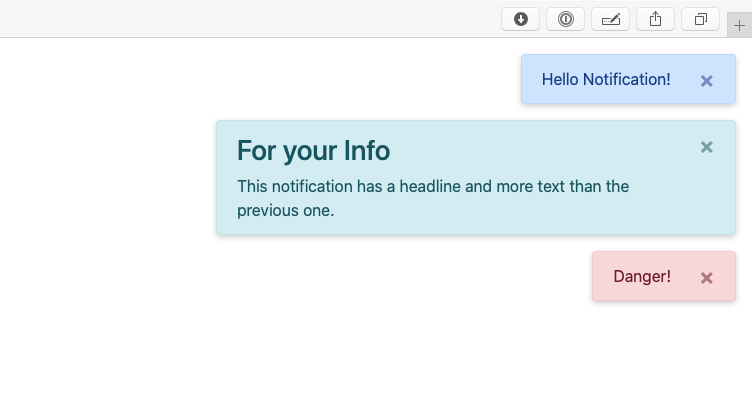
$("#button-show-simple").click(function () {
$.showNotification({body: "Hello Notification!"})
})
// type info and more complex body
$("#button-show-info").click(function () {
$.showNotification({
body: "<h3>For your Info</h3>This notification has a title and a body and more text than the previous one.", type: "info"
})
})
// type danger
$("#button-show-danger").click(function () {
$.showNotification({
body: "Danger!", type: "danger"
})
})
// type secondary and sticky
$("#button-show-sticky").click(function () {
$.showNotification({
body: "This notification will stay", type: "secondary", duration: 0
})
})
```
## Props (defaults)
```js
this.props = {
body: "", // the text, shown
type: "primary", // the appearance
duration: 5500, // duration till auto-hide, set to `0` to disable auto-hide
maxWidth: "520px", // the notification maxWidth
shadow: "0 2px 6px rgba(0,0,0,0.2)", // the box-shadow
zIndex: 100,
margin: "1rem", // the margin (above maxWidth)
direction: "prepend" // or "append", the stack direction
}
```
## Documentation
- [Repository and documentation](https://github.com/shaack/bootstrap-show-notification)
## More Bootstrap extensions
Check out my [further Bootstrap extensions](https://shaack.com/en/open-source-components)