https://github.com/shashiben/flutter_next
An advanced flutter package to build responsive application accross all platform with ease and has an handful of different types of extension.
https://github.com/shashiben/flutter_next
bootstrap flutter flutter-bootstrap flutter-resp responsive-layout responsive-web-design
Last synced: about 1 year ago
JSON representation
An advanced flutter package to build responsive application accross all platform with ease and has an handful of different types of extension.
- Host: GitHub
- URL: https://github.com/shashiben/flutter_next
- Owner: shashiben
- License: mit
- Created: 2022-01-26T15:36:05.000Z (about 4 years ago)
- Default Branch: master
- Last Pushed: 2025-02-20T14:42:15.000Z (about 1 year ago)
- Last Synced: 2025-03-25T08:42:38.019Z (about 1 year ago)
- Topics: bootstrap, flutter, flutter-bootstrap, flutter-resp, responsive-layout, responsive-web-design
- Language: Dart
- Homepage: https://pub.dev/packages/flutter_next
- Size: 6.33 MB
- Stars: 13
- Watchers: 3
- Forks: 7
- Open Issues: 0
-
Metadata Files:
- Readme: README.md
- Changelog: CHANGELOG.md
- License: LICENSE
Awesome Lists containing this project
README
# 🚀 Flutter Next - Your Next Level Flutter Toolkit 🛠️
[](https://pub.dev/packages/flutter_next)
[](https://opensource.org/licenses/MIT)
[](https://pub.dev/packages/flutter_next/score)
[](https://pub.dev/packages/flutter_next/score)
[](https://pub.dev/packages/flutter_next/score)



🎉 Elevate your Flutter development experience with Flutter Next! 🎉
Flutter Next is an advanced Flutter package designed to supercharge your Flutter development. It helps you build responsive applications across all platforms with ease and provides a handful of useful extensions.
## 🌟 Features
- 📱 Develop Responsive UIs like a breeze
- 🎨 Add animations with a single line of code
- 🧰 Handful of extensions to boost your productivity
## 🚀 Usage/Examples
Check out our demo: 🔗 [One Page](https://one-page-with-flutter.netlify.app/)
Join the Flutter Next revolution today and take your Flutter apps to the next level! 🚀
## Appendix
- [Widgets](#widgets)
- [Avatar](#avatar)
- [Hover Widget](#hover-widget)
- [BreadCumb](#breadcumb)
- [Alerts](#alerts)
- [Grid System](#grid-system)
- [Next Grid](#next-grid)
- [Container](#container)
- [Accordion](#accordion)
- [Button](#button)
- [Animations](#animations)
- [Extensions](#extensions)
- [Widget Extensions](#widget-extensions)
- [Context](#context)
- [Padding](#padding)
- [String](#string)
- [Bool](#bool)
- [Shadows](#shadows)
# Widgets
## Avatar
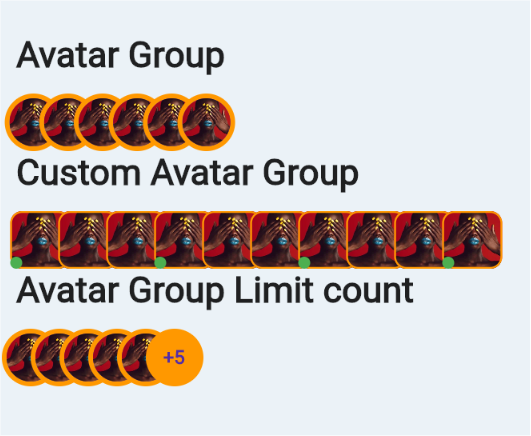
```dart
Text(
"Avatar Group",
style: TextStyle(fontSize: 30, fontWeight: FontWeight.bold),
),
SizedBox(
height: 15,
),
NextAvatarGroup(
backgroundColor: Colors.orange,
imagesList: List.generate(
6,
(index) => NetworkImage(
"https://images.ctfassets.net/hrltx12pl8hq/qGOnNvgfJIe2MytFdIcTQ/429dd7e2cb176f93bf9b21a8f89edc77/Images.jpg?fit=fill&w=175&h=175&fm=webp"))),
Text(
"Custom Avatar Group",
style: TextStyle(fontSize: 30, fontWeight: FontWeight.bold),
),
SizedBox(
height: 15,
),
NextAvatarGroup(
backgroundColor: Colors.orange,
itemCount: 6,
widthFactor: 0.8,
imagesList: List.generate(
10,
(index) => NetworkImage(
"https://images.ctfassets.net/hrltx12pl8hq/qGOnNvgfJIe2MytFdIcTQ/429dd7e2cb176f93bf9b21a8f89edc77/Images.jpg?fit=fill&w=175&h=175&fm=webp")),
itemBuilder: (context, index, image) => Stack(
children: [
Container(
width: 50,
height: 50,
decoration: BoxDecoration(
image: DecorationImage(image: image),
border: Border.all(color: Colors.orange, width: 1.5),
color: Colors.red,
borderRadius: BorderRadius.circular(10)),
),
if (index % 3 == 0)
Positioned(
bottom: 0,
left: 0,
child: CircleAvatar(
backgroundColor: Colors.green,
radius: 5,
),
)
],
),
),
Text(
"Avatar Group Limit count",
style: TextStyle(fontSize: 30, fontWeight: FontWeight.bold),
),
SizedBox(
height: 15,
),
NextAvatarGroup(
backgroundColor: Colors.orange,
limitTo: 5,
imagesList: List.generate(
10,
(index) => NetworkImage(
"https://images.ctfassets.net/hrltx12pl8hq/qGOnNvgfJIe2MytFdIcTQ/429dd7e2cb176f93bf9b21a8f89edc77/Images.jpg?fit=fill&w=175&h=175&fm=webp")),
widthFactor: 0.5,
)
```
## Hover Widget
Using this you can know whether widget is hovered or not. Even it works for mobile and every device.
`Hover Duration` - Duration for returning from hover to normal state
```dart
HoverWidget(
builder:(context,isHovered)=>Container(child:....)
)
```
## BreadCumb
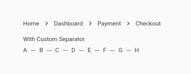
```dart
NextBreadCumb(
childrens: ["Home", "Dashboard", "Payment", "Checkout"]
.map((e) => NextBreadCumbItem(child: (isHovered) => Text(e)))
.toList()),
SizedBox(height: 20),
Text("With Custom Separator"),
SizedBox(height: 10),
NextBreadCumb(
seperator: Text("---"),
childrens: ["A", "B", "C", "D", "E", "F", "G", "H"]
.map(
(e) => NextBreadCumbItem(child: (isHovered) => Text(e)),
)
.toList()),
```
Additionally you can provide variant
- Wrap (If exceeds more than width then it will move to next line)
- Scroll (It will scroll horizontally)
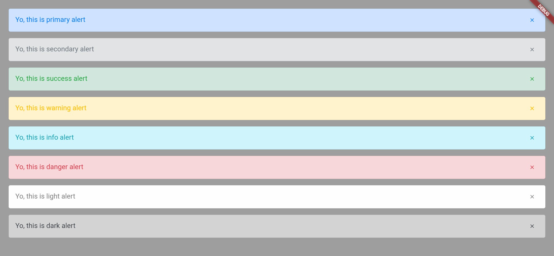
## Alerts
Define an alert by:
```dart
NextAlert(
child: Text("Yo, this is primary alert"),
onClosedIconPressed: () {},
margin: EdgeInsets.only(bottom: 15),
),
```
You can use multiple variant of alerts
```dart
NextAlert(
variant: NextVariant.secondary,
child: Text("Yo, this is primary alert"),
onClosedIconPressed: () {},
margin: EdgeInsets.only(bottom: 15),
),
```
And you can even define custom,variant should be custom
```dart
NextAlert(
variant: NextVariant.custom,
customConfigs: NextAlertColorUtils(
borderColor: Colors.black,
backgroundColor: Colors.pink,
color: Colors.deepOrange,
),
child: Text("Yo, this is primary alert"),
onClosedIconPressed: () {},
margin: EdgeInsets.only(bottom: 15),
),
```
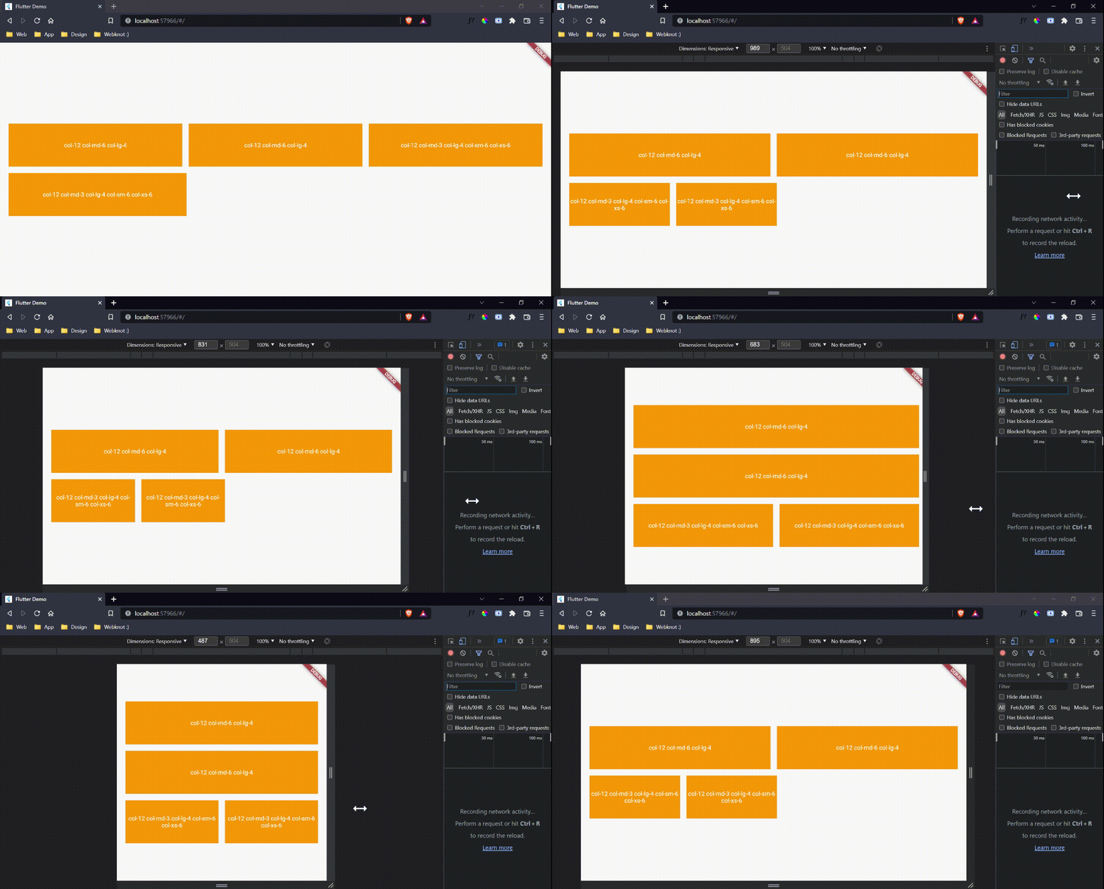
## Grid System
Extra small
<576px
Small
≥576px
Medium
≥768px
Large
≥992px
Extra large
≥1200px
Max container width
None (auto)
540px
720px
960px
1140px
Class prefix
col-
col-sm-
col-md-
col-lg-
col-xl-
```dart
NextRow(
verticalSpacing: 15,
horizontalSpacing: 15,
children: [
"col-12 col-md-6 col-lg-4",
"col-12 col-md-6 col-lg-4",
"col-12 col-md-3 col-lg-4 col-sm-6 col-xs-6",
"col-12 col-md-3 col-lg-4 col-sm-6 col-xs-6"
]
.map((e) => NextCol(
sizes: e,
child: Container(
height: 100,
decoration: BoxDecoration(color: Colors.orange),
child: Center(
child: Text(
e,
textAlign: TextAlign.center,
style: TextStyle(color: Colors.white),
),
),
width: double.infinity,
)))
.toList())
```
## Next Grid
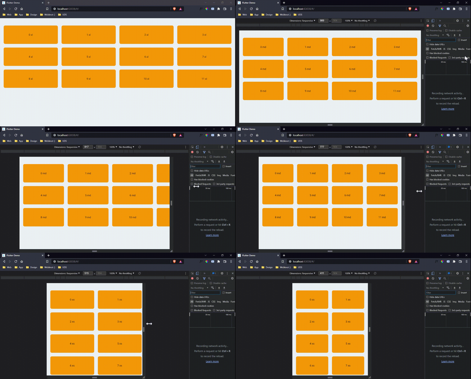
```dart
NextGridView(
sizes: "col-6 col-md-3 col-lg-4 col-xl-3 col-xs-6",
childrens: List.generate(
12,
(index) => NextGridItem(
child: Text(
"$index ${NextUtils.getPrefixByWidth(context.width)}")
.center()
.sizedBox(width: double.infinity, height: 100)
.addDecoration(BoxDecoration(
color: Colors.orange,
borderRadius: BorderRadius.circular(8))))))
```
- Additionaly you can even provide vertical spacing or horizontal spacing and for each children you can even define separate sizes
```dart
NextGridItem(
sizes: "col-12 col-md-6 col-lg-6",
....
)
```
## Container
Extra small
<576px
Small
≥576px
Medium
≥768px
Large
≥992px
X-Large
≥1200px
XX-Large
≥1400px
Next Container
100%
540px
720px
960px
1140px
1320px
- If you pass fluid as true then it will take whole width
## Accordion
```dart
NextAccordion(
initiallyExpanded: true,
backgroundColor: Colors.white,
collapsedBackgroundColor: Colors.white,
title: Text("Hey this it title which is initially Expanded"),
children: [
Padding(
padding: EdgeInsets.symmetric(vertical: 20, horizontal: 10),
child: NextAlert(
child: Text("Yo this is child"),
),
)
],
),
```

## Button
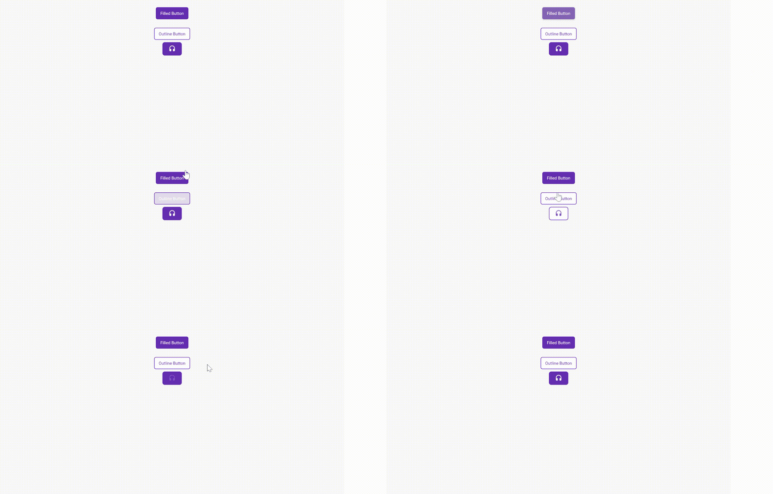
You can customise button by using itemBuilder
```dart
NextButton(
onPressed: () {},
style: TextStyle(color: Colors.white),
child: Text(
"Filled Button",
style: TextStyle(color: Colors.white),
),
),
SizedBox(height: 20),
NextButton(
onPressed: () {},
variant: NextButtonVariant.outlined,
child: Text("Outline Button"),
),
NextButton(
onPressed: () {},
variant: NextButtonVariant.outlined,
itemBuilder: (context, isHovered, color) =>
Icon(Icons.headset_rounded, color: color)
.paddingSymmetric(horizontal: 20, vertical: 10)
.decoration(BoxDecoration(
border:
Border.all(color: context.primaryColor, width: 1.5),
color: !isHovered ? context.primaryColor : Colors.white,
borderRadius: BorderRadius.circular(8),
)),
)
```
- the param color in itemBuilder is a color tween between color and outline color provided in button
## Animations
### Available Animations
- Slide Animation
- SlideInLeft
- SlideInRight
- SlideInTop
- SlideInBottom
- Zoom Animation
- ZoomIn
- ZoomOut
- Fade Animation
- FadeInLeft
- FadeInRight
- FadeInTop
- FadeInBottom
- FadeOutLeft
- FadeOutRight
- FadeOutTop
- FadeOutBottom
- Flip Animation
- Flipx
- FlipY
- Bounce Animation
- BounceInLeft
- BounceInRight
- BounceInTop
- BounceInBottom
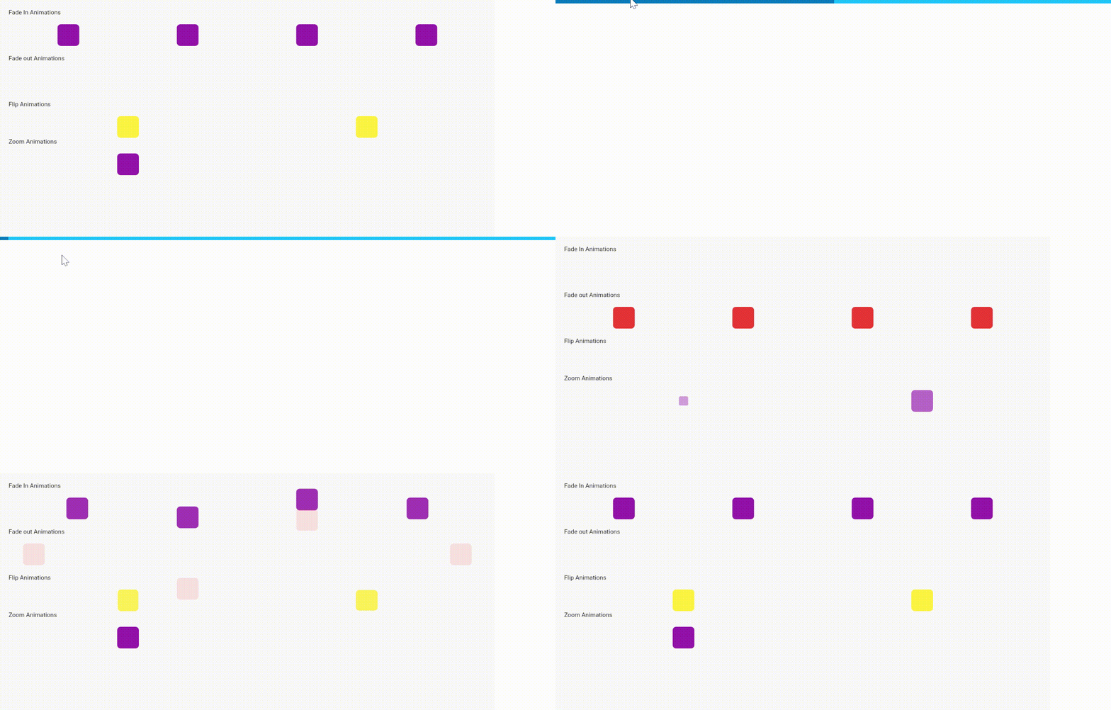
```dart
Text("Fade In Animations").customPadding(bottom: 20),
Row(
mainAxisAlignment: MainAxisAlignment.spaceAround,
children: [
ContainerThing().fadeIn(
variant: NextFadeInVariant.fadeInLeft,
duration: Duration(milliseconds: 600)),
ContainerThing().fadeIn(
variant: NextFadeInVariant.fadeInTop,
duration: Duration(milliseconds: 600)),
ContainerThing().fadeIn(
variant: NextFadeInVariant.fadeInBottom,
duration: Duration(milliseconds: 600)),
ContainerThing().fadeIn(
variant: NextFadeInVariant.fadeInRight,
duration: Duration(milliseconds: 600)),
],
),
SizedBox(height: 20),
Text("Fade out Animations").customPadding(bottom: 20),
Row(
mainAxisAlignment: MainAxisAlignment.spaceAround,
children: [
ContainerThing(
color: Colors.red,
).fadeOut(
variant: NextFadeOutVariant.fadeOutLeft,
duration: Duration(milliseconds: 600)),
ContainerThing(
color: Colors.red,
).fadeOut(
variant: NextFadeOutVariant.fadeOutTop,
duration: Duration(milliseconds: 600)),
ContainerThing(
color: Colors.red,
).fadeOut(
variant: NextFadeOutVariant.fadeOutBottom,
duration: Duration(milliseconds: 600)),
ContainerThing(
color: Colors.red,
).fadeOut(
variant: NextFadeOutVariant.fadeOutRight,
duration: Duration(milliseconds: 600)),
],
),
SizedBox(height: 20),
Text("Flip Animations").customPadding(bottom: 20),
Row(
mainAxisAlignment: MainAxisAlignment.spaceAround,
children: [
ContainerThing(
color: Colors.yellow,
).flip(
variant: NextFlipVariant.flipX,
duration: Duration(milliseconds: 600)),
ContainerThing(
color: Colors.yellow,
).flip(
variant: NextFlipVariant.flipY,
duration: Duration(milliseconds: 600)),
],
),
SizedBox(height: 20),
Text("Zoom Animations").customPadding(bottom: 20),
Row(
mainAxisAlignment: MainAxisAlignment.spaceAround,
children: [
ContainerThing().zoom(variant: NextZoomVariant.zoomIn),
ContainerThing().zoom(variant: NextZoomVariant.zoomOut),
],
)
```
# Extensions
## Widget Extensions
- Now you can add onTap function easily
```dart
Widget().onTap((){
....
})
```
- Double Tap
```dart
Widget().onDoubleTap((){
....
})
```
- On Long press
```dart
Widget().onLongPress((){
....
})
```
- And center your widget easily
```dart
Widget(
child:...
).center()
```
- And for column/row/stack
```dart
[Widget1(),Widget2(),Widget3()].column(
// Additionally you can provide mainAxis and remaining params here
)
```
- For decoration
```dart
Widget().addDecoration(BoxDecoration(
// Add params here
))
```
- you can even use clipRRect,clipper,safearea etc...
## Context
Now access themedata and mediaquery data easily like
```dart
context.themeData
context.textTheme
context.buttonTheme
context.snackBarTheme
```
Or if you want to develop responsive views w.r.t height and width
```dart
context.height
context.width
```
And for colors
```dart
context.primaryColor
context.backgroundColor
context.canvasColor
context.dividerColor
```
## Padding
Instead of
```dart
Padding(
padding: const EdgeInsets.all(20)
child:Widget(
child...
)
)
```
You can use
```dart
Widget(
child:...
).pad(20)
// Or
Widget(
child:...
).paddingSymmetric(horizontal:20,vertical:12)
//or
Widget(
child:...
).customPadding(left:10,right:12)
```
## String
- We provide handful of string extensions
- `"string".capitalize()` // Output is: String
- `"45".toInt()` // Output is: 45
- `"45.4".toDouble()` // Output is: 45.4
- `"flutter".isInt()` //Output is: False
- `"flutter".isDouble()` //Output is: False
- `"flutter".toDouble() `//Output is: null
## Bool
- `false.toggle()` //Output is true
# Shadows

```dart
ContainerThing(
shadows: NextShadow.shadow100()
),
```
- Additionally you can provide customshadow color
```dart
ContainerThing(
shadows: NextShadow.shadow100(color:Colors.red)
),
```
## 🔗 Connect with Me
Feel free to connect with me on these platforms:
[](https://shashiben.me/)
[](https://www.linkedin.com/in/shashi-kumar-58ab1b1a4/)
[](https://twitter.com/Shashi35744438)
# 🤝 Contributions
Contributions, issues, and feature requests are always welcome! Here's how you can contribute:
- Check out the [open issues](https://github.com/shashiben/flutter_next/issues) to find a task you can help with
- Fork the repo and create your branch from `master`
- Make sure your code adheres to our linting standards
- Submit a pull request and get it reviewed and approved. Welcome to our community!
Please read the [contribution guidelines](CONTRIBUTING.md) for more information.