https://github.com/shirvanie/flutter_sliding_box
A draggable flutter widget that makes it easier to use a SlidingBox panel for all platform. Boxes can be customized with your content and placed in your app.
https://github.com/shirvanie/flutter_sliding_box
dart dartlang flutter flutter-package flutter-packages flutter-ui flutter-widget library
Last synced: 5 months ago
JSON representation
A draggable flutter widget that makes it easier to use a SlidingBox panel for all platform. Boxes can be customized with your content and placed in your app.
- Host: GitHub
- URL: https://github.com/shirvanie/flutter_sliding_box
- Owner: shirvanie
- License: mit
- Created: 2023-06-06T23:21:30.000Z (about 3 years ago)
- Default Branch: master
- Last Pushed: 2023-11-18T15:36:04.000Z (over 2 years ago)
- Last Synced: 2023-11-19T14:41:41.288Z (over 2 years ago)
- Topics: dart, dartlang, flutter, flutter-package, flutter-packages, flutter-ui, flutter-widget, library
- Language: Dart
- Homepage: https://pub.dev/packages/flutter_sliding_box
- Size: 69 MB
- Stars: 3
- Watchers: 1
- Forks: 3
- Open Issues: 1
-
Metadata Files:
- Readme: README.md
- Changelog: CHANGELOG.md
- License: LICENSE
Awesome Lists containing this project
README
# SlidingBox for Flutter
[](https://pub.dartlang.org/packages/flutter_sliding_box)
[](https://pub.dev/packages/flutter_sliding_box/score)
[](https://github.com/shirvanie/flutter_sliding_box/stargazers)
[](https://github.com/shirvanie/flutter_sliding_box/blob/master/LICENSE)
[](https://pub.dev/packages/flutter_sliding_box/score)
[](https://pub.dev/packages/flutter_sliding_box/score)
[](https://img.shields.io/badge/platform-android%20|%20ios%20|%20linux%20|%20macos%20|%20web%20|%20windows-green.svg)
A draggable flutter widget (like bottom sheet panel) that makes it easier to use a SlidingBox for all platform.
Boxes can be customized with your content and placed in your app.
To see example of the following SlidingBox on a device or simulator:
```bash
cd example/
flutter run --release
```
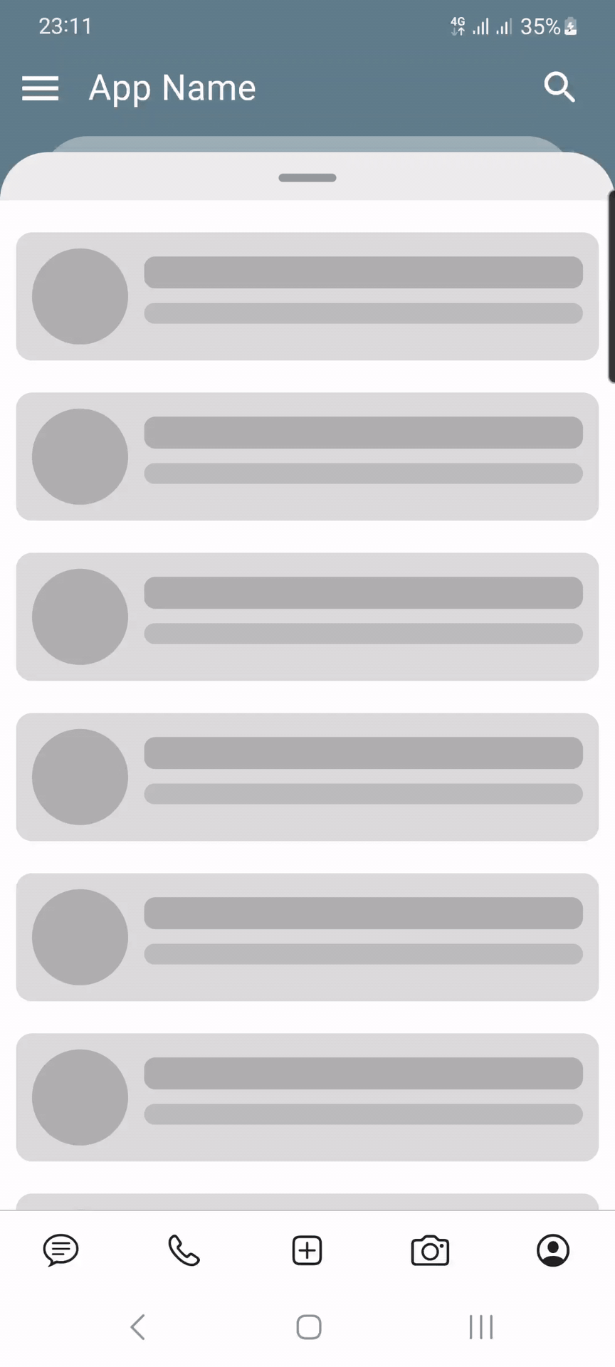
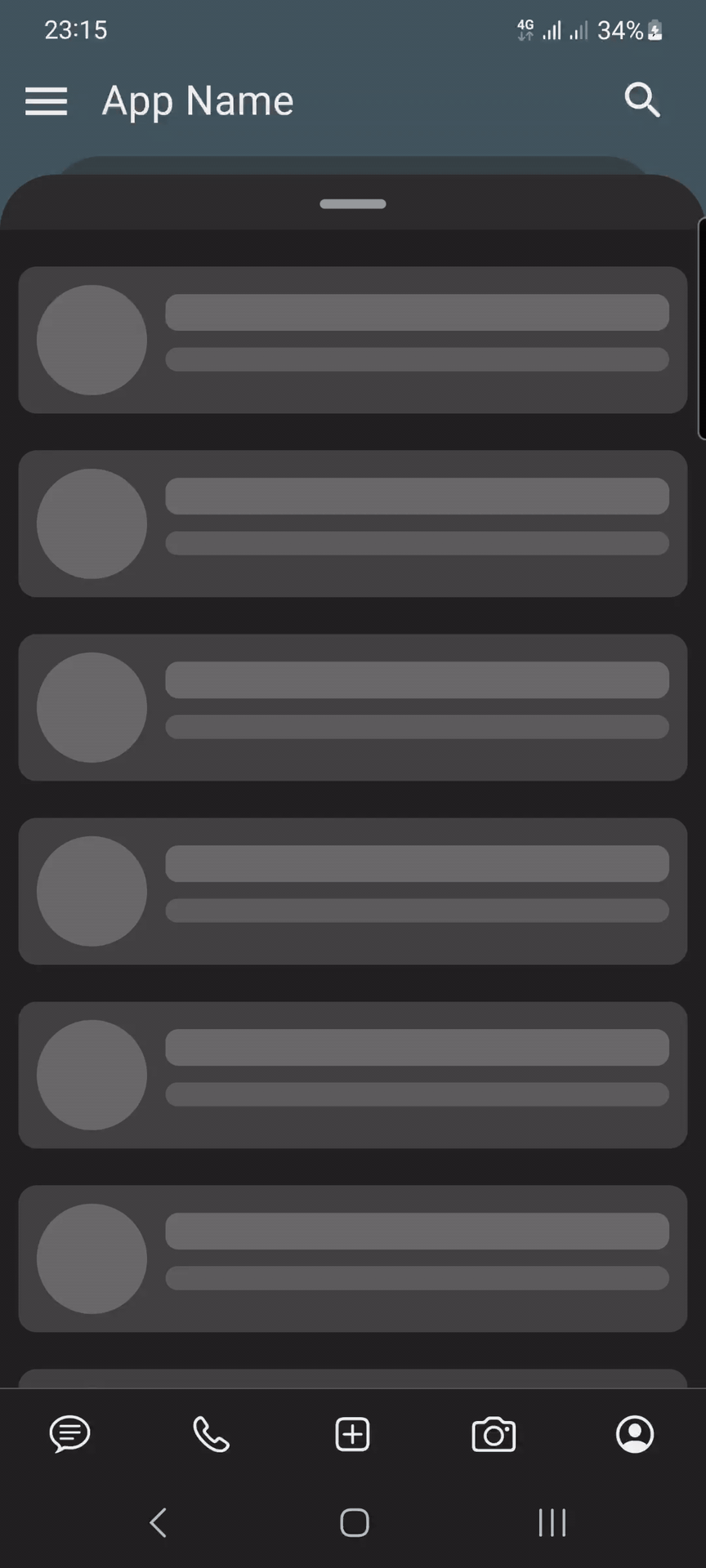
## Demo

### Simple
| Light | Dark |
|------------------------------------------------------------------------------------------------------------------------------------------------------------------------------------------|----------------------------------------------------------------------------------------------------------------------------------------------------------------------------------------|
|  |
|  |
|
Source Link:
example/lib/main.dart
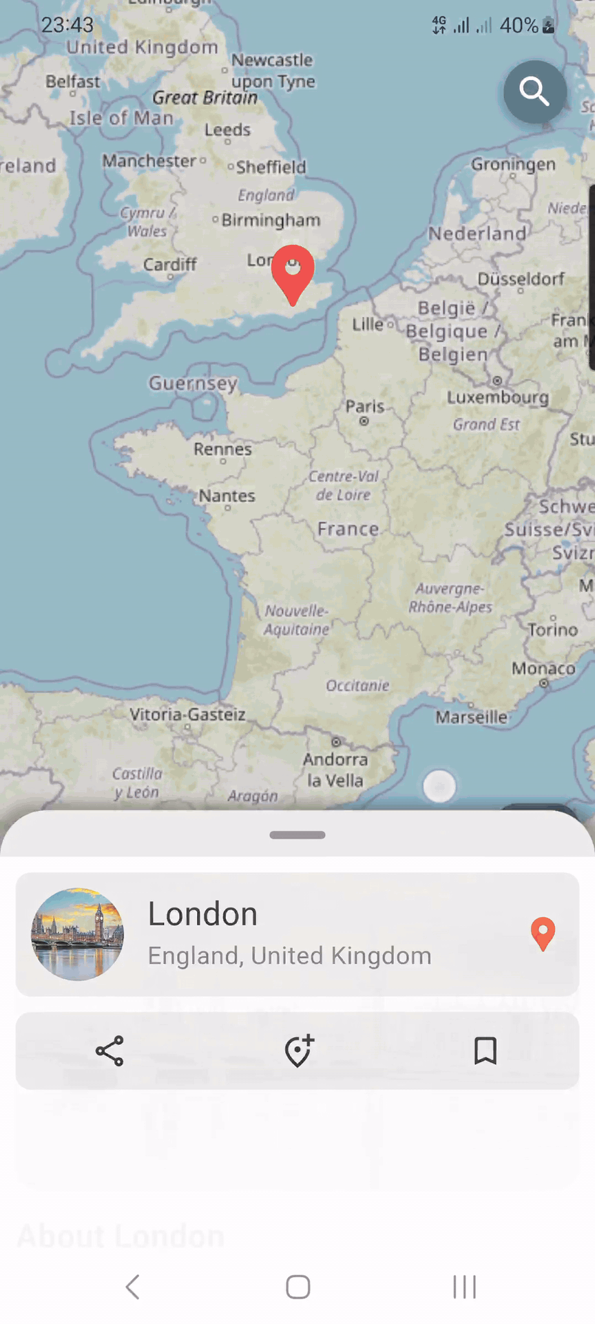
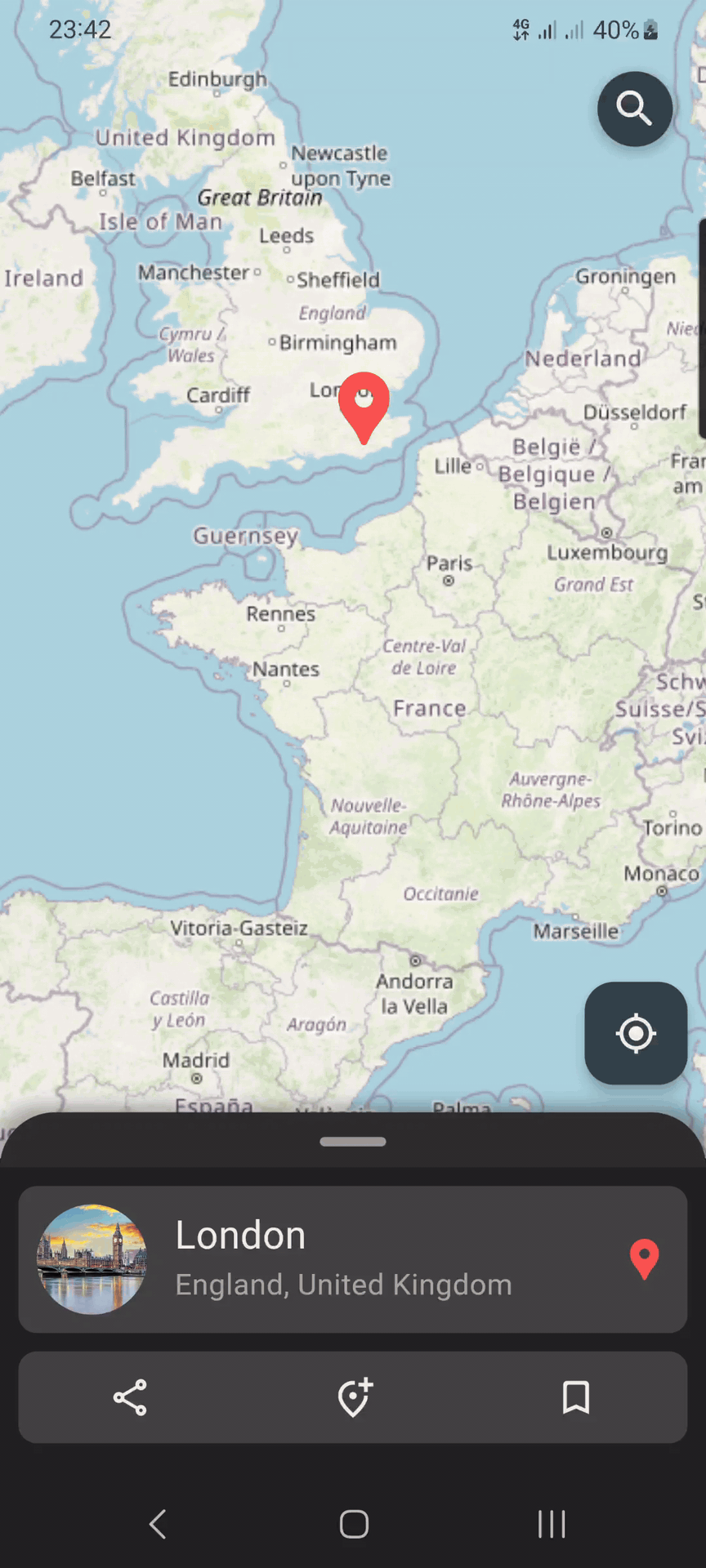
### Map
| Light | Dark |
|--------------------------------------------------------------------------------------------------------------------------------------------------------------------------------------|------------------------------------------------------------------------------------------------------------------------------------------------------------------------------------|
|  |
|  |
|
Source Link:
example/lib/map_screen.dart
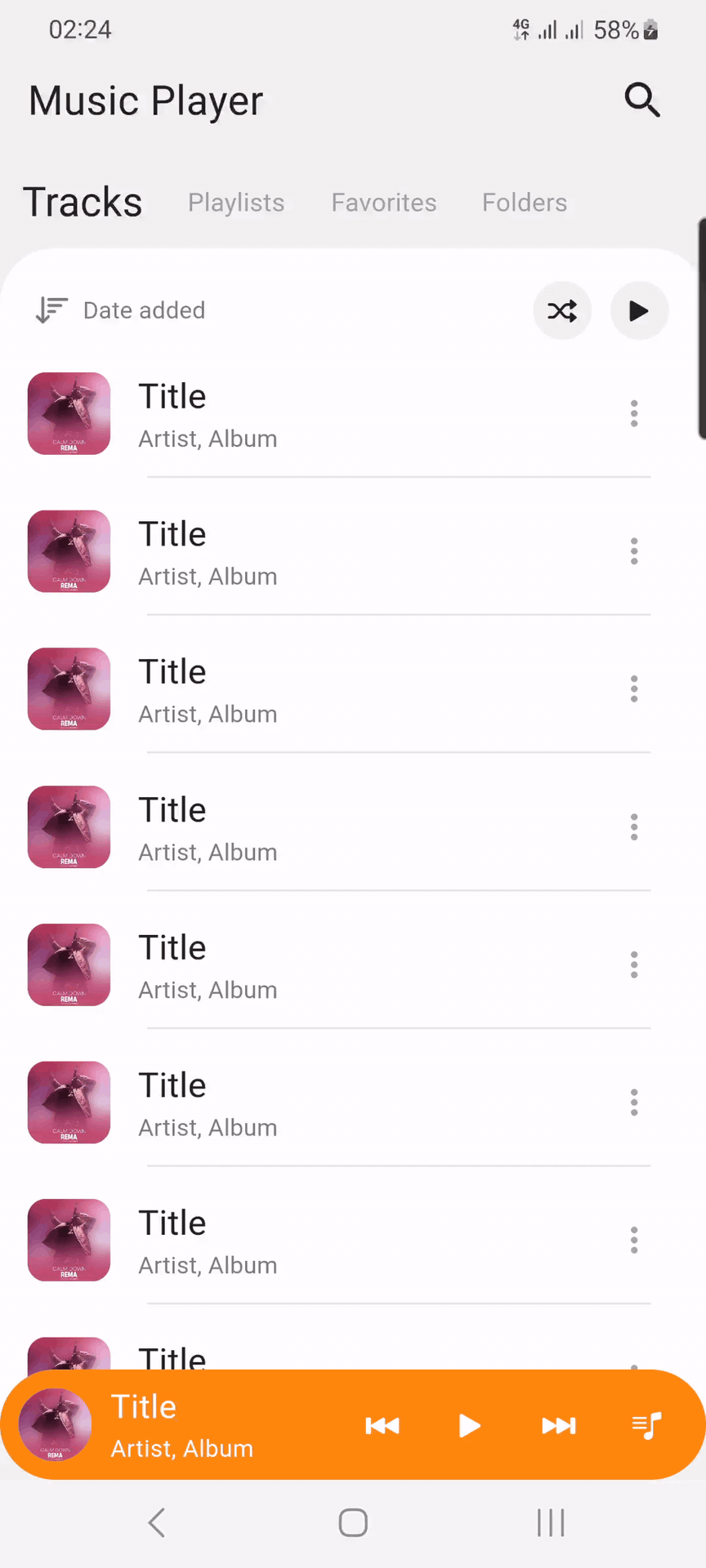
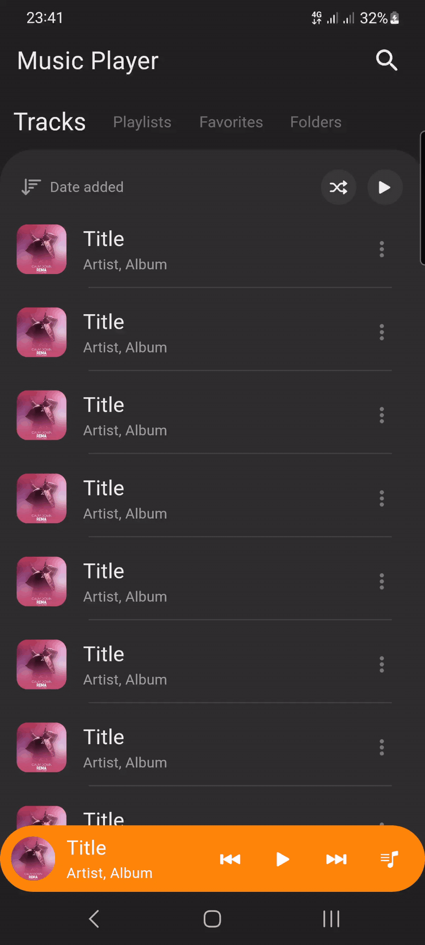
### Music player
| Light | Dark |
|--------------------------------------------------------------------------------------------------------------------------------------------------------------------------------------------------------|------------------------------------------------------------------------------------------------------------------------------------------------------------------------------------------------------|
|  |
|  |
|
Source Link:
example/lib/music_player_screen.dart
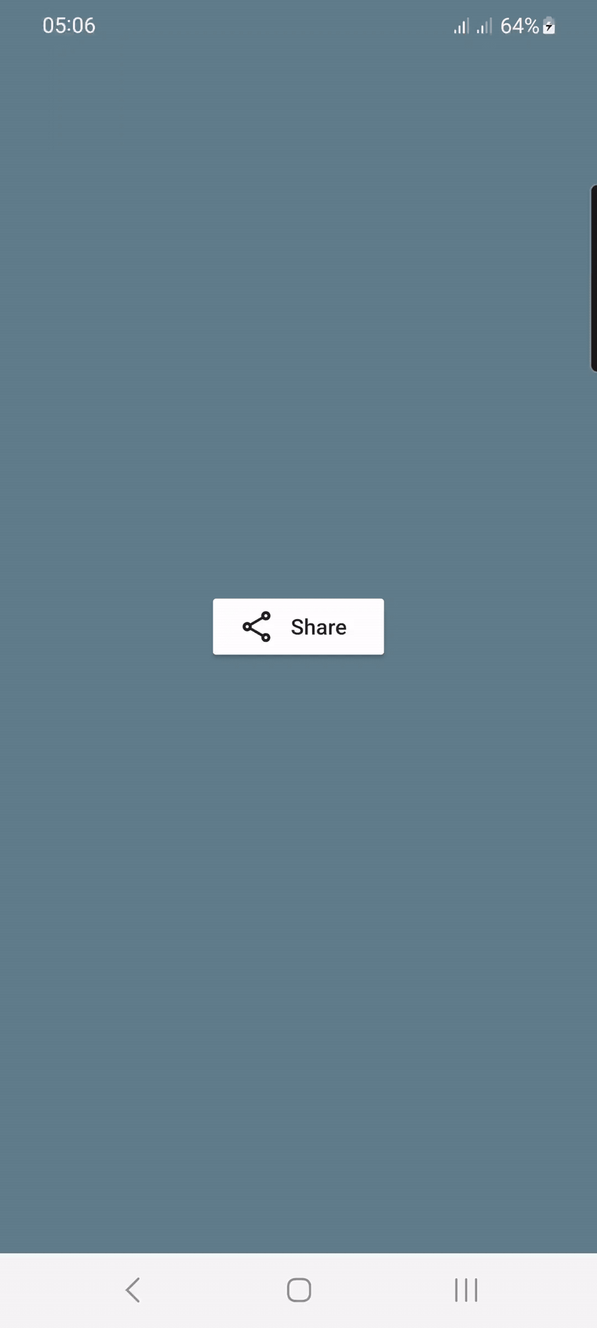
### Share
|  |
|
|:----------------------------------------------------------------------------------------------------------------------------------------------------------------------------------------:|
Source Link:
example/lib/share_screen.dart
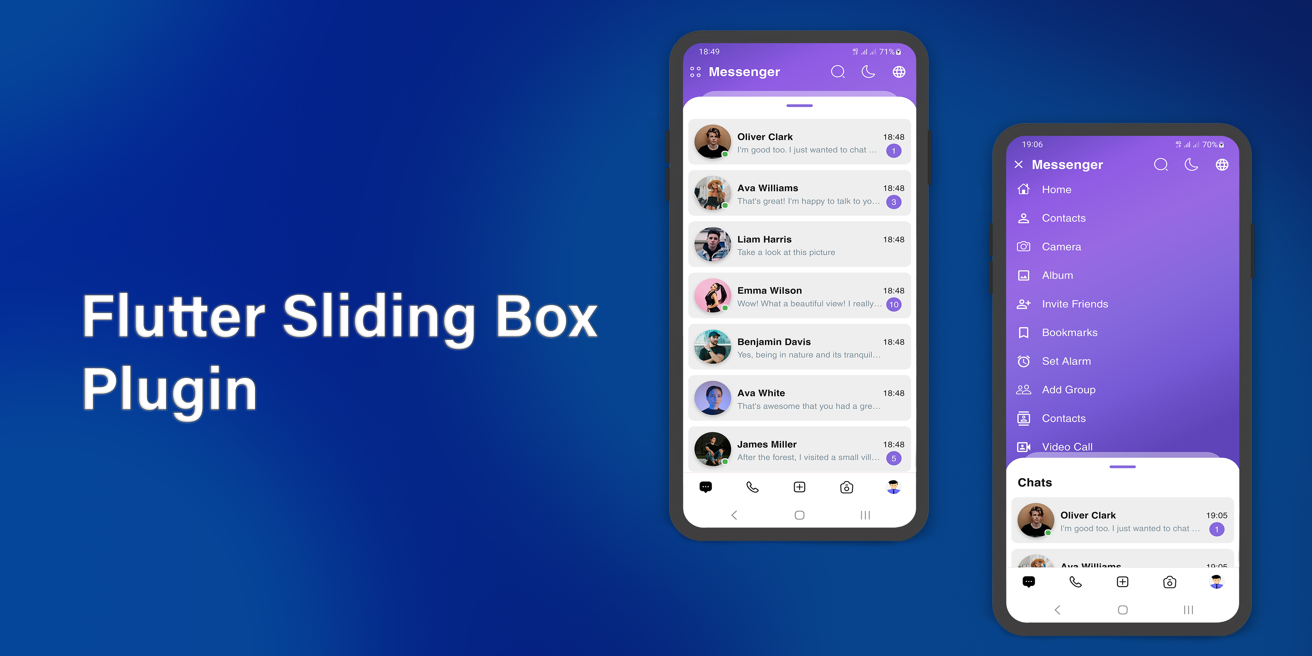
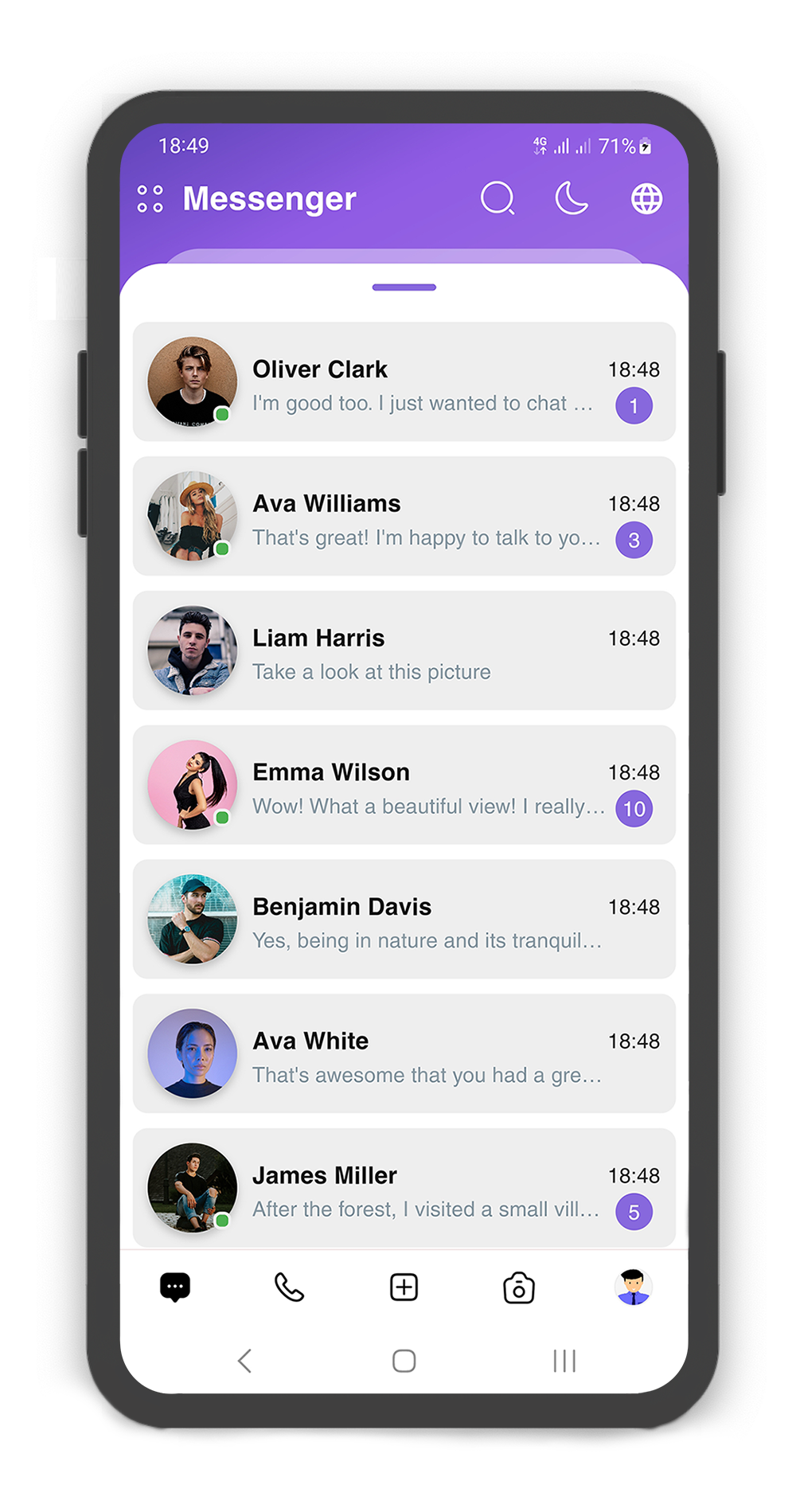
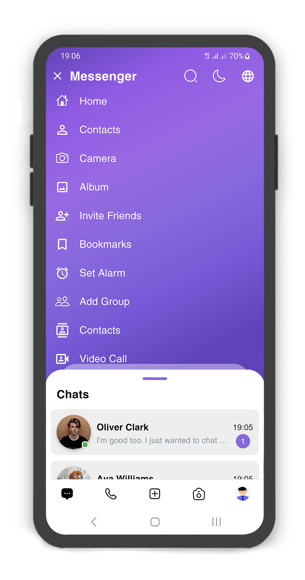
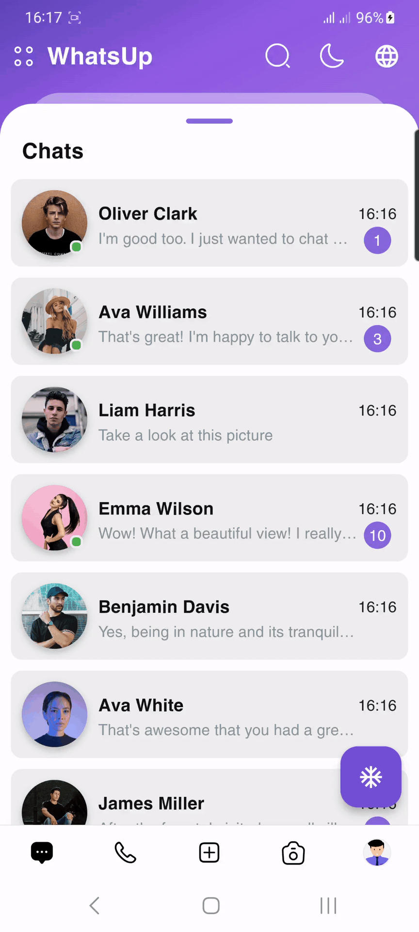
### Messenger
|  |
|
|:-------------------------------------------------------------------------------------------------------------------------------------------------------------------------------------------------------:|
Source Link:
Messenger application
# Getting Started
- [Installation](#installation)
- [Usage](#usage)
- [Custom Usage](#custom-usage)
- [Backdrop Usage](#backdrop-usage)
- [Backdrop AppBar Usage](#backdrop-appbar-usage)
- [SearchBox Usage](#searchbox-usage)
- [Box Controller](#box-controller)
- [Body Builder](#body-builder)
- [showSlidingBox Method](#showslidingbox-method)
## Installation
Add *flutter_sliding_box* as a dependency in your `pubspec.yaml` file:
```yaml
dependencies:
flutter_sliding_box: ^1.1.5
```
Import the plugin package to your dart code
```dart
import 'package:flutter_sliding_box/flutter_sliding_box.dart';
```
## Usage

By default use SlidingBox as root widget for body (recommended)
```dart
@override
Widget build(BuildContext context) {
return Scaffold(
body: SlidingBox(
body: const Center(
child: Text("This is the sliding box widget",
style: TextStyle(color: Colors.black),),
),
backdrop: Backdrop(
color: Colors.blueGrey,
),
),
);
}
```
### Custom Usage
There are several options that allow for more control:
| Properties | Data Type | Description |
|--------------------------|------------------------|------------------------------------------------------------------------------------------------------------------------------------------------------------------------------------------------------------|
| `body` | `Widget` | A widget that slides from `minHeight` to `maxHeight` and is placed on the `backdrop`. |
| `bodyBuilder` | `Widget` | Provides a `ScrollController` to attach to a scrollable widget in the box and current box position. If `body` and `bodyBuilder` are both non-null, `body` will be used. |
| `controller` | `BoxController` | It can be used to control the state of sliding box and search box. |
| `collapsed` | `bool` | If set to `true`, the state of the box is collapsed. |
| `collapsedBody` | `Widget` | The Widget displayed overtop the box when `collapsed`. This fades out as the sliding box is `opened`. |
| `width` | `double` | `width` of the sliding box. |
| `minHeight` | `double` | The height of the sliding box when fully `collapsed`. |
| `maxHeight` | `double` | The height of the sliding box when fully `opened`. |
| `color` | `Color` | `color` to fill the background of the sliding box. |
| `borderRadius` | `BorderRadius` | The corners of the sliding box are rounded by this. |
| `style` | `BoxStyle` | The styles of the sliding box that includes `shadow` and `sheet` and `none`. |
| `physics` | `ScrollPhysics` | Gets a `ScrollPhysic`, the `physics` determines how the scroll view continues to animate after the user stops dragging the scroll view. |
| `draggable` | `bool` | Allows toggling of draggability of the sliding box. If set to `false`, the sliding box cannot be dragged up or down. |
| `draggableIcon` | `IconData` | A Icon Widget that is placed in top of the box. Gets a IconData. |
| `draggableIconColor` | `Color` | The color of the `draggableIcon`. |
| `draggableIconVisible` | `bool` | If set to `false`, the `draggableIcon` hides. Use `controller` to open and close sliding box by taps. |
| `draggableIconBackColor` | `Color` | The color to fill the background of the `draggableIcon` icon. The position of the icon is top of the box. |
| `onBoxSlide` | `ValueChanged` | This callback is called when the sliding box slides around with position of the box. The position is a double value between `0.0` and `1.0`, where `0.0` is fully `collapsed` and `1.0` is fully `opened`. |
| `onBoxOpen` | `VoidCallback` | This callback is called when the sliding box is fully `opened`. |
| `onBoxClose` | `VoidCallback` | This callback is called when the sliding box is fully `closed`. |
| `onBoxShow` | `VoidCallback` | This callback is called when the sliding box is `visible`. |
| `onBoxHide` | `VoidCallback` | This callback is called when the sliding box is `invisible`. |
| `onSearchBoxShow` | `VoidCallback` | This callback is called when the search box is `visible`. |
| `onSearchBoxHide` | `VoidCallback` | This callback is called when the search box is `invisible`. |
| `animationCurve` | `Curve` | `animationCurve` defines the easier behavior of the box animation. |
| `animationDuration` | `Duration` | `animationDuration` defines the time for the box animation to complete. |
| `backdrop` | `Backdrop` | A Widget that is placed behind of the box, filled with the `Backdrop`. |
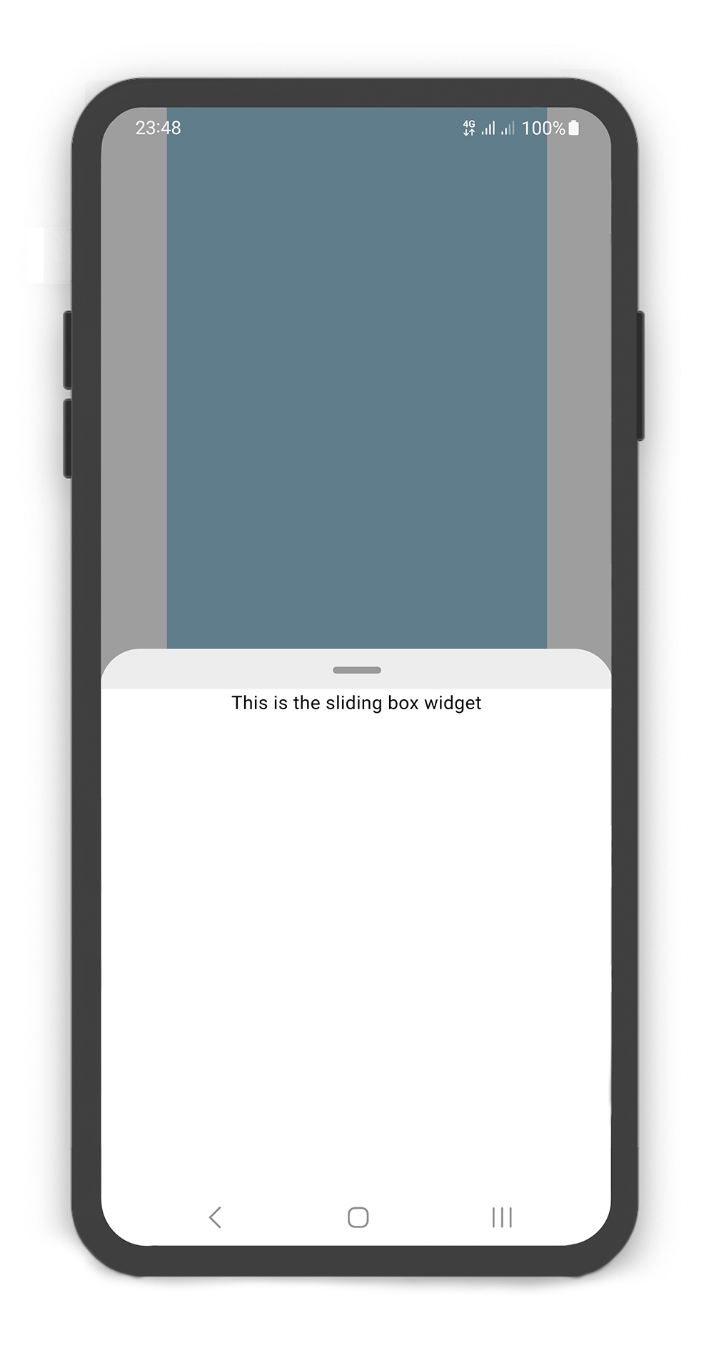
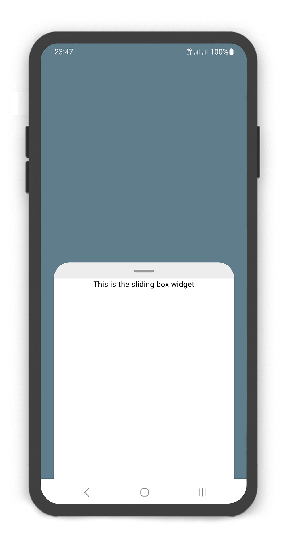
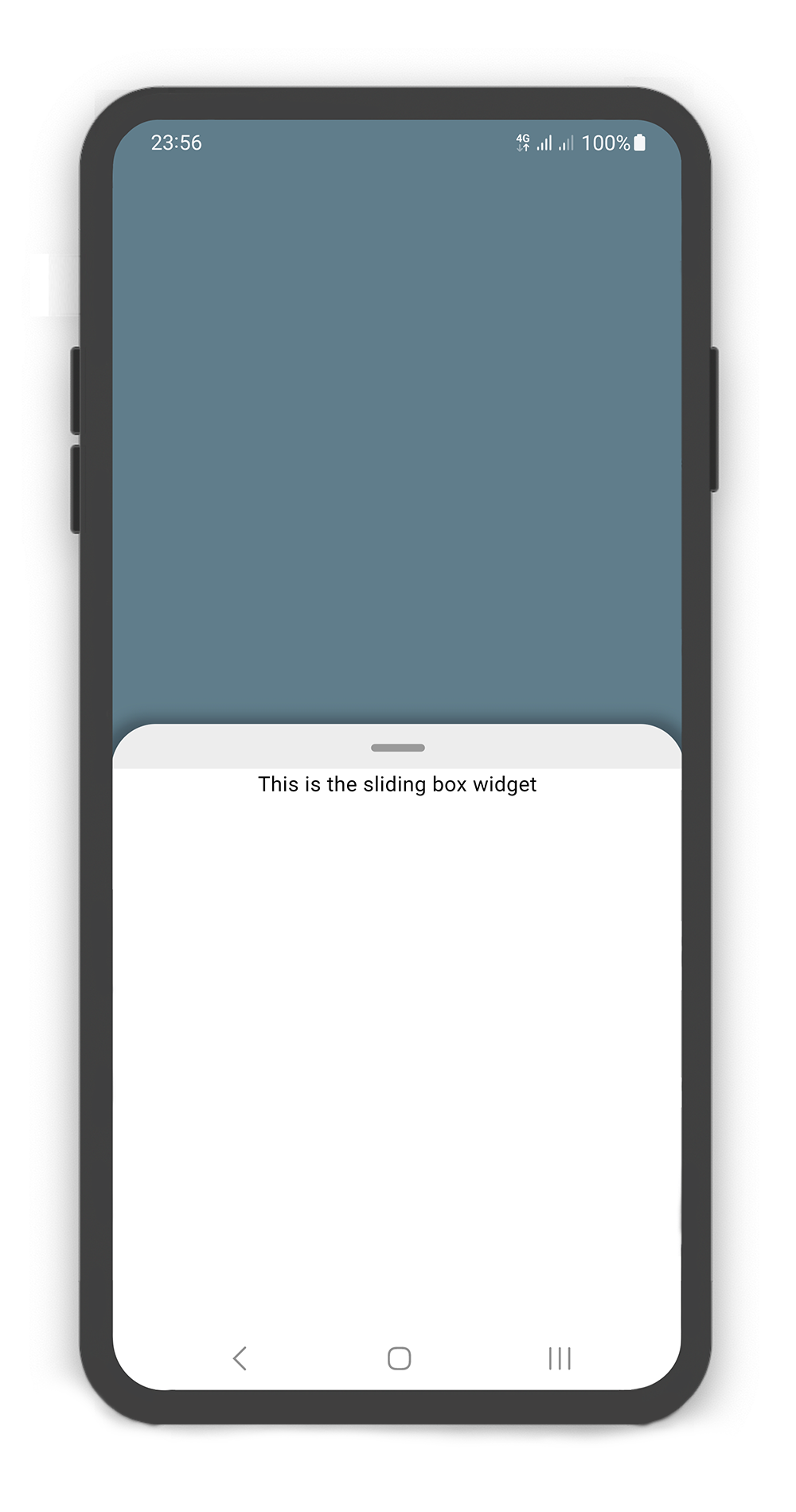
### Backdrop Usage
#### Using the `Backdrop`
Manually change the `Backdrop` properties.
| Properties | Data Type | Description |
|----------------------|------------------|-------------------------------------------------------------------------------------------------------------------------------------------|
| `color` | `Color` | `color` to fill the background of the `backdrop`. |
| `width` | `double` | `width` of the `backdrop body`. |
| `fading` | `bool` | If set to `true`, the backdrop body `fades out` when the sliding box `opened`. |
| `moving` | `bool` | If set to `true`, the backdrop body `moving up` when the sliding box `opened`. |
| `overlay` | `bool` | If set to `true`, a dark layer displayed above of the `backdrop` and behind of the sliding box when is `opened`. |
| `overlayOpacity` | `double` | Amount of dark overlay layer. a double value between `0.0` and `1.0`. |
| `backgroundGradient` | `Gradient` | The gradient color to fill the background of the `backdrop`. if `color` and `backgroundGradient` are both non-null, `color` will be used. |
| `body` | `Widget` | A Widget that is placed in the backdrop and behind of the sliding box. |
| `appBar` | `BackdropAppBar` | `appBar` to display at the top of the `backdrop`. |
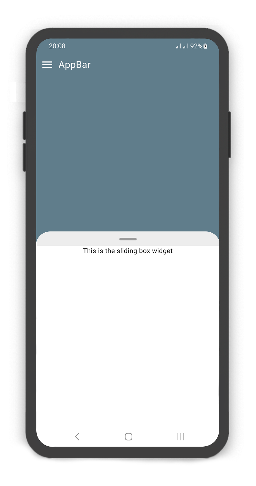
SlidingBox includes appBar: `BackdropAppBar`
```dart
BoxController boxController = BoxController();
@override
Widget build(BuildContext context) {
return Scaffold(
body: SlidingBox(
controller: boxController,
minHeight: 200,
maxHeight: 400,
body: Center(
child: Text("This is the sliding box widget",
style: TextStyle(color: Colors.black),),
),
backdrop: Backdrop(
color: Colors.blueGrey,
appBar: BackdropAppBar(
title: Padding(
padding: EdgeInsets.all(10),
child: Text("AppBar", style: TextStyle(fontSize: 20),)
),
leading: Icon(Icons.menu, color: Colors.white, size: 27,),
),
),
),
);
}
```
### Backdrop AppBar Usage
#### Using the `BackdropAppBar`
Manually change the `BackdropAppBar` properties.
| Properties | Data Type | Description |
|--------------|----------------|----------------------------------------------------------------------------------------------------------------------------------------------------------------------------------------------------------------------------|
| `title` | `Widget` | A Widget that is placed on the topLeft of the `backdrop`. |
| `leading` | `Icon` | A `Icon` Widget that is placed in left of the `title`. |
| `searchBox` | `SearchBox` | A search box to display above `backdrop`. add a IconButton widget to `actions` and call boxController.showSearchBox() in onPressed method. see example. |
| `actions` | `List` | A list of Widgets placed on the topRight of the `backdrop`. |
| 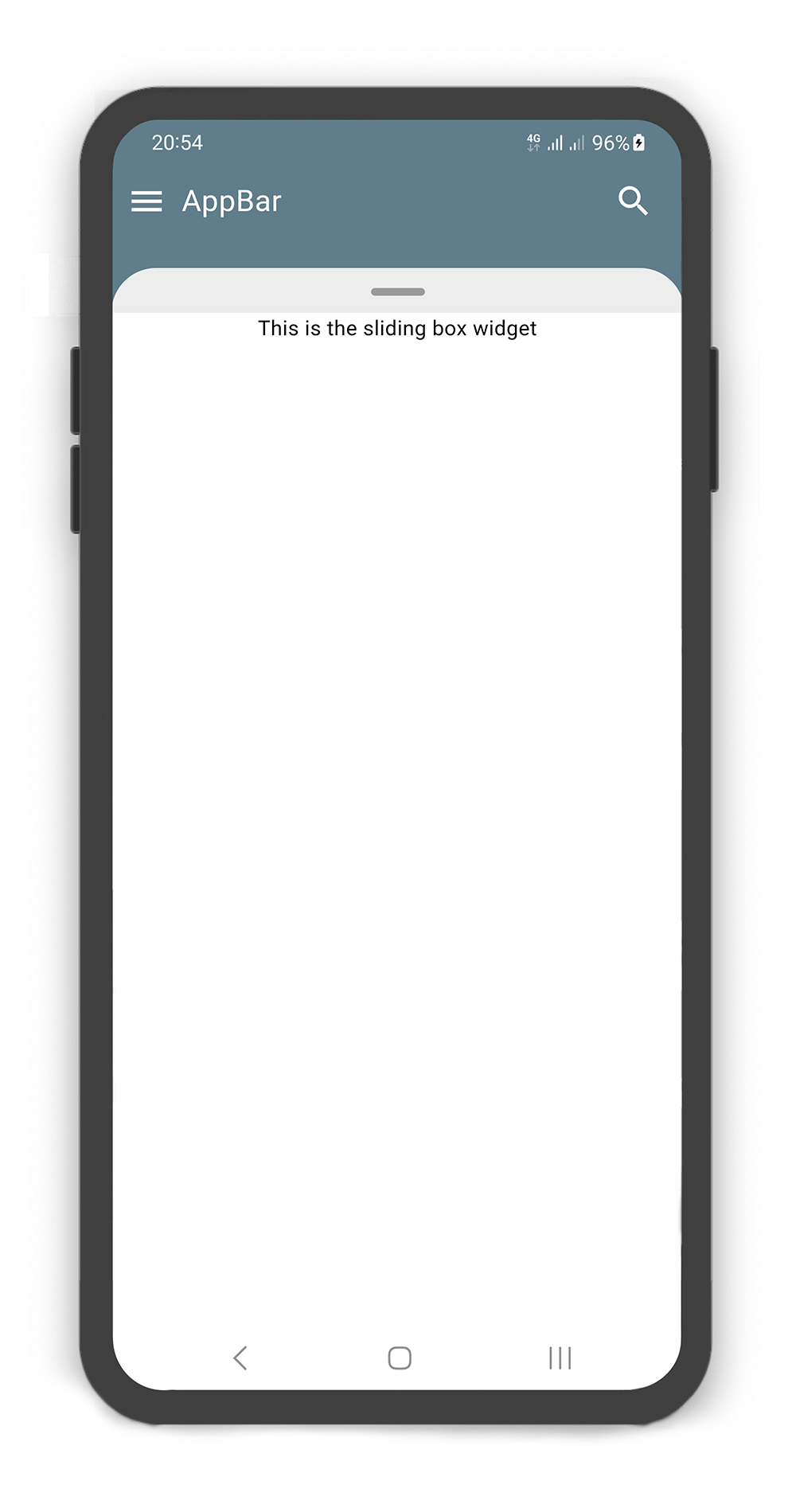 |
|  |
|
|:-----------------------------------------------------------------------------------------------------------------------------------------------------:|:-----------------------------------------------------------------------------------------------------------------------------------------------------:|
SlidingBox appBar includes searchBox: `SearchBox`
```dart
BoxController boxController = BoxController();
TextEditingController textEditingController = TextEditingController();
@override
Widget build(BuildContext context) {
return Scaffold(
body: SlidingBox(
controller: boxController,
minHeight: 200,
maxHeight: MediaQuery
.of(context)
.size
.height - 100,
body: Center(
child: Text("This is the sliding box widget",
style: TextStyle(color: Colors.black),),
),
backdrop: Backdrop(
color: Colors.blueGrey,
appBar: BackdropAppBar(
title: Padding(
padding: EdgeInsets.all(10),
child: Text("AppBar", style: TextStyle(fontSize: 20),)
),
leading: Icon(Icons.menu, color: Colors.white, size: 27,),
searchBox: SearchBox(
controller: textEditingController,
body: Center(
child: Text("This is the search box body widget",
style: TextStyle(color: Colors.black),
),
),
),
actions: [
Container(
margin: const EdgeInsets.fromLTRB(0, 0, 10, 0),
child: SizedBox.fromSize(
size: const Size.fromRadius(25),
child: IconButton(
iconSize: 25,
icon: Icon(Icons.search, color: Colors.white, size: 27,),
onPressed: () {
textEditingController.text = "";
boxController.showSearchBox();
},
),
),
),
]
),
),
),
);
}
```
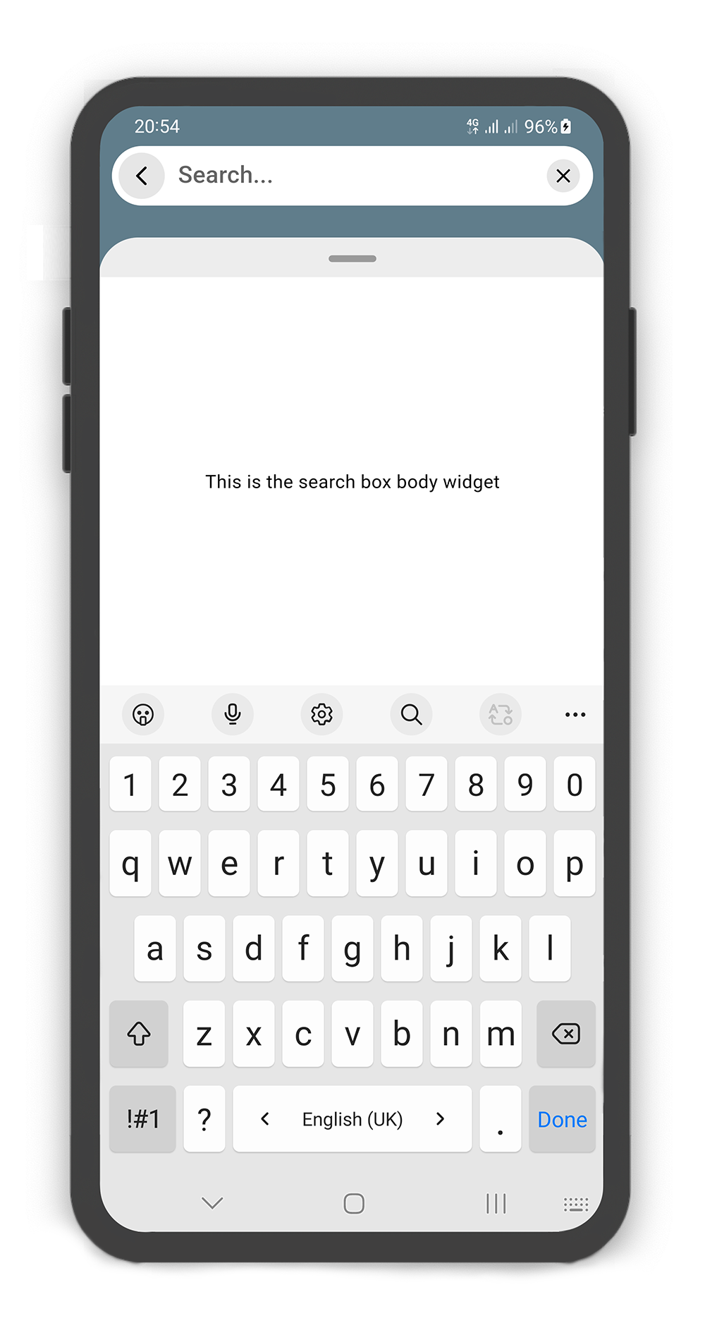
### SearchBox Usage
#### Using the `SearchBox`
Manually change the `SearchBox` properties.
| Properties | Data Type | Description |
|-------------------|-------------------------|--------------------------------------------------------------------------------------------------------------------------------------------------------------------------------------------------------------------|
| `controller` | `TextEditingController` | It can be used to control the state of search box text field. Gets a `TextEditingController`. |
| `leading` | `Icon` | A `Icon` Widget that is placed in left of the search box text field. |
| `color` | `Color` | `color` to fill the background of the `SearchBox`. |
| `inputDecoration` | `InputDecoration` | `decoration` to show around the search box text field. |
| `borderRadius` | `BorderRadius` | The corners of the search box are rounded by this. |
| `style` | `TextStyle` | `style` for text of the SearchBox. |
| `body` | `Widget` | A Widget that is placed in the sliding box (in search mode displays the search result). |
| `draggableBody` | `bool` | In search mode, allows toggling of draggability of the sliding box. If set to `false`, the sliding box cannot be dragged up or down when search box visible. If set to `true`, search box invisible when dragging. |
|  |
|  |
|
|:-------------------------------------------------------------------------------------------------------------------------------------------------------------------:|:-----------------------------------------------------------------------------------------------------------------------------------------------------------------:|
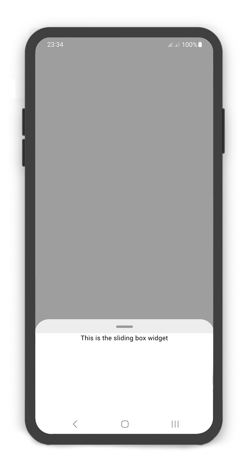
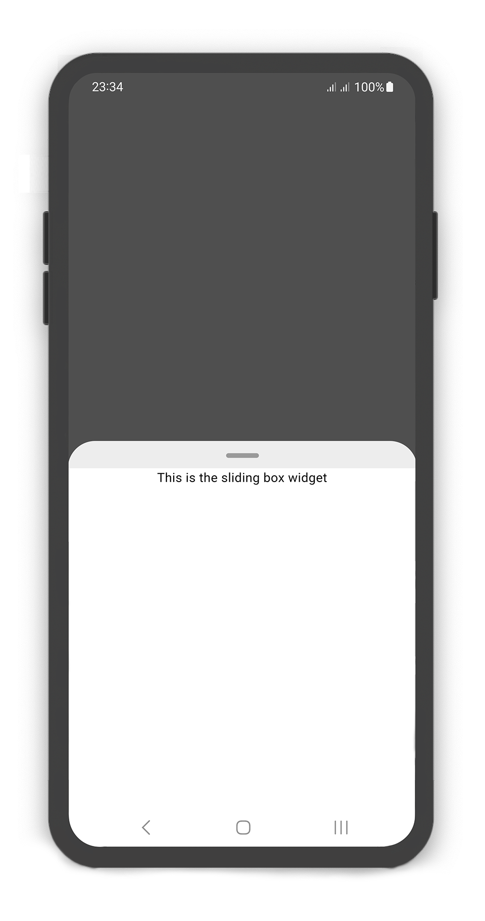
SlidingBox backdrop includes overlay: `true`
Customize `overlayOpacity` (a value between `0.0` and `1.0`), default value is `0.5`
```dart
@override
Widget build(BuildContext context) {
return Scaffold(
body: SlidingBox(
body: const Center(
child: Text("This is the sliding box widget",
style: TextStyle(color: Colors.black),
),
),
backdrop: Backdrop(
overlay: true,
overlayOpacity: 0.5,
color: Colors.grey,
),
),
);
}
```
|  |
|  |
|
|:-----------------------------------------------------------------------------------------------------------------------------------------------------:|:-----------------------------------------------------------------------------------------------------------------------------------------------------------:|
SlidingBox `width` and Backdrop `width`
```dart
@override
Widget build(BuildContext context) {
return Scaffold(
body: SlidingBox(
width: MediaQuery.of(context).size.width - 50,
minHeight: 200,
maxHeight: 400,
body: Center(
child: Text("This is the sliding box widget",
style: TextStyle(color: Colors.black),),
),
backdrop: Backdrop(
width: MediaQuery.of(context).size.width - 100,
color: Colors.blueGrey,
),
),
);
}
```
|  |
|  |
|
|:---------------------------------------------------------------------------------------------------------------------------------------------------------------------:|:-------------------------------------------------------------------------------------------------------------------------------------------------------------------:|
SlidingBox includes style: `sheet`, `shadow`, `none`
```dart
@override
Widget build(BuildContext context) {
return Scaffold(
body: SlidingBox(
minHeight: 200,
maxHeight: 400,
style: BoxStyle.sheet, /// or BoxStyle.shadow (default is 'none')
body: Center(
child: Text("This is the sliding box widget",
style: TextStyle(color: Colors.black),),
),
backdrop: Backdrop(
color: Colors.blueGrey,
),
),
);
}
```
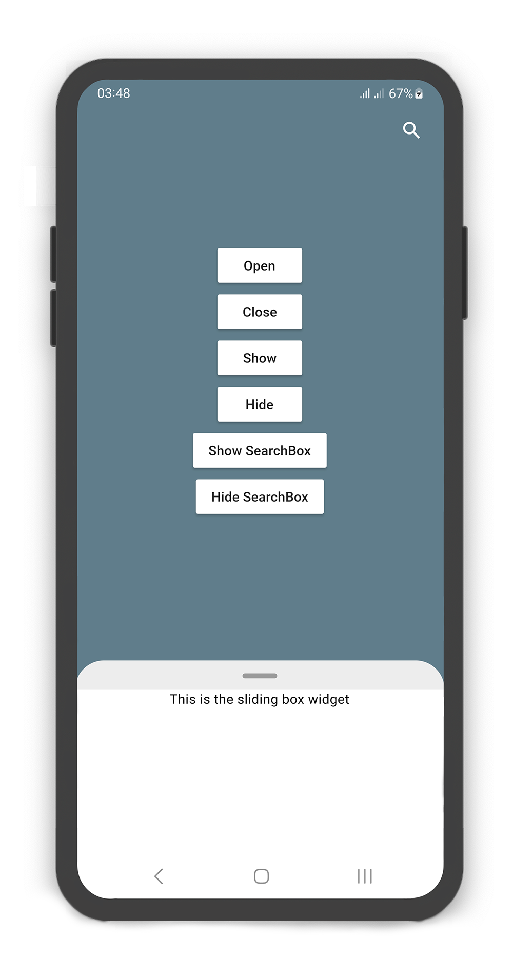
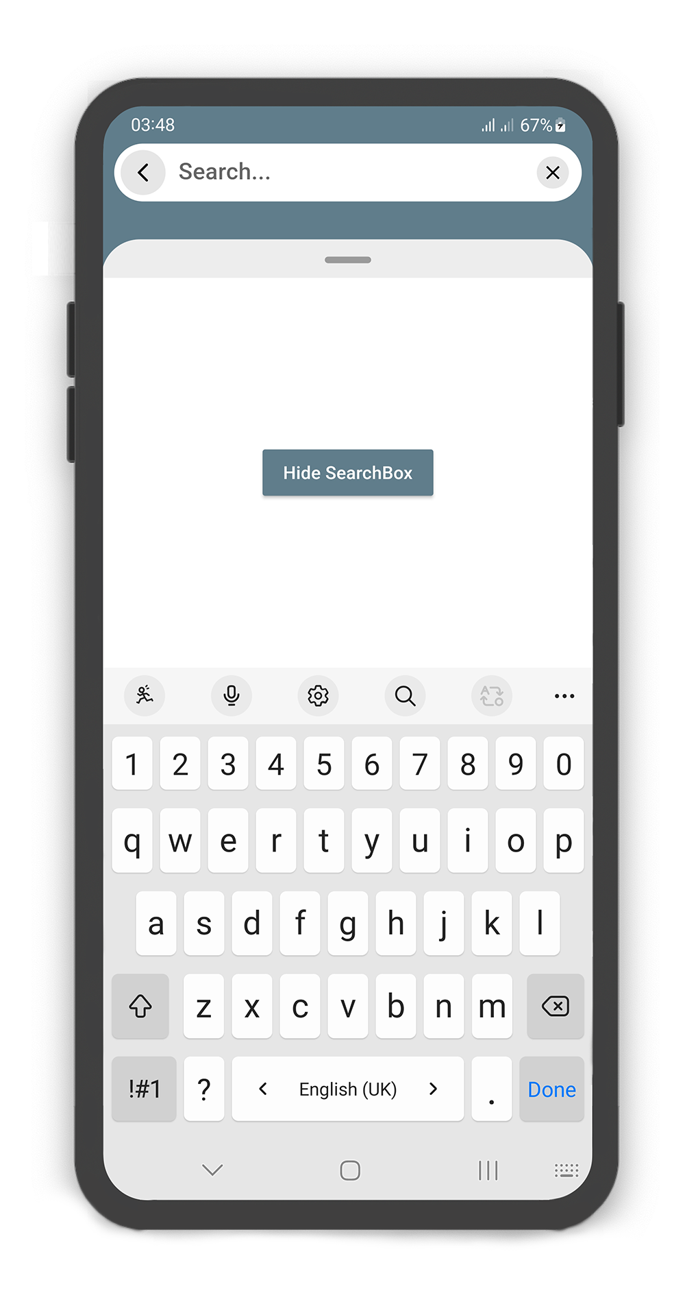
### Box Controller
#### Using the `BoxController`
Manually change the `SearchBox` state. For better performance, use a `BoxController` as controller (recommended).
| Properties | Data Type | Description |
|----------------------|-----------|------------------------------------------------------------------------------------------------------------------------------------------------------------------------|
| `isAttached` | `bool` | Determine if the `boxController` is attached to an instance of the `SlidingBox` (this property must be `true` before any other `BoxController` functions can be used). |
| `isBoxOpen` | `bool` | Returns whether or not the box is `open`. |
| `isBoxClosed` | `bool` | Returns whether or not the box is `close`. |
| `isBoxVisible` | `bool` | Returns whether or not the box is `visible`. |
| `isSearchBoxVisible` | `bool` | Returns whether or not the search box is `visible`. |
| `getPosition` | `bool` | Returns box position (a value between `0.0` and `1.0`). |
| `minHeight` | `double` | Returns box `minHeight`. |
| `maxHeight` | `double` | Returns box `maxHeight`. |
| `boxWidth` | `double` | Returns box `width`. |
| `backdropWidth` | `double` | Returns backdrop `width`. |
| Methods | Return Type | Description |
|-------------------|----------------|---------------------------------------------------------------------------------|
| `openBox()` | `Future` | Opens the sliding box with animation (i.e. to the `maxHeight`). |
| `closeBox()` | `Future` | Closes the sliding box with animation (i.e. to the `minHeight`). |
| `showBox()` | `Future` | Shows the sliding box (i.e. is visible). |
| `hideBox()` | `Future` | Hides the sliding box (i.e. is invisible). |
| `showSearchBox()` | `Future` | Shows the search box (i.e. is visible). |
| `hideSearchBox()` | `Future` | Hides the search box (i.e. is invisible). |
| `setPosition()` | `Future` | Sets the sliding box position with animation (a value between `0.0` and `1.0)`. |
| `setSearchBody()` | `Future` | Sets the search box `body` content. |
|  |
|  |
|
|:-----------------------------------------------------------------------------------------------------------------------------------------------------:|:-------------------------------------------------------------------------------------------------------------------------------------------------------------------:|
```dart
BoxController boxController = BoxController();
TextEditingController textEditingController = TextEditingController();
@override
Widget build(BuildContext context) {
return Scaffold(
body: SlidingBox(
controller: boxController,
minHeight: 200,
maxHeight: MediaQuery
.of(context)
.size
.height - 100,
body: const Center(
child: Text("This is the sliding box widget",
style: TextStyle(color: Colors.black),),
),
collapsed: true,
backdrop: Backdrop(
color: Colors.blueGrey,
appBar: BackdropAppBar(
searchBox: SearchBox(
controller: textEditingController,
body: Center(
child: MaterialButton(
child: Text("Hide SearchBox"),
onPressed: () {
boxController.hideSearchBox();
boxController.closeBox();
},
color: Colors.blueGrey,
textColor: Colors.white,
),
),
draggableBody: true,
),
actions: [
Container(
margin: const EdgeInsets.fromLTRB(0, 0, 10, 0),
child: SizedBox.fromSize(
size: const Size.fromRadius(25),
child: IconButton(
iconSize: 25,
icon: Icon(Icons.search, color: Colors.white, size: 27,),
onPressed: () {
textEditingController.text = "";
boxController.showSearchBox();
},
),
),
),
]
),
body: SingleChildScrollView(
child: SizedBox(
width: MediaQuery
.of(context)
.size
.width,
height: MediaQuery
.of(context)
.size
.height,
child: Column(
mainAxisAlignment: MainAxisAlignment.center,
children: [
MaterialButton(
child: Text("Open"),
onPressed: () => boxController.openBox(),
color: Colors.white,
),
MaterialButton(
child: Text("Close"),
onPressed: () => boxController.closeBox(),
color: Colors.white,
),
MaterialButton(
child: Text("Show"),
onPressed: () => boxController.showBox(),
color: Colors.white,
),
MaterialButton(
child: Text("Hide"),
onPressed: () => boxController.hideBox(),
color: Colors.white,
),
MaterialButton(
child: Text("Show SearchBox"),
onPressed: () => boxController.showSearchBox(),
color: Colors.white,
),
MaterialButton(
child: Text("Hide SearchBox"),
onPressed: () => boxController.hideSearchBox(),
color: Colors.white,
),
],
),
),
),
),
),
);
}
```
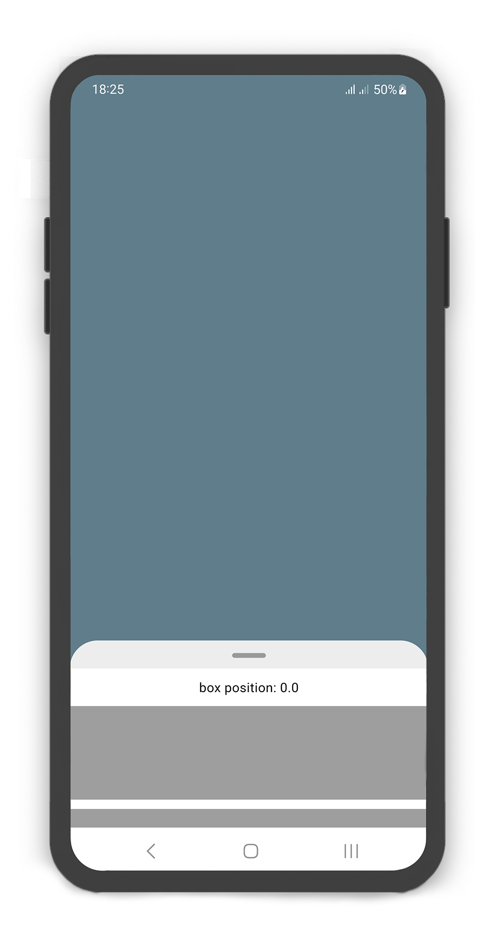
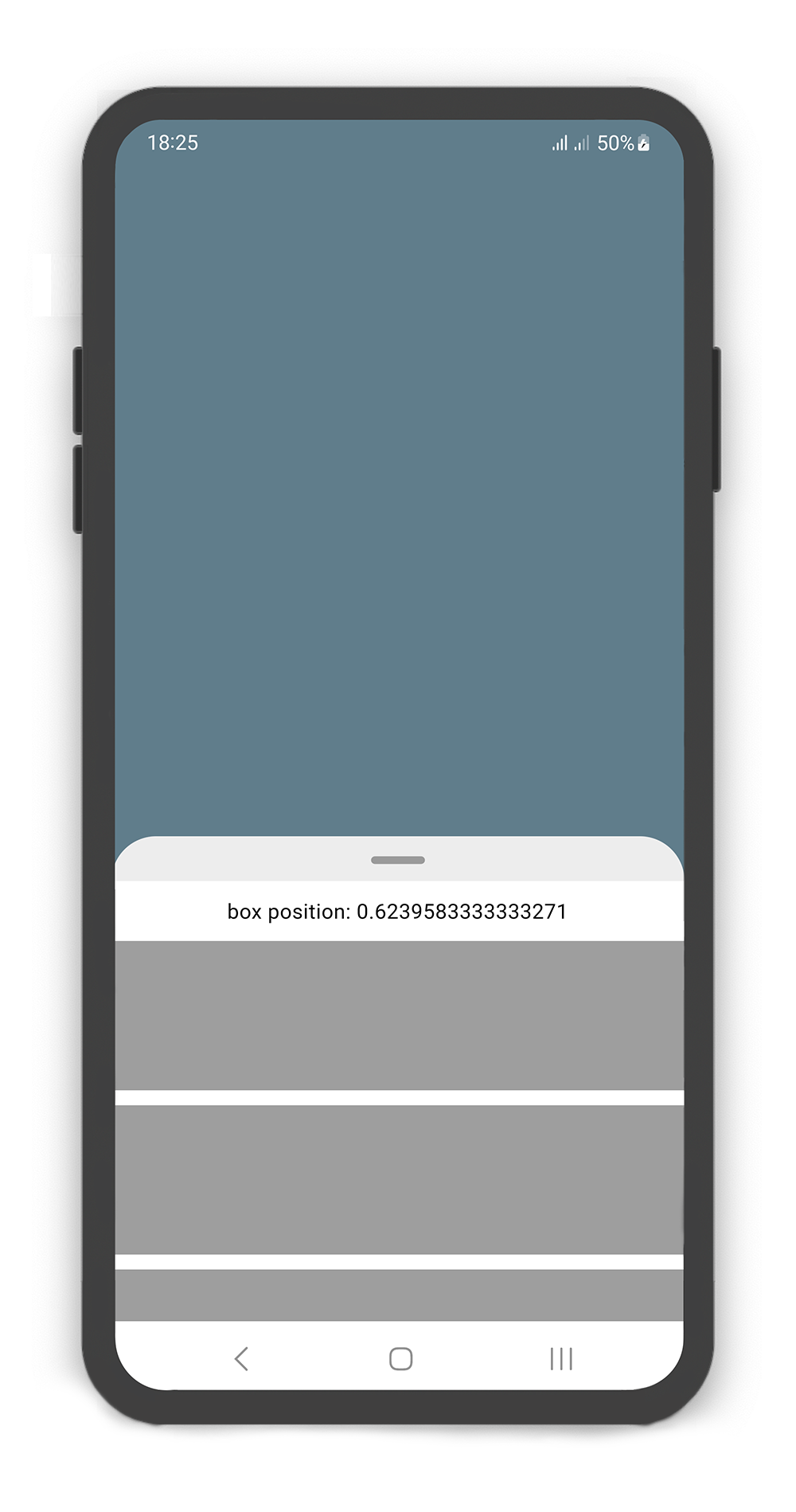
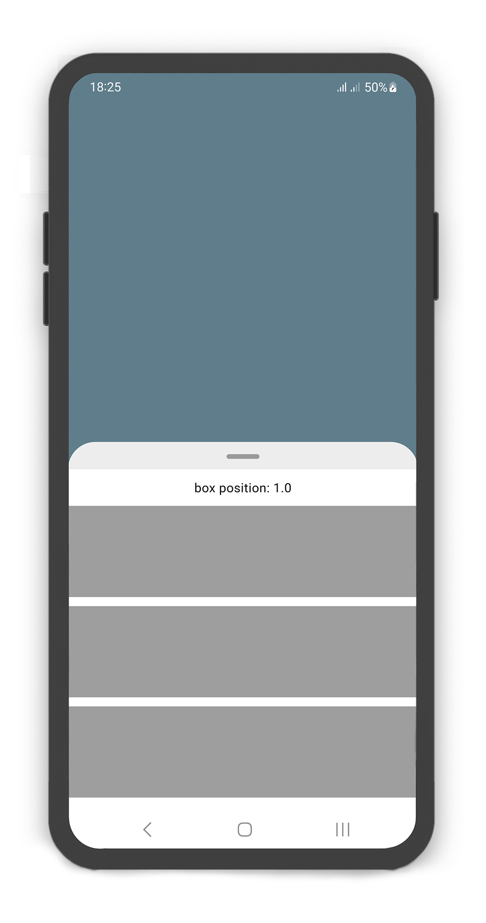
### Body Builder
#### Using the `bodyBuilder`
When content overflow in body widget, scroll enable automatically and can using the body builder to manage and control `scroll` and box `position`.
|  |
|  |
|  |
|
|:-------------------------------------------------------------------------------------------------------------------------------------------------------------------------------:|:---------------------------------------------------------------------------------------------------------------------------------------------------------------------------:|:-------------------------------------------------------------------------------------------------------------------------------------------------------------------------:|
```dart
@override
Widget build(BuildContext context) {
return Scaffold(
body: SlidingBox(
minHeight: 200,
maxHeight: 400,
bodyBuilder: (sc, pos) => _body(sc, pos),
backdrop: Backdrop(
color: Colors.blueGrey,
),
),
);
}
_body(ScrollController sc, double pos) {
sc.addListener(() {
print("scrollController position: ${sc.position.pixels}");
});
return Column(
children: [
SizedBox(height: 10,),
Center(
child: Text("box position: $pos",
style: TextStyle(color: Colors.black),),
),
SizedBox(height: 10,),
Container(color: Colors.grey, height: 100,),
SizedBox(height: 10,),
Container(color: Colors.grey, height: 100,),
SizedBox(height: 10,),
Container(color: Colors.grey, height: 100,),
SizedBox(height: 10,),
Container(color: Colors.grey, height: 100,),
],
);
}
```
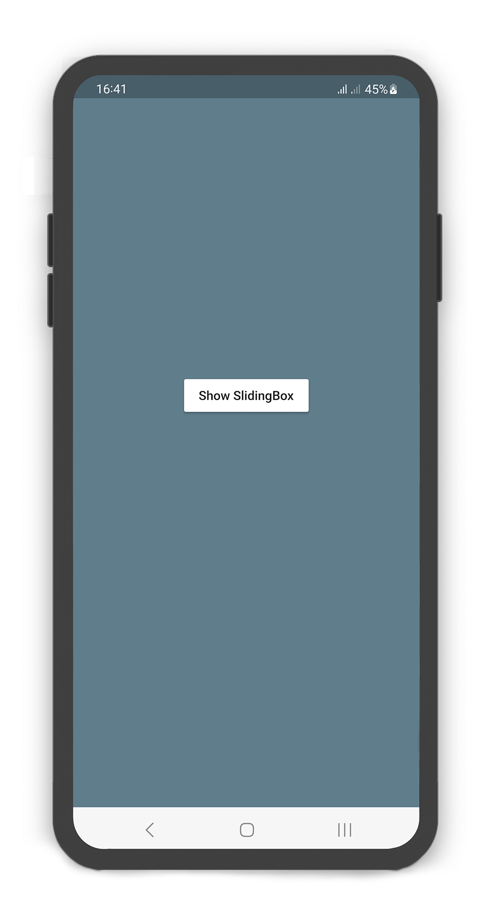
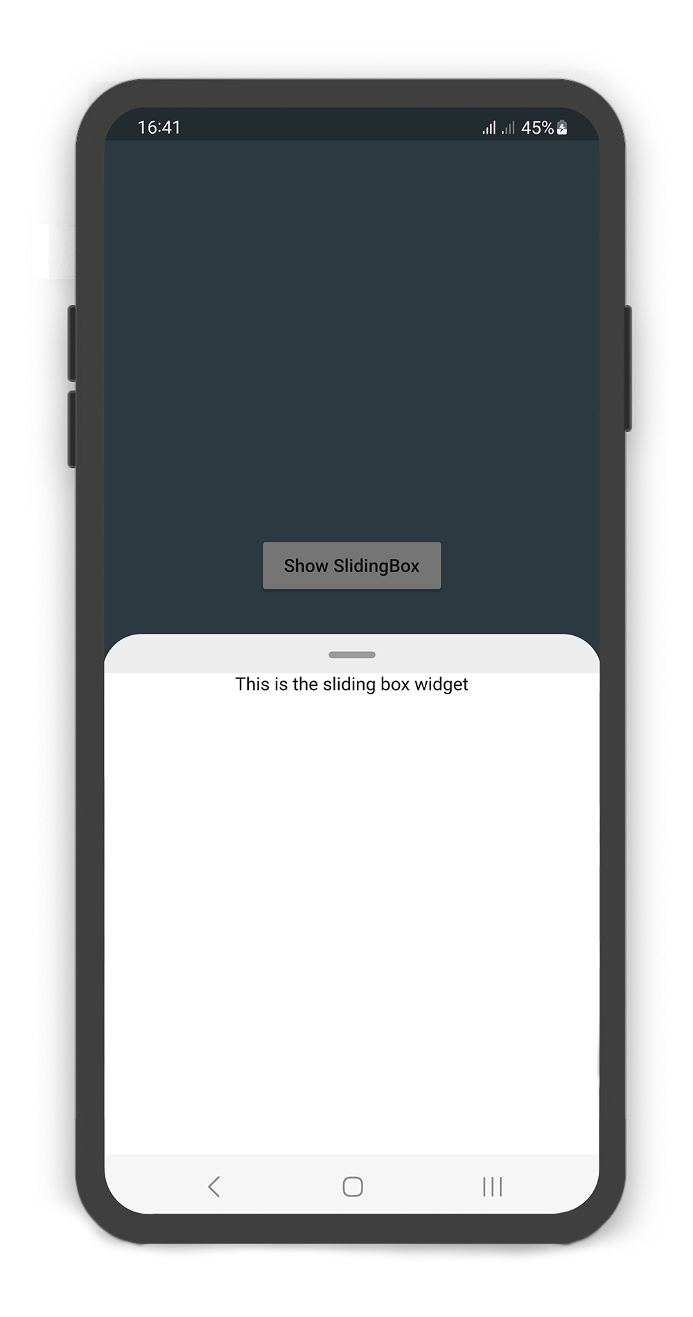
### showSlidingBox Method
#### Using the `showSlidingBox()` method
Display a SlidingBox easily and simply. Just call `showSlidingBox()` method.
|  |
|  |
|
|:---------------------------------------------------------------------------------------------------------------------------------------------------------------:|:-------------------------------------------------------------------------------------------------------------------------------------------------------------:|
```dart
@override
Widget build(BuildContext context) {
return Scaffold(
backgroundColor: Colors.blueGrey,
body: Center(
child: MaterialButton(
color: Colors.white,
onPressed: () {
/// Shows SlidingBox
showSlidingBox(
context: context,
box: SlidingBox(
body: const Center(
child: Text("This is the sliding box widget",
style: TextStyle(color: Colors.black),),
),
)
);
},
child: const Text("Show SlidingBox"),
),
),
);
}
```