https://github.com/shruagarwal/streamlit-custom-toggle
Insert heart-shaped Toggle Switch within Streamlit apps! 🧡
https://github.com/shruagarwal/streamlit-custom-toggle
accessible python react streamlit streamlit-component toggle-switch typescript
Last synced: 8 months ago
JSON representation
Insert heart-shaped Toggle Switch within Streamlit apps! 🧡
- Host: GitHub
- URL: https://github.com/shruagarwal/streamlit-custom-toggle
- Owner: ShruAgarwal
- License: mit
- Created: 2022-10-25T13:04:43.000Z (over 3 years ago)
- Default Branch: main
- Last Pushed: 2023-02-27T11:56:25.000Z (over 3 years ago)
- Last Synced: 2024-10-11T04:41:58.242Z (over 1 year ago)
- Topics: accessible, python, react, streamlit, streamlit-component, toggle-switch, typescript
- Language: Python
- Homepage:
- Size: 1.43 MB
- Stars: 12
- Watchers: 2
- Forks: 1
- Open Issues: 0
-
Metadata Files:
- Readme: README.md
- License: LICENSE
Awesome Lists containing this project
README


⚡ A custom component that can load heart-shaped Toggle Switch inside your Streamlit apps. Also, you can **sync this toggle with different Streamlit widgets!**
## Demo 🕹
[](https://shru-examples.streamlit.app/Heart_Toggle_Switch)

## Installation ⬇
First `pip install streamlit`. Don't know how? 👉 [Check here!](https://30days.streamlit.app/?challenge=Day+1)
After that, install this component:
```
pip install streamlit-custom-toggle
```
## How to Use? 🤓
*Here's an example code 👇*
```python
import streamlit as st
from streamlit_custom_toggle import st_custom_toggle
st.subheader('Music Choices 🎵')
col1, col2, col3 = st.columns(3, gap="small")
with col1:
# Disabled toggle switch
calm = st_custom_toggle('Calm', active_track_fill="#EAE4E4", active_thumb_color="#EAE4E4", value="true", key="toggle1")
with col2:
fun = st_custom_toggle('Fun', active_track_fill="#57FD6E", active_thumb_color="#EAE4E4", key="toggle2")
with col3:
music_toggle = st_custom_toggle('Rock', active_track_fill="#FF5733", active_thumb_color="#900C3F", key="toggle3")
music = st.radio(
"Select your favorite artist",
('The Beatles', 'AC/DC', 'Pink Floyd', 'Elvis Presley', 'MÃ¥neskin'), disabled=music_toggle)
st.markdown(f"You choose {music}")
# Checking the toggle state
st.code(f"Calm = {calm}, Fun = {fun}, Rock = {music_toggle}")
```
## Arguments Config ⚙
It supports the following arguments customization:
| Args | Type | Required | Description |
| ----------------------------- | ------ | -------- | -------------------------------------------------------------------------------------------------------- |
| label | string | YES | Define the toggle with a short label value
| active_track_fill | string | YES | Changes the color of the track when the toggle is in the active/on state. Default value is: `#ff708f`
| active_thumb_color | string | YES | Changes the color of the thumb when the toggle is in the active/on state. Default value is: `#ffffff`
| value | bool | OPTIONAL | If it's value is set to `true`, then the toggle switch is deactivated. **The toggle is activated by default**
| key | string | YES | An optional key value that uniquely identifies this component.
## Tech Stack 🧰


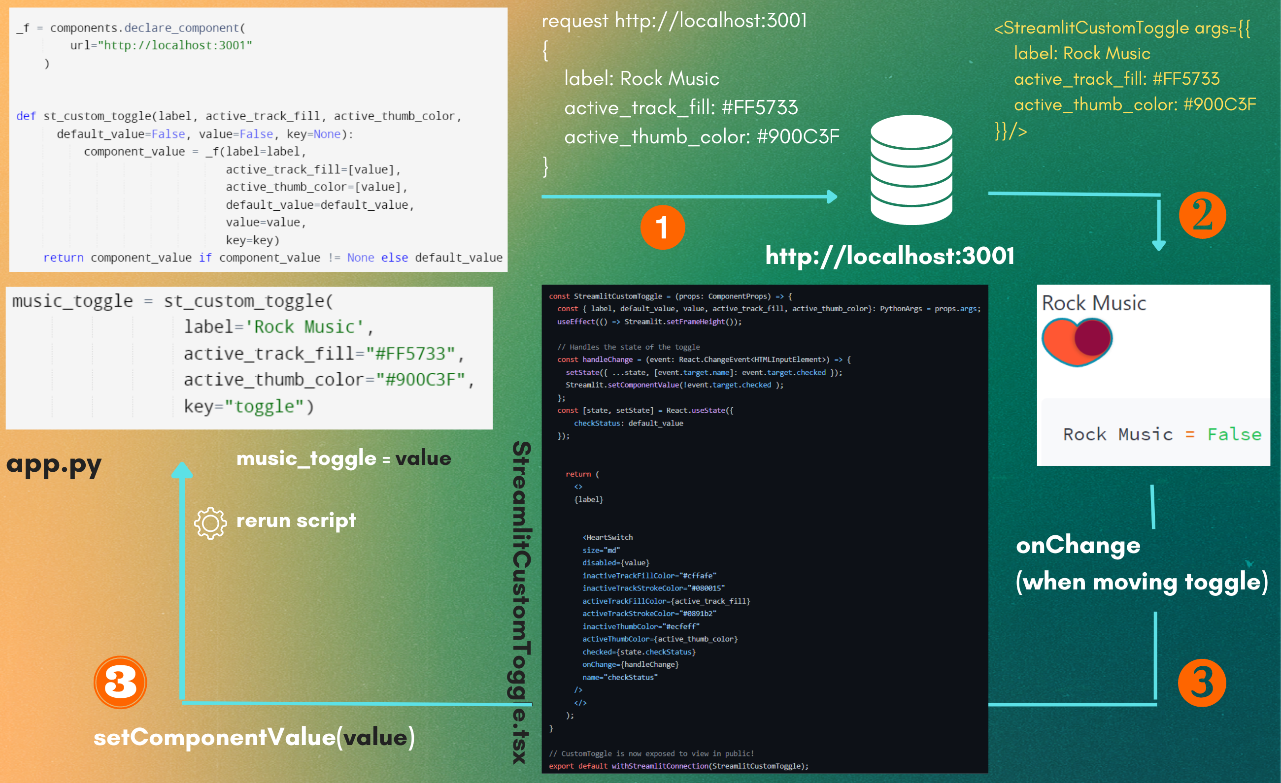
## Workflow 👀
Here's the blueprint on how my component works. For understanding it in details, 👉 **[Read here please!](https://shru.hashnode.dev/dont-let-those-bugs-slow-you-down#heading-final-code-blueprint)**
## License 📝
This software is open source, licensed under the [MIT License.](https://github.com/ShruAgarwal/streamlit-custom-toggle/blob/main/LICENSE)
## Helpful References 🤩
- [React heart-switch](https://github.com/anatoliygatt/heart-switch)
- [Streamlit Components Tutorial by FANILO](https://streamlit-components-tutorial.netlify.app/)
- [Streamlit Component Publish Docs](https://docs.streamlit.io/library/components/publish)