https://github.com/sinasys/items_selector
📦 A Flutter package providing flexible item selection widgets with support for multiple layouts including list, grid, wrap, radio button, and checkbox list selectors, allowing you to choose the perfect selection style for your app's needs.
https://github.com/sinasys/items_selector
checkbox-selector custom-selection grid-selector item-selector list-selector multi-select radio-selector selector single-select
Last synced: 4 months ago
JSON representation
📦 A Flutter package providing flexible item selection widgets with support for multiple layouts including list, grid, wrap, radio button, and checkbox list selectors, allowing you to choose the perfect selection style for your app's needs.
- Host: GitHub
- URL: https://github.com/sinasys/items_selector
- Owner: SinaSys
- License: bsd-3-clause
- Created: 2025-03-22T10:00:23.000Z (about 1 year ago)
- Default Branch: master
- Last Pushed: 2025-05-07T18:06:44.000Z (about 1 year ago)
- Last Synced: 2025-10-22T22:49:20.918Z (8 months ago)
- Topics: checkbox-selector, custom-selection, grid-selector, item-selector, list-selector, multi-select, radio-selector, selector, single-select
- Language: Dart
- Homepage: https://pub.dev/packages/items_selector
- Size: 3.63 MB
- Stars: 3
- Watchers: 1
- Forks: 0
- Open Issues: 0
-
Metadata Files:
- Readme: README.md
- Changelog: CHANGELOG.md
- License: LICENSE
Awesome Lists containing this project
README
# Items Selector

# Introduction
This package provides a flexible and customizable solution for selecting items from a list. It supports both single and multi-selection modes, as well as the ability to define initial items (either fixed and non-selectable or selectable). The package offers versatile display options, including scrollable lists (horizontal or vertical), grid views, wrap-based layouts for dynamic multi-line arrangements, radio button lists with RadioSelector, and checkbox lists with CheckBoxSelector. Additionally, it is fully generic and supports all data types, making it adaptable to various use cases.
# Features
- Supports all primitive data types (e.g., int, String, etc.), enums, and custom classes.
- Built-in state management handled by the package.
- Provides both single-select and multi-select options.
- Fully customizable widgets for selected and unselected states.
- Displays scrollable lists horizontally or vertically.
- Supports grid view and wrap-based layouts for flexible item arrangement.
- Customizable RadioSelector and CheckBoxSelector widgets for item selection.
- Ability to define initial items (selectable or non-selectable).
- Animation support.
# How to use
In a terminal, located at the root of your package, run this command:
```dart
flutter pub add items_selector
```
# Options
## **SingleSelectOption**
`SingleSelectOption` is used within the **ListSelector**, **GridSelector**, and **WrapSelector** widgets and includes two boolean properties:
- **`allowUnselectedInitialItems`**
When the `initialItems` property is set, enabling this option allows those initial items to be **unselected**.
- **`allowUnselectedMainItems`**
Enabling this option prevents the **main items** from being selected.
| Row | Initial Items | Main Items | Allow Unselect Main Items | Allow Unselect Initial Items | Image |
|:---:|:------------:|:---------:|:-----------------------:|:--------------------------:|:-----------------:|
| 1 | Y | Y | Y | Y |  |
| 2 | Y | Y | Y | N |  |
| 3 | Y | Y | N | Y |  |
| 4 | Y | Y | N | N | 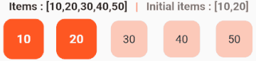 |
| 5 | N | Y | N | N | 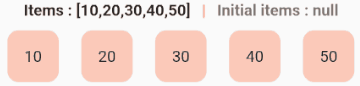 |
## **MultiSelectOption**
`MultiSelectOption` is used within the **ListSelector**, **GridSelector**, and **WrapSelector** widgets and includes two properties:
- **`allowUnselectedInitialItems`**
When the `initialItems` property is set, enabling this option allows those initial items to be **unselected**.
- **`maxItems`**
Defines the maximum number of items that can be selected.
| Row | Initial Items | Main Items | Allow Unselect Initial Items | Max Items | Image |
|:---:|:------------:|:--------:|:----------------------:|:---------:|:-----:|
| 1 | Y | Y | Y | Y |  |
| 2 | Y | Y | N | Y |  |
| 3 | N | Y | N | Y |  |
| 4 | Y | Y | Y | N |  |
| 5 | Y | Y | N | N |  |
| 6 | N | Y | N | N |  |
## 📌 Widgets Overview ( ListSelector | GridSelector | WrapSelector )
**ListSelector, GridSelector, and WrapSelector** provide a flexible solution for selecting items from a collection, supporting both single and multi-selection modes.
### 📋 Widget Variants
| Widget Name | Variants (Implemented in Library) |
|------------------|--------------------------------|
| **`ListSelector`** | `ListSelector()`, `ListSelector.builder()`, `ListSelector.separated()`, `ListSelector.wheel()` |
| **`GridSelector`** | `GridSelector.builder()`, `GridSelector.count()`, `GridSelector.extent()` |
| **`WrapSelector`** | `WrapSelector()` |
---
## 🖼️ Layout Differences
| Widget Type | Variants | Description |
|-------------|-------------|-------------|
| **📜 List-based Widgets** | `ListSelector()` | Uses `Row` or `Column` under the hood based on `direction`. |
| | `ListSelector.builder()` | Uses `ListView.builder` for dynamic item rendering. |
| | `ListSelector.separated()` | Uses `ListView.separated` with `separatorBuilder` for defining item separators. |
| | `ListSelector.wheel()` | Uses `ListWheelScrollView`. |
| **🔲 Grid-based Widgets** | `GridSelector.builder()` | Uses a builder function for grid items. |
| | `GridSelector.count()` | Uses a fixed number of columns. |
| | `GridSelector.extent()` | Uses a maximum cross-axis extent for items. |
| **🔀 Wrap-based Widget** | `WrapSelector()` | Provides automatic line breaks, single generative constructor (no named constructors). |
---
## 🔹 Common Properties (Available in All Widgets)
| Property | Description |
|------------------|-------------|
| **`items`** | Defines the available list of items. |
| **`builder`** | Creates custom widgets for selected and unselected states via `selectedItem` and `unSelectedItem`. |
| **`selectedItems`** | Returns the list of selected items when a selection is made. |
| **`initialItems`** *(optional)* | Allows specifying pre-selected items at initialization. |
| **`hasLongPress`** *(optional, default: `false`)* | Enables selection using a long press instead of a regular tap. |
| **`options`** *(optional, default: `SingleSelectOption`)* | Defines selection behavior using `SingleSelectOption` or `MultiSelectOption`. |
---
## 🔹 Layout-Specific Properties
| Property | Available In | Description |
|----------|-------------|-------------|
| **`wrapConfiguration`** | `WrapSelector` | Configures `Wrap` properties like `alignment`, `spacing`, `runSpacing`, etc. |
| **`listConfiguration`** | `ListSelector.builder`, `ListSelector.separated` | Provides access to `ListView` properties like scrolling behavior, physics, controllers, etc. |
| **`separatorBuilder`** | `ListSelector.separated` | A required function that defines separators between list items. |
| **`flexConfiguration`** | `ListSelector()` (Generative Constructor) | Used for configuring `Row` or `Column` properties (`MainAxisAlignment`, `CrossAxisAlignment`, etc.). |
| **`wheelConfiguration`** | `ListSelector.wheel` | Configures `ListWheelScrollView` properties like `itemExtent`, `squeeze`, `perspective`, etc. |
| **`direction`** | `ListSelector()`, `ListSelector.builder`, `ListSelector.separated` | Defines layout direction. |
| | `ListSelector()` *(Generative Constructor)* | Default: `Axis.horizontal`. |
| | `ListSelector.builder`, `ListSelector.separated` | Default: `Axis.vertical`. |
| **`BuilderConfiguration`** | `GridSelector.builder` | Similar to `GridView.builder`. |
| **`CountConfiguration`** | `GridSelector.count` | Similar to `GridView.count`. |
| **`ExtentConfiguration`** | `GridSelector.extent` | Similar to `GridView.extent`. |
---
## ⚙️ Selection Behavior
### SingleSelectOptions
| Option | Type | Description |
|-----------------------------|---------|------------------------------------------------------------------------|
| `allowUnselectInitialItems` | `bool?` | If `true`, allows initial items to be unselected. Defaults to `false`. |
| `allowUnselectMainItems` | `bool?` | If `true`, allows main items to be unselected. Defaults to `false`. |
### MultiSelectOptions
| Option | Type | Description |
|-----------------------------|---------|----------------------------------------------------------------------------|
| `allowUnselectInitialItems` | `bool?` | If `true`, allows initial items to be unselected. Defaults to `false`. |
| `maxItems` | `int?` | Limits the number of selectable items. If `null`, no limit is enforced. |
---
## 📌 Widgets Overview ( RadioSelector | CheckboxSelector )
### ☑️ CheckBoxSelector
**CheckBoxSelector** is a versatile Flutter widget that provides an easy-to-implement solution for multi-selection scenarios using checkboxes. Built on top of `CheckBoxListTile`, it offers a vertically arranged list of checkboxes with comprehensive customization options through both global settings (via `CheckBoxSelectorOption`) and individual item properties (via `CheckBoxSelectorItem`). The widget simplifies selection management by supporting initial selections, providing callback functions that return both selected items and their indices, and maintaining all the native functionality of `CheckBoxListTile` while adding convenient layout controls like spacing and alignment. Developers can quickly implement feature-rich checkbox lists where global styles can be defined while still allowing specific items to override these defaults as needed.
## Properties
| Property | Type | Description |
|------------------|-----------------------------------|-----------------------------------------------------------------------------|
| `items` | `List` | A list of `CheckBoxSelectorItem` objects representing the checkboxes. Each item extends `CheckboxListTile` and supports all its properties. |
| `selectedItems` | `void Function(List, List index)` | A callback invoked when checkbox selections change, providing the list of selected items and their indices. |
| `options` | `CheckBoxSelectorOption?` | Optional global configuration for all checkboxes, extending `CheckBoxSelectorItem` with additional layout properties like `spacing`, `mainAxisAlignment`, and `crossAxisAlignment`. |
| `initialItems` | `List?` | Optional list of indices for initially selected items. Each index must be valid within the `items` list. |
### 🔘 RadioSelector
**RadioSelector** is a customizable Flutter widget for selecting a single item from a vertical list of radio buttons. It wraps `RadioListTile` with a structured API and accepts a list of `RadioSelectorItems`, each inheriting all properties of `RadioListTile`. A shared configuration can be applied using the `options` property (`RadioSelectorOption`), which defines common styling and layout values like `activeColor`, `tileColor`, and `spacing`. Individual item properties override these shared settings. The widget also supports an optional `initialItem` to preselect a radio, and returns the selected item and its index via the `selectedItems` callback.
## Properties
| Property | Type | Description |
|------------------|-----------------------------------------|-----------------------------------------------------------------------------|
| `items` | `List` | A list of `RadioSelectorItem` objects representing the radio buttons. Each item extends `RadioListTile` and supports all its properties. |
| `selectedItems` | `void Function(RadioSelectorItem,int index)` | A callback invoked when a radio button is selected, providing the selected item and its index. |
| `options` | `RadioSelectorOption?` | Optional global configuration for all radio buttons, extending `RadioSelectorItem` with additional layout properties like `spacing`, `mainAxisAlignment`, and `crossAxisAlignment`. |
| `initialItem` | `int?` | Optional index of the initially selected item. Must be a valid index within the `items` list. |
### ListSelector
```dart
ListSelector(
items: yourListOfItems,
//// If set to Axis.horizontal, Row is used; if set to Axis.vertical, Column is used.
direction: Axis.horizontal,
// Can be SingleSelectOptions() or MultiSelectOptions() based on your requirement
options: MultiSelectOptions(),
// Default is SingleSelectOptions
flexConfiguration: FlexConfiguration(
// You can also pass other Row or Column properties like mainAxisAlignment, crossAxisAlignment, etc.
spacing: 10.0,
),
selectedItems: (List selectedItems, _) {
debugPrint(selectedItems.toString());
},
builder: (_, index) {
return ItemSelector(
selectedItem: yourDesiredWidget(),
unSelectedItem: yourDesiredWidget(),
);
},
)
```
```dart
ListSelector.builder(
items: yourListOfItems,
direction: Axis.horizontal, // Set to Axis.horizontal or Axis.vertical based on layout preference
options: SingleSelectOptions(), // Can be SingleSelectOptions() or MultiSelectOptions() based on your requirement
listConfiguration: ListConfiguration(
shrinkWrap: true,
// You can also pass other ListView properties like physics, controller, etc.
),
selectedItems: (List selectedItems, _) {
debugPrint(selectedItems.toString());
},
builder: (_, index) {
return ItemSelector(
selectedItem: yourDesiredWidget(),
unSelectedItem: yourDesiredWidget(),
);
},
)
```
```dart
// Use ListSelector.separated if you need separators between items
ListSelector.separated(
items: yourListOfItems,
direction: Axis.horizontal, // Set to Axis.horizontal or Axis.vertical based on layout preference
options: MultiSelectOptions(), // Can be SingleSelectOptions() or MultiSelectOptions() based on your requirement
listConfiguration: ListConfiguration(
shrinkWrap: true,
// You can also pass other ListView properties like physics, controller, etc.
),
selectedItems: (List selectedItems, _) {
debugPrint(selectedItems.toString());
},
separatorBuilder: (_, index) {
return yourDesiredWidget();
},
builder: (_, index) {
return ItemSelector(
selectedItem: yourDesiredWidget(),
unSelectedItem: yourDesiredWidget(),
);
},
)
```
```dart
ListSelector.wheel(
items: yourListOfItems,
wheelConfiguration: WheelConfiguration(
// You can also pass other ListWheelScrollView properties like squeeze, controller, etc.
itemExtent: 60,
diameterRatio: 3.0,
perspective: 0.01,
),
// Can be SingleSelectOptions() or MultiSelectOptions() based on your requirement
options: MultiSelectOptions(),
selectedItems: (List selectedItems, _) {
debugPrint(selectedItems.toString());
},
builder: (_, index) {
return ItemSelector(
selectedItem: yourDesiredWidget(),
unSelectedItem: yourDesiredWidget(),
);
},
)
```


### GridSelector
```dart
GridSelector.builder(
items: yourListOfItems,
// Can be SingleSelectOptions() or MultiSelectOptions() based on your requirement
// options: SingleSelectOptions(), // Default is SingleSelectOptions
builderConfiguration: BuilderConfiguration(
// You can also pass other GridView.builder properties like physics, controller, etc.
gridDelegate: SliverGridDelegateWithMaxCrossAxisExtent(
maxCrossAxisExtent: 120.0,
crossAxisSpacing: 10.0,
mainAxisSpacing: 10.0,
),
shrinkWrap: true,
),
selectedItems: (List selectedItems, _) {
debugPrint(selectedItems.toString());
},
builder: (_, index) {
return ItemSelector(
selectedItem: yourDesireWidget(),
unSelectedItem: yourDesireWidget(),
);
},
),
```
```dart
GridSelector.count(
items: yourListOfItems,
// Can be SingleSelectOptions() or MultiSelectOptions() based on your requirement
// options: MultiSelectOptions(), // Default is SingleSelectOptions
countConfiguration: CountConfiguration(
// You can also pass other GridView.count properties like physics, controller, etc.
crossAxisCount: 3,
shrinkWrap: true,
),
selectedItems: (List selectedItems, _) {
debugPrint(selectedItems.toString());
},
builder: (_, index) {
return ItemSelector(
selectedItem: yourDesireWidget(),
unSelectedItem: yourDesireWidget(),
);
},
)
```
```dart
GridSelector.extent(
items: yourListOfItems,
// Can be SingleSelectOptions() or MultiSelectOptions() based on your requirement
// options: MultiSelectOptions(), // Default is SingleSelectOptions
extentConfiguration: ExtentConfiguration(
// You can also pass other GridView.extent properties like physics, controller, etc.
maxCrossAxisExtent: 150,
mainAxisSpacing: 10,
crossAxisSpacing: 10,
shrinkWrap: true,
),
selectedItems: (List selectedItems, _) {
debugPrint(selectedItems.toString());
},
builder: (_, index) {
return ItemSelector(
selectedItem: yourDesireWidget(),
unSelectedItem: yourDesireWidget(),
);
},
)
```


### WrapSelector
```dart
WrapSelector(
items: yourListOfItems,
// Can be SingleSelectOptions() or MultiSelectOptions() based on your requirement
// options: MultiSelectOptions(), // Default is SingleSelectOptions
wrapConfiguration: WrapConfiguration(
// You can also pass other wrap properties like runAlignment, crossAxisAlignment, etc.
spacing: 10,
runSpacing: 20.0,
),
selectedItems: (List selectedItems, _) {
debugPrint(selectedItems.toString());
},
builder: (_, index) {
return ItemSelector(
selectedItem: yourDesireWidget(),
unSelectedItem: yourDesireWidget(),
);
},
)
```

### RadioSelector
```dart
RadioSelector(
options: RadioSelectorOption(
fillColor: WidgetStateProperty.all(Colors.white70),
spacing: 2.0,
mainAxisAlignment: MainAxisAlignment.center,
),
items: [
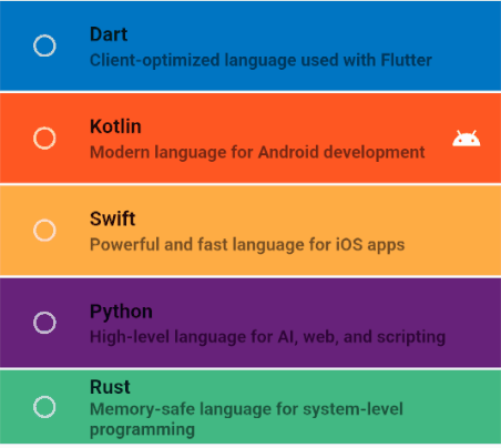
RadioSelectorItem(
title: Text("Dart"),
subtitle: Text(
"Client-optimized language used with Flutter",
style: style,
),
tileColor: Color(0xFF0175C2),
),
RadioSelectorItem(
title: Text("Kotlin"),
subtitle: Text(
"Modern language for Android development",
style: style,
),
tileColor: Color(0xFFFF5722),
secondary: Icon(
Icons.android,
color: Colors.white,
),
),
],
selectedItems: (selectedItems, indexes) {
debugPrint(selectedItems.toString());
debugPrint(indexes.toString());
},
)
```
### CheckboxSelector
```dart
CheckBoxSelector(
initialItems: [3,4],
selectedItems: (selectedItems, indexes) {
debugPrint(selectedItems.toString());
debugPrint(indexes.toString());
},
options: CheckBoxSelectorOption(
mainAxisAlignment: MainAxisAlignment.center,
controlAffinity: ListTileControlAffinity.leading,
fillColor: WidgetStateProperty.all(Colors.black26),
),
items: [
CheckBoxSelectorItem(
title: Text("Dart", style: style),
subtitle: Text(
"Client-optimized language used with Flutter",
style: style,
),
tileColor: Color(0xFF0175C2),
),
CheckBoxSelectorItem(
title: Text("Kotlin", style: style),
subtitle: Text(
"Modern language for Android development",
style: style,
),
tileColor: Color(0xFFFF5722),
secondary: Icon(
Icons.android,
color: Colors.white,
),
),
],
)
```

# Examples
| Widget | Example |
|:--------------------------:|:--------------:|
| ListSelector | [code](https://github.com/SinaSys/items_selector/tree/master/example/lib/list_selector) |
| GridSelector | [code](https://github.com/SinaSys/items_selector/tree/master/example/lib/grid_selector) |
| WrapSelector | [code](https://github.com/SinaSys/items_selector/tree/master/example/lib/wrap_selector) |
| RadioSelector | [code](https://github.com/SinaSys/items_selector/tree/master/example/lib/radio_selector) |
| CheckBoxSelector | [code](https://github.com/SinaSys/items_selector/tree/master/example/lib/checkbox_selector) |
| Options | Example |
|:--------------------------:|:--------------:|
| SingleSelectOptions | [code](https://github.com/SinaSys/items_selector/blob/master/example/lib/options/single_option_example.dart) |
| MultiSelectOptions | [code](https://github.com/SinaSys/items_selector/blob/master/example/lib/options/multi_option_example.dart) |
## ⚠️ Troubleshooting
### Issue: `initialItems` Not Working for Custom Classes (ListSelector, GridSelector, or WrapSelector)
If you use a **custom class** as the item type and set the `initialItems` property, you might notice that the initial items are **not selected** when the app runs. This happens because **Dart uses reference equality by default**, meaning it does not automatically recognize two objects as equal even if their properties have the same values.
### ✅ Solution 1: Override `==` Operator and `hashCode`
To ensure Dart correctly identifies equal objects, override the **equality (`==`) operator** and **hashCode** in your custom class:
```dart
class CustomItem {
final int id;
final String name;
CustomItem(this.id, this.name);
@override
bool operator ==(Object other) =>
identical(this, other) || (other is CustomItem && other.id == id && other.name == name);
@override
int get hashCode => id.hashCode ^ name.hashCode;
}
```
### ✅ Solution 2: Use the equatable Package
Instead of manually overriding == and hashCode, you can use the **equatable** package to simplify equality checks.
1️⃣ **Add `equatable` to your dependencies:**
```dart
flutter pub add equatable
```
2️⃣ Modify your custom class to extend `equatable`:
```dart
import 'package:equatable/equatable.dart';
class CustomItem extends Equatable {
final int id;
final String name;
const CustomItem(this.id, this.name);
@override
List get props => [id, name];
}
```
With **Equatable**, Dart will automatically handle equality comparisons, ensuring `initialItems` work correctly! 🎯