https://github.com/sletheren/react-gdpr-consent
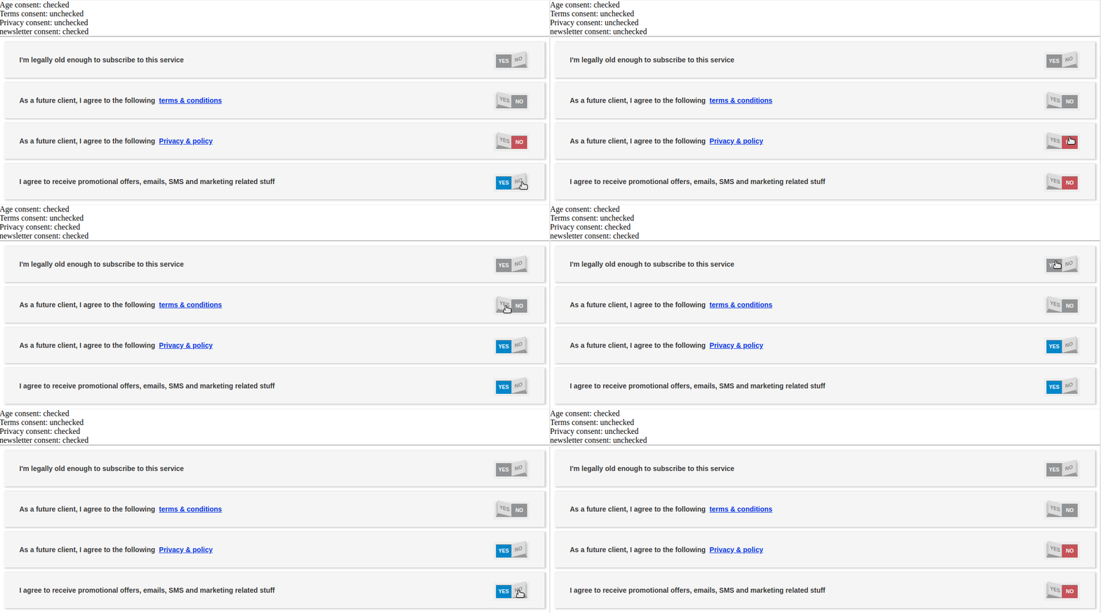
A simple component for your react app to implement the General Data Protection Regulation (GDPR) in a friendly-UI approach using toggles
https://github.com/sletheren/react-gdpr-consent
gdpr gdpr-component react react-components toggles
Last synced: 8 months ago
JSON representation
A simple component for your react app to implement the General Data Protection Regulation (GDPR) in a friendly-UI approach using toggles
- Host: GitHub
- URL: https://github.com/sletheren/react-gdpr-consent
- Owner: Sletheren
- Created: 2018-11-10T17:25:44.000Z (about 7 years ago)
- Default Branch: master
- Last Pushed: 2022-12-10T16:34:05.000Z (almost 3 years ago)
- Last Synced: 2025-04-03T03:06:00.531Z (8 months ago)
- Topics: gdpr, gdpr-component, react, react-components, toggles
- Language: JavaScript
- Size: 1.87 MB
- Stars: 9
- Watchers: 1
- Forks: 1
- Open Issues: 21
-
Metadata Files:
- Readme: README.md
Awesome Lists containing this project
README
# REACT-GDPR-CONSENT [](https://www.npmjs.com/package/react-gdpr-consent)
A React component to make it easy to implement the General Data Protection Regulation (GDPR) into your React App
## Online Demo

You can check out this little demo to get the feel of it: [Online demo](https://sletheren.github.io/react-gdpr-consent/)
## Get started
It's very easy to use the tool, follow the instructions
### Add the package
Install the package using npm
```
npm i react-gdpr-consent
```
### Import the package into your react app
```
import GDPR from 'react-gdpr-consent'
```
### Pass a configuration array as a prop `config` to the GDPR component
Example of the Configuraiton array:
````js
const config = [
{ id: 'age', text: "I'm 18 years old or older", checked: true, locked: true },
{ id: 'terms', text: "I accept", checked: true, locked: true, link: "http://www.example.com/terms.html", linkText: "terms & conditions"},
{ id: 'privacy', text: "I accept", checked: true, locked: true, link: "http://www.example.com/privacy.html", linkText: "Privacy & policy" },
{ id: 'newsletter', text: "I want to receive newsletters and updates by email", checked: false, locked: false }
]
````
Then pass it to the GDPR component:
```
```
Explanation of the different properties of the configuration array:
| Name | Type | Description |
| ------------ | ----------- | ----------- |
| id | String | Unique string that defines the element |
| text | String | The text that's showed before the toggle |
| checked | Boolean | If the toggle is checked initially (default: false) |
| locked | Boolean | If the toggle is disabled or not (default: false) |
| link | string (OPTIONAL) | If specified the text can be clicked as a link |
| linkText | string (OPTIONAL) | the text that will be clicked |
### Pass `ToggleHanlder` and `linkHandler`:
The two functions are mendatory to handle the toggle of the items and the link action handling
Example:
````js
const linkHanlder = (link) => {
window.open(link, '_blank');
}
const toggleHandler = (id, value) => {
console.log(id, value)
}
return (
);
````
| Name | Type | Description |
| ------------ | ----------- | ----------- |
| toggleHandler | function | Function that is fired when an item is toggeled, it has 2 params (id, value) |
| linkHandler | function | Function that handles when the user clicks on a link it has 1 param (link) |
### Enjoy :)