https://github.com/sletheren/react-spinners-loading
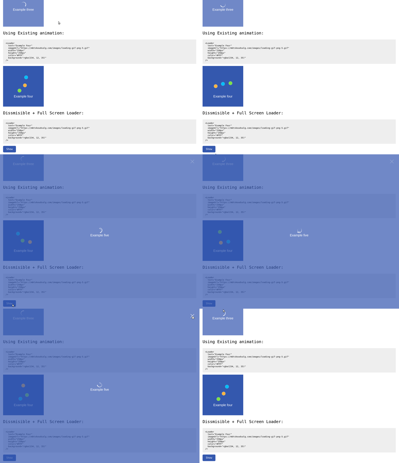
A totally customizable component for loading spinners/animation for your react project, it can serve as document loader (full screen), specific block loading animation and more, it has presets and accept your own assets as spinners
https://github.com/sletheren/react-spinners-loading
component loading loading-spinner react reactjs spinner spinner-components
Last synced: about 1 year ago
JSON representation
A totally customizable component for loading spinners/animation for your react project, it can serve as document loader (full screen), specific block loading animation and more, it has presets and accept your own assets as spinners
- Host: GitHub
- URL: https://github.com/sletheren/react-spinners-loading
- Owner: Sletheren
- Created: 2018-11-19T18:14:57.000Z (over 7 years ago)
- Default Branch: master
- Last Pushed: 2019-01-02T15:12:10.000Z (over 7 years ago)
- Last Synced: 2025-03-16T17:25:12.327Z (about 1 year ago)
- Topics: component, loading, loading-spinner, react, reactjs, spinner, spinner-components
- Language: JavaScript
- Size: 253 KB
- Stars: 8
- Watchers: 1
- Forks: 1
- Open Issues: 2
-
Metadata Files:
- Readme: README.md
Awesome Lists containing this project
README
# React Loading Spinners [](https://www.npmjs.com/package/react-spinners-loading)
A Highly Customizable React component to help you with loaders/spinners for specific part of your project or as a project loading, with built-in presets and the ability of using your own assets.
## Online Demo

You can check out this little demo to get the feel of it: [Online demo](https://sletheren.github.io/react-spinners-loading/)
## Get started
It's very easy to use the tool, follow the instructions
### Add the package
Install the package using npm
```
npm i react-spinners-loading
```
### Import the package into your react app
```
import Loader from 'react-spinners-loading'
```
### Pass the configuration props:
Example of the Configuraiton array:
````js
````
And that's pretty much it!
#### Explanation of the different properties you can pass:
| Name | Type | Default | Description |
| ------------ | ----------- | ----------- | ----------- |
| text | String | 'Loading...' | Unique string that defines the element |
| animation | String | null | One of the built-in presets [bar, circle, clock, dots, double-circle, drop, spinner] |
| color | String | '#FFFFFF' | The color of the text/spinner in HEX,RGB or RGBa |
| background | String | 'rgba(0, 0, 0, 0.7)' | The background color of the whole Loader in HEX,RGB or RGBa |
| width | String | '100%' | The Width of the Loader in Px/rem/em/% |
| height | String | '100%' | The Height of the Loader in Px/rem/em/% |
| fullscreen | Boolean | false | If the Loader should be showed in full-screen (Width & Height shouldn't be specified) |
| show | Boolean | true | To control if the Loader has to be shown or not |
| imageUrl | String | null | The URL for the Loading animation (animation doesn't need to be specified) |
| dismissible | Boolean | false | Showing a Closing button to close the Loader |
### Enjoy :)