https://github.com/sockandsandal/retro-shadow-buttons
A little CSS library I wrote for buttons that look cool
https://github.com/sockandsandal/retro-shadow-buttons
css
Last synced: about 1 year ago
JSON representation
A little CSS library I wrote for buttons that look cool
- Host: GitHub
- URL: https://github.com/sockandsandal/retro-shadow-buttons
- Owner: SockAndSandal
- Created: 2020-10-09T11:42:46.000Z (over 5 years ago)
- Default Branch: main
- Last Pushed: 2020-10-30T16:13:56.000Z (over 5 years ago)
- Last Synced: 2024-03-23T11:21:53.061Z (over 2 years ago)
- Topics: css
- Language: CSS
- Homepage:
- Size: 2.07 MB
- Stars: 9
- Watchers: 2
- Forks: 1
- Open Issues: 0
-
Metadata Files:
- Readme: README.md
Awesome Lists containing this project
README
# Retro Shadow Buttons
## _Fun little library to get those text-based retro game styled buttons on your website_
## Installation
A good idea would be to simply clone this git repo and pick up the CSS file.
```shell
git clone https://github.com/SockAndSandal/Retro-Shadow-Buttons.git
```
This package is also available via `npm`.
```shell
npm install --save retro-shadow-buttons
```
## Getting started
To get started, simply make a `div` using the `retro` class name and enter some text inside. This will create a button that can support say, a sentence of text. The class uses Roboto Mono as a default, with a font size of 20, but you can couple the button class with a header or paragraph to match your choices in type.
Also check out this [pen](https://codepen.io/SocksAndSandals/pen/xxObjzz) to try out this button! (Refer to width problem below if the button looks all stretched out)
```html
Hello! This is a button!
```
## Using the Buttons
This library was made with [my website](www.amanbeer.com) kept in mind, which was based on the concept of a text-based choice-based game in mind. Thus, most buttons are made keeping a large amount of text in mind. The button assumes no particular width and will probably stretch to the entire width, thus you'd have to control it using a wrapper container or a column. (I used Bootstrap to sort that out for me)
Let me break down the 3 classes that are relevant to this little set of buttons I have created. They're really tuned to work well with a black background, but some inline CSS can change that. You're also free to edit the CSS for the buttons as you like, it's lucid enough for understanding.
### Small Buttons
The `.rbtn-small` class can be used where you just want to make a small button for something like 'Listen on Spotify!' and don't want the extra padding on the right. You'd want to use both `retro` and `rbtn-small` for the desired effect.
```html
Listen on Spotify!
```

### Big Buttons
The `rbtn-big` class comes in handy when you're trying to nest a bunch of different kinds of text in a single button. Where would that be useful? As a design language, that could come in handy to make each header or title of your blog an entire big button, with a preview and everything of the sort. You'd want to use both `retro` and `rbtn-small` for the desired effect.
```html
{{ entry.title }}
{{entry.preview}}
```
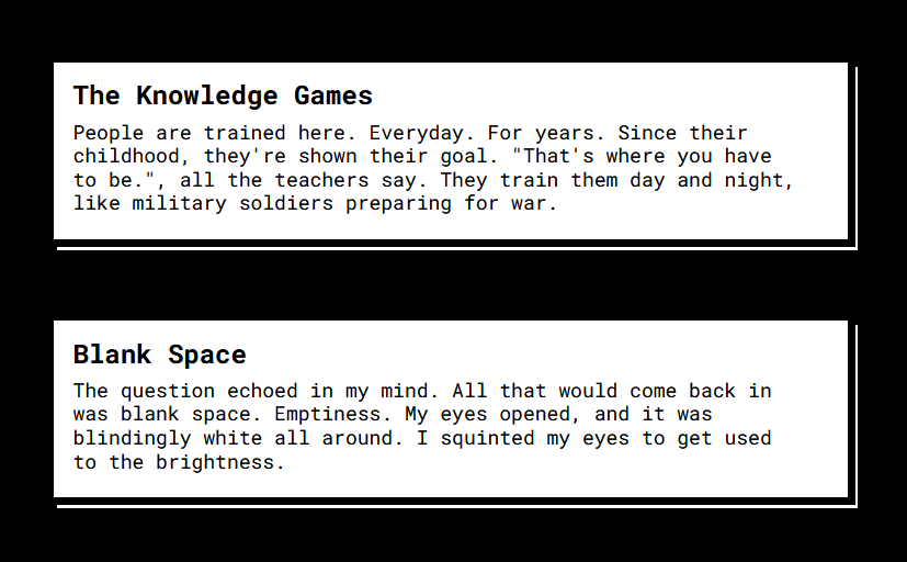
### Images
The `retro-img` class is used if you want to take an image (or a GIF for that matter) and make a button out of that. Don't use `retro` and `retro-img` together, most of their features are common except a few, could create trouble.
```html

```

## Accessibility
Retro-Shadow-Buttons supports the [`prefers-reduced-motion` media query](https://webkit.org/blog/7551/responsive-design-for-motion/) so that users with motion sensitivity can opt out of animations. On supported platforms (currently all the majors browsers and OS), users can select "reduce motion" on their operating system preferences and it will turn off CSS transitions for them without any further work required.
## Contributing
Pull requests are the way to go here. I really only have two rules for submitting a pull request: match the naming convention (camelCase, explain what you've done) and show a demo of submitted animations in a [pen](https://codepen.io). That **last one is important**.