https://github.com/srikanth-kandi/react-faqs-app
FAQs App using ReactJS ⚛
https://github.com/srikanth-kandi/react-faqs-app
Last synced: 9 months ago
JSON representation
FAQs App using ReactJS ⚛
- Host: GitHub
- URL: https://github.com/srikanth-kandi/react-faqs-app
- Owner: srikanth-kandi
- Created: 2023-11-13T12:09:41.000Z (about 2 years ago)
- Default Branch: main
- Last Pushed: 2023-11-13T12:25:44.000Z (about 2 years ago)
- Last Synced: 2025-02-08T07:28:01.780Z (11 months ago)
- Language: JavaScript
- Homepage: https://srikanth-kandi.github.io/react-faqs-app/
- Size: 529 KB
- Stars: 0
- Watchers: 1
- Forks: 0
- Open Issues: 0
-
Metadata Files:
- Readme: README.md
Awesome Lists containing this project
README
          # FAQs App using ReactJS ⚛

Live demo - [https://srikanth-kandi.github.io/react-faqs-app/](https://srikanth-kandi.github.io/react-faqs-app/)

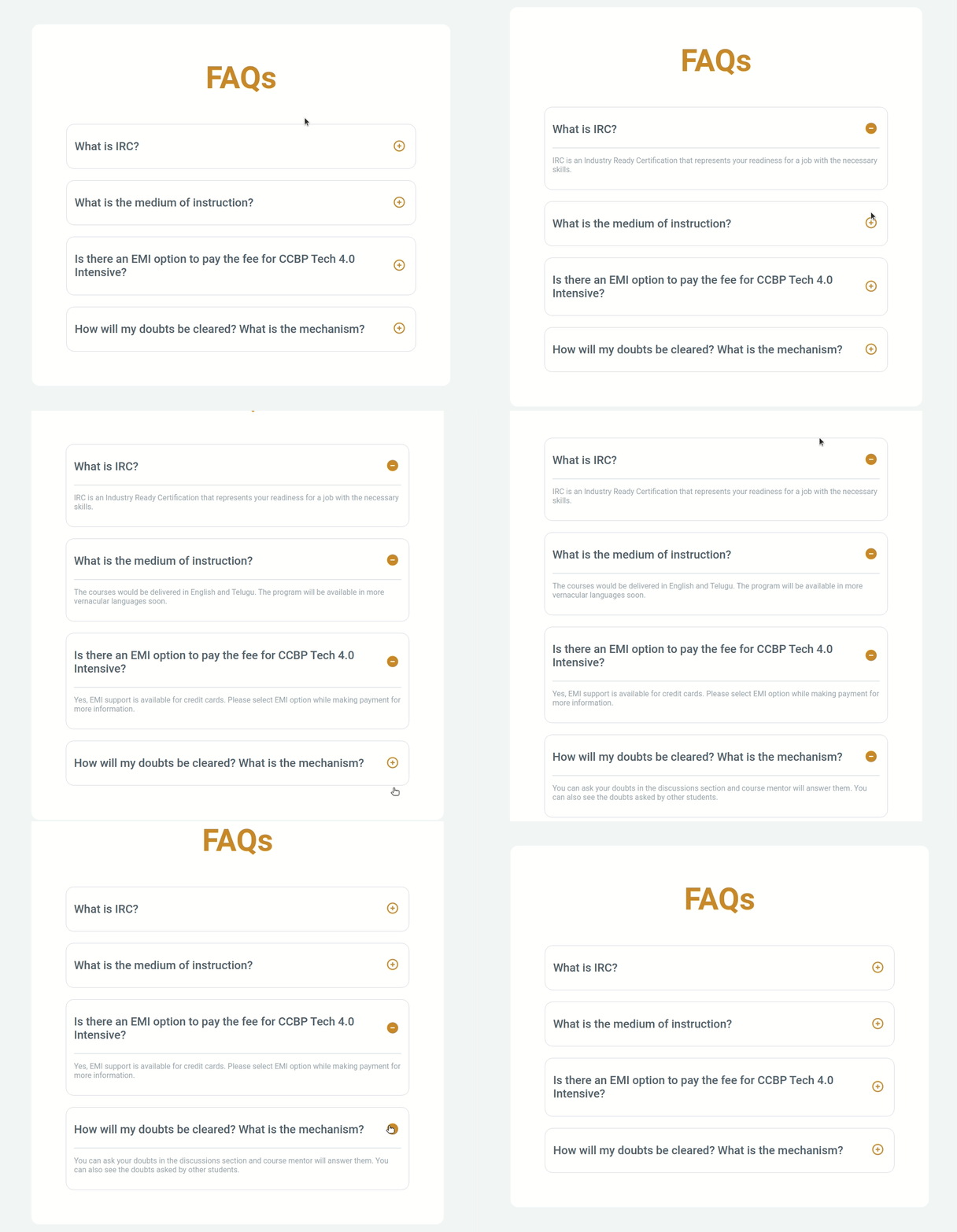
In this project, let's build a **Faqs App** by applying the concepts we have learned till now.

### Refer to the image below:


### Design Files

Click to view

- [Extra Small (Size < 576px), Small (Size >= 576px), Medium (Size >= 768px)](https://assets.ccbp.in/frontend/content/react-js/faqs-sm-output-v2.png)

- [Large (Size >= 992px) and Extra Large (Size >= 1200px)](https://assets.ccbp.in/frontend/content/react-js/faqs-lg-output-v2.png)

### Set Up Instructions

Click to view

- Download dependencies by running `npm install`

- Start up the app using `npm start`

### Completion Instructions

Functionality to be added


The app must have the following functionalities

- When the plus icon is clicked in a FAQ

  - The answer to the FAQ should be visible to the user

  - The plus icon should change to a minus icon

- When the minus icon is clicked in a FAQ

  - The answer to the FAQ should be hidden to the user

  - The minus icon should change to a plus icon

- The `Faqs` component receives the `faqsList` as a prop. It consists of a list of faq objects with the following properties in each faq object

  |     Key      | Data Type |

  | :----------: | :-------: |

  |      id      |  Number   |

  | questionText |  String   |

  |  answerText  |  String   |

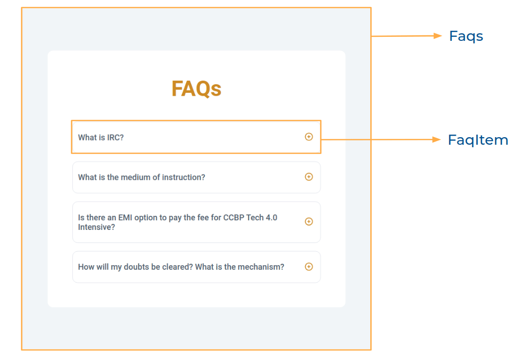
Components Structure


Implementation Files


Use these files to complete the implementation:

- `src/components/Faqs/index.js`

- `src/components/Faqs/index.css`

- `src/components/FaqItem/index.js`

- `src/components/FaqItem/index.css`

### Quick Tips

Click to view


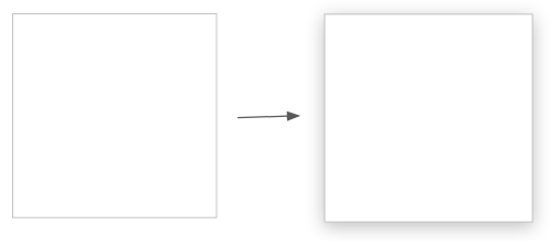
- You can use the `box-shadow` CSS property to apply the box-shadow effect to containers

  ```

    box-shadow: 0px 4px 16px 0px #bfbfbf;

  ```


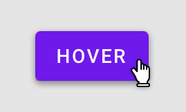
- You can use the `cursor` CSS property to specify the mouse cursor to be displayed when pointing over an element

  ```

    cursor: pointer;

  ```


- You can use the below `outline` CSS property for buttons and input elements to remove the highlighting when the elements are clicked

  ```

    outline: none;

  ```

### Resources

Image URLs

- [https://assets.ccbp.in/frontend/react-js/faqs-plus-icon-img.png](https://assets.ccbp.in/frontend/react-js/faqs-plus-icon-img.png) alt should be **plus**

- [https://assets.ccbp.in/frontend/react-js/faqs-minus-icon-img.png](https://assets.ccbp.in/frontend/react-js/faqs-minus-icon-img.png) alt should be **minus**

Colors


Hex: #cb8805

Hex: #52606d

Hex: #9aa5b1

#### Border Colors

Hex: #d7dae6

Hex: #e4e7eb

#### Background Colors

Hex: #ffffff

Hex: #f1f5f8

Font-families

- Roboto

> ### _Things to Keep in Mind_

>

> - All components you implement should go in the `src/components` directory.

> - Don't change the component folder names as those are the files being imported into the tests.

> - **Do not remove the pre-filled code**

> - Want to quickly review some of the concepts you’ve been learning? Take a look at the Cheat Sheets.