https://github.com/stefangabos/Zebra_Dialog
A small, compact, mobile-friendly and highly configurable jQuery plugin for creating gorgeous dialog boxes
https://github.com/stefangabos/Zebra_Dialog
alert dialog-box dialog-boxes jquery modal-dialogs modal-windows notifications
Last synced: about 1 year ago
JSON representation
A small, compact, mobile-friendly and highly configurable jQuery plugin for creating gorgeous dialog boxes
- Host: GitHub
- URL: https://github.com/stefangabos/Zebra_Dialog
- Owner: stefangabos
- License: other
- Created: 2013-04-08T18:05:20.000Z (about 13 years ago)
- Default Branch: master
- Last Pushed: 2025-03-08T10:40:02.000Z (over 1 year ago)
- Last Synced: 2025-03-11T05:05:47.101Z (over 1 year ago)
- Topics: alert, dialog-box, dialog-boxes, jquery, modal-dialogs, modal-windows, notifications
- Language: JavaScript
- Homepage: http://stefangabos.github.io/Zebra_Dialog/flat.html
- Size: 1.89 MB
- Stars: 157
- Watchers: 17
- Forks: 66
- Open Issues: 1
-
Metadata Files:
- Readme: README.md
- Changelog: CHANGELOG.md
- Funding: .github/FUNDING.yml
- License: LICENSE.md
Awesome Lists containing this project
README

# Zebra Dialog [](https://twitter.com/intent/tweet?text=A+small,+compact,+mobile-friendly+and+highly+configurable+jQuery+plugin+for+creating+responsive+modal+dialog+boxes&url=https://github.com/stefangabos/Zebra_Dialog&via=stefangabos&hashtags=jquery,dialog,notifications,alert,modal,javascript)
*A small, compact, mobile-friendly and highly configurable jQuery plugin for creating responsive modal dialog boxes*
[](https://www.npmjs.com/package/zebra_dialog) [](https://www.npmjs.com/package/zebra_dialog) [](https://www.npmjs.com/package/zebra_dialog) [](https://www.jsdelivr.com/package/npm/zebra_dialog) [](https://github.com/stefangabos/Zebra_Dialog/blob/master/LICENSE.md)
A modal dialog box is a focused interface element that prompts users to take action before returning to the main application. These dialogs are commonly used to capture user attention, deliver important information, confirm actions, or highlight warnings and errors. By temporarily blocking interaction with the rest of the page, modal windows ensure that users address critical tasks or notifications before proceeding, making them a fundamental part of modern web applications.
**Zebra Dialog** is a small (~12KB minified, 3KB gzipped), compact (one JavaScript file, no dependencies other than jQuery 1.7.0+), mobile-friendly and highly configurable jQuery plugin for creating responsive modal dialog boxes, meant to replace native JavaScript *alert*, *confirm* and *prompt* dialog boxes.
Can also be used as a notification widget (when configured to show no buttons and to close automatically) for updates or errors, without distracting users from their browser experience by displaying obtrusive alerts.
[](https://stefangabos.github.io/Zebra_Dialog/flat.html)
[](https://stefangabos.github.io/Zebra_Dialog/materialize.html)
[](https://stefangabos.github.io/Zebra_Dialog/index.html)
## Features
- great looking dialog boxes, out of the box, with 3 beautiful themes included
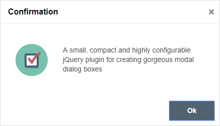
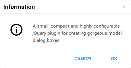
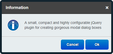
- 6 types of dialog boxes available: *confirmation*, *error*, *information*, *prompt*, *question* and *warning*
- content can also be added through AJAX calls, iFrames or from inline elements (together with attached events)
- easily customisable appearance by editing the CSS file
- create modal or non-modal dialog boxes
- easily add custom buttons
- position the dialog box wherever you want - not just in the middle of the screen
- dialog boxes are draggable
- callback functions can be used for further customisations
- use callback functions to handle users' choice
- works on mobile devices
- works in pretty much any browser (Chrome, Firefox, Safari, Edge, Opera, Internet Explorer 6+)
For the [classic theme](https://stefangabos.github.io/Zebra_Dialog/index.html), the icons used for *confirmation*, *information*, *error* and *question* dialog boxes are made by [DryIcon](http://dryicons.com/free-icons/preview/aesthetica/) while the *warning* icon is made by Function Design & Development Studio (website is not online anymore).
For the [flat theme](https://stefangabos.github.io/Zebra_Dialog/flat.html), the icons used are made by [Elegant Themes](http://www.elegantthemes.com/blog/freebie-of-the-week/beautiful-flat-icons-for-free)
For the [materialize theme](https://stefangabos.github.io/Zebra_Dialog/materialize.html) theme, the icons used are taken from [Google's Material Design](https://material.io/tools/icons/?style=baseline) *"design language"*.
## 🎂 Support the development of this project
Your support means a lot and it keeps me motivated to keep working on open source projects.
If you like this project please ⭐ it by clicking on the star button at the top of the page.
If you are feeling generous, you can buy me a coffee by donating through PayPal, or you can become a sponsor.
Either way - **Thank you!** 🎉
[ ](https://github.com/stefangabos/Zebra_Dialog) [](https://www.paypal.com/cgi-bin/webscr?cmd=_s-xclick&hosted_button_id=RKMCMRZB493LY) [
](https://github.com/stefangabos/Zebra_Dialog) [](https://www.paypal.com/cgi-bin/webscr?cmd=_s-xclick&hosted_button_id=RKMCMRZB493LY) [ ](https://github.com/sponsors/stefangabos)
## Demo
See the [demos](https://stefangabos.github.io/Zebra_Dialog/flat.html)
## Requirements
Zebra Dialog has no dependencies other than jQuery 1.7.0+
## Installation
Zebra Dialog is available as a [npm package](https://www.npmjs.com/package/zebra_dialog). To install it use:
```bash
# the "--save" argument adds the plugin as a dependency in packages.json
npm install zebra_dialog --save
```
## How to use
First, load jQuery from a CDN and provide a fallback to a local source like:
```html
window.jQuery || document.write('<script src="path/to/jquery-3.7.1.js"><\/script>')
```
Load the Zebra Dialog jQuery plugin:
```html
```
Alternatively, you can load Zebra Dialog from [JSDelivr CDN](https://www.jsdelivr.com/package/npm/zebra_dialog) like this:
```html
```
Load the style sheet file from a local source
```html
```
...or from [JSDelivr CDN](https://www.jsdelivr.com/)
```html
```
Now, within the DOM-ready event do
```javascript
$(document).ready(function() {
// show a dialog box when clicking on an element
$('#element').on('click', function(e) {
e.preventDefault();
new $.Zebra_Dialog('The link was clicked!');
});
});
```
## Configuration options
## Properties
Property
Type
Default
Description
animation_speed_hide
integer
250
The speed, in milliseconds, by which the backdrop and the dialog box will be animated when closing.
animation_speed_show
integer
0
The speed, in milliseconds, by which the backdrop and the dialog box will be animated when appearing.
auto_close
mixed
false
The number of milliseconds after which to automatically close the dialog box or false to not automatically close the dialog box.
auto_focus_button
mixed
true
The index (0-based) of the button (from left to right) to place the focus on when a dialog box is first shown.
Set to false to disable.
When set to false the focus will be placed on the dialog box's content so that when the users presses TAB, the focus will be set on the first button.
Setting this to true is equivalent to setting it to 0.
Default is TRUE
backdrop_close
boolean
true
Should the dialog box close when the backdrop is clicked?
backdrop_opacity
double
.9
The opacity of the backdrop (between 0 and 1)
buttons
mixed
Use this for localization and for adding custom buttons.
If set to true, the default buttons will be used, depending on the type of the dialog box: ['Ok', 'Cancel'] for prompt, question and warning types, and ['Ok'] for the other types of dialog boxes.
For custom buttons, use an array containing the captions of the buttons to display: ['My button 1', 'My button 2'].
Set to false if you want no buttons.
You can also add custom CSS classes, set which button's callback to be triggered when the user presses ENTER while
inside the input box (for prompt dialog boxes and when prompt_rows is 1), and/or attach callback functions to individual buttons by using
objects in the form of:
[{
caption: 'My button 1',
custom_class: 'foo',
default_confirmation: true,
callback: function() { // code }
},{
caption: 'My button 2',
custom_class: 'bar',
callback: function() { // code }
}]
For prompt dialog box types use the default_confirmation property to tell the library
which button's callback to trigger when the user presses ENTER while inside the input box. If
not set, you will have to handle user input via the onBeforeClose event, or you will
not be able to process user input for this case.
The above applies only if prompt_rows is 1 as otherwise the ENTER key inserts a line-break
Callback functions receive as first argument the entire dialog box, as a jQuery object, and as second argument,
the value entered in the input box - when the dialog box's type is prompt, or undefined
for the other dialog types.
A callback function attache to a button is executed as soon as the button is clicked rather than after
the dialog box is closed, as it is the case with the onClose event.
A callback function returning FALSE will prevent the dialog box from closing.
center_buttons
boolean
false
Setting this property to true will instruct the plugin to center any available buttons instead of aligning them to the right
custom_class
mixed
false
An extra class to add to the dialog box's container and to the backdrop (when present).
For example, setting this value to mycustom and in the CSS file having something like
.mycustom .ZebraDialog_Title { background: red }
would set the dialog box title's background to red.
Take a look into a theme's style sheet file to see what can be changed.
default_value
string
""
(empty string)
Default value to show in the input box when the dialog box type is prompt.
See also the placeholder property.
disable_page_scrolling
boolean
true
Prevents scrolling of the page behind the dialog box, when the dialog box is open.
This has effect only when the modal property is set to true.
draggable
mixed
true for dialog boxes that have a title
Whether the dialog box should be draggable or not.
Dialog boxes that have a title are draggable by default unless this property is set to false.
For dialog boxes not having a title, set this property to force for making them draggable.
height
mixed
0
(automatically set)
By default, the height of the dialog box is automatically computed to fit the content (but not exceed viewport).
Can be specified as a numeric value (which will be interpreted as a value in pixels) or as a percentage (of the viewport).
If max_height is set to valid value greater than 0, then this property will be ignored!
keyboard
boolean
true
When set to true, pressing the ESC key will close the dialog box.
margin
mixed
0
Margin of the dialog box relative to the viewport's limits (a single value, applied both horizontally and/or vertically)
This is used when the dialog box is stretched 100% horizontally and/or vertically and width and max_width are not set (when stretched horizontally) and height and max_height are not set (when stretched vertically).
This propery is also taken into account when using the position property.
Can be specified as a numeric value (which will be interpreted as a value in pixels) or as a percentage (of the viewport).
max_height
mixed
0
The maximum height of the dialog box.
Can be specified as a numeric value (which will be interpreted as a value in pixels) or as a percentage (of the viewport).
If this property is set to valid value greater than 0, then the height property will be ignored.
max_width
mixed
450
The maximum width of the dialog box.
Can be specified as a numeric value (which will be interpreted as a value in pixels) or as a percentage (of the viewport).
If this property is set to valid value greater than 0, then the width property will be ignored.
message
string
The text (or HTML) to be displayed in the dialog box.
See the source property on how to add content via AJAX, iFrames or from inline elements.
modal
boolean
true
When set to true there will be a semitransparent backdrop behind the dialog box, preventing users from clicking the page's content.
placeholder
string
""
(empty string)
When set to true there will be a semitransparent backdrop behind the dialog box, preventing users from clicking the page's content.
See also default_value property.
position
mixed
'center'
Position of the dialog box.
Can be either center (which would center the dialog box both horizontally and vertically), or an array with 2 elements, in the form of
// notice that everything is enclosed in quotes
['horizontal_position +/- offset',
'vertical_position +/- offset']
where
-
horizontal_position can beleft,rightorcenter -
vertical_position can betop,bottomormiddle -
offset is optional and represents the value of pixels to add/subtract from the respective horizontal or vertical position
Positions are relative to the viewport (the area of the browser that is visible to the user) and
the value of themarginproperty is taken into account!
Examples:
// position the dialog box in the top-left corner// shifted 20 pixels inside['left + 20', 'top + 20']// position the dialog box in the bottom-right corner// shifted 20 pixels inside
['right - 20', 'bottom - 20']// position the dialog box in center-top// shifted 20 pixels down['center', 'top + 20']Note that when the width of the viewport is less than 768 pixels, any arithmetics will be ignored (so, things likeleft + 20will be interpreted as justleft)
prompt_rows
integer
1
If the dialog box type is
prompt, setting this property to a value higher than 1
will change the input box to a textarea input having the specified number of rows.
reposition_speed
integer
500
The duration (in milliseconds) of the animation used to reposition the dialog box when the browser window is resized.
show_close_button
boolean
true
When set to
true, a close button (the little "x") will be shown in the upper right corner of the dialog box.If the dialog box has a title bar then the close button will be shown in the title bar, vertically centered and respecting the right padding.
If the dialog box does not have a title bar then the close button will be shown in the upper right corner of the body of the dialog box, respecting the position related properties set in the stylesheet.
source
mixed
false
Add content via AJAX, iFrames or from inline elements (together with the already applied events).
This property can be any of the following:
-
ajax: object- where object can be anobjectwith any of the properties you'd normally use to make an AJAX call in jQuery (see the description for the settings argument here), or it can be astringrepresenting a valid URL whose content to be fetched via AJAX and placed inside the dialog box.
source: {ajax: 'http://myurl.com/'}
source: {
ajax: {
url: 'http://myurl.com/',
cache: false
}
}
Note that you cannot use the
successproperty as it will always be overwritten by the library; use thecompleteproperty instead, if you have to
-
iframe: object- where object can be anobjectwhere property names are valid attributes of the iframe tag, or it can be astringrepresenting a valid URL to be loaded inside an iFrame and placed inside the dialog box.
source: {iframe: 'http://myurl.com/'}
source: {
// iFrame's width and height are automatically set
// to fit the dialog box's width and height
iframe: {
src: 'http://myurl.com/'
}
}
-
inline: selector- where element is a jQuery element from the page; the element will be copied and placed inside the dialog box together with any attached events. If you just want the element's inner HTML, use$('#element').html()
source: {inline: $('#myelement')}
title
string
""
(empty string, no title)
Title of the dialog box
type
mixed
information
Dialog box type.
Can be any of the following:
- confirmation
- error
- information
- prompt
- question
- warning
If you don't want an icon, set the
type property to false.By default, the
warning and question types have two buttons with the captions Ok and Cancel respectively, while the other types have a single button with the caption Ok.
vcenter_short_message
boolean
Should messages shorter than the dialog's height be vertically centered?
This property is ignored whensourceisiframe
width
integer
0
(uses the value defined in the theme)
By default, the width of the dialog box is automatically computed in order to fit the content (but not exceed viewport.
Can be specified as a numeric value (which will be interpreted as a value in pixels) or as a percentage (of the viewport).
Ifmax_widthis set to valid value greater than0, then this property will be ignored.
## Events
Event
Description
onOpen
Event fired after the dialog box is opened.
The callback function receives as unique argument the dialog box, as a jQuery element.
onBeforeClose
Event fired before the dialog box is closed.
The main difference when compared to theonCloseevent is that, with this event, by
returningfalsefrom the callback function you can prevent the closing of the dialog box - useful
for validating user input.
The callback function receives as first argument the caption of the clicked button or boolean
FALSE
if the dialog box is closed by pressing the
ESC key, by clicking the dialog box's x
button, or by clicking the backdrop. The argument can also be boolean
TRUE when the dialog box
type is
prompt and the ENTER key is pressed while inside the input box.As second argument, the callback function receives the value entered in the input box - when the dialog box
type is
prompt and a button was clicked or the ENTER key was pressed while inside
the input box, or
undefined for any other case.All this is important when expecting user input as you can say that you have user input only
when the value of the first argument is boolean
TRUEor the value it's the same as the label of
the button considered as confirmation (i.e. "Ok"), and the value of the second argument is
!== undefined.See the
buttons property for another way of handling user input.
onClose
Event fired after the dialog box is closed.
For executing functions before the closing of the dialog box, see the onBeforeClose
event or the buttons property.
For properly validating user input you might want to use the onBeforeClose event
or the buttons property!
The callback function receives as first argument the caption of the clicked button or boolean
FALSE
if the dialog box is closed by pressing the
ESC key, by clicking the dialog box's x
button, or by clicking the backdrop. The argument can also be boolean
TRUE when the dialog box
type is
prompt and the ENTER key is pressed while inside the input box.As second argument, the callback function receives the value entered in the input box - when the dialog box
type is
prompt and a button was clicked or the ENTER key was pressed while inside
the input box, or
undefined for any other case.All this is important when expecting user input as you can say that you have user input only
when the value of the first argument is boolean
TRUEor the value it's the same as the label of
the button considered as confirmation (i.e. "Ok"), and the value of the second argument is
!== undefined.See the
buttons property or the onBeforeClose event for other ways of handling user input.
## Methods
### `close()`
Call this method to manually close a dialog box.
```javascript
var dialog = new $.Zebra_Dialog('This is some information');
dialog.close();
```
### `update()`
Use this method to adjust the dialog box's position after content is changed dynamically, at run-time.
```javascript
var dialog = new $.Zebra_Dialog('This is some information');
// change the content in the dialog box
$('.ZebraDialog_Body').html('New content');
dialog.update();
```
## Sponsors
Cross browser/device testing is done with
[](https://www.browserstack.com/)