https://github.com/stefmde/homeassistant-simpledatetimeclockcard
This date time card for home assistant is easy to configure and bring you rich features on the same time
https://github.com/stefmde/homeassistant-simpledatetimeclockcard
clock date datetime hacs hacs-default hacs-integration home-assistant time
Last synced: 3 months ago
JSON representation
This date time card for home assistant is easy to configure and bring you rich features on the same time
- Host: GitHub
- URL: https://github.com/stefmde/homeassistant-simpledatetimeclockcard
- Owner: stefmde
- License: mit
- Created: 2023-08-25T20:32:33.000Z (over 2 years ago)
- Default Branch: main
- Last Pushed: 2024-02-11T13:08:46.000Z (almost 2 years ago)
- Last Synced: 2024-02-11T14:26:32.880Z (almost 2 years ago)
- Topics: clock, date, datetime, hacs, hacs-default, hacs-integration, home-assistant, time
- Language: JavaScript
- Homepage:
- Size: 219 KB
- Stars: 1
- Watchers: 2
- Forks: 0
- Open Issues: 0
-
Metadata Files:
- Readme: README.md
- License: LICENSE
Awesome Lists containing this project
README
# Simple Date Time Clock Card for HomeAssistant
[](https://github.com/custom-components/hacs)
## Description
This card for home assistant is easy to configure and bring you rich features on the same time. Also for that reason you can find all properties to configure, an explanation of them and samples below.
Currently there are 29 or more properties. But don't worry, you don't need to set any of them to get a good result (See sample `No special config`).
## Properties
### Global
| Name | Type | Default | Description |
|--|--|--|--|
| `global_text_align` | `string` | `center` | Could be `center`, `left` or `right`. The alignment of the text |
| `global_padding_left_size` | `string` | `0px` | Inner space to the left. Unit is up to you |
| `global_padding_right_size` | `string` | `0px` | Inner space to the right. Unit is up to you |
| `global_padding_top_size` | `string` | `15px` | Inner space to the top. Unit is up to you |
| `global_padding_bottom_size` | `string` | `15px` | Inner space to the bottom. Unit is up to you |
| `global_update_interval_ms` | `int` | `1000` | Interval for updating the clock. Could be set higher to save power or if you doesn't display the seconds anyway. |
### Time
| Name | Type | Default | Description |
|--|--|--|--|
| `time_show` | `bool` | `true` | Sets the visibility of the time |
| `time_font_size` | `string` | `5em` | Size of the text of the time. Unit is up to you |
| `time_separator_char` | `string` | `:` | Sets the char that is displayed between the hours and minutes or minutes and seconds |
| `time_separator_blink` | `bool` | `false` | Let the `time_separator_char` blink each second. Could also be usefull if seconds aren't displayed |
| | | | |
| `time_hours_24` | `bool` | `true` | Enables or disables the clock in 24h style. Else it would be 12h with AM/PM |
| `time_hours_lead_zero` | `bool` | `true` | Forces the value to two digits: 9 -> 09 |
| `time_minutes_lead_zero` | `bool` | `true` | Forces the value to two digits: 9 -> 09 |
| `time_seconds_font_size` | `string` | `2em` | Size of the text of the seconds. If undefined the value is the same than `time_font_size`. Unit is up to you |
| `time_seconds_show` | `bool` | `true` | Sets the visibility of the seconds |
| `time_seconds_lead_zero` | `bool` | `true` | Forces the value to two digits: 9 -> 09 |
| `time_seconds_visibility_percentage` | `string` | `100%` | Can dim the text of the seconds to more match the background |
### Date
| Name | Type | Default | Description |
|--|--|--|--|
| `date_show` | `bool` | `true` | Sets the visibility of the date |
| `date_locale` | `string` | `en-US` | The locale is used to translate the name of the week. See `date_week_day_name_show` |
| `date_separator_char` | `string` | `.` | Sets the char that is displayed between the day and the month or the month and the year |
| `date_font_size` | `string` | `2em` | Size of the text of the date. Unit is up to you |
| `date_us_format` | `bool` | `false` | Sets the date format to us(MM.DD.YYYY) insteat the eu/default(DD.MM.YYYY) format |
| | | | |
| `date_days_lead_zero` | `bool` | `true` | Forces the value to two digits: 9 -> 09 |
| `date_week_day_name_show` | `bool` | `true` | Sets the visibility of the name of the week. |
| `date_week_day_name_long` | `bool` | `false` | Sets the length of the name of the week. Fri <=> Friday |
| `date_week_number_show` | `bool` | `false` | Sets the visibility of the week number of the year |
| `date_week_number_label` | `string` | `KW` | Sets the label that is shown before the number of the week. Could also be empty |
| `date_months_lead_zero` | `bool` | `true` | Forces the value to two digits: 9 -> 09 |
| `date_year_two_digit` | `bool` | `false` | Sets the year to two digits. 2023 -> 23 |
## Samples
### My favorit
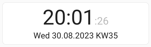
type: custom:simple-date-time-clock-card
time_seconds_visibility_percentage: 30%
time_seconds_font_size: 0.5em
date_week_number_show: true
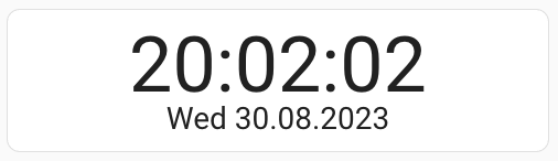
### No special config

type: custom:simple-date-time-clock-card
### US
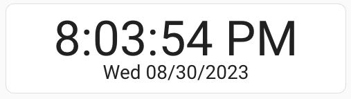
type: custom:simple-date-time-clock-card
date_us_format: true
date_separator_char: /
time_hours_24: false
### Minimal UI
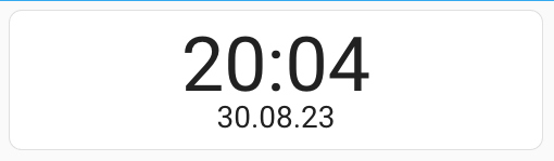
type: custom:simple-date-time-clock-card
time_seconds_show: false
date_week_day_name_show: false
date_year_two_digit: true
### Just the Clock
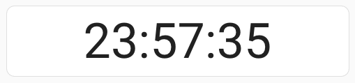
type: custom:simple-date-time-clock-card
time_seconds_show: true
date_show: false
### Just the Date
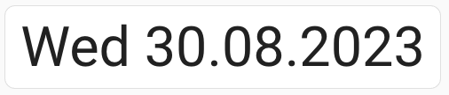
type: custom:simple-date-time-clock-card
time_show: false
date_font_size: 5em
date_week_day_name_show: true
### Separators
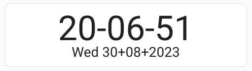
Please note, that for some special chars you need to place them in ''
type: custom:simple-date-time-clock-card
time_separator_char: '-'
date_separator_char: +
## ToDo