https://github.com/stevej2608/reactpy-apexcharts
ReactPy wrapper for react-apexcharts
https://github.com/stevej2608/reactpy-apexcharts
apexcharts python reactpy
Last synced: 4 months ago
JSON representation
ReactPy wrapper for react-apexcharts
- Host: GitHub
- URL: https://github.com/stevej2608/reactpy-apexcharts
- Owner: stevej2608
- License: mit
- Created: 2023-12-19T16:05:41.000Z (over 2 years ago)
- Default Branch: master
- Last Pushed: 2025-12-22T11:49:34.000Z (7 months ago)
- Last Synced: 2025-12-28T12:27:49.908Z (7 months ago)
- Topics: apexcharts, python, reactpy
- Language: Python
- Homepage:
- Size: 13.3 MB
- Stars: 9
- Watchers: 1
- Forks: 0
- Open Issues: 1
-
Metadata Files:
- Readme: README.md
- Contributing: CONTRIBUTING.md
- License: LICENSE
Awesome Lists containing this project
README
## reactpy-apexcharts
Minimal [ReactPy](https://reactpy.dev/docs/index.html) wrapper for
the [react-apexcharts](https://github.com/apexcharts/react-apexcharts) library (v 1.4.1).
## Usage
pip install reactpy-apexcharts
## Documentation
Configuration options can be found [here](https://apexcharts.com/docs/react-charts/)
### Simple Barchart Example
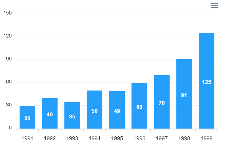
*./examples/barchart_example.py*
```
from reactpy import component, html, run
from reactpy_apexcharts import ApexChart
@component
def AppMain():
return html.div(
ApexChart(
options = {
'chart': {'id': 'apex-chart-example'},
'xaxis': {
'categories': [1991, 1992, 1993, 1994, 1995, 1996, 1997, 1998, 1999]}
},
series = [{
'name': 'series-1',
'data': [30, 40, 35, 50, 49, 60, 70, 91, 125]
}],
chart_type = "bar",
width=500,
height=320
)
)
# python -m examples.chart_example
if __name__ == "__main__":
run(AppMain)
```
### More complex area chart
[syncing_chart.py](examples/syncing_chart.py), is a more complex example showing how to control color, grids and
format X & Y axis labels.
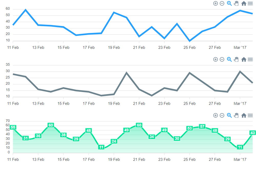
*./examples/syncing_chart.py*
```
from reactpy import component, html, run
from reactpy_apexcharts import ApexChart
DATE = dt(2017, 2, 11)
options = {
"series": [{"data": time_series(DATE, 20, {"min": 10, "max": 60})}],
"chart": {"id": "fb", "group": "social", "type": "line", "height": 160},
"xaxis": {'type': 'datetime'},
"colors": ["#008FFB"],
}
optionsLine2 = {
"series": [{"data": time_series(DATE, 20, {"min": 10, "max": 30})}],
"chart": {"id": "tw", "group": "social", "type": "line", "height": 160},
"xaxis": {'type': 'datetime'},
"colors": ["#546E7A"],
}
optionsArea = {
"series": [{"data": time_series(DATE, 20, {"min": 10, "max": 60})}],
"chart": {"id": "yt","group": "social","type": "area","height": 160},
"xaxis": {'type': 'datetime'},
"colors": ["#00E396"]
}
@component
def CustomChart(options):
return html.div({'style': {'min-height': '175px'}},
ApexChart(options=options),
)
@component
def AppMain():
return html.div(
CustomChart(options=options),
CustomChart(options=optionsLine2),
CustomChart(options=optionsArea),
)
# python -m examples.syncing_chart
if __name__ == "__main__":
run(AppMain)
```