https://github.com/stla/shinyambarcharts
'AmCharts' bar charts for Shiny
https://github.com/stla/shinyambarcharts
r shiny
Last synced: about 2 months ago
JSON representation
'AmCharts' bar charts for Shiny
- Host: GitHub
- URL: https://github.com/stla/shinyambarcharts
- Owner: stla
- Created: 2019-05-28T12:24:09.000Z (about 7 years ago)
- Default Branch: master
- Last Pushed: 2020-08-10T08:07:18.000Z (almost 6 years ago)
- Last Synced: 2025-03-31T11:15:02.495Z (about 1 year ago)
- Topics: r, shiny
- Language: JavaScript
- Size: 274 KB
- Stars: 3
- Watchers: 2
- Forks: 0
- Open Issues: 2
-
Metadata Files:
- Readme: README.md
Awesome Lists containing this project
README
# shinyAmBarCharts
'AmCharts' bar charts for Shiny.
**This package is obsolete. Use [rAmCharts4](https://github.com/stla/rAmCharts4) instead.**
___
*Installation:* `devtools::install_github("stla/shinyAmBarCharts")`
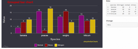
```r
library(shiny)
library(shinyAmBarCharts)
# create a dataset
set.seed(666)
df0 <- data.frame(
species = rep(c("sorgho","poacee","banana","triticum"), each = 3),
condition = rep(c("normal", "stress", "Nitrogen"), 4),
value = rpois(12, 10)
)
library(tidyr)
df1 <- spread(df0, condition, value)
# grouped bar chart
ui <- fluidPage(
fluidRow(
column(9,
amBarChart(
"mygroupedbarchart", data = df1, height = "400px",
category = "species", value = c("normal", "stress", "Nitrogen"),
valueNames = c("Normal", "Stress", "Nitrogen"),
minValue = 0, maxValue = 20,
draggable = c(FALSE, FALSE, TRUE),
theme = "dark", backgroundColor = "#30303d",
columnStyle = list(fill = c("darkmagenta", "darkred", "gold"),
stroke = "#cccccc",
cornerRadius = 4),
chartTitle = list(text = "Grouped bar chart",
fontSize = 23,
color = "firebrick"),
xAxis = list(title = list(text = "Species",
fontSize = 21,
color = "silver"),
labels = list(color = "whitesmoke",
fontSize = 17)),
yAxis = list(title = list(text = "Value",
fontSize = 21,
color = "silver"),
labels = list(color = "whitesmoke",
fontSize = 14)),
columnWidth = 90,
caption = list(text = "[font-style:italic]shinyAmBarCharts[/]",
color = "yellow"),
gridLines = list(color = "whitesmoke",
opacity = 0.4,
width = 1),
tooltip = list(text = "[bold;font-style:italic]{name}: {valueY}[/]",
labelColor = "#101010",
backgroundColor = "cyan",
backgroundOpacity = 0.7)
)
),
column(3,
tags$label("Data:"),
verbatimTextOutput("data"),
br(),
tags$label("Change:"),
verbatimTextOutput("change"))
)
)
server <- function(input, output){
output[["data"]] <- renderPrint({
input[["mygroupedbarchart"]]
})
output[["change"]] <- renderPrint({ input[["mygroupedbarchart_change"]] })
}
shinyApp(ui, server)
```