https://github.com/svar-widgets/menu
Svelte menu component. Build dropdown menus, context menus, or complex menu bars.
https://github.com/svar-widgets/menu
menu menu-bar menu-component menu-navigation svelte svelte-component svelte-ui-components svelte4 svelte5 sveltejs ui-component
Last synced: 3 months ago
JSON representation
Svelte menu component. Build dropdown menus, context menus, or complex menu bars.
- Host: GitHub
- URL: https://github.com/svar-widgets/menu
- Owner: svar-widgets
- License: mit
- Created: 2024-10-04T18:00:01.000Z (over 1 year ago)
- Default Branch: main
- Last Pushed: 2026-03-04T15:56:03.000Z (3 months ago)
- Last Synced: 2026-03-04T21:38:59.289Z (3 months ago)
- Topics: menu, menu-bar, menu-component, menu-navigation, svelte, svelte-component, svelte-ui-components, svelte4, svelte5, sveltejs, ui-component
- Language: Svelte
- Homepage: https://docs.svar.dev/svelte/core/category/menu
- Size: 857 KB
- Stars: 32
- Watchers: 2
- Forks: 1
- Open Issues: 0
-
Metadata Files:
- Readme: readme.md
- License: license.txt
Awesome Lists containing this project
README
# SVAR Svelte Menu
[](https://www.npmjs.com/package/@svar-ui/svelte-menu)
[](https://github.com/svar-widgets/menu/blob/main/license.txt)
[](https://www.npmjs.com/package/@svar-ui/svelte-menu)
[Documentation](https://docs.svar.dev/svelte/core/category/menu/) • [Demos](https://docs.svar.dev/svelte/core/samples-menu/#/action/willow)
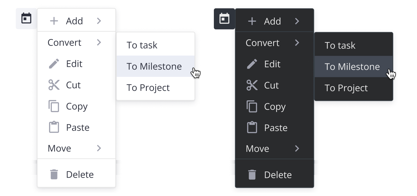
**SVAR Menu** is a ready-to-use Svelte component for creating context and popup menus. Easily customize each menu item with text, icons, and sub-items, and control the menu's position relative to its parent element.
### Svelte 4 and Svelte 5 versions
There are two versions of the library: the 1.x version, designed to work with Svelte 4, and the 2.x version, created for Svelte 5. To use the SVAR Menu beta for Svelte 5, install it as follows:
```
npm install @svar-ui/svelte-menu
```
To use the SVAR Menu for Svelte 4:
```
npm install wx-svelte-menu@1.3.0
```
### How to Use
To use SVAR Svelte Menu, simply import the package and include the component in your Svelte file:
```svelte
import { Menu } from "@svar-ui/svelte-menu";
function onClick(ev) {
message = ev.option ? `clicked on ${ev.option.id}` : "closed";
}
const options = [
{ id: "edit-cut", text: "Cut", icon: "wxi wxi-content-cut" },
{ id: "edit-copy", text: "Copy", icon: "wxi wxi-content-copy" },
{
id: "edit-paste",
text: "Paste",
icon: "wxi wxi-content-paste",
},
];
```
For more details, please visit the [getting started guide](https://docs.svar.dev/svelte/core/category/menu/).
### How to Modify
Typically, you don't need to modify the code. However, if you wish to do so, follow these steps:
1. Run `yarn` to install dependencies. Note that this project is a monorepo using `yarn` workspaces, so npm will not work
2. Start the project in development mode with `yarn start`
### Run Tests
To run the test:
1. Start the test examples with:
```sh
yarn start:tests
```
2. In a separate console, run the end-to-end tests with:
```sh
yarn test:cypress
```