https://github.com/svar-widgets/react-toolbar
React toolbar component for building configurable panels with buttons, icons, dropdowns, etc.
https://github.com/svar-widgets/react-toolbar
button react react-component react-toolbar reactjs toolbar
Last synced: 9 months ago
JSON representation
React toolbar component for building configurable panels with buttons, icons, dropdowns, etc.
- Host: GitHub
- URL: https://github.com/svar-widgets/react-toolbar
- Owner: svar-widgets
- License: mit
- Created: 2025-09-15T18:24:53.000Z (10 months ago)
- Default Branch: main
- Last Pushed: 2025-09-26T09:03:36.000Z (9 months ago)
- Last Synced: 2025-09-26T09:39:08.330Z (9 months ago)
- Topics: button, react, react-component, react-toolbar, reactjs, toolbar
- Language: JavaScript
- Homepage: https://svar.dev/react/core/
- Size: 71.3 KB
- Stars: 5
- Watchers: 0
- Forks: 0
- Open Issues: 0
-
Metadata Files:
- Readme: README.md
- License: license.txt
Awesome Lists containing this project
README
# SVAR React Toolbar
[](https://www.npmjs.com/package/@svar-ui/react-toolbar)
[](https://github.com/svar-widgets/react-toolbar/blob/main/license.txt)
[](https://www.npmjs.com/package/@svar-ui/react-toolbar)
[Documentation](https://docs.svar.dev/react/core/toolbar/) • [Demos](https://docs.svar.dev/react/core/samples-toolbar/#/base/willow)
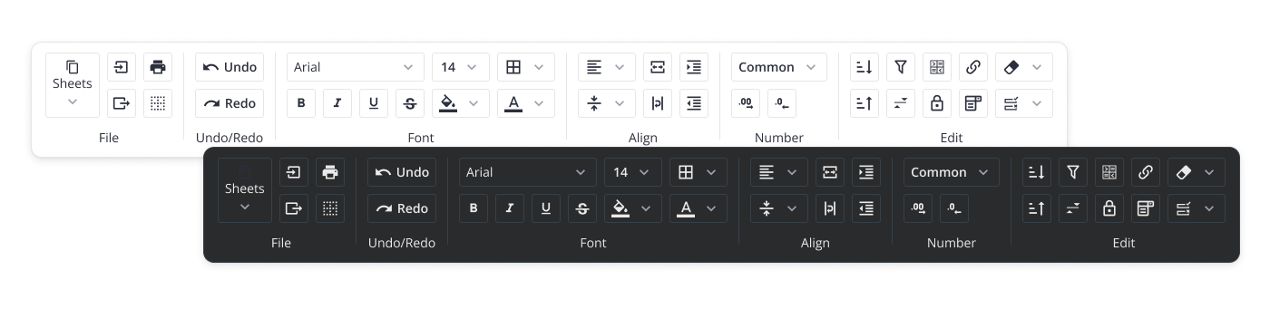
**SVAR React Toolbar** is a customizable React UI component that helps you build panels of buttons and icons, giving users quick access to key actions and tools in your app. It supports different button types, multi-line toolbars, collapsible button groups, and responsive layouts that adapt to different screen sizes. Compatible with React 18 and 19.
### :hammer_and_wrench: How to Use
To use SVAR React Toolbar, simply import the package and include the component in to .jsx file:
```jsx
import { Toolbar } from "@svar-ui/react-toolbar";
import "@svar-ui/react-toolbar/all.css";
function MyComponent(){
const items = [
{ id: 'label', text: 'Toolbar with icon buttons' },
{ id: 'search', comp: 'button', icon: 'wxi-search' },
{ comp: 'spacer' },
{ id: 'edit', comp: 'button', icon: 'wxi-edit-outline'}
];
return ();
}
```