https://github.com/talebrafiepour/step_progress
A lightweight package for displaying customizable step progress indicators in a user interface.
https://github.com/talebrafiepour/step_progress
step-progress step-progress-indicator
Last synced: 6 months ago
JSON representation
A lightweight package for displaying customizable step progress indicators in a user interface.
- Host: GitHub
- URL: https://github.com/talebrafiepour/step_progress
- Owner: TalebRafiepour
- License: bsd-3-clause
- Created: 2021-04-03T10:09:02.000Z (about 5 years ago)
- Default Branch: master
- Last Pushed: 2025-07-02T13:25:53.000Z (12 months ago)
- Last Synced: 2025-07-02T14:36:35.685Z (12 months ago)
- Topics: step-progress, step-progress-indicator
- Language: Dart
- Homepage: https://pub.dev/packages/step_progress
- Size: 492 KB
- Stars: 6
- Watchers: 1
- Forks: 5
- Open Issues: 0
-
Metadata Files:
- Readme: README.md
- Changelog: CHANGELOG.md
- Contributing: CONTRIBUTING.md
- License: LICENSE
Awesome Lists containing this project
README
# StepProgress
[](https://pub.dev/packages/step_progress/versions)
[](https://github.com/TalebRafiepour/step_progress/stargazers)
[](https://github.com/TalebRafiepour/step_progress/issues)
[](https://github.com/TalebRafiepour/step_progress/issues?q=is%3Aissue+is%3Aclosed)

[](https://codecov.io/gh/TalebRafiepour/step_progress)
**StepProgress** is a lightweight and highly flexible package designed to display step progress indicators for completing multi-step tasks in a user interface. This package supports both **vertical and horizontal** orientations, allowing developers to customize the display according to their application's needs. It provides a variety of customizable widgets that visually represent the progress of a task, making it easier for users to understand their current position and the steps remaining. With this flexibility, **StepProgress** can seamlessly integrate into various UI designs, enhancing user experience across different platforms.
## Features
- **Visual Step Indication**: Clearly displays progress through a sequence of steps, available in both horizontal and vertical orientations.
- **Theming and Customization**:
- **Comprehensive Theme**: Easily customize the look and feel using `StepProgressThemeData`, controlling colors, text styles, and border properties.
- **Step Sizing**: Adjust the size of step nodes with `stepNodeSize`.
- **Titles and Subtitles**: Add descriptive labels to each step nodes and lines for enhanced user understanding.
- **Visibility Control**: Show or hide titles, subtitles, and connecting lines using `StepProgressVisibilityOptions`.
- **Custom Icons**: Utilize custom icons for step nodes using `nodeIconBuilder`.
- **Custom Labels**: Use `nodeLabelBuilder` and `lineLabelBuilder` to provide custom labels for step nodes and connecting lines.
- **Breadcrumb Support**: Display connecting lines as breadcrumbs for a unique visual style using the `isBreadcrumb` property in `StepLineStyle`.
- **Interactive Elements**:
- **Step Tapping**: Enable user interaction with steps using `onStepNodeTapped` callbacks.
- **Line Tapping**: Provide actions when users tap on the lines connecting steps with `onStepLineTapped`.
- **Step Change Notification**: Receive callbacks with `onStepChanged` when the current step is updated.
- **Programmatic Control**:
- **`StepProgressController`**: Manage the current step externally, allowing integration with your application's logic.
- **Initial Step**: Set the starting step with the `currentStep` property.
- **Reversed**: Display steps in reverse order using the `reversed` property.
- **Flexible Layout**:
- **Dimensions**: Control the width and height of the widget.
- **Spacing**: Adjust margins and padding for optimal visual placement.
## Showcases
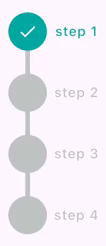
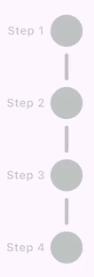
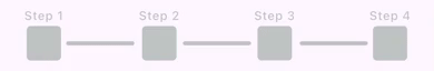
### Example 1: Vertical Step Progress Indicator
Show Implementation
```dart
StepProgress(
totalSteps: 4,
controller: stepProgressController,
axis: Axis.vertical,
nodeTitles: const ['step 1', 'step 2', 'step 3', 'step 4'],
onStepChanged: (index) {
debugPrint('on step changed: $index');
},
onStepNodeTapped: (index) {
debugPrint('on step tapped with index: $index');
},
onStepLineTapped: (index) {
debugPrint('on step line tapped with index: $index');
},
),
```
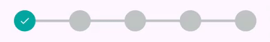
### Example 2: Horizontal Step Progress Without Labels
Show Implementation
```dart
StepProgress(
totalSteps: 5,
padding: const EdgeInsets.symmetric(horizontal: 24),
controller: _stepProgressController,
onStepChanged: (currentIndex) {
setState(() {
currentStep = currentIndex;
});
},
),
```
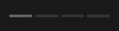
### Example 3: Horizontal Step Progress (Line Only Mode)
Show Implementation
```dart
StepProgress(
totalSteps: 5,
visibilityOptions: StepProgressVisibilityOptions.lineOnly,
controller: stepProgressController,
highlightOptions: StepProgressHighlightOptions.highlightCurrentLine,
onStepChanged: (currentIndex) {
debugPrint('onStepChanged: $currentIndex');
},
onStepLineTapped: (index) {
debugPrint('onStepLineTapped: $index');
},
theme: const StepProgressThemeData(
stepLineSpacing: 6,
defaultForegroundColor: Color.fromARGB(255, 55, 55, 55),
activeForegroundColor: Color.fromARGB(255, 105, 105, 105),
stepLineStyle: StepLineStyle(
lineThickness: 9,
borderRadius: Radius.circular(2),
),
),
),
```
### Example 4: Customized Horizontal Step Progress (Line Only Mode)
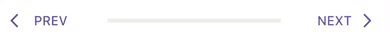
Show Implementation
```dart
Row(
children: [
TextButton.icon(
onPressed: stepProgressController.previousStep,
label: const Text('PREV'),
icon: const Icon(Icons.arrow_back_ios),
),
Expanded(
child: StepProgress(
totalSteps: 5,
visibilityOptions: StepProgressVisibilityOptions.lineOnly,
controller: stepProgressController,
theme: const StepProgressThemeData(
defaultForegroundColor: Color(0xFFeeeee4),
activeForegroundColor: Color(0xFF1A76D2),
),
),
),
TextButton.icon(
onPressed: stepProgressController.nextStep,
label: const Text('NEXT'),
icon: const Icon(Icons.arrow_forward_ios),
iconAlignment: IconAlignment.end,
),
],
),
```
### Example 5: Horizontal Step Progress with Custom Node Icons
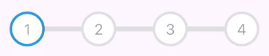
Show Implementation
```dart
StepProgress(
totalSteps: 4,
margin: const EdgeInsets.symmetric(horizontal: 12),
controller: stepProgressController,
nodeIconBuilder: (index, completedStepIndex) {
if (index <= completedStepIndex) {
return Text(
'${index + 1}',
style: const TextStyle(
fontSize: 24,
color: Color(0xFFb1acaa),
),
);
} else {
return Text(
'${index + 1}',
style: const TextStyle(
fontSize: 24,
color: Color(0xFFa2a2ab),
),
);
}
},
theme: const StepProgressThemeData(
defaultForegroundColor: Colors.white,
activeForegroundColor: Colors.white,
borderWidth: 4,
activeBorderColor: Color(0xFF2d9ada),
borderColor: Color(0xFFdee0e2),
stepLineStyle: StepLineStyle(lineThickness: 0),
),
),
```
### Example 6: Horizontal Step Progress with Positioned Labels
Show Implementation
```dart
StepProgress(
totalSteps: 4,
controller: stepProgressController,
nodeTitles: const ['Step 1', 'Step 2', 'Step 3', 'Step 4'],
theme: const StepProgressThemeData(
stepLabelAlignment: StepLabelAlignment.topBottom,
stepLineSpacing: 2,
stepLineStyle: StepLineStyle(lineThickness: 2),
),
),
```
### Example 7: Horizontal Step Progress (Node Only Mode)

Show Implementation
```dart
StepProgress(
totalSteps: 4,
controller: stepProgressController,
visibilityOptions: StepProgressVisibilityOptions.nodeOnly,
nodeSubTitles: const ['sub 1', 'sub 2', 'sub 3', 'sub 4'],
padding: const EdgeInsets.all(18),
theme: const StepProgressThemeData(
stepLabelAlignment: StepLabelAlignment.right,
nodeLabelStyle: StepLabelStyle(labelAxisAlignment: CrossAxisAlignment.start),
),
),
```
### Example 8: Vertical Step Progress with Custom Line Spacing
Show Implementation
```dart
StepProgress(
totalSteps: 4,
controller: stepProgressController,
axis: Axis.vertical,
height: 300,
nodeTitles: const [
'Step 1',
'Step 2',
'Step 3',
'Step 4',
],
padding: const EdgeInsets.all(18),
theme: const StepProgressThemeData(
stepLabelAlignment: StepLabelAlignment.left,
nodeLabelStyle: StepLabelStyle(
labelAxisAlignment: CrossAxisAlignment.start,
),
stepLineSpacing: 24,
stepLineStyle: StepLineStyle(
borderRadius: Radius.circular(4),
),
),
),
```
### Example 9: Horizontal Step Progress with Square Node Shape
Show Implementation
```dart
StepProgress(
totalSteps: 4,
controller: stepProgressController,
nodeTitles: const [
'Step 1',
'Step 2',
'Step 3',
'Step 4',
],
padding: const EdgeInsets.all(18),
theme: const StepProgressThemeData(
shape: StepNodeShape.square,
stepLabelAlignment: StepLabelAlignment.top,
stepLineSpacing: 24,
stepNodeStyle: StepNodeStyle(
decoration: BoxDecoration(
borderRadius: BorderRadius.all(
Radius.circular(4),
),
),
activeDecoration: BoxDecoration(
borderRadius: BorderRadius.all(
Radius.circular(6),
),
),
),
stepLineStyle: StepLineStyle(
borderRadius: Radius.circular(4),
),
),
),
```
### Example 10: Horizontal Step Progress with Triangle Node Shape
Show Implementation
```dart
StepProgress(
totalSteps: 4,
controller: stepProgressController,
visibilityOptions: StepProgressVisibilityOptions.nodeOnly,
nodeTitles: const [
'Step 1',
'Step 2',
'Step 3',
'Step 4',
],
padding: const EdgeInsets.all(18),
theme: const StepProgressThemeData(
shape: StepNodeShape.triangle,
stepLabelAlignment: StepLabelAlignment.left,
stepNodeStyle: StepNodeStyle(
activeIcon: null,
),
),
),
```
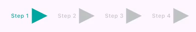
### Example 11: Horizontal Step Progress with Diamond Node Shape
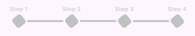
Show Implementation
```dart
StepProgress(
totalSteps: 4,
stepNodeSize: 24,
controller: stepProgressController,
nodeTitles: const [
'Step 1',
'Step 2',
'Step 3',
'Step 4',
],
padding: const EdgeInsets.all(18),
theme: const StepProgressThemeData(
shape: StepNodeShape.diamond,
stepLineSpacing: 18,
stepLineStyle: StepLineStyle(
borderRadius: Radius.circular(4),
),
nodeLabelStyle: StepLabelStyle(
margin: EdgeInsets.only(bottom: 6),
),
stepNodeStyle: StepNodeStyle(
activeIcon: null,
decoration: BoxDecoration(
borderRadius: BorderRadius.all(
Radius.circular(6),
),
),
),
),
),
```
### Example 12: Vertical Step Progress with Hexagon Node Shape
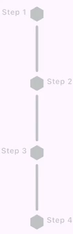
Show Implementation
```dart
StepProgress(
totalSteps: 4,
stepNodeSize: 24,
height: 390,
axis: Axis.vertical,
controller: stepProgressController,
nodeTitles: const [
'Step 1',
'Step 2',
'Step 3',
'Step 4',
],
padding: const EdgeInsets.all(18),
theme: const StepProgressThemeData(
stepLabelAlignment: StepLabelAlignment.leftRight,
shape: StepNodeShape.hexagon,
stepLineSpacing: 18,
stepLineStyle: StepLineStyle(
borderRadius: BorderRadius.all(
Radius.circular(4),
),
),
stepNodeStyle: StepNodeStyle(
decoration: BoxDecoration(
borderRadius: BorderRadius.all(
Radius.circular(6),
),
),
),
),
),
```
### Example 13: Vertical Step Progress with Star Node Shape

Show Implementation
```dart
StepProgress(
totalSteps: 4,
stepNodeSize: 28,
height: 390,
axis: Axis.vertical,
controller: stepProgressController,
padding: const EdgeInsets.all(18),
theme: const StepProgressThemeData(
stepLabelAlignment: StepLabelAlignment.left,
shape: StepNodeShape.star,
stepLineSpacing: 18,
stepLineStyle: StepLineStyle(
lineThickness: 3,
borderRadius: Radius.circular(3),
),
stepNodeStyle: StepNodeStyle(
activeIcon: Icon(
Icons.verified_rounded,
size: 10,
color: Colors.white,
),
icon: Icon(
Icons.more_horiz_outlined,
size: 10,
color: Colors.white,
),
decoration: BoxDecoration(
borderRadius: BorderRadius.all(
Radius.circular(6),
),
),
),
),
),
```
### Example 14: Horizontal Step Progress with Line Labels

Show Implementation
```dart
StepProgress(
totalSteps: 4,
padding: const EdgeInsets.all(10),
lineTitles: const [
'line title 1',
'line title 2',
'line title 3',
],
controller: stepProgressController,
nodeIconBuilder: (index, completedStepIndex) {
if (index <= completedStepIndex) {
return const Icon(
Icons.check,
color: Colors.white,
);
} else {
return const Icon(
Icons.more_horiz,
color: Colors.white,
);
}
},
theme: const StepProgressThemeData(
lineLabelAlignment: Alignment.bottomCenter,
lineLabelStyle: StepLabelStyle(
defualtColor: Colors.grey,
activeColor: Colors.green,
),
stepLineSpacing: 20,
stepLineStyle: StepLineStyle(
lineThickness: 3,
borderRadius: Radius.circular(4),
),
),
),
```
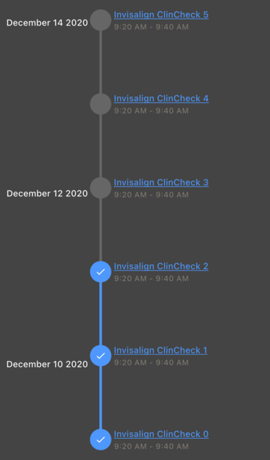
### Example 15: Customized Vertical Step Progress with Line and Node Labels
Show Implementation
```dart
StepProgress(
totalSteps: 6,
padding: const EdgeInsets.all(10),
axis: Axis.vertical,
reversed: true,
controller: stepProgressController,
nodeIconBuilder: (index, completedStepIndex) {
if (index <= completedStepIndex) {
//step completed
return const Icon(
Icons.check,
size: 18,
color: Colors.white,
);
}
return null;
},
lineLabelBuilder: (index, completedStepIndex) {
// here index is index of current line
// (numbers of lines is equal to toalSteps - 1)
if (index.isEven) {
return Text(
'December ${index + 10} 2020',
style: Theme.of(context)
.textTheme
.titleSmall
?.copyWith(color: Colors.white),
);
}
return null;
},
nodeLabelBuilder: (index, completedStepIndex) {
return Column(
mainAxisSize: MainAxisSize.min,
crossAxisAlignment: CrossAxisAlignment.start,
spacing: 2,
children: [
Text(
'Invisalign ClinCheck $index',
maxLines: 3,
style: Theme.of(context).textTheme.titleSmall?.copyWith(
decorationColor: const Color(0xFF4e97fc),
color: const Color(0xFF4e97fc),
decoration: TextDecoration.underline,
),
),
Text(
'9:20 AM - 9:40 AM',
style: Theme.of(context).textTheme.labelMedium?.copyWith(
color: const Color(0xFF7e7971),
),
),
],
);
},
theme: const StepProgressThemeData(
defaultForegroundColor: Color(0xFF666666),
activeForegroundColor: Color(0xFF4e97fc),
lineLabelAlignment: Alignment.topLeft,
nodeLabelStyle: StepLabelStyle(
maxWidth: double.infinity,
margin: EdgeInsets.all(4),
),
lineLabelStyle: StepLabelStyle(
maxWidth: double.infinity,
margin: EdgeInsets.only(
right: 18,
),
),
),
)
```
### Example 16: Horizontal Step Progress with Breadcrumb Lines

Show Implementation
```dart
StepProgress(
totalSteps: 5,
padding: const EdgeInsets.all(10),
controller: stepProgressController,
lineSubTitles: const [
'Step 2',
'Step 3',
'Step 4',
'Step 5',
],
theme: const StepProgressThemeData(
stepLineSpacing: 28,
stepLineStyle: StepLineStyle(
lineThickness: 10,
isBreadcrumb: true,
),
),
)
```
### Example 17: Horizontal Step Progress with Dotted Lines

Show Implementation
```dart
StepProgress(
totalSteps: 5,
padding: const EdgeInsets.all(10),
controller: stepProgressController,
theme: const StepProgressThemeData(
stepLineStyle: StepLineStyle(
borderRadius: Radius.circular(8),
borderStyle: OutterBorderStyle(
isDotted: true,
borderWidth: 3,
),
),
),
)
```
### Example 18: Horizontal Step Progress with Ripple Effect on Nodes

Show Implementation
```dart
StepProgress(
totalSteps: 5,
padding: const EdgeInsets.all(10),
controller: stepProgressController,
theme: const StepProgressThemeData(
enableRippleEffect: true,
),
)
```
### Example 19: Horizontal Step Progress with Highlighted Current Step Node

Show Implementation
```dart
StepProgress(
totalSteps: 5,
padding: const EdgeInsets.all(10),
controller: stepProgressController,
highlightOptions: StepProgressHighlightOptions.highlightCurrentNode,
)
```
### Example 20: Horizontal Step Progress Customized Icons

Show Implementation
```dart
final stepProgressController = StepProgressController(totalSteps: 5);
const nodeIcons = [
Icon(Icons.home),
Icon(Icons.star),
Icon(Icons.settings),
Icon(Icons.person),
Icon(Icons.check)
];
```
```dart
StepProgress(
totalSteps: 5,
stepNodeSize: 75,
padding: const EdgeInsets.all(10),
controller: stepProgressController,
visibilityOptions: StepProgressVisibilityOptions.nodeOnly,
nodeIconBuilder: (index, completedStepIndex) => nodeIcons[index],
theme: const StepProgressThemeData(
stepAnimationDuration: Duration.zero,
stepNodeStyle: StepNodeStyle(
iconColor: Color(0xfffdfdfd),
activeIconColor: Color(0xff72479e),
),
activeForegroundColor: Color(0xFF181818),
defaultForegroundColor: Color(0xff4c4c4c),
),
)
```
### Example 21: Instagram Story Stepper

Show Implementation
```dart
StepProgress(
totalSteps: 5,
padding: const EdgeInsets.all(10),
controller: stepProgressController,
visibilityOptions: StepProgressVisibilityOptions.lineOnly,
autoStartProgress: true,
onStepChanged: (currentIndex) {
debugPrint('Current step changed to: $currentIndex');
},
theme: const StepProgressThemeData(
activeForegroundColor: Color.fromARGB(255, 255, 255, 255),
defaultForegroundColor: Color.fromARGB(255, 171, 168, 168),
stepLineSpacing: 3,
stepLineStyle: StepLineStyle(
lineThickness: 5,
animationDuration: Duration(seconds: 3),
borderRadius: Radius.circular(5),
),
),
),
```
### Example 22: LineFirst mode (horizontal)
Show Implementation
```dart
StepProgress(
totalSteps: 6,
stepNodeSize: 20,
padding: const EdgeInsets.symmetric(vertical: 24),
visibilityOptions: StepProgressVisibilityOptions.lineThenNode,
theme: const StepProgressThemeData(
//stepLineSpacing: 20,
stepNodeStyle: StepNodeStyle(
shape: StepNodeShape.hexagon,
)),
controller: stepProgressController,
),
```
### Example 23: LineFirst mode (horizontal)
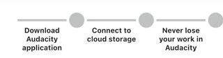
Show Implementation
```dart
StepProgress(
totalSteps: 3,
stepNodeSize: 30,
hasEqualNodeAndLineCount: true, // enable equal node and line count
padding: const EdgeInsets.symmetric(vertical: 24),
visibilityOptions: StepProgressVisibilityOptions.lineThenNode,
lineTitles: const [
'Download Audacity application',
'Connect to cloud storage',
'Never lose your work in Audacity'
],
theme: const StepProgressThemeData(
stepLineSpacing: 20,
lineLabelAlignment: Alignment.bottomCenter,
lineLabelStyle: StepLabelStyle(
defualtColor: Colors.black87,
activeColor: Colors.black87,
margin: EdgeInsets.only(top: 10),
titleStyle: TextStyle(fontSize: 14, fontWeight: FontWeight.bold),
),
stepNodeStyle: StepNodeStyle(
shape: StepNodeShape.circle,
),
),
controller: stepProgressController,
),
```
## Installation
To use StepProgress, add it to your `pubspec.yaml` file:
```yaml
dependencies:
step_progress: latest_version
```
Then, run the following command to install the package:
```bash
flutter pub get
```
## Usage
To use StepProgress in your Flutter app, first import the package:
```dart
import 'package:step_progress/step_progress.dart';
```
### Initialize Your StepProgressController
```dart
final _stepProgressController = StepProgressController(totalStep: 4);
```
### Then Pass Your StepProgressController to the StepProgress Widget
```dart
StepProgress(
controller: _stepProgressController,
totalSteps: 4,
onStepChanged: (index) {
debugPrint('on step changed: $index');
},
),
```
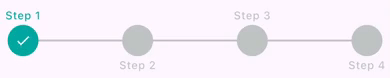
## StepProgressThemeData parameters
| Property | Type | Description | Default Value |
|-------------------------|---------------------|----------------------------------------------------|--------------------------------------------|
|`defaultForegroundColor` |`Color` | The default color of the step nodes. | `Color.fromARGB(255, 191, 196, 195)` |
|`activeForegroundColor` |`Color` | The color of the active step node. | `Color.fromARGB(255, 0, 167, 160)` |
|`borderStyle` |`OutterBorderStyle` | border style of line and nodes. | `null` |
|`enableRippleEffect` |`bool` | Whether to enable the ripple effect on step nodes. | `false` |
|`shape` |`StepNodeShape` | The shape of the step nodes (e.g., circle, square).| `StepNodeShape.circle` |
|`stepAnimationDuration` |`Duration` | The duration of the animation for step transitions.|`Duration(milliseconds: 150)` |
|`stepLineSpacing` |`double` | The spacing between step lines. | `0.0` |
|`nodeLabelAlignment` |`StepLabelAlignment?`| The alignment of the labels for the step nodes. |`null` |
|`lineLabelAlignment` |`Alignment?` | The alignment of the labels for the step lines. |`null` |
|`nodeLabelStyle` |`StepLabelStyle` | The style of the labels for the step nodes. | `StepLabelStyle()` |
|`lineLabelStyle` |`StepLabelStyle` | The style of the labels for the step lines. | `StepLabelStyle(maxWidth: double.infinity)`|
|`stepNodeStyle` |`StepNodeStyle` | The style of the step nodes. | `StepNodeStyle()` |
|`stepLineStyle` |`StepLineStyle` | The style of the lines connecting the step nodes. | `StepLineStyle()` |
|`rippleEffectStyle` |`RippleEffectStyle` | The style of the ripple effect on step nodes. | `RippleEffectStyle()` |
## StepNodeStyle Properties
| Property | Type | Description | Default Value|
| ---------------------- | ------------------ | ------------------------------------------------------------------------------------------------------------ | ----------------------------- |
|`defaultForegroundColor`| `Color?` | The default color for the foreground of the step node. If not set, it will be read from the theme. | `null` |
|`activeForegroundColor` | `Color?` | The color for the foreground of the step node when it is active. If not set, it will be read from the theme. | `null` |
|`borderStyle` | `OutterBorderStyle`| border style of nodes. | `null` |
|`animationDuration` | `Duration?` | The duration of the animation for the step node. If not set, it will be read from the theme. | `null` |
|`iconColor` | `Color` | The color of the icon. | `null` |
|`activeIconColor` | `Color` | The color of the icon when the step node is active. | `null` |
|`shape` | `StepNodeShape` | The shape of the step node. | `null` |
|`decoration` | `BoxDecoration` | The decoration of the step node. | `const BoxDecoration(color: Color.fromARGB(50, 255, 255, 255))` (semi-transparent white) |
|`activeDecoration` | `BoxDecoration` | The decoration of the step node when it is active. | `null` |
|`icon` | `Widget?` | The icon widget to display. | `null` |
|`activeIcon` | `Widget?` | The icon widget to display when the step is active.| `const Icon(Icons.check, size: 18, color: Colors.white)` |
|`enableRippleEffect` | `bool` | Whether to enable the ripple effect. | `true` |
## RippleEffectStyle Properties
| Property | Type | Description | Default Value |
|--------------------|--------------|-------------------------------------------------------------------------------------------|---------------|
| `foregroundColor` | `Color?` | The color of the ripple effect's foreground. If `null`, the theme determines the color. | `null` |
| `animationDuration`| `Duration?` | The duration of the ripple effect animation. If `null`, the theme determines the duration.| `null` |
| `borderColor` | `Color?` | The color of the ripple effect's border. If `null`, the theme determines the color. | `null` |
| `borderWidth` | `double` | The width of the ripple effect's border. | `1` |
## StepLineStyle Properties
| Property | Type | Description | Default Value |
|--------------------|------------------- |----------------------------------------------------------------------------------------|-----------------------|
| `foregroundColor` | `Color?` | The color of the step line. If not set, it will be determined by the theme. | `null` |
| `activeColor` | `Color?` | The color used when the step is active. If not set, it will be determined by the theme.| `null` |
| `animationDuration`| `Duration?` | The duration of the animation. If not set, it will be determined by the theme. | `null` |
| `lineThickness` | `double` | The thickness of the line in the step progress. | `4.0` |
| `borderRadius` | `Radius` | The border radius of the line in the step progress. | `Radius.zero` |
| `isBreadcrumb` | `bool` | Indicates whether the step line is displayed as a breadcrumb. | `false` |
| `chevronAngle` | `double` | Specifies the angle of the chevron in the step line. | `30.0` |
| `borderStyle` | `OutterBorderStyle`| border style of nodes. | `null` |
## OuterBorderStyle Properties
| Property | Type | Description | Default Value |
|--------------------|--------------------|----------------------------------------------------------------------------------------|------------------------------------|
|`borderWidth` | `double` | The width of the border around the step progress indicator. | `2` |
|`defaultBorderColor`| `Color` | The default color of the border when the step is inactive. |`Color.fromARGB(255, 191, 196, 195)`|
|`activeBorderColor` | `Color` | The color of the border when the step is active. |`Color.fromARGB(255, 0, 167, 160)` |
|`isDotted` | `bool` | Determines whether the border is rendered as a dotted line. | `false` |
|`dashPattern` | `List` | The pattern of dashes and gaps for a dotted border. | `[0.7, 4]` |
## StepLabelStyle Properties
| Property | Type | Description | Default Value |
| -------------------- | ------------------- | ---------------------------------------------------------------------------| -------------------------- |
| `labelAxisAlignment` | `CrossAxisAlignment`| The alignment of the label along the cross axis. | `CrossAxisAlignment.center`|
| `titleStyle` | `TextStyle?` | The style to use for the title text. | `null` |
| `subTitleStyle` | `TextStyle?` | The style to use for the subtitle text. | `null` |
| `activeColor` | `Color?` | The color to use when the step is active. | `null` |
| `defualtColor` | `Color?` | The color to use when the step is not active. | `null` |
| `textAlign` | `TextAlign` | How the text should be aligned horizontally. | `TextAlign.center` |
| `titleMaxLines` | `int` | The maximum number of lines for the title text. | `3` |
| `maxWidth` | `double` | The maximum width of the step label. | `48` |
| `subTitleMaxLines` | `int` | The maximum number of lines for the subtitle text. | `3` |
| `overflow` | `TextOverflow` | How visual overflow should be handled. | `TextOverflow.ellipsis` |
| `padding` | `EdgeInsets` | The amount of space to surround the label with. | `EdgeInsets.zero` |
| `margin` | `EdgeInsets` | The amount of space to surround the label with. | `EdgeInsets.all(2)` |
| `animationDuration` | `Duration?` | The duration of the animation when the style changes. | `null` |
--------------
## Support the Package
We appreciate your support for the StepProgress package! You can help us by:
- Liking the package on [pub.dev](https://pub.dev/packages/step_progress).
- Starring the repository on [GitHub](https://github.com/TalebRafiepour/step_progress).
- Reporting any issues or bugs you encounter [here](https://github.com/TalebRafiepour/step_progress/issues).
Your contributions and feedback are invaluable to us!
## Donate
**If you wants to support me:  **
**
## License
`StepProgress` is released under the `BSD-3-Clause` License.
## Contact Me 📨
Feel free to reach out to me through the following platforms:


I look forward to connecting with you!