https://github.com/thenifemi/flutter_polls
🗳 Customizable Polls for Flutter.
https://github.com/thenifemi/flutter_polls
android dart flutter flutter-apps flutter-package flutter-polls flutter-widget ios lib library mobile polling polls votes voting
Last synced: 5 months ago
JSON representation
🗳 Customizable Polls for Flutter.
- Host: GitHub
- URL: https://github.com/thenifemi/flutter_polls
- Owner: thenifemi
- License: mit
- Created: 2022-05-05T20:24:47.000Z (about 4 years ago)
- Default Branch: main
- Last Pushed: 2024-01-31T14:31:56.000Z (over 2 years ago)
- Last Synced: 2025-04-03T00:34:12.274Z (over 1 year ago)
- Topics: android, dart, flutter, flutter-apps, flutter-package, flutter-polls, flutter-widget, ios, lib, library, mobile, polling, polls, votes, voting
- Language: Dart
- Homepage: https://pub.dev/packages/flutter_polls
- Size: 464 KB
- Stars: 34
- Watchers: 2
- Forks: 28
- Open Issues: 4
-
Metadata Files:
- Readme: README.md
- Changelog: CHANGELOG.md
- License: LICENSE
Awesome Lists containing this project
README
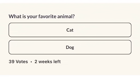
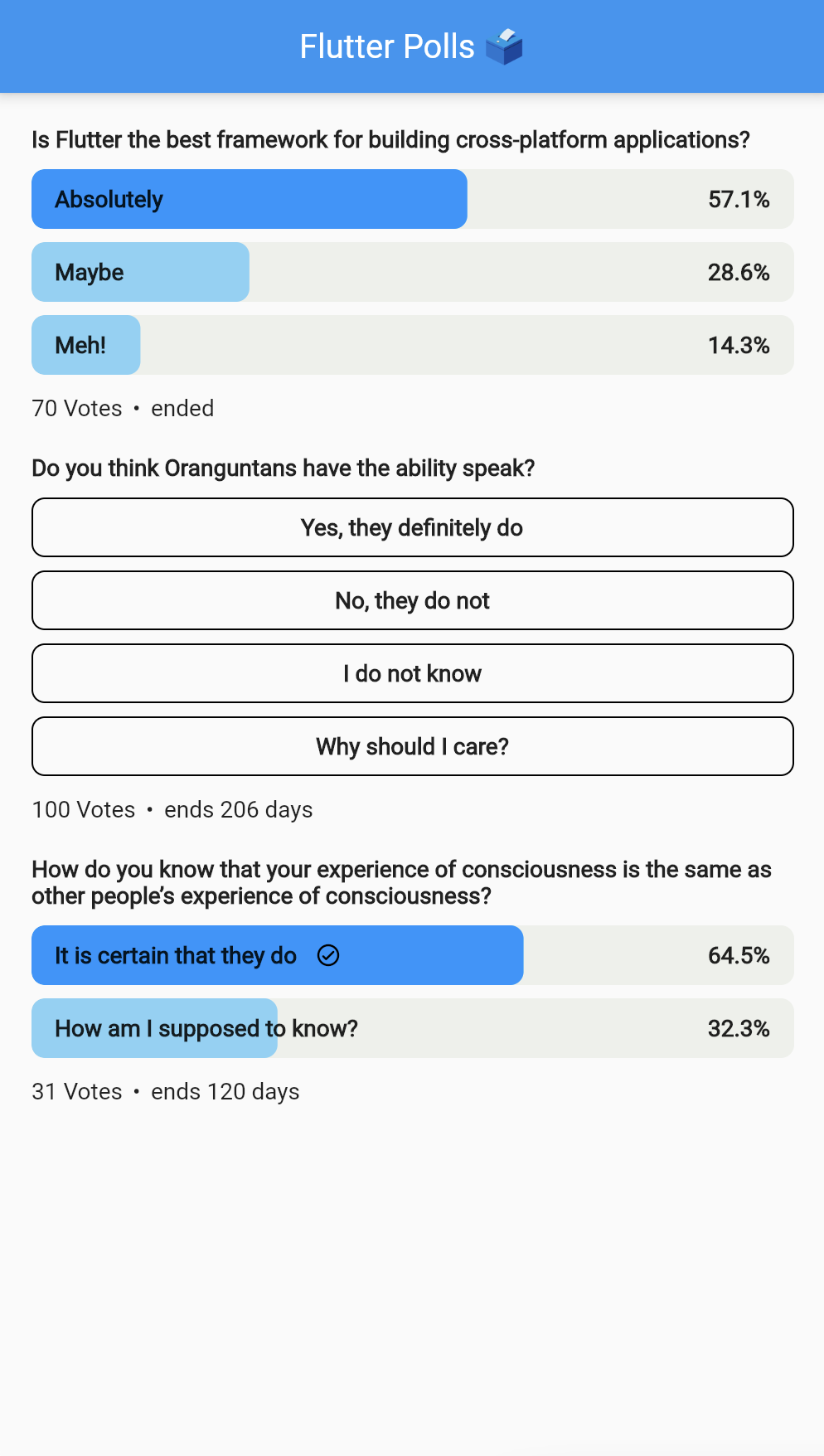
          # Flutter Polls

Customizable Polls for Flutter.

Simple, easy to use and highly customizable.


[Flutter Polls on pub.dev](https://pub.dev/packages/flutter_polls)

## Getting Started

In the `pubspec.yaml` of your flutter project, add the following dependency:

```yaml

dependencies:

  ...

  flutter_polls: ^0.1.6

```

Import it:

```dart

import 'package:flutter_polls/flutter_polls.dart';

```

## Example

Check out the example project in the `example` directory here: [example on github](https://github.com/thenifemi/flutter_polls/tree/main/example)


```dart

FlutterPolls(

    pollId: '1',

    onVoted: (PollOption pollOption, int newTotalVotes) {

      print('Voted: ${pollOption.id}');

    },

    pollOptionsSplashColor: Colors.white(),

    votedProgressColor: Colors.greyDark().withOpacity(0.3),

    votedBackgroundColor: Colors.grey().withOpacity(0.2),

    votesTextStyle: themeData.textTheme.subtitle1,

    votedPercentageTextStyle:

        themeData.textTheme.headline4?.copyWith(

    color: Colors.black(),

    ),

    votedCheckmark: Icon(

        Icons.circle_check,

        color: AppColors.black(),

        height: 18,

        width: 18,

    ),

    pollTitle: Align(

    alignment: Alignment.centerLeft,

    child: AutoSizeText(

        poll['title'],

        style: TextStyle(

            fontSize: 20,

        ),

    ),

    pollOptions: poll['options'].map(

    (option) {

        return PollOption(

        id: option['id'],

        title: AutoSizeText(

            option['title'],

            style: tTextStyle(

            fontSize: 20,

        ),

        ),

        votes: option['votes'],

        );

    },

    ).toList(),

    metaWidget: Row(

    children: [

        const SizedBox(width: 6),

        AutoSizeText(

        '•',

        style: TextStyle(

            fontSize: 20,

        ),

        ),

        const SizedBox(

        width: 6,

        ),

        AutoSizeText(

        '2 weeks left',

        style: TextStyle(

            fontSize: 20,

        ),

        ),

    ],

    ),

),

```

## Parameters

| Parameter                    | Type                                                    | Description                                                                                         |

| ---------------------------- |---------------------------------------------------------| --------------------------------------------------------------------------------------------------- |

| pollId                       | String                                                  | The poll id.                                                                                        |

| hasVoted                     | bool                                                    | Whether the user has voted.                                                                         |

| userVotedOptionId            | String                                                  | The user voted option id. If the user hasn't voted, this will be null.                              |

| onVoted                      | void Function(PollOption pollOption, int newTotalVotes) | The callback when the user voted.                                                                   |

| pollTitle                    | Widget                                                  | The poll title. Can be any widget.                                                                  |

| pollOptions                  | List                                        | The poll options. Each item is a map with the following keys: id, title, votes.                     |

| heightBetweenTitleAndOptions | double                                                  | The height between the poll title and the poll options.                                             |

| heightBetweenOptions         | double                                                  | The height between the poll options.                                                                |

| votesText                    | String                                                  | Votes text. Can be "Votes", "Votos", "Ibo" or whatever language. If not specified, "Votes" is used. |

| votesTextStyle               | TextStyle                                               | The style of the votes text.                                                                        |

| metaWidget                   | Widget                                                  | The meta widget. Can be any widget.                                                                 |

| createdBy                    | String                                                  | The poll creator.                                                                                   |

| userToVote                   | String                                                  | The user to vote.                                                                                   |

| pollStartDate                | DateTime                                                | The poll start date.                                                                                |

| pollEnded                    | bool                                                    | If the poll is closed.                                                                              |

| pollOptionsHeight            | double                                                  | The poll options height.                                                                            |

| pollOptionsWidth             | double                                                  | The poll options width.                                                                             |

| pollOptionsBorderRadius      | BorderRadius                                            | The poll options border radius.                                                                     |

| pollOptionsBorder            | BoxBorder                                               | The poll options border.                                                                            |

| pollOptionsFillColor         | Color                                                   | The poll options fill color.                                                                        |

| pollOptionsSplashColor       | Color                                                   | The poll options splash color.                                                                      |

| votedPollOptionsRadius       | Radius                                                  | The voted poll options border radius.                                                               |

| votedBackgroundColor         | Color                                                   | The voted poll options background color.                                                            |

| votedProgressColor           | Color                                                   | The voted poll options progress color.                                                              |

| voteInProgressColor          | Color                                                   | The voted poll options background color when user has voted and its still in progress.              |

| votedCheckmark               | Widget                                                  | The voted poll options checkmark.                                                                   |

| votedPercentageTextStyle     | TextStyle                                               | The voted poll options percentage text style.                                                       |

| votedAnimationDuration       | int                                                     | The voted poll options animation duration.                                                          |

| loadingWidget                | Widget                                                  | The loading widget when a user votes. Can be any widget.                                            |