https://github.com/therealprohacker/footballviz
https://github.com/therealprohacker/footballviz
Last synced: 12 months ago
JSON representation
- Host: GitHub
- URL: https://github.com/therealprohacker/footballviz
- Owner: theRealProHacker
- Created: 2022-01-15T23:52:14.000Z (over 4 years ago)
- Default Branch: master
- Last Pushed: 2022-02-07T16:29:56.000Z (over 4 years ago)
- Last Synced: 2023-03-26T02:04:37.504Z (over 3 years ago)
- Language: Python
- Size: 4.11 MB
- Stars: 0
- Watchers: 1
- Forks: 0
- Open Issues: 0
-
Metadata Files:
- Readme: README.md
Awesome Lists containing this project
README
# FootballViz Documentation
This project was made by Rashid Harvey and Adel Golghalyani in the [DataViz Module](https://github.com/orgs/FUB-HCC/teams/2021-22_dataviz_students) by the [Human-Centered Computing](https://github.com/FUB-HCC) apartment at Freie Universität Berlin.
Our task was to create a visualization using the [European Soccer Database by Hugo Mathiens](https://www.kaggle.com/hugomathien/soccer)
# Concept
The main idea is to assess the efficiency of Bundesliga teams and compare them.
# Learnings and Reflections
For my part, I surely learned some hard skills like how to implement a microservice architecture. Also, I learned some things about human-centeredness. Really, putting the viewer first in every step of the creation process is already the essence.
### What didn't go as expected?
What never goes as expected is the time spent on doing something. Most things take longer than initially planned. So often so, that it isn't really unexpected at some point.
### What would we do if we had more time?
We would put a bit more time into the little things which are just not fitting in the front-end, also the code quality could be improved for sure. But apart from this, everything is quite fine.
# Tech Stack
For the visualization we used React and Recharts. In the course we learned how to use [altair](https://github.com/altair-viz/altair). However, we chose Recharts because of these reasons:
1. We have more experience with Recharts
1. An Altair chart just doesn't blend in with the surrounding JS/React environment
1. We felt like Recharts gives us more flexibility deciding every single detail
# Design
Tamara Munzner, an expert in data visualization, wrote a book called [Visualization Analysis and Design: Principles, Techniques, and Practice](https://www.amazon.de/Visualization-Analysis-Design-Principles-Techniques/dp/1466508914).
One of the concepts she conveys are the ["Four Nested Levels of Visualization Design"](https://www.cs.ubc.ca/labs/imager/tr/2009/NestedModel/NestedModel.pdf).
Here we will use it to show our design process.
# Domain problem characterization
- Target Users: Football fans
- User Interests: Team efficiency and performance
- User Data: General Information that is publicly broadcasted like which team won the last Bundesliga or what big transfers where done
# Task and Data Abstraction
## Tasks
- Compare teams and their efficiency
- Inspect further details:
- Team progress over any time span
- Transfers for every season and team
- Matches of every season
### How to solve the tasks
- We have to somehow calculate the efficiency of a team
- For this we split the efficiency into four categories
1. Goal per money spent
2. Points per goal scored
3. Number of efficient games (Games won with one goal difference)
4. Number of perfect games (Games won without a goal against)
These categories are then normalized so that the maximum is 100% in every season and then averaged in equal weights to give a total score. The user is supposed to chose the weighting himself, so the default should be unbiased.
### Why these categories?
Because they are a good mixture of different aspects of efficiency
1. aspect: Financial efficiency (1)
2. aspect: Much effect with little effort (2,3)
3. aspect: Success with little risk (4)
## Data
### Sources and reliability
1. European Soccer Database for the backbone of the database with teams and matches. The data only goes from season 2008/2009 to season 2015/2016. [(source)](https://www.kaggle.com/hugomathien/soccer)
1. transfermarkt.de for transfer data and the logo. [(source)](https://www.transfermarkt.de/1-bundesliga/transfers/wettbewerb/L1)
1. Wikipedia for team trivia. [(source)](https://de.wikipedia.org/wiki/Liste_der_Vereine_der_Fu%C3%9Fball-Bundesliga)
1. fussballdaten.de for data verification. [(source)](https://www.fussballdaten.de/bundesliga/)
We cannot be held liable that the data is fully correct, but the data is very very likely correct. Furthermore, the data is easily verifiable.
### Data Processing
- We filtered the data and only kept the data we needed from the original European Soccer Database
- We scraped the data from Wikipepia and transfermarkt.de
- Then we saved the new data in small csv files with four tables:
- Teams
- Team Attributes
- Matches
- Transfers
- This data is then formatted to json on runtime in the back-end and sent to the front-end on request.
# Visual Encoding
## General Encoding Guidelines
- Overview first, detail on demand.
- Soft animation transitions
- Use familiarity (e.g. use common idioms, or use team logos instead of just names)
## Specific Encoding Choices
When you first open the page, you will see an extremely cool hero banner. If you scroll down, there is a bit of context information about the project.
Then you can start a guided tour of the main visualization.
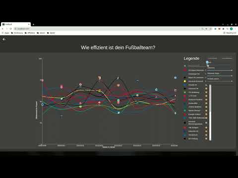
The main visualization is a Line Chart with all Bundesliga teams from 2008/2009 to 2015/2016. The efficency of every team is plotted over the seasons.
You might notice gaps in the plot. These are there to symbolize, that a team didn't play in that season.

Why did we choose a line chart even though the plot almost looks like "Kabelsalat" (cable spaghetti)? The reason is that in our opinion it still is the optimal solution:
1. It feels like the line chart is made for plotting an attribute over time (Why? [Here](https://chartio.com/learn/charts/line-chart-complete-guide/#when-you-should-use-a-line-chart) and [here](https://infogram.com/blog/the-line-chart-how-and-when-to-use-it/), both on the first page when asking ecosia for ["what are line charts made for"](https://www.ecosia.org/search?q=what+are+line+charts+made+for)).
1. Users are familiar with the encoding and can instantly understand it.
1. We tested other encodings like stream graphs and stacked bar charts. Even though they look cleaner, user studies revealed that it is almost impossible to compare two similar teams, let alone reading the value of a single team. With the line chart howoever, it is easy to compare the teams. Which is the core task after the efficiency assessment.
Interacting with the chart is very simple. In the legend you can search and filter teams. Also, you can weight the categories. The chart includes tooltips and logos and colors are matched to every team. When you click on a team, the document is scrolled down to another view.

Following the concept "Overview first, detail on demand", in this view the categories are split up and the team is compared with any team including the average team, which is the default.
Here we also chose a line chart for very similar reasons as the main chart. Here again the chart is highly interactive. A click at a season will give you the next view.

Here, the viewer is served even more detail. Every single match of the specified season is plotted. The Y-axis depends on the chosen category. On the right hand side the data is plotted as a simple bar chart. On the left hand side the data is plotted in an aggregated line chart. We initially plotted both on top of each other, but again user studies showed us, the two Y-Axes on one chart were quite confusing. Now we are pretty sure that there is no confusion. Here again animation and interaction is implemented
- Tooltips tell the opponents, the match result and the match date
- A hover selection is automatically transferred to the other chart for better overview
If you selected the money category, then you might also see this chart below

Obviously this one is also animated. We purposefully chose a simple pie chart without much text; just a colored and sliced circle.
It is supposed to only give an overview of how much money a team spent in relation to how much it earned. The tooltips give detail numbers.
# Screencast
[](http://www.youtube.com/watch?v=QH-KfQWzB_8)