https://github.com/thewebkid/lit-gauge
A fully customizable gauge web component. Add it to a dashboard!
https://github.com/thewebkid/lit-gauge
gauge gauges lit threshold webcomponent
Last synced: 6 months ago
JSON representation
A fully customizable gauge web component. Add it to a dashboard!
- Host: GitHub
- URL: https://github.com/thewebkid/lit-gauge
- Owner: thewebkid
- License: mit
- Created: 2023-11-25T03:48:21.000Z (over 2 years ago)
- Default Branch: master
- Last Pushed: 2024-02-04T00:49:12.000Z (over 2 years ago)
- Last Synced: 2025-02-26T19:40:27.523Z (over 1 year ago)
- Topics: gauge, gauges, lit, threshold, webcomponent
- Language: JavaScript
- Homepage: https://thewebkid.com/modules/lit-gauge
- Size: 375 KB
- Stars: 1
- Watchers: 1
- Forks: 1
- Open Issues: 0
-
Metadata Files:
- Readme: README.md
- License: LICENSE
Awesome Lists containing this project
README
# \ [](https://badge.fury.io/js/lit-gauge) [](https://opensource.org/licenses/MIT)
A snazzy gauge web component to visualize telemetry. Roll/style your own gauge at the link below:
[Live demo and configuration / style editor](https://thewebkid.com/modules/lit-gauge/)
Since this is a [Lit 3 web component](https://lit.dev/), this will work inside any SPA framework. Read the [React integration docs](https://lit.dev/docs/frameworks/react/). Framework-agnostic web components are the future!
## Installation
```bash
npm i lit-gauge
```
## Usage Examples
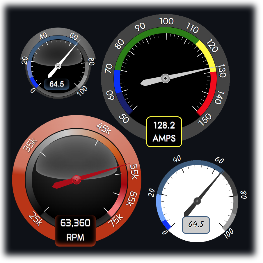
Here are examples using declarative inline attributes. These correspond to the gauges displayed in the screenshot. Styling examples are near the bottom of the readme.
```html
import {LitGauge} from 'lit-gauge';
```
## Usage with single options object
```html
import {LitGauge} from 'lit-gauge';
let g = document.querySelector('lit-gauge');
g.options = {
scaleValues: [50, 60, 70, 115, 130, 150],
scaleColors: ['midnightblue','blue','green','yellow','rgba(255,0,0,1)'],
ticks: 10, minorTicks: 5,
fluidColors: false, plain: true,
valuePrecision: 1
}
```
## Attributes
- **size**: _Number_ - Sets the height and width of the component. This component is square. It starts to look bad below 150px.
- **scaleValues**: _String_ - `(scaleValues="0,10,50,90,100")` Sets the value ranges that will correspond with the color thresholds.
- **scaleColors**: _String_ - `(scaleColors="#333,green,yellow,red")` Sets the colors that fill each value range. Must be exactly one value less than the scaleValues attrib. If you set a `scaleValue=0,10,20,30` then you have created 3 ranges (thresholds) that require a color. scaleColors=#333,#888,#ccc would set 0-10 to #333, 10-20 to #888, and 20-30 to #ccc. Use any valid css color string for each value.
- **fluidColors**: _Boolean_ - Shows a fluid gradient instead of hard stops for the color ranges.
- **ticks**: _String_ - `(ticks="10")` Accepts either a numeric divisor (represents the total count of ranges created by the tick marks), or a csv value string representing custom value positions to place ticks (minor ticks will be disabled). Optionally you can enter `ticks="thresholds"` to place ticks on the scaleValues attrib values. The tick mark total will be one greater than the value you enter since the ranges are bounded on both sizes by marks.
- **minorTicks**: _Number_ - `(minorTicks="5")` Available only when ticks is a numeric value. Subdivides each tick range by the specified value.
- **tickLabels**: _String_ - `(tickLabels="0%,20%,50%,100%")`Override the generated numeric tick values with a CSV string.
- **value**: _Number_ - `(value=runtimeValue)` The runtime value that positions the needle and sets the runtime color value.
- **label**: _String_ - `(label="Volts")` The runtime label to display below the value. If unspecified, the value moves upwards. This should be a short, succinct label.
- **plain**: _Boolean_ - Overrides the lighted glassy appearance. Uses a flat look. You can also do this with the css variables shown below.
- **valuePrecision** _Int_ - For readability the label displays value.toFixed(decimalPrecision). If you have a suggestion for large numbers, please open an issue and share!
## Styling
CSS vars to set custom colors and appearance. Below are the default values. Use the [online editor](https://thewebkid.com/modules/lit-gauge/) to generate your own theme.
```html
lit-gauge{
--font-fam: Roboto, -apple-system, "Helvetica Neue", "Noto Sans", "Liberation Sans", Arial, sans-serif;
--outer-color:#444;//this is the outermost background ring
/*outer-lighting is the lighting effect on the outer band. Uses a conic semi-opaque gradient overlay.*/
--outer-lighting-effect:conic-gradient(from 180deg at 50.0% 50.0%,
rgba(0,0,0,0) 98.00deg,
rgba(255,255,255,0.3) 103.00deg,
rgba(255,255,255,0.5) 180.00deg,
rgba(255,255,255,0.3) 257.00deg,
rgba(0,0,0,0) 265.00deg
);
/* styles for the label at the bottom center*/
--label-bg: #000; /* the label that shows the current value inside*/
--label-color:#fff; /* font color of the label*/
--label-min-width:3em; /* customize to your value so the container does not jiggle when updating the value*/
/* ticks/label styles*/
--tick-color:#fff; /* the tick line color*/
--tick-label-color:#fff;/* the outer numeric tick label colors*/
--tick-label-shadow:0 1px 1px black;/* shadow to apply to the tick-labels to enhance visibility*/
/* dial styles*/
--dial-background:rgb(22,22,22);/* the main inner color*/
--dial-gradient:none;/* you can play with gradients to create your own lighting effect*/
--dial-shadow: 0 0 1em .25em rgba(122,122,122,.8), inset 0 0 2em #bbb;/* used to enhance the space between the color thresholds.*/
--dial-border-width: 1px;/* the dial border is where the outer ring meets the color threshold bands*/
--dial-border-color:#111;
--hand-color: #ddd; /* the needle color*/
}
```
## Styling examples
These are the styles used to create the example screenshot in sequence
```html
#lg1{
--outer-color: #000;
--hand-color: white;
--dial-background: black;
}
#lg2{
--font-fam: Jost;
--hand-color: #ccc;
--dial-background: black;
--dial-shadow:none;
}
#lg3{
--font-fam: Mina;
--outer-color: #400;
--dial-background: black;
--dial-gradient: radial-gradient(200px at 50.0% 10.0%,
rgba(55, 55, 55, 1) 15%,
rgba(0, 0, 0, 1) 70%,
rgba(0, 0, 0, 0) 100%
);
--hand-color: #B4080E;
--dial-border-width: 2px;
--tick-label-shadow: 0 1px 2px black;
--dial-shadow: inset 0 -10px 30px #444;
}
#lg4{
--font-fam: Kalam;
--outer-color: transparent;
--label-color: black;
--dial-background: #fff;
--dial-shadow: none;
--tick-color: black;
--tick-label-color: white;
--hand-color: #333;
--tick-label-shadow: 0 1px 1px black;
--label-bg: #ccc;
}
```
## Run local
Uses vite. Will run on node 16+ - but will complain about compatibility if you are stuck on node 16 like me. Ignore this. It's fine.
```bash
git clone https://github.com/thewebkid/lit-gauge.git
cd ./lit-gauge
npm i
npm dev
```