https://github.com/timc1/postel
tiny react library for building tooltips, flyovers, menus and more
https://github.com/timc1/postel
flyover javascript menu react tooltip
Last synced: 4 months ago
JSON representation
tiny react library for building tooltips, flyovers, menus and more
- Host: GitHub
- URL: https://github.com/timc1/postel
- Owner: timc1
- License: mit
- Created: 2020-06-09T01:59:26.000Z (about 6 years ago)
- Default Branch: master
- Last Pushed: 2023-07-10T01:19:49.000Z (about 3 years ago)
- Last Synced: 2025-11-23T16:02:35.108Z (8 months ago)
- Topics: flyover, javascript, menu, react, tooltip
- Language: TypeScript
- Homepage: https://postel.vercel.app/
- Size: 1.18 MB
- Stars: 82
- Watchers: 1
- Forks: 4
- Open Issues: 12
-
Metadata Files:
- Readme: README.md
- License: LICENSE
Awesome Lists containing this project
README
# Postel 🌑
[](https://badge.fury.io/js/postel)


Postel is a single component that you can easily extend into customized tooltips, dropdowns, flyovers –
any type of UI which would make sense to render outside of your regular React root node, floating
above all other content.
Postel is built on the idea of opening a generic set of props that allow wide customizability. With
that, we attempt to keep the API as simple as possible.
- [Usage](#usage)
- [Props](#props)
- [Contributing](#contributing)
- [Installation](#installation)
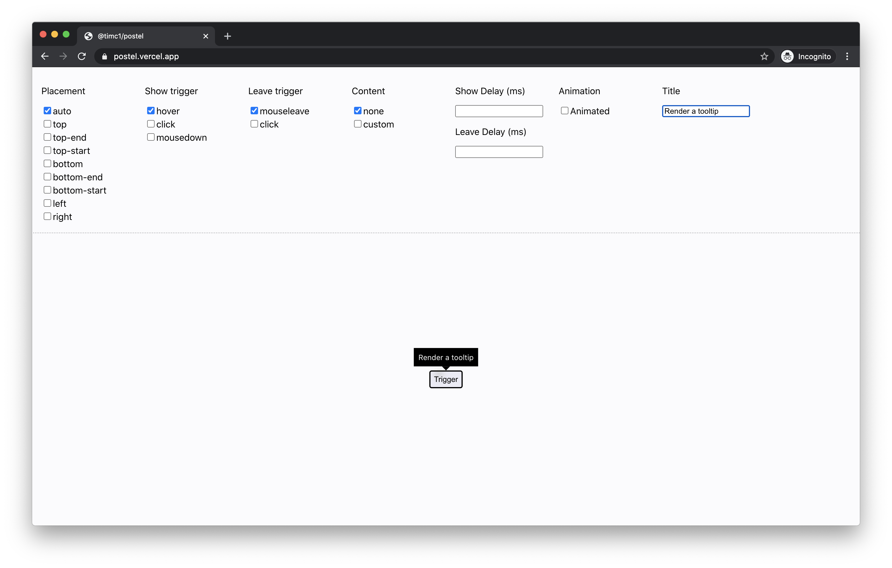
Tooltip
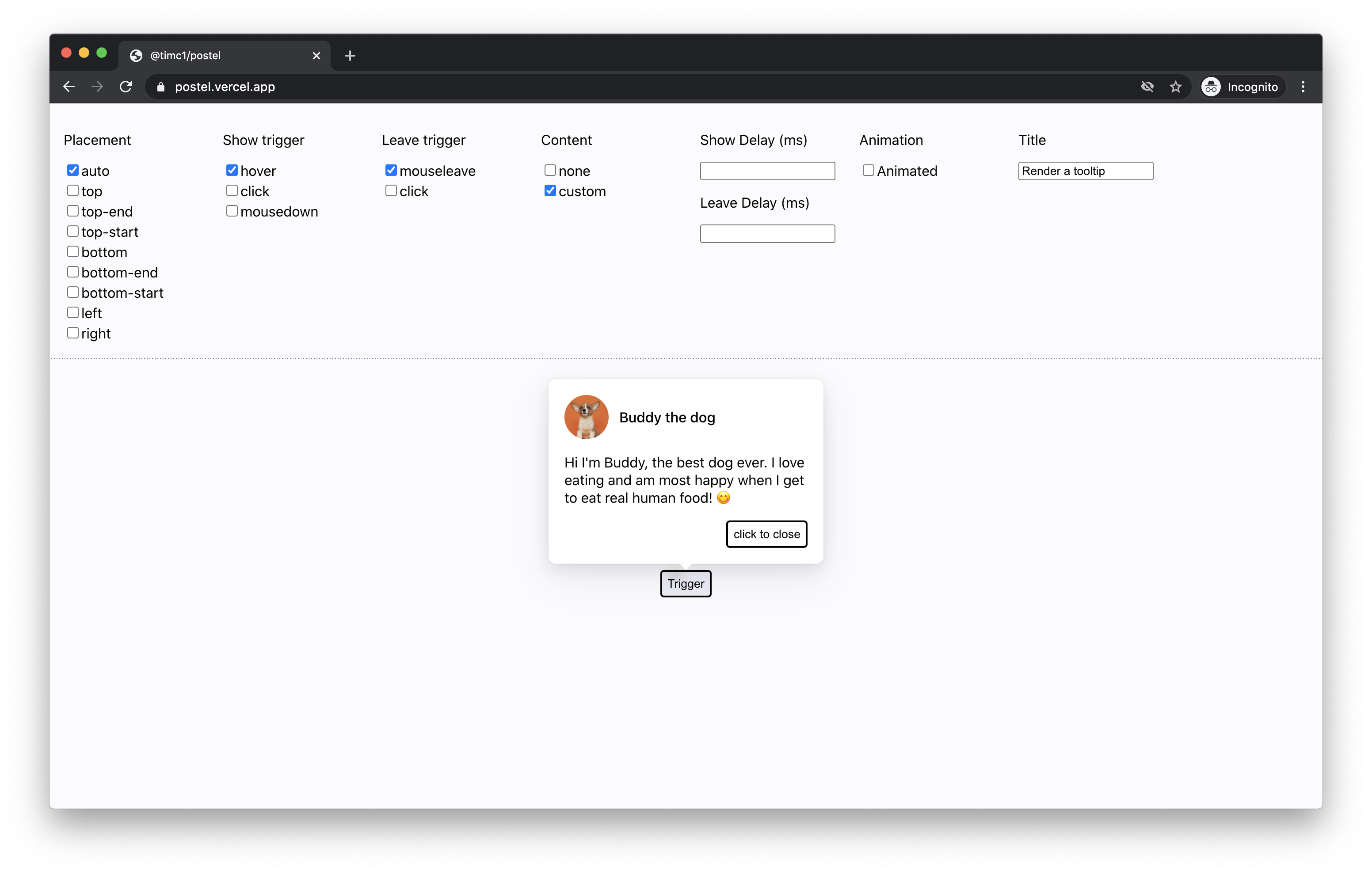
Custom content
### Usage
The simplest usage of Postel is building something like a tooltip – just wrap it around the component that you want to trigger:
```
Tooltip content
}
caret={
}
}}>
Trigger
```
## Props
#### children: React.ReactNode
A valid React child that Postel will attach listeners to.
#### title: string
A string to describe the purpose of what will be shown or hidden.
#### placement?: "auto" | "top" | "top-start" | "top-end" | "left" | "right" | "bottom" | "bottom-start" | "bottom-end"
The position that you want Postel to render your `content` relative to the `children`.
#### preferredAutoPlacement?: "top" | "top-start" | "top-end" | "left" | "right" | "bottom" | "bottom-start" | "bottom-end"
If your placement is set to `auto`, this is the preferred position that you would like `auto` to
default to.
#### trigger?: "hover" | "click" | "mousedown"
The type of action you want to apply to the `children` that will show your `content`.
#### triggerDelay?: number
The time in milliseconds that you want to delay showing the `content` after triggering to show.
#### hideTrigger?: "click" | "mouseleave"
The type of action you want to signal that the `content` should hide.
#### hideDelay?: number
The time in milliseconds that you want to delay hiding the `content` after triggering to hide.
#### transitionOutMs?: number
Important for adding leave animations – the amount of time in milliseconds you want your `content` to animate out before unmounting.
#### showTransparentUnderlay?: boolean
Add this if you want a hidden transparent underlay that will cover the entire screen to prevent clicks on UI outside of your `content`.
#### verticalOffset?: number
Add this if you want to vertically offset the content by n `px`s.
#### horizontalOffset?: number
Add this if you want to horizontally offset the content by n `px`s.
### Contributing
Contributions are welcome! For requests or bugs, please create an issue [here](https://github.com/timc1/postel/issues).
#### Installation
Postel uses `yarn` to manage dependencies. To install, simply run:
`git clone git@github.com:timc1/postel.git`
`cd postel`
`yarn install`
`yarn start`
Navigate to `localhost:8080` and you should see a hot reloading interface to run the code against.