https://github.com/tpkn/vue-spolier
A tiny spoiler component
https://github.com/tpkn/vue-spolier
Last synced: 5 months ago
JSON representation
A tiny spoiler component
- Host: GitHub
- URL: https://github.com/tpkn/vue-spolier
- Owner: tpkn
- License: mit
- Created: 2019-10-13T22:02:28.000Z (over 6 years ago)
- Default Branch: master
- Last Pushed: 2019-12-03T18:29:06.000Z (over 6 years ago)
- Last Synced: 2025-08-18T15:53:11.390Z (10 months ago)
- Language: Vue
- Homepage:
- Size: 35.2 KB
- Stars: 0
- Watchers: 1
- Forks: 0
- Open Issues: 0
-
Metadata Files:
- Readme: README.md
- License: LICENSE
Awesome Lists containing this project
README
# Vue Spoiler
A tiny spoiler component
## Props
### expand
**Type**: _Boolean_
**Default**: `false`
Auto-expand the spoiler
### width
**Type**: _String_
**Default**: `100%`
Spoiler element width
### height
**Type**: _String_
**Default**: `none`
Spoiler `.content` block maximum height
### title
**Type**: _String_
Spoiler title text. Overrides ``
### titleExpanded
**Type**: _String_
Title after the spoiler expands. Overrides ``
### arrow
**Type**: _Boolean_
**Default**: `true`
Arrow icon indicating the spoiler state
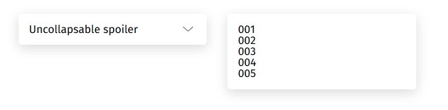
### uncollapsable
**Type**: _Boolean_
**Default**: `false`
If `true`, then title would be removed right after the spoiler expands
## Events
### expanded
Called as soon as the spoiler has expanded
```html
```
## Usage
```javascript
import Spoiler from './components/Spoiler.vue'
Vue.component('Spoiler', Spoiler);
```
### Simple
```html
- 001
- 002
- 003
````
### Auto-expand with changing title
```html
- 001
- 002
- 003
````
### Custom title and limited width
```html
SOME REALLY BIG TITLE
TITLE AFTER EXPANDING
- 001
- 002
- 003
````
## Style
```css
.vue-spoiler {
margin-bottom: 10px;
border-radius: 5px;
border: 1px solid #cccccc;
background-color: white;
font-family: 'Fira Sans';
.title {
padding: 10px 15px;
.arrow {
margin-left: auto;
}
}
.content {
padding: 15px;
}
}
.vue-spoiler.expanded .title {
border-bottom: 1px solid #dbdbdb;
}
```