https://github.com/trinker/space_manikin
https://github.com/trinker/space_manikin
Last synced: 5 months ago
JSON representation
- Host: GitHub
- URL: https://github.com/trinker/space_manikin
- Owner: trinker
- Created: 2014-04-12T04:07:35.000Z (about 12 years ago)
- Default Branch: master
- Last Pushed: 2014-04-12T04:36:46.000Z (about 12 years ago)
- Last Synced: 2025-02-14T12:41:35.997Z (over 1 year ago)
- Language: TeX
- Size: 496 KB
- Stars: 1
- Watchers: 3
- Forks: 0
- Open Issues: 0
-
Metadata Files:
- Readme: README.md
Awesome Lists containing this project
README
space_manikin
===
In this post you will learn how to:
1. Create your own quasi-shape file
2. Plot your homemade quasi-shape file in `ggplot2`
3. Add an external svg/ps graphic to a plot
4. Change a `grid` grob's color and alpha
---
## Background (See [just code](https://raw.githubusercontent.com/trinker/space_manikin/master/space_manikin.R) if you don't care much about the process)
I started my journey wanting to replicate a graphic called a *space manikin* by McNeil (2005) and fill areas in that graphic like a choropleth. I won't share the image from McNeil's book as it's his intellectual property but know that the graphic is from a gesturing book that divides the body up into zones (p. 275). To get a sense of what the manikin looks like here is the `ggplot2` version of it:
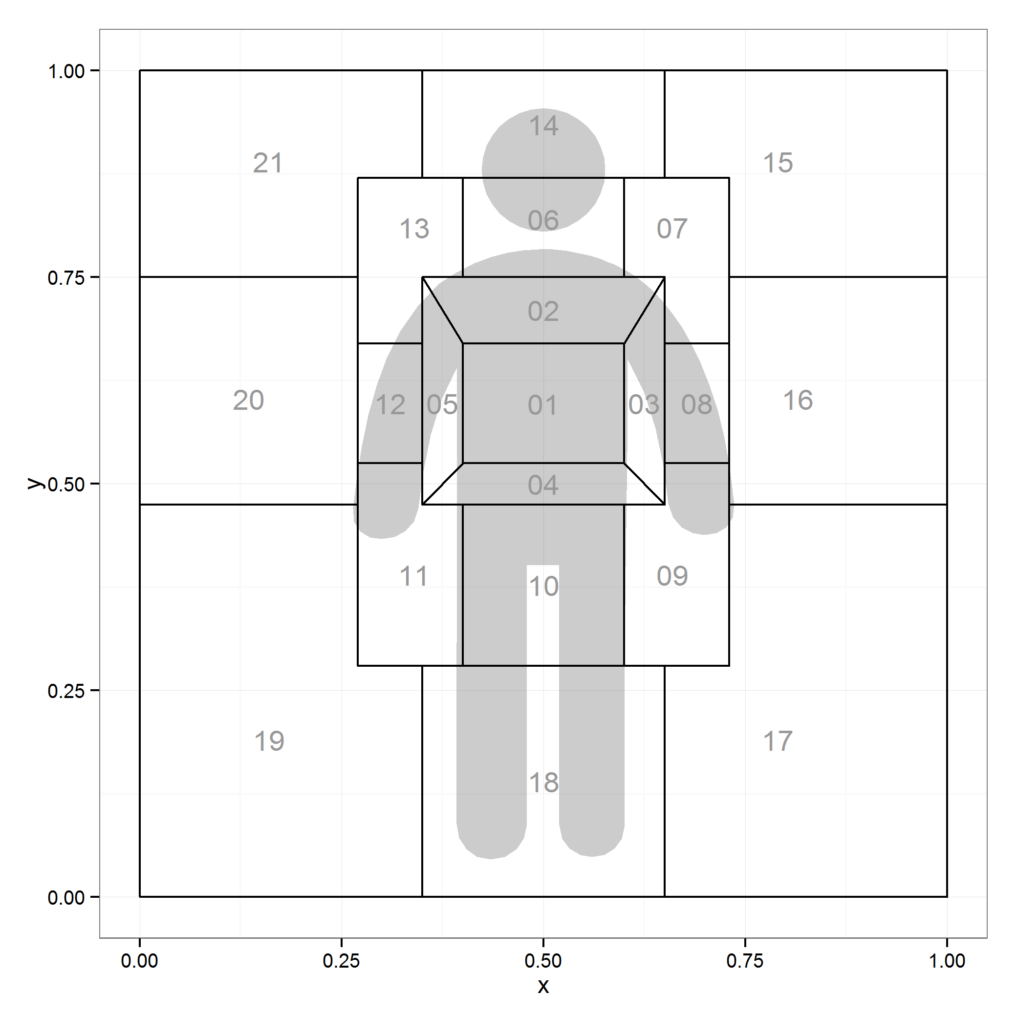
Figure 1: ggplot2 Version of McNeil's (2005) Space Manikin
While this is a map of areas of a body you can see where this could be extended to any number of spatial tasks such as mapping the layout of a room.
---
## 1. Creating a Quasi-Shape File
So I figured "zones" that's about like states on a map. I have toyed with [choropleth maps](http://trinkerrstuff.wordpress.com/2013/07/05/ggplot2-chloropleth-of-supreme-court-decisions-an-tutorial/) of the US in the past and figured I'd generalize this learning. The difference is I'd have to make the shape file myself as the http://cran.r-project.org/web/packages/maps/index.html package doesn't seem to have McNeil's space manikin.
Let's look at what `ggplot2` needs from the `maps` package:
```r
library(maps); library(ggplot2)
head(map_data("state"))
```
```
## long lat group order region subregion
## 1 -87.46 30.39 1 1 alabama
## 2 -87.48 30.37 1 2 alabama
## 3 -87.53 30.37 1 3 alabama
## 4 -87.53 30.33 1 4 alabama
## 5 -87.57 30.33 1 5 alabama
## 6 -87.59 30.33 1 6 alabama
```
Hmm coordinates, names of regions, and order to connect the coordinates. I figured I can handle that. I don't 100% know what a shape file is, mostly that it's a file that makes shapes. What we're making may or may not technically be a shape file but know we're going to map shapes in `ggplot2` (I use the quasi to avoid the wrath of those who do know precisely what a shape file is).
I needed to make the zones around an image of a person so I first grabbed a free png silhouette from: http://www.flaticon.com/free-icon/standing-frontal-man-silhouette_10633. I then knew I'd need to add some lines and figure out the coordinates of the outlines of each cell. So I read the raster image into R, plotted in `ggplot2` and added lots of grid lines for good measure. Here's what I wound up with:
```r
library(png); library(grid); library(qdap)
url_dl(url="http://i.imgur.com/eZ76jcu.png")
file.rename("eZ76jcu.png", "body.png")
img <- rasterGrob(readPNG("body.png"), 0, 0, 1, 1, just=c("left","bottom"))
ggplot(data.frame(x=c(0, 1), y=c(0, 1)), aes(x=x, y=y)) +
geom_point() +
annotation_custom(img, 0, 1, 0, 1) +
scale_x_continuous(breaks=seq(0, 1, by=.05))+
scale_y_continuous(breaks=seq(0, 1, by=.05)) + theme_bw() +
theme(axis.text.x=element_text(angle = 90, hjust = 0, vjust=0))
```

Figure 2: Silhouette from ggplot2 With Grid Lines
---
### 1b. Dirty Deeds Done Cheap
I needed to get reference lines on the plot so I could begin recording coordinates. Likely there's a better process but this is how I approached it and it worked. I exported the ggplot in Figure 2 into ([GASP](http://www.dramabutton.com/)) Microsoft Word (I may have just lost a few die hard command line folks). I added lines and figured out the coordinates of the lines. It looked something like this:
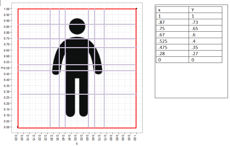
Figure 3: Silhouette from ggplot2 with MS Word Augmented Border Lines
After that I began the tedious task of figuring out the corners of each of the shapes ("zones") in the space manikin. Using Figure 3 and a list structure in R I mapped each of the corners, the approximate shape centers, and the order to plot the coordinates in for each shape. This is the code for corners:
```r
library(qdap)
dat <- list(
`01`=data.frame(x=c(.4, .4, .6, .6), y=c(.67, .525, .525, .67)),
`02`=data.frame(x=c(.35, .4, .6, .65), y=c(.75, .67, .67, .75)),
`03`=data.frame(x=c(.6, .65, .65, .6), y=c(.525, .475, .75, .67)),
`04`=data.frame(x=c(.4, .35, .65, .6), y=c(.525, .475, .475, .525)),
`05`=data.frame(x=c(.35, .35, .4, .4), y=c(.75, .475, .525, .67)),
`06`=data.frame(x=c(.4, .4, .6, .6), y=c(.87, .75, .75, .87)),
`07`=data.frame(x=c(.6, .6, .65, .65, .73, .73), y=c(.87, .75, .75, .67, .67, .87)),
`08`=data.frame(x=c(.65, .65, .73, .73), y=c(.67, .525, .525, .67)),
`09`=data.frame(x=c(.6, .6, .73, .73, .65, .65), y=c(.475, .28, .28, .525, .525, .475)),
`10`=data.frame(x=c(.4, .4, .6, .6), y=c(.475, .28, .28, .475)),
`11`=data.frame(x=c(.27, .27, .4, .4, .35, .35), y=c(.525, .28, .28, .475, .475, .525)),
`12`=data.frame(x=c(.27, .27, .35, .35), y=c(.67, .525, .525, .67)),
`13`=data.frame(x=c(.27, .27, .35, .35, .4, .4), y=c(.87, .67, .67, .75, .75, .87)),
`14`=data.frame(x=c(.35, .35, .65, .65), y=c(1, .87, .87, 1)),
`15`=data.frame(x=c(.65, .65, .73, .73, 1, 1), y=c(1, .87, .87, .75, .75, 1)),
`16`=data.frame(x=c(.73, .73, 1, 1), y=c(.75, .475, .475, .75)),
`17`=data.frame(x=c(.65, .65, 1, 1, .73, .73), y=c(.28, 0, 0, .475, .475, .28)),
`18`=data.frame(x=c(.35, .35, .65, .65), y=c(.28, 0, 0, .28)),
`19`=data.frame(x=c(0, 0, .35, .35, .27, .27), y=c(.475, 0, 0, .28, .28, .475)),
`20`=data.frame(x=c(0, 0, .27, .27), y=c(.75, .475, .475, .75)),
`21`=data.frame(x=c(0, 0, .27, .27, .35, .35), y=c(1, .75, .75, .87, .87, 1))
)
dat <- lapply(dat, function(x) {
x$order <- 1:nrow(x)
x
})
space.manikin.shape <- list_df2df(dat, "id")[, c(2, 3, 1, 4)]
```
And the code for the centers:
```r
centers <- data.frame(
id = unique(space.manikin.shape$id),
center.x=c(.5, .5, .625, .5, .375, .5, .66, .69, .66, .5, .34, .31,
.34, .5, .79, .815, .79, .5, .16, .135, .16),
center.y=c(.597, .71, .5975, .5, .5975, .82, .81, .5975, .39, .3775, .39,
.5975, .81, .935, .89, .6025, .19, .14, .19, .6025, .89)
)
```
There you have it folks your very own quasi-shape file. Celebrate the fruits of your labor by plotting that bad oscar.
---
## 2. Plot Your Homemade Quasi-Shape File
```r
ggplot(centers) + annotation_custom(img,0,1,0,1) +
geom_map(aes(map_id = id), map = space.manikin.shape, colour="black", fill=NA) +
theme_bw()+
expand_limits(space.manikin.shape) +
geom_text(data=centers, aes(center.x, center.y, label = id), color="grey60")
```

Figure 4: Plotting the Quasi-Shape File and a Raster Image
Then I said I may want to tone down the color of the silhouette a bit so I can plot geoms atop without distraction. Here's that attempt.
```r
img[["raster"]][img[["raster"]] == "#0E0F0FFF"] <- "#E7E7E7"
ggplot(centers) + annotation_custom(img,0,1,0,1) +
geom_map(aes(map_id = id), map = space.manikin.shape, colour="black", fill=NA) +
theme_bw()+
expand_limits(space.manikin.shape) +
geom_text(data=centers, aes(center.x, center.y, label = id), color="grey60")
```

Figure 5: Altered Raster Image Color
---
## 3. Add an External svg/ps
I realized quickly a raster was messy. I read up a bit on them in the R Journal ([click here](http://journal.r-project.org/archive/2011-1/RJournal_2011-1_Murrell.pdf)). In the process of reading and fooling around with [Picas](http://picasa.google.com/) I turned my original silhouette (body.png) blue and couldn't fix him. I headed back to http://www.flaticon.com/free-icon/standing-frontal-man-silhouette_10633 to download another. In this act I saw you could download a svg file of the png. I thought maybe this will be less messier and easier to change colors. This lead me to a google search and finding the `grImport` package after seeing his [listserve post](https://stat.ethz.ch/pipermail/r-sig-geo/2009-February/005003.html). And then I saw an article from Paul Murrell (2009) and figured I could turn the svg (I didn't realize what svg was until I opened it in Notepad++) into a ps file and read into R and convert to a flexible grid grob.
Probably there are numerous ways to convert an svg to a ps file but I chose a [cloud convert service](https://cloudconvert.org/svg-to-ps). After I read the file in with `grImport` per the Paul Murrell (2009) article. You're going to have to download the ps file [HERE](https://github.com/trinker/space_manikin/raw/master/images/being.ps) and get to your working directory.
```r
browseURL("https://github.com/trinker/space_manikin/raw/master/images/being.ps")
## Move that file from your downloads to your working directory.
## Sorry I don't know how to automate this.
library(grImport)
## Convert to xml
PostScriptTrace("being.ps")
## Read back in and convert to a grob
being_img <- pictureGrob(readPicture("being.ps.xml"))
## Plot it
ggplot(centers) + annotation_custom(being_img,0,1,0,1) +
geom_map(aes(map_id = id), map = space.manikin.shape,
colour="black", fill=NA) +
theme_bw()+
expand_limits(space.manikin.shape) +
geom_text(data=centers, aes(center.x, center.y,
label = id), color="grey60")
```

Figure 6: Quasi-Shape File with Grob Image Rather than Raster
---
## 4. Change a `grid` Grob's Color and Alpha
Now we have a flexible grob we can mess around with colors and alpha until our heart's content.
`str` is our friend to figure out where and how to mess with the grob (`str(being_img)`). That leads me to the following changes to the image to adjust color and/or alpha (transparency).
```r
being_img[["children"]][[1]][[c("gp", "fill")]] <-
being_img[["children"]][[2]][[c("gp", "fill")]] <- "black"
being_img[["children"]][[1]][[c("gp", "alpha")]] <-
being_img[["children"]][[2]][[c("gp", "alpha")]] <- .2
## Plot it
ggplot(centers) + annotation_custom(being_img,0,1,0,1) +
geom_map(aes(map_id = id), map = space.manikin.shape,
colour="black", fill=NA) +
theme_bw()+
expand_limits(space.manikin.shape) +
geom_text(data=centers, aes(center.x, center.y,
label = id), color="grey60")
```

Figure 7: Quasi-Shape File with Grob Image Alpha = .2
---
## Let's Have Some Fun
Let's make it into a choropleth and a density plot. We'll make some fake fill values to fill with.
```r
set.seed(10)
centers[, "Frequency"] <- rnorm(nrow(centers))
being_img[["children"]][[1]][[c("gp", "alpha")]] <-
being_img[["children"]][[2]][[c("gp", "alpha")]] <- .25
ggplot(centers, aes(fill=Frequency)) +
geom_map(aes(map_id = id), map = space.manikin.shape,
colour="black") +
scale_fill_gradient2(high="red", low="blue") +
theme_bw()+
expand_limits(space.manikin.shape) +
geom_text(data=centers, aes(center.x, center.y,
label = id), color="black") +
annotation_custom(being_img,0,1,0,1)
```

Figure 8: Quasi-Shape File as a Choropleth
```r
set.seed(10)
centers[, "Frequency2"] <- sample(seq(10, 150, by=20, ), nrow(centers), TRUE)
centers2 <- centers[rep(1:nrow(centers), centers[, "Frequency2"]), ]
ggplot(centers2) +
# geom_map(aes(map_id = id), map = space.manikin.shape,
# colour="grey65", fill="white") +
stat_density2d(data = centers2,
aes(x=center.x, y=center.y, alpha=..level..,
fill=..level..), size=2, bins=12, geom="polygon") +
scale_fill_gradient(low = "yellow", high = "red") +
scale_alpha(range = c(0.00, 0.5), guide = FALSE) +
theme_bw()+
expand_limits(space.manikin.shape) +
geom_text(data=centers, aes(center.x, center.y,
label = id), color="black") +
annotation_custom(being_img,0,1,0,1) +
geom_density2d(data = centers2, aes(x=center.x,
y=center.y), colour="black", bins=8, show_guide=FALSE)
```

Figure 9: Quasi-Shape File as a Density Plot
Good times were had by all.
---
Created using the reports (Rinker, 2013) package
Get the .Rmd file here
---
## References
- D. McNeil, (2005) Gesture \& Thought.
- Paul Murrell, (2009) Importing Vector Graphics: The {grImport} Package for {R}. Journal of Statistical Software 30 (4) 1-37 http://www.jstatsoft.org/v30/i04/
- Tyler Rinker, (2013) {reports}: {P}ackage to asssist in report writing. http://github.com/trinker/reports