https://github.com/uduma-sonia/svelte-wizard
A flexible and customizable stepper component for Svelte, perfect for building multi-step forms with progress indicators.
https://github.com/uduma-sonia/svelte-wizard
stepper svelte svelte-library svelte-stepper wizard
Last synced: 5 months ago
JSON representation
A flexible and customizable stepper component for Svelte, perfect for building multi-step forms with progress indicators.
- Host: GitHub
- URL: https://github.com/uduma-sonia/svelte-wizard
- Owner: uduma-sonia
- Created: 2024-11-11T18:11:01.000Z (over 1 year ago)
- Default Branch: main
- Last Pushed: 2025-06-06T07:45:32.000Z (about 1 year ago)
- Last Synced: 2025-11-27T20:12:07.523Z (7 months ago)
- Topics: stepper, svelte, svelte-library, svelte-stepper, wizard
- Language: Svelte
- Homepage: https://svelte-wizard.netlify.app/
- Size: 371 KB
- Stars: 5
- Watchers: 1
- Forks: 0
- Open Issues: 0
-
Metadata Files:
- Readme: README.md
Awesome Lists containing this project
README
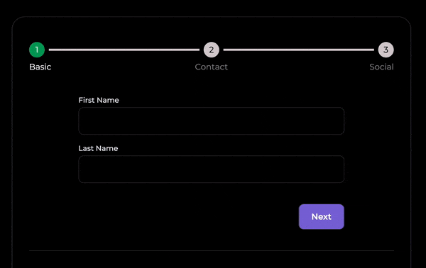
# Svelte Wizard
A flexible, customizable stepper component for Svelte — perfect for building multi-step forms with progress indicators.
Style each step, control navigation, and manage form state your way.

-welcome-brightgreen.svg?style=flat-square)
> ⚠️ Minimum supported Svelte version: **v5**
---
### 📺 [Live Demo](https://svelte-wizard.netlify.app) | 🧪 [Playground](https://svelte.dev/playground/740a81ce5023497eba5c4ebd7f8ec6ad?version=5.1.16)
---
## ⚡ Features
- Custom styling for steps, titles, and progress
- Step navigation and state tracking
- Built-in progress bar
- Animated transitions
- Event dispatching
- Centralized form state
# Installation
```
$ npm i svelte-wizard
```
# 🧩 Basic Usage
```
import { WizardComponent } from 'svelte-wizard';
import StepOne from './StepOne.svelte';
import StepTwo from './StepTwo.svelte';
import StepThree from './StepThree.svelte';
let stepsList = [
{ step: StepOne, title: 'Step One' },
{ step: StepTwo, title: 'Step Two' },
{ step: StepThree, title: 'Step Three' }
];
```
# ⚙️ With Options
```
import { WizardComponent } from 'svelte-wizard';
let stepsList = [...];
let options = $state({
showTitles: true,
showCheckIcon: false
});
```
# 🎨 With Custom Class Names
```
import { WizardComponent } from 'svelte-wizard';
let stepsList = [...];
let customClassnames = $state({
activeTitleClass: 'activeTitleClass'
});
```
# 🧪 Props Reference
### Bindable
| Props | Type | Description |
| --------------- | -------- | ---------------------------------- |
| currentIndex | `number` | Index of the current step |
| wizardFormState | `object` | Shared form state across all steps |
### `stepsList`
| Prop | Type | Description |
| ----- | ----------------- | ---------------------------- |
| step | `SvelteComponent` | The step component to render |
| title | `string` | Title of the step |
| icon | `SvelteComponent` | Optional icon for the step |
### `options`
| Prop | Type | Default | Description |
| ------------------- | ------- | ------- | ----------------------------------------------------------------------------- |
| showTitles | boolean | `true` | Show titles for each step |
| showOneTitle | boolean | `false` | Show only the active step title (requires `showTitles` and `showProgressBar`) |
| showCheckIcon | boolean | `false` | Show check icon on completed steps |
| showStepCount | boolean | `true` | Show step numbers |
| clickableNavigation | boolean | `false` | Allow users to click step indicators to navigate |
| shouldAnimate | boolean | `true` | Animate transitions between steps |
| showProgressBar | boolean | `true` | Display progress bar |
| defaultStep | number | `0` | Index of the initial step |
### `customClassnames`
| Prop | Type | Description |
| ----------------------- | ------ | ---------------------------------------------- |
| activeTitleClass | string | CSS class for active/completed step titles |
| inactiveTitleClass | string | CSS class for inactive step titles |
| activeBarItemClass | string | CSS class for active progress items (dot/line) |
| inactiveBarItemClass | string | CSS class for inactive progress items |
| activeStepNumberClass | string | CSS class for active/current step number |
| inactiveStepNumberClass | string | CSS class for inactive step numbers |
# 📣 Events
Svelte wizard provides custom events to the parent and child components giving control over navigation and form state management.
### Examples
Parent Component
```
console.log(e)} />
```
Child Component
```
let { handleBack, handleSkipTo, handleNext, handleSkipToEnd,handleReset } = $props();
Next
Skip
```
| Event/Prop | Triggered by | Description |
| --------------------- | ------------ | ----------------------------------------------- |
| `onStepChange` | Parent | Fires when current step changes |
| `handleNext` | Child | Goes to the next step |
| `handleBack` | Child | Goes to the previous step |
| `handleSkipTo(index)` | Child | Skips to a specific step |
| `handleSkipToEnd` | Child | Skips to the final step |
| `handleSkipToStart` | Child | Skips to the first step |
| `handleReset` | Child | Resets form state and returns to the first step |
| `handleStateUpdate` | Child | Updates shared `wizardFormState` |
# 🧠 State Management
Svelte Wizard provides a centralized wizardFormState shared across all steps. You can update it using handleStateUpdate
### Accessing `wizardFormState`
```
let { wizardFormState } = $props();
let firstName = $state(wizardFormState?.firstName);
```
### Using `handleStateUpdate`
```
let { handleStateUpdate, wizardFormState } = $props();
const submit = () => {
handleStateUpdate('firstName', 'Jane'); // Set a single key
handleStateUpdate({ lastName: 'Doe' }); // Merge object
handleStateUpdate({ firstName: 'Jane', lastName: 'Doe' }, { replaceAll: true }); // Replace state
};
```
### `handleStateUpdate` Argument Types
| Argument | Type | Description |
| --------------- | ------------------------------- | ------------------------------------- |
| key + value | string, any | Updates a specific field in the state |
| object | object | Merges into `wizardFormState` |
| object + config | object, { replaceAll: boolean } | Optionally replaces the entire state |
## defaultFormState
Svelte wizard also accepts the `defaultFormState` props used to define default data for `wizardFormState`
```
```
# 🎨 Using Custom CSS Classes
To scope styles locally, use :global:
```
:global(.activeTitleClass) { /* styles */ }
:global(.inactiveTitleClass) { /* styles */ }
:global(.activeBarItemClass) { /* styles */ }
:global(.inactiveBarItemClass) { /* styles */ }
:global(.activeStepNumberClass) { /* styles */ }
:global(.inactiveStepNumberClass) { /* styles */ }
```
## 🤝 Contributing
Pull requests are welcome! If you'd like to add features or fix bugs, feel free to fork and submit a PR.
## ⚖️ Licence
MIT (c) [Sonia Uduma](https://sohnya.dev)