https://github.com/ufologist/responsive-page
让你的页面轻松适配各种移动设备和PC端浏览器
https://github.com/ufologist/responsive-page
mobile
Last synced: about 1 year ago
JSON representation
让你的页面轻松适配各种移动设备和PC端浏览器
- Host: GitHub
- URL: https://github.com/ufologist/responsive-page
- Owner: ufologist
- License: mit
- Created: 2015-07-16T09:16:37.000Z (almost 11 years ago)
- Default Branch: master
- Last Pushed: 2019-07-06T08:22:39.000Z (almost 7 years ago)
- Last Synced: 2025-03-26T10:52:19.890Z (about 1 year ago)
- Topics: mobile
- Language: JavaScript
- Homepage: http://ufologist.github.io/responsive-page
- Size: 2.1 MB
- Stars: 147
- Watchers: 5
- Forks: 40
- Open Issues: 1
-
Metadata Files:
- Readme: README.md
- License: LICENSE
Awesome Lists containing this project
- awesome-frontend - responsive-page
- awesome-frontend - responsive-page
- awesome-front-end - responsive-page
README
#  responsive-page
v1.0.0 2015-7-16 by Sun
让你的页面轻松适配各种移动设备和桌面端(PC)浏览器, 1.46 KB only! 无任何其他依赖.
* 非常适合专题着陆页(landing page)
* 页面内容一般为几张图片拼接而成
* 需同时适配移动端和桌面端
* 需自适应宽度
* (绝对)定位元素仅需使用 px 单位即可适配
* 仅需按照 640px(可配置) 宽的设计稿来切图
* 即使内容很长, 换行也需要正确
## 基础原理
计算出页面内容与页面宽度的比率, 通过 transform: scale 缩放页面内容来达到适配任何屏幕(占满屏幕宽度)的目的.
## 兼容性
特性: querySelectorAll, CSS3 transform, matchMedia
* PC端: IE9+, 其他现代浏览器(chrome, firefox等等)
* 移动端: iOS4+, Android 2.3+
## 示例
* [jd.html](http://ufologist.github.io/responsive-page/demo/jd.html) 页面中包含多个需要适配的模块
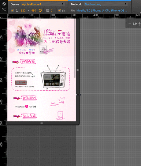
* [70c.html](http://ufologist.github.io/responsive-page/demo/70c.html) 页面仅包含一个需要适配的模块和绝对定位的可点击区域, 并开启 center 模式来适配PC端
页面宽度超过切图宽度后, 不再适配页面宽度, 而是居中显示在页面中

## 使用手册
最好的使用手册就是示例, [下载/引入JS](https://github.com/ufologist/responsive-page/raw/master/responsive-page.min.js), 执行JS, 坐等适配结果
## API文档
```javascript
responsivePage({
selector: '.mod-responsive', // string 内容区域的父级元素, 接受任何合法的CSS选择器
sliceWidth: 640, // number 切图宽度(单位是px), 即设计稿宽度
center: true // boolean 页面宽度超过切图宽度后, 是否不再适配宽度居中显示在页面中
});
```
## 感谢他们给我的灵感
* [pageResponse](https://github.com/peunzhang/pageResponse)
* [JD的页面](http://sale.jd.com/m/act/LZkDEwunm53ilyrR.html) 已经下线了...
如果有任何bug或者问题, 请发个 [issue](https://github.com/ufologist/responsive-page/issues) 给项目, 非常感谢.
## 其他适配方案
* [百分比](http://ufologist.github.io/responsive-page/others-responsive/70c-percent.html)
只用CSS就能够适配屏幕, 比较适合多图片拼接的页面. 由于需要适配屏幕, 因此绝对定位元素的位置, 宽, 高都需要使用百分比来设置, 在布局时我们需要手工将原来的 px 值计算成百分比(特别是 top 难以计算), 让人心好累.
**对于混合大段文字内容时就会出现适配不了的问题, 可能就需要你通过JS来动态设置文字的大小和行高了.**
* [initial-scale](http://ufologist.github.io/responsive-page/others-responsive/70c-initial-scale.html)
用非常简单的JS就能够实现和 responsive-page 一样的适配效果, **但对于混合大段文字内容时就会出现适配不了的问题(这个很可能是移动端浏览器的BUG造成的, 通过chrome模拟时没有这个问题)**
* [rem](http://ufologist.github.io/responsive-page/others-responsive/70c-rem.html) | [flexible](http://ufologist.github.io/responsive-page/others-responsive/flexible.html)
与"百分比"的解决方案类似, 只不过这里使用的是 rem 单位, 使用此方案时所有元素的尺寸单位和位置单位都需要使用 rem, 才能确保适配屏幕时元素的尺寸能够自由适配, 相对于百分比值的计算, 计算出元素的 rem 值要方便多了.
此方案也需要借助 JS 来实现适配的逻辑, 主要是根据屏幕宽度比来修改 root(html) font-size, 以达到适配任何屏幕的目的. 可以参考[web app变革之rem](http://isux.tencent.com/web-app-rem.html)和[阿里无线前端可伸缩布局方案](https://github.com/amfe/lib-flexible)来详细了解下关于 rem 和适配.
**对于混合大段文字内容时也出现了一点点不适配的问题, 文字相对于原始布局出现了一些偏移, 其他方面都很好, 算是非常完满的适配方案了.**
## 版本更新历史
[CHANGLOG](CHANGLOG.md)
## Licence
[MIT](https://github.com/ufologist/responsive-page/blob/master/LICENSE)