https://github.com/ui-d/goel
⚔️ GOEL is an SCSS library, which consists of multiple placeholders, build in utility/functional/atomic style.
https://github.com/ui-d/goel
atomic-css css css3 functional-css placeholder sass sass-framework sass-library utility-classes utility-library utility-placeholder
Last synced: 5 months ago
JSON representation
⚔️ GOEL is an SCSS library, which consists of multiple placeholders, build in utility/functional/atomic style.
- Host: GitHub
- URL: https://github.com/ui-d/goel
- Owner: ui-d
- Created: 2019-11-20T20:21:26.000Z (over 6 years ago)
- Default Branch: master
- Last Pushed: 2019-12-28T16:46:59.000Z (over 6 years ago)
- Last Synced: 2024-10-30T06:58:56.435Z (over 1 year ago)
- Topics: atomic-css, css, css3, functional-css, placeholder, sass, sass-framework, sass-library, utility-classes, utility-library, utility-placeholder
- Language: CSS
- Homepage:
- Size: 1 MB
- Stars: 1
- Watchers: 1
- Forks: 0
- Open Issues: 0
-
Metadata Files:
- Readme: README.md
Awesome Lists containing this project
README


GOEL
Utility SASS Placeholders
GOEL is an SCSS library, which consists of multiple placeholders, build in utility/functional/atomic style.
## Contents
- [Description](#description)
- [Highlights](#highlights)
- [Install](#intsall)
- [Placeholder](#placeholder)
- [Code comparison](#comparison)
- [Utility placeholder implementation](#implementation)
- [Usage](#usage)
- [Output](#output)
- [License](#license)
## Description
Goel is a sass placeholder library, allowing to marry functional and semantic approach in css. It will help you write clean, easy to read code, with DRY output.
## Highlights
This approach comes with multiple benefits for front-end / ui developers.
- match semantic and functional CSS
- create developer-friendly class names using well-known methodologies like BEM, OOCSS
- use a functional approach to CSS
- use well-known architecture like ITCSS
- write clean CSS without unnecessary repetition
- write clean HTML without cluttering it with unnecessary classes
- stop wasting time to set up additional dependencies
- placeholders are not included in output = DRY code
- Tailwind CSS naming convention
- easy to set up and compose as you like
- easy to control how things look
- easy to extend (new placeholders, mixins, variables, etc.)
- clean and beautiful output, configure as you wish
- simple and minimal syntax
## Install
```
npm install @michu1234/goel
```
Import GOEL.scss from @import 'node_modules/@michu1234/goel/GOEL/GOEL' to your SASS file
## PLACEHOLDER
> Sass has a special kind of selector known as a “placeholder”. It looks and acts a lot like a class selector, but **it starts with a % and it's not included in the CSS output**. In fact, any complex selector (the ones between the commas) that even contains a placeholder selector isn't included in the CSS, nor is any style rule whose selectors all contain placeholders,
```scss
// placeholders
%purple {
color: purple;
}
%red {
color: red;
}
p {
@extend %purple;
}
span {
@extend %purple;
}
h2 {
@extend %purple;
}
h1 {
@extend %purple;
}
```
👇
```scss
h1, h2, span, p {
color: purple;
}
```
## Comparison
Let's compare functional and semantic approach
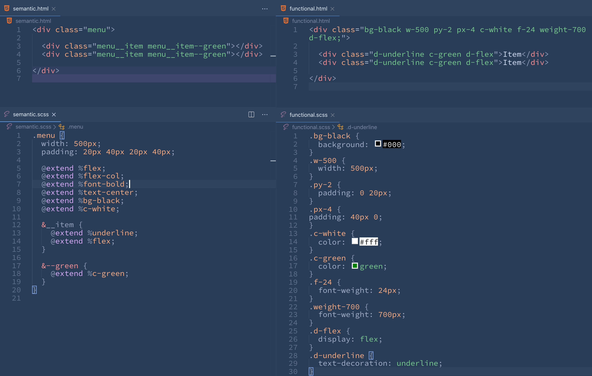
## Implementation
##### 1 GOEL placeholder consists of 1 CSS declaration
```scss
%flex-row {
flex-direction: row;
}
%flex-row-reverse {
flex-direction: row-reverse;
}
%flex-col {
flex-direction: column;
}
%visible {
visibility: visible;
}
%invisible {
visibility: hidden;
}
```
## Usage
```html
```
```scss
.menu {
width: 500px;
padding: 20px 40px 20px 40px;
@extend %flex;
@extend %flex-col;
@extend %font-bold;
@extend %text-center;
@extend %bg-black;
@extend %c-white;
&__item {
@extend %underline;
@extend %flex;
}
&--green {
@extend %c-green;
}
}
```
## Output
```scss
.menu {
@extend %flex;
}
.menu__block {
@extend %flex;
}
.menu__wrapper {
@extend %flex;
}
.menu__list {
@extend %flex;
}
.menu__list-item {
@extend %flex;
}
```
👇
```css
.menu, .menu__block, .menu__wrapper, .menu__list, .menu__list-item {
display: flex;
}
```
## License
[MIT](https://github.com/wolfulus/zoya/blob/master/license.md)