https://github.com/vasilescur/decsci-group-9
DECSCI 101 - Final Project (Group 9)
https://github.com/vasilescur/decsci-group-9
data-analysis decision-science qualtrics statistics visualization
Last synced: 3 months ago
JSON representation
DECSCI 101 - Final Project (Group 9)
- Host: GitHub
- URL: https://github.com/vasilescur/decsci-group-9
- Owner: vasilescur
- Created: 2018-11-05T01:22:42.000Z (over 7 years ago)
- Default Branch: master
- Last Pushed: 2018-12-03T01:19:00.000Z (over 7 years ago)
- Last Synced: 2025-03-06T06:24:32.719Z (over 1 year ago)
- Topics: data-analysis, decision-science, qualtrics, statistics, visualization
- Language: Python
- Size: 47.9 KB
- Stars: 0
- Watchers: 2
- Forks: 0
- Open Issues: 0
-
Metadata Files:
- Readme: README.md
Awesome Lists containing this project
README
# Decision Science 101 Final Project - Group 9
Analysis of the effect of multi/single-attribute decisions on the choice overload effect.
This repository contains the code used to analyze data collected from a Qualtrics survey.
## Data Processing
The data were exported from Qualtrics as a CSV format and then processed in Excel in order to remove irrelevant information such as IP address, date/time, and so on.
Then, the records were split into four different groups based on which columns were non-null:
```python
# Split into confidence values for each type of question
meal_short = data['meal_short'].dropna()
meal_long = data['meal_long'].dropna()
class_short = data['class_short'].dropna()
class_long = data['class_long'].dropna()
```
## Statistical Analysis
### 2x2 ANOVA
The `statsmodels` package was used to perform a 2-way ANOVA. After the satisfaction values
were aggregated into lists by category, the following code was used for the ANOVA:
```python
formula = 'Satisfaction ~ C(Type) + C(Length) + C(Type):C(Length)'
model = ols(formula, aggregate).fit()
aov_table = statsmodels.stats.anova.anova_lm(model, typ=1)
```
The results of the ANOVA were:
```
df sum_sq mean_sq F PR(>F)
C(Type) 1.0 3.582745 3.582745 0.875582 0.350383
C(Length) 1.0 17.122664 17.122664 4.184584 0.041916
C(Type):C(Length) 1.0 0.300051 0.300051 0.073329 0.786790
Residual 233.0 953.399603 4.091844 NaN NaN
```
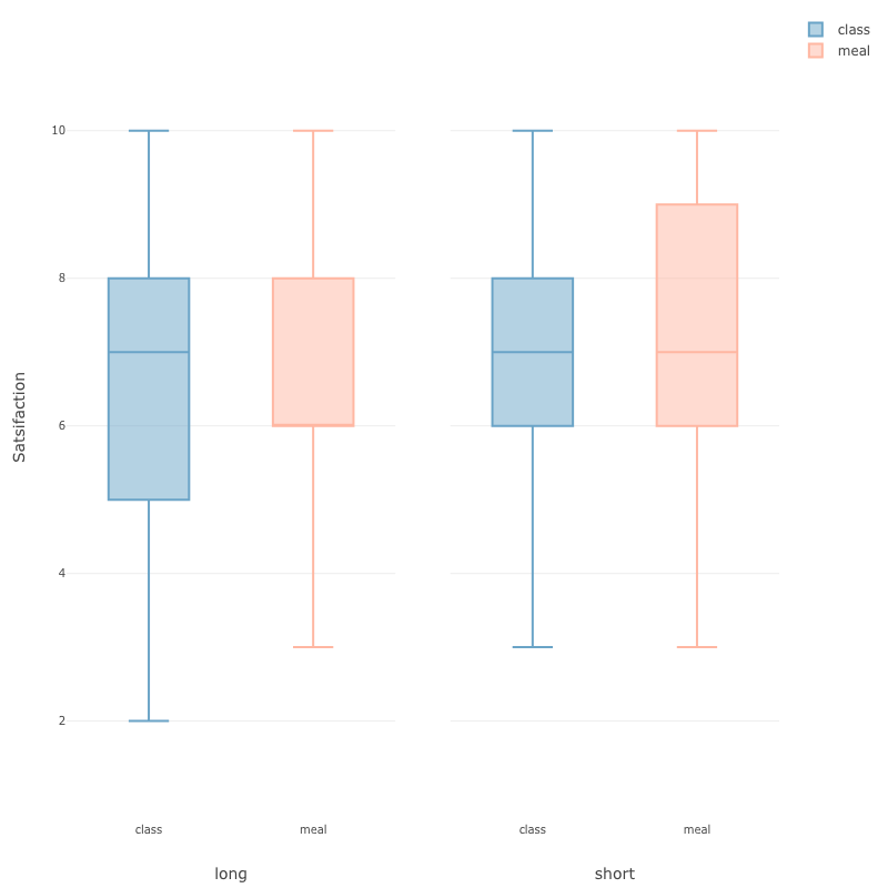
## Results Visualization
### Box & Whiskers Plot
[Exploratory.io](https://exploratory.io) was used to create a data visualization. First, we used Excel to coalesce the data into the following format:
| Type | Length | Response |
| ---- | ------ | -------- |
| class | short | 7 |
| meal | short | 7 |
| class | short | 6 |
| class | long | 10 |
| ... |
Then, the following box-and-whiskers plots were created from the newly formatted data:
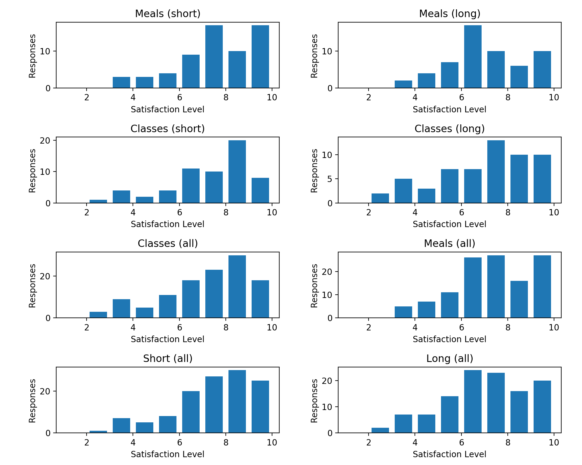
### Histogram Summary
In addition, the `pyplot` package from `matplotlib` was used to create a full visualization of the data consisting of a series of histograms outlining the preference reported by users for each category of question.
Graphs were creates as follows:
```python
plt.subplot(4, 2, 1) # 1st plot
plt.title('Meals (short)')
plt.xlabel('Satisfaction Level')
plt.ylabel('Responses')
plt.hist(
meal_short,
bins=range(1, 11), # 1, 2, ..., 10
rwidth=0.75,
label='Meals (short)'
)
...
# Fix overlapping in layout, and then display the plots
plt.tight_layout()
plt.gcf().canvas.set_window_title('Results') # Window title
plt.show()
```
This resulted in the following visualization:
## Website
A website view of this readme is hosted at [decsci.raduvasilescu.com](http://decsci.raduvasilescu.com).
This host is specified in the `CNAME` file in this repository, and the main HTML page template has been adjusted
from the default Jekyll theme and can be found in `_layouts/default.html`.
## Project Contributors
- Radu Vasilescu
- Zoe Tang
- Claire Hutchinson
- Prateek Khandelwal