https://github.com/vchib1/lightdarkthemetoggle
The LightDarkThemeToggle widget is a customizable and animated light/dark theme toggle switch for Flutter apps. It provides a visually appealing way for users to switch between light and dark modes in your app.
https://github.com/vchib1/lightdarkthemetoggle
animation dart flutter flutter-package flutter-widget pub-dev theme-switch theme-toggle
Last synced: 5 months ago
JSON representation
The LightDarkThemeToggle widget is a customizable and animated light/dark theme toggle switch for Flutter apps. It provides a visually appealing way for users to switch between light and dark modes in your app.
- Host: GitHub
- URL: https://github.com/vchib1/lightdarkthemetoggle
- Owner: vchib1
- License: mit
- Created: 2025-01-16T17:02:42.000Z (over 1 year ago)
- Default Branch: master
- Last Pushed: 2025-02-12T09:37:10.000Z (over 1 year ago)
- Last Synced: 2025-04-08T11:51:41.671Z (over 1 year ago)
- Topics: animation, dart, flutter, flutter-package, flutter-widget, pub-dev, theme-switch, theme-toggle
- Language: Dart
- Homepage: https://pub.dev/packages/light_dark_theme_toggle
- Size: 4.4 MB
- Stars: 2
- Watchers: 1
- Forks: 0
- Open Issues: 0
-
Metadata Files:
- Readme: README.md
- Changelog: CHANGELOG.md
- License: LICENSE
Awesome Lists containing this project
README
# LightDarkThemeToggle
The `LightDarkThemeToggle` widget is a customizable and animated light/dark theme toggle switch for
Flutter apps. It provides a visually appealing way for users to switch between light and dark modes
in your app.
## Features
- Customizable size, color, padding, and tooltip.
- Smooth animations with adjustable duration and curves.
- Multiple animated icon styles using different theme icon types.
- Built entirely with Dart code and `CustomPainter` for efficient rendering and better performance.
## Demo
[LightDarkThemeToggle Web App](https://vchib1.github.io/LightDarkThemeToggleWebApp/)
## Preview
---
## Installation
1. Add the dependency to your `pubspec.yaml`:
```yaml
dependencies:
light_dark_theme_toggle: ^1.1.2
```
2. Import the package in your Dart file:
```dart
import 'package:light_dark_theme_toggle/light_dark_theme_toggle.dart';
```
---
## Usage
Here is an example of how to use the `LightDarkThemeToggle` widget:
```dart
import 'package:flutter/material.dart';
import 'package:light_dark_theme_toggle/light_dark_theme_toggle.dart';
void main() => runApp(MyApp());
class MyApp extends StatelessWidget {
@override
Widget build(BuildContext context) {
return MaterialApp(
theme: ThemeData.light(),
darkTheme: ThemeData.dark(),
themeMode: ThemeMode.system,
home: Scaffold(
appBar: AppBar(title: Text('Light/Dark Theme Toggle')),
body: Center(
child: LightDarkThemeToggle(
value: false,
// Initial value (false for dark, true for light)
onChanged: (bool value) {
// Handle theme change here.
},
size: 48.0,
themeIconType: ThemeIconType.expand,
color: Colors.orange,
tooltip: 'Toggle Theme',
duration: Duration(milliseconds: 500),
curve: Curves.easeInOut,
),
),
),
);
}
}
```
---
## Properties
| Property | Type | Default | Description |
|-------------------|-----------------------|-----------------------------------|------------------------------------------------------------------------|
| `value` | `bool` | Required | Determines whether the toggle is in light (true) or dark (false) mode. |
| `onChanged` | `ValueChanged` | Required | Callback when the toggle is pressed. |
| `themeIconType` | `ThemeIconType` | `ThemeIconType.expand` | Defines the style of the icon. |
| `color` | `Color?` | `ThemeData.colorScheme.onSurface` | Color of the icon. |
| `hoverColor` | `Color?` | `ThemeData.hoverColor` | Hover Color of the toggle. |
| `highlightColor` | `Color?` | `ThemeData.highlightColor` | Highlight Color of the toggle in pressed down state. |
| `focusColor` | `Color?` | `ThemeData.focusColor` | Focus Color of the toggle when it has input focus. |
| `splashColor` | `Color?` | `ThemeData.splashColor` | Splash Color of the toggle. |
| `tooltip` | `String?` | `null` | Tooltip displayed on long press or hover. |
| `padding` | `EdgeInsetsGeometry?` | `null` | Padding around the icon. |
| `size` | `double?` | `IconTheme.size ?? 24.0` | Size of the icon. |
| `duration` | `Duration` | `Duration(milliseconds: 500)` | Duration of the animation. |
| `reverseDuration` | `Duration` | `Duration(milliseconds: 500)` | Duration of the reverse animation. |
| `curve` | `Curve` | `Curves.easeOutBack` | Animation curve for the forward animation. |
| `reverseCurve` | `Curve` | `Curves.easeOutBack` | Animation curve for the reverse animation. |
---
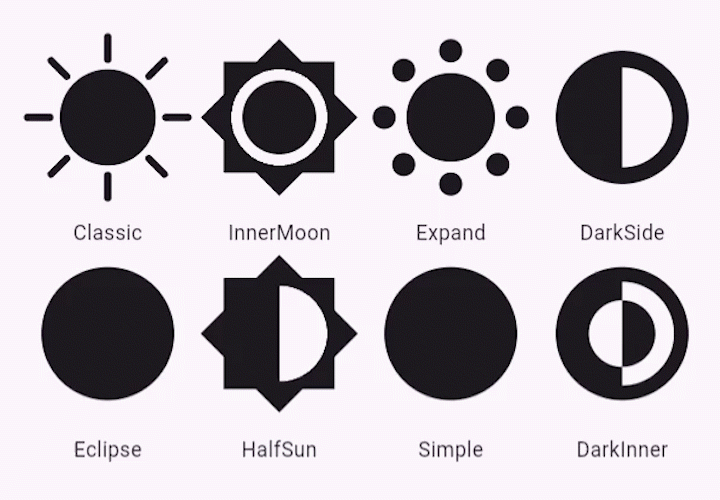
## Theme Icon Types
The widget supports the following icon types via the `ThemeIconType` enum:
- **Classic**
- **Simple**
- **Eclipse**
- **HalfSun**
- **DarkSide**
- **InnerMoon**
- **Expand**
- **DarkInner**
To use an icon type, pass it to the `themeIconType` property. For example:
```dart
LightDarkThemeToggle(
themeIconType:ThemeIconType.eclipse,
...
)
```
---
## Customization
### Animation
You can adjust the animation by changing:
- `duration`: Duration of the forward animation.
- `reverseDuration`: Duration of the reverse animation.
- `curve`: Curve for forward animation.
- `reverseCurve`: Curve for reverse animation.
### Appearance
You can customize the icon's:
- `size`: Adjust the size of the toggle.
- `padding`: Add padding around the icon.
- `tooltip`: Set a tooltip message for accessibility.
- `color`: Change the icon's color.
- `hoverColor`: Change the toggle's color in hovering state.
- `focusColor`: Change the toggle's color when it has the input focus.
- `highlightColor`: Change the toggle's color in pressed down state.
- `splashColor`: Change the toggle's splash color.
---
## License
This project is licensed under the [MIT License](LICENSE).
---
## Contributions
Contributions, issues, and feature requests are welcome! Feel free to check out
the [issues page](https://github.com/vchib1/LightDarkThemeToggle/issues).
---
## Author
[Vivek Chib](https://github.com/vchib1)
---
## Acknowledgments
This package is inspired by [toggles.dev](https://toggles.dev/) created
by [Alfie Jones](https://github.com/AlfieJones).
Special thanks for providing inspiration and ideas that helped shape this package.