https://github.com/velascoandres/ez-forms
An awesome library for Angular to create reactive forms from a configuration file. For the moment it supports angular material and bootstrap style frameworks.
https://github.com/velascoandres/ez-forms
angular package reactive-forms typescript
Last synced: 2 months ago
JSON representation
An awesome library for Angular to create reactive forms from a configuration file. For the moment it supports angular material and bootstrap style frameworks.
- Host: GitHub
- URL: https://github.com/velascoandres/ez-forms
- Owner: velascoandres
- License: gpl-3.0
- Created: 2019-10-28T19:18:45.000Z (over 6 years ago)
- Default Branch: master
- Last Pushed: 2023-01-07T11:10:31.000Z (over 3 years ago)
- Last Synced: 2025-08-08T16:55:07.711Z (11 months ago)
- Topics: angular, package, reactive-forms, typescript
- Language: TypeScript
- Homepage:
- Size: 2.37 MB
- Stars: 2
- Watchers: 1
- Forks: 0
- Open Issues: 23
-
Metadata Files:
- Readme: README.md
- License: LICENSE
Awesome Lists containing this project
README
# ez-form
## Index
1. [Description](#description)
2. [Install](#install)
3. [Usage](#usage)
3.1 [Files](#file)
3.2 [Multiple files](#multiple-files)
3.3 [Autocomplete](#autocomplete)
3.4 [Toaster](#toaster)
3.5 [Bootstrap](#bootstrap)
3.6 [Animations](#animations)
4. [Summary](#summary)
5. [Especial Thanks](#especial-thanks)
## Description
`ez-form` is a component that allows create reactive forms for angular 2+.
``This library makes use of angular material, bocd otstrap and PrimeNG libraries and
components ``
## Install
* Install the package:
```shell script
$ npm i @gordon_freeman/ez-form
```
>You must have bootstrap installed in your angular project
* Import `EzFormModule`
```typescript
@NgModule({
declarations: [
AppComponent
],
imports: [
EzFormModule,
],
providers: [],
bootstrap: [AppComponent]
})
```
## Usage
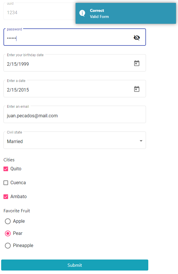
First we need a config object inside of parent component.
For example: we need to create a form with the following fields:
* UUID: `Disabled` input (Optional)
```typescript
uuidField: InputTextFieldInterface = {
controlName: 'uuid',
type: {
typeName: 'input-text'
},
disabled: true,
};
```
* Password: `Password` input (Required)
```typescript
passwordField: InputTextFieldInterface = {
controlName: 'password',
type: {
typeName: 'input-text',
class: 'password',
},
validators: [
Validators.required,
]
};
```
* Brithday: `Date` input (Required)
```typescript
birthdayField: DateFieldInterface = {
controlName: 'birthday',
placeholder: 'Enter your birthday date',
hint: 'Enter a valid date',
type: {
typeName: 'date'
},
validators: [
Validators.required,
]
};
```
* Address: `Long text` input (Required)
```typescript
addressField: TextAreaFieldInterface = {
controlName: 'address',
label: 'Address',
placeholder: 'Enter a complete address',
type: {
typeName: 'textArea',
maxLength: 20,
},
validators: [
Validators.required,
],
};
```
* Email: `Text` input (Required, Email Validation)
```typescript
emailField: InputTextFieldInterface = {
controlName: 'email',
validators: [
Validators.required,
Validators.email
],
placeholder: 'Enter an email',
type: {
typeName: 'input-text',
maxLength: 30,
},
errorMessages: {
required: 'The email is mandatory',
email: 'You must enter a valid email',
},
hint: 'Enter a valid email'
};
```
* Civil State: `Select` input (Required)
```typescript
civilStateField: SimpleSelectFieldInterface = {
controlName: 'civilState',
placeholder: 'Choose a civil state',
label: 'Civil state',
hint: 'Please pick a Civil State',
validators: [
Validators.required
],
type: {
typeName: 'select',
options: [
{
value: 1,
label: 'Married'
},
{
value: 2,
label: 'Single'
}
]
},
};
```
* Cities: `Multiple Select` input (Required, minimum 2)
```typescript
citiesField: CheckFieldInterface = {
controlName: 'cities',
type: {
typeName: 'check',
minRequired: 2,
options: [
{
value: 1,
label: 'Quito'
},
{
value: 2,
label: 'Cuenca'
},
{
value: 3,
label: 'Ambato'
}
]
},
label: 'Cities',
errorMessages: {
required: 'select two cities at least',
}
};
```
* Favorite Fruit: `Radio Button` input (Required)
```typescript
favoriteFruitField: RadioFieldInterface = {
controlName: 'favoriteFruit',
validators: [
Validators.required
],
label: 'Favorite Fruit',
type: {
typeName: 'radio',
options: [
{
value: 3,
label: 'Apple'
},
{
value: 1,
label: 'Pear'
},
{
value: 2,
label: 'Pineapple'
}
],
},
};
```
* Profile Picture: `File` input (Accept images only)
```typescript
profilePictureField: FileFieldInterface = {
controlName: 'profilePicture',
label: 'Profile Picture',
hint: 'Please upload your profile picture',
placeholder: 'Add your profile picture',
validators: [
Validators.required,
FileValidator.extensions(['jpg']),
FileValidator.minSize(100),
FileValidator.maxSize(500),
],
errorMessages: {
required: 'Mandatory File',
fileExtension: 'Please select a jpg file',
fileMinSize: 'File size must be above of 100 kilobytes',
fileMaxSize: 'File size is larger than 500 kilobytes'
},
type: {
typeName: 'file',
multiple: false,
accept: 'image/*',
showFile: true,
},
};
```
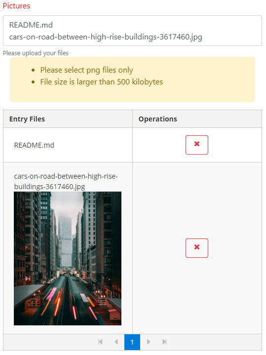
* someFields: `File` input (Multiple)
* Validators: Required, minSize, maxSize, file extension.
```typescript
someFilesField: FileFieldInterface = {
controlName: 'someFiles',
label: 'Pictures',
hint: 'Please upload your files',
placeholder: 'Add Files',
validators: [
Validators.required,
FileValidator.extensions(['png']),
FileValidator.maxSize(500),
],
errorMessages: {
fileExtension: 'Please select png files only',
required: 'Mandatory File',
fileMaxSize: 'File size is larger than 500 kilobytes'
},
type: {
typeName: 'file',
multiple: true,
accept: '*/*',
showFile: true,
tableHeaders: {
actions: 'Operations',
description: 'Entry Files'
}
},
};
```
All fields must be at a config array like this in our parent component, for example:
### `parentComponent.ts`
```typescript
myConfiguration: PrincipalFormFieldInterface[] = [
this.uuidField,
this.passwordField,
this.birthdayField,
this.addressField,
this.emailField,
this.civilStateField,
this.citiesField,
this.favoriteFruitField,
this.profilePictureField,
this.someFilesField,
];
```
So in our `parentComponent.html` call the component.
```html
Submit
```
If we want our form to be filled with default values. We need to declare a object with the controls name as keys example:
```typescript
userData = {
uuid: 1234,
email: 'juan.pecados@mail.com',
civilState: 1,
otherDate: '2015-02-16',
birthday: '1999-02-16',
favoriteFruit: 1,
cities: [1, 3],
password: '12133',
};
```
Template `parentComponent.html`:
```html
Submit
```
The form has an `Output` where you will return the form data or an` undefined` depending
If the form has been filled out correctly.
So we need to make use of the Output : `dataFromForm`"
```html
Submit
```
Results:
## File
## Multiple Files
## Autocomplete
Parent component typescript code:
```typescript
articleField: AutoCompleteFieldInterface = {
controlName: 'article',
validators: [
Validators.required
],
label: 'Wikipedia article',
placeholder: 'Example: DNA',
type: {
typeName: 'autoComplete',
completeMethod: this.filterWikipediaArticleByTitle,
showAttribute: 'title',
componentReference: this,
},
errorMessages: {
required: 'The article is mandatory',
},
hint: 'Search an article'
};
filterWikipediaArticleByTitle(event, contexto) {
return contexto._wikipediaService.find(event.query ? event.query : event);
}
```
### About filter method
```text
The filter service methond must return an observable. If you need format the data from the API,
you should use the `pipe` operator.
```
The `find` method code in wikipedia service:
```typescript
find(query: string): Observable {
const url = `${this.url}&srsearch=${query}`;
return this._httpClient.get(url)
.pipe(
mergeMap(
(response: any) => {
if (response.query) {
return of(response.query.search);
}
return of([]);
}
)
);
}
```
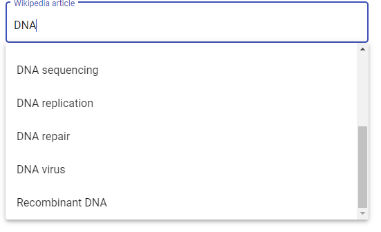
### Results
* Material
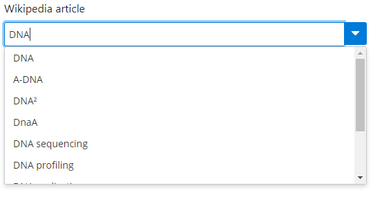
* PRIMENG
```text
I put the PRIMENG autocomplete into bootstrap mode since the boostrap framework does not have an autocomplete component.
```
## Toaster
This library makes use of [angular2-toaster](https://www.npmjs.com/package/angular2-toaster)
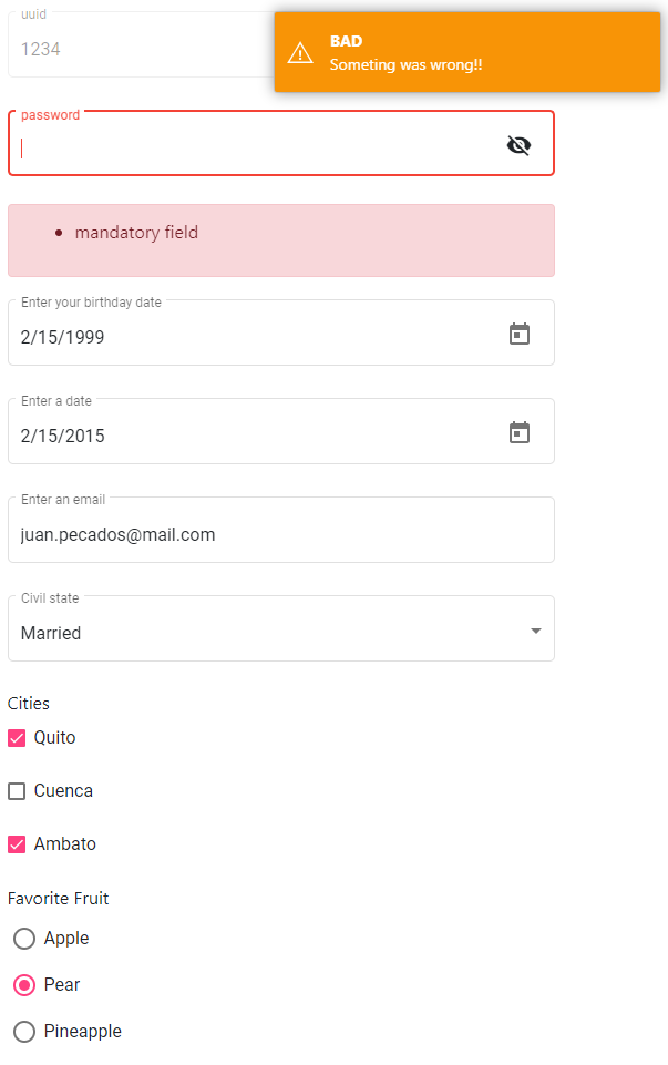
* The toaster is the message which shows on screen when the form has been filled correctly or incorrectly.
* The display of this messages could be optional
We need to make use of the following Input : `showToaster`"
```html
...
```
Also we could config the messages that will show on the toaster:
```typescript
myToasterConfig = {
success: {
type: 'info',
title: 'GOOD',
body: 'All right!!'
},
fail: {
type: 'warning',
title: 'BAD',
body: 'Someting was wrong!!'
}
};
```
Use the input : `toasterConfig`"
```html
...
```
Results:
### Bootstrap
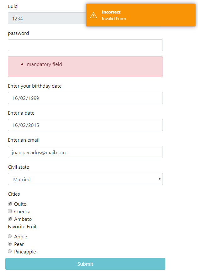
By Deault the ez-form component loads its internal components from `Angular Material`.
* If you want make use of bootstrap components:
Use the Input : `styleFramework`"
```html
..
```
## Results
### Animations
The error messages animations for every form field could be modify, so we need to make use of [animate.css
](https://www.npmjs.com/package/animate.css?activeTab=versions).
Use the Input : `msgErrorAnimation`:
```html
```
Complete example form component:
```html
Submit
```
## Summary
#### Component
|Attribute | Type | Description | Required |
| --- | --- | ---| --- |
| formConfig | Input | Form config object | YES |
| inputData | Input | Form default values object | OPTIONAL
| dataFromForm | OutPut | Data returned from form | YES
| styleFramework | Input | Form style | OPTIONAL
| msgErrorAnimation | Input | Error message animation | OPTIONAL
| toasterConfig | Input | Toaster message configuration object | OPTIONAL
| showToaster | Input | Show Toaster message | OPTIONAL
| fullWidth | Input | Full width of each form fields | OPTIONAL
### Control Object
|Attribute | Description | Required |
| --- | ---| --- |
| controlName | Form Control name | YES
| placeholder | Describes the expected value of an input field | OPTIONAL
| hint | Hint displayed in the input field before the user enters a value | OPTIONAL
| label | Hint displayed in the input field before the user enters a value | OPTIONAL
| type | Input type object: select, input, file, check.. | YES
| validators | Array with angular form validators, it doesn't work with check type | OPTIONAL
### Type Attribute Object
|Attribute | Description |
| --- | ---|
| input | Input field for text and numbers |
| typename | type name: input, select, radio, check, textarea, date, file |
| class | Uniquely for input type. Defines the character type for example a `password` field
| options | Uniquely for select, radio, check
| minRequired | Uniquely for check. Defines how many checks fields are mandatory
| maxLength | Uniquely for input, textarea and date. Defines how many characters are allowed
| showFile | Uniquely for file. Default `false`. Show file or files preview.
### Example Full Code
If you are looking for a full example of this library please check the following [github repository](https://github.com/velascoandrs/ez-form-example)
# Especial Thanks
* [Angular Material](https://material.angular.io/)
* [PrimeNG](https://primefaces.org/primeng/#/)
* [Bootstrap](https://getbootstrap.com/)
* [Animate.css](https://daneden.github.io/animate.css/)
* [angular2-toaster](https://www.npmjs.com/package/angular2-toaster)
* [Pexels](https://www.pexels.com/)
* [chart.js](https://www.chartjs.org/)
* [Quill](https://quilljs.com/)