Ecosyste.ms: Awesome
An open API service indexing awesome lists of open source software.
https://github.com/vonovak/react-native-bottom-toolbar
UI Bar in javascript for react native
https://github.com/vonovak/react-native-bottom-toolbar
android ios menu menubar react-native tabbar tabs
Last synced: 4 months ago
JSON representation
UI Bar in javascript for react native
- Host: GitHub
- URL: https://github.com/vonovak/react-native-bottom-toolbar
- Owner: vonovak
- Created: 2016-11-19T13:02:22.000Z (about 8 years ago)
- Default Branch: master
- Last Pushed: 2022-12-03T15:40:42.000Z (about 2 years ago)
- Last Synced: 2024-09-21T18:50:42.884Z (5 months ago)
- Topics: android, ios, menu, menubar, react-native, tabbar, tabs
- Language: JavaScript
- Homepage:
- Size: 825 KB
- Stars: 48
- Watchers: 5
- Forks: 11
- Open Issues: 4
-
Metadata Files:
- Readme: README.md
- Funding: .github/FUNDING.yml
Awesome Lists containing this project
README
        # react-native-bottom-toolbar

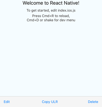
Bottom toolbar styled as in iOS, implemented in JS, typed with Flow. Highly configurable with text or icons (I recommend `react-native-vector-icons`) and nested actions that display in ActionSheetIOS (iOS only). You can also render your own components as content.

### Expo demo

[here](https://expo.io/@vonovak/bottom-toolbar-demo), code for the demo is in the `example` folder

### Installation & usage

`npm i react-native-bottom-toolbar`

or

`yarn add react-native-bottom-toolbar`

```

import BottomToolbar from 'react-native-bottom-toolbar'


      console.warn(index + ' ' + JSON.stringify(propsOfThisAction))}

  />


      console.warn(index + ' ' + JSON.stringify(propsOfThisAction))}

  />


      console.warn(index + ' ' + JSON.stringify(propsOfThisAction))}

  />

```


### Configuration

The component accepts these props:

```

type BottomToolbarProps = {

  IconComponent?: React.ComponentType<*>, // use this together with `color` prop and `iconName` from `BottomToolbar.Action`

  iconSize: number,

  onPress: (number, Object) => any,

  wrapperStyle?: ViewStyleProp,

  textStyle?: ViewStyleProp,

  buttonStyle?: ViewStyleProp,

  color: string,

  disabledColor: string,

  showIf: boolean,

  children: React.Node,

};

type ActionProps = {

  IconElement?: React.Node, // use this to provide your own custom react element (e.g. icon with text)

  IconComponent?: React.ComponentType<*>, // overrides `IconComponent` from `BottomToolbar`

  title: string,

  iconName?: string,

  disabled?: boolean,

  onPress?: (number, Object) => any,

  color?: string,

  testID?: string,

  iconSize?: number,

  actionSheetTitle?: string,

  actionSheetMessage?: string,

};

type NestedActionProps = {

  title: string,

  onPress?: (number, Object) => any,

  style?: 'cancel' | 'destructive',

};

```

The `onPress` function can be specified on three different levels: you may pass it as a prop to the component itself (see the first example), you may include it in the `BottomToolbar.Action` (see the first example), or may include it in the `BottomToolbar.NestedAction` (see the second example).

The function has to be specified on at least one level. You may combine the levels together - the `onPress` of a `BottomToolbar.NestedAction` overrides the `onPress` of an `BottomToolbar.Action`, and the `onPress` of a `BottomToolbar.Action` overrides the `onPress` of the component. This gives you a lot of flexibility - you can have one event handler for all actions and nested actions, or you can specify the handlers separately. The `onPress` function always receives the `action` / `nested action` it was triggered from, so you can easily distinguish the event source.

I suggest you pick an approach that works best for a given scenario and stick with it so you keep you code easy to understand.

### License

MIT