https://github.com/vtan/nickel-hs
Generates a weekly spending chart from tracked data
https://github.com/vtan/nickel-hs
chart-generator haskell spending
Last synced: over 1 year ago
JSON representation
Generates a weekly spending chart from tracked data
- Host: GitHub
- URL: https://github.com/vtan/nickel-hs
- Owner: vtan
- Created: 2016-08-30T17:42:13.000Z (almost 10 years ago)
- Default Branch: master
- Last Pushed: 2017-11-23T21:41:20.000Z (over 8 years ago)
- Last Synced: 2025-02-15T08:37:49.954Z (over 1 year ago)
- Topics: chart-generator, haskell, spending
- Language: Haskell
- Homepage:
- Size: 119 KB
- Stars: 0
- Watchers: 3
- Forks: 0
- Open Issues: 0
-
Metadata Files:
- Readme: README.md
Awesome Lists containing this project
README
# nickel-hs
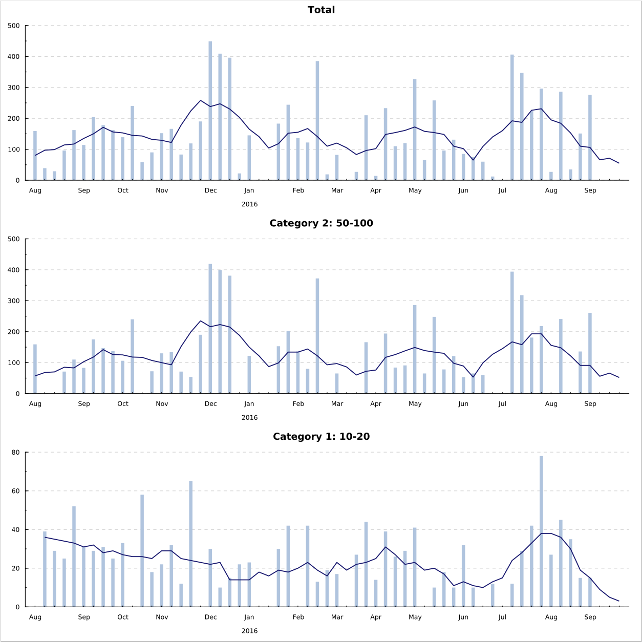
Generates an SVG chart displaying weekly financial expenses split into categories.
[](https://github.com/vtan/nickel/blob/master/example-chart.svg)
## Building and usage
The simplest way is using *[stack](https://www.haskellstack.org/)*,
available in the repositories of many Linux distributions.
You can build and run *nickel* in your shell with:
```
stack build
stack exec nickel < example-data
```
## Input format
The input data is read from the standard input.
Each expense item is stored in a line with the following fields separated by whitespace:
* The minus sign character: `-`
* The date in `yyyy-mm-dd` format
* The expense amount
* The category of the expense item.
It can be enclosed by quotation marks to escape spaces.
* Description -- currently unused.
It can be enclosed by quotation marks to escape spaces.
For an example see [the example file](https://github.com/vtan/nickel/blob/master/example-data).
## Output format
The output file `weekly.svg` is placed in the current directory.
Each tick on the horizontal axis labeled with a month represents the week of the first day of that month.
The bars show the total expenses,
the lines show rolling averages for each week.
The rolling averages are displayed until the previous week (based on the system time).
The categories are ordered by the number of expense items descending.