https://github.com/vtex-apps/disclosure-layout
The Disclosure Layout app creates a layout structure based on disclosure indicators.
https://github.com/vtex-apps/disclosure-layout
hacktoberfest store-framework vtex-io
Last synced: 6 months ago
JSON representation
The Disclosure Layout app creates a layout structure based on disclosure indicators.
- Host: GitHub
- URL: https://github.com/vtex-apps/disclosure-layout
- Owner: vtex-apps
- Created: 2020-08-18T19:09:00.000Z (almost 6 years ago)
- Default Branch: master
- Last Pushed: 2025-04-09T20:39:40.000Z (about 1 year ago)
- Last Synced: 2025-04-09T21:37:26.983Z (about 1 year ago)
- Topics: hacktoberfest, store-framework, vtex-io
- Language: TypeScript
- Homepage:
- Size: 426 KB
- Stars: 1
- Watchers: 8
- Forks: 2
- Open Issues: 4
-
Metadata Files:
- Readme: docs/README.md
- Changelog: CHANGELOG.md
- Codeowners: .github/CODEOWNERS
Awesome Lists containing this project
README
📢 Use this project, [contribute](https://github.com/vtex-apps/disclosure-layout) to it or open issues to help evolve it using [Store Discussion](https://github.com/vtex-apps/store-discussion).
# Disclosure Layout
[](#contributors-)
The Disclosure Layout app creates a layout structure based on disclosure indicators.
 [Check this example](https://github.com/vtex-apps/store-theme/pull/226)
## Configuration
### Step 1 - Adding the Disclosure Layout app to your theme dependencies
In the `manifest.json` file of your theme, add the Disclosure Layout app as a dependency:
```diff
"dependencies": {
+ "vtex.disclosure-layout": "1.x"
}
```
Now, you can use all the blocks exported by the `disclosure-layout` app. See the full list below:
| Block name | Description |
| - | - |
| `disclosure-layout` |  Parent block that enables you to build the disclosure layout using its three children blocks: `disclosure-trigger`, `disclosure-content`, and `disclosure-state-indicator`. |
| `disclosure-trigger` | Declares the blocks that will be rendered as disclosure triggers, i.e., the blocks that, when clicked, will open or close the disclosure content (defined by the `disclosure-content` block). |
| `disclosure-content` | Declares the blocks displaying the desired content when the disclosure trigger is clicked. |
| `disclosure-state-indicator` | Optional block that renders the chevron or other UI elements that change when the disclosure is opened or closed. |
| `disclosure-layout-group` | Wraps many `disclosure-layouts` blocks at once. You can use this block to control when each should be displayed, allowing only one `disclosure-layout` open at a time. |
| `disclosure-trigger-group` | Wraps many `disclosure-trigger` blocks at once. You can use this block to control when and how the `disclosure-layouts` blocks declared inside the `disclosure-layout-group` should be displayed. |
### Step 2 - Adding the Disclosure Layout blocks to your theme templates
Copy one of the examples below and paste it into your desired theme template, changing as necessary. If needed, add the `disclosure-layout` block to the block list of the template.
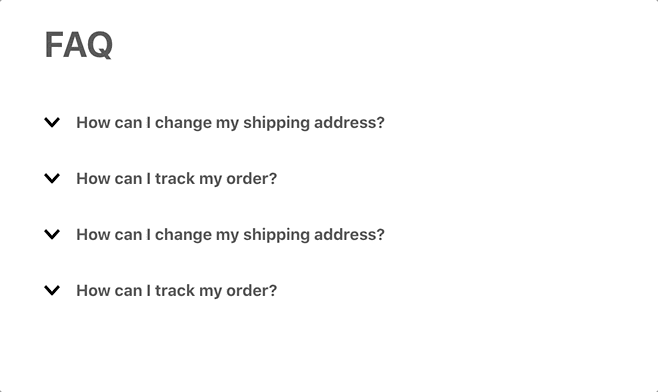
- Simple example:
```json
{
"disclosure-layout#simple": {
"children": ["disclosure-trigger#simple", "disclosure-content#simple"]
},
"disclosure-trigger#simple": {
"children": ["rich-text#question"]
},
"disclosure-content#simple": {
"children": ["rich-text#answer"]
},
"rich-text#question": {
"props": {
"text": "How can I change my shipping address?"
}
},
"rich-text#answer": {
"props": {
"text": "Call us at (212) 123-1234"
}
}
}
```
- Example using the `disclosure-layout-group` block:
```json
{
"disclosure-layout-group#group": {
"children": ["disclosure-layout#first", "disclosure-layout#second"]
},
"disclosure-layout#first": {
"children": ["disclosure-trigger#first", "disclosure-content#first"]
},
"disclosure-trigger#first": {
"children": ["rich-text#question1"]
},
"disclosure-content#first": {
"children": ["rich-text#answer1"]
},
"rich-text#question1": {
"props": {
"text": "How can I change my shipping address?"
}
},
"rich-text#answer1": {
"props": {
"text": "Call us at (212) 123-1234."
}
},
"disclosure-layout#second": {
"children": ["disclosure-trigger#first", "disclosure-content#first"]
},
"disclosure-trigger#second": {
"children": ["rich-text#question1"]
},
"disclosure-content#second": {
"children": ["rich-text#answer1"]
},
"rich-text#question2": {
"props": {
"text": "How can I track my order?"
}
},
"rich-text#answer2": {
"props": {
"text": "After logging in to your account, you can find this information in the Orders link."
}
}
}
```
- Example using the `disclosure-state-indicator` block:
```json
{
"disclosure-state-indicator": {
"props": {
"Show": "icon-angle--down",
"Hide": "icon-angle--up"
}
}
}
```
#### `disclosure-layout` props
| Prop name | Type | Description | Default value |
| - | - | - | - |
| `initialVisibility` | `enum` | Defines the initial visibility of the layout content. Possible values are: `visible` (content initially open) or `hidden` (content is only displayed with user interaction). | `hidden` |
| `animated` | `boolean` | Defines if the layout content should have animations. When set as `true`, this prop will enable additional `data-\*` attributes on the content, which you can use as selectors in CSS. It will also ensure that the element will be hidden once the transition has ended. | `false` |
#### `disclosure-trigger` props
| Prop name | Type | Description | Default value |
| - | - | - | - |
| `Show` | `block` | Name of the block that will be rendered when prompted to show the content. | `undefined` |
| `Hide` | `block` | Name of the block that will be rendered when prompted to hide the content. | `undefined` |
| `as` | `string` | HTML tag to be applied to the component when rendered on the UI. | `button` |
| `children` | `block` | Name of the block that will be rendered if no blocks are declared in the `Show` or `Hide` props. | `undefined` |
| `blockClass` | `string` | Block ID defined by you that will be used in [CSS customizations](https://developers.vtex.com/docs/guides/vtex-io-documentation-using-css-handles-for-store-customization#using-the-blockclass-property). | `undefined` |
#### `disclosure-content` props
| Prop name | Type | Description | Default value |
| - | - | - | - |
| `blockClass` | `string` | Block ID defined by you that will be used in [CSS customizations](https://developers.vtex.com/docs/guides/vtex-io-documentation-using-css-handles-for-store-customization#using-the-blockclass-property). | `undefined` |
| `children` | `[block]` | List of blocks that will render the desired disclosure content. | `undefined` |
#### `disclosure-state-indicator` props
| Prop name | Type | Description | Default value |
| - | - | - | - |
| `Show` | `block` | Name of the block that will be rendered when prompted to show the content. | `undefined` |
| `Hide` | `block` | Name of the block that will be rendered when prompted to hide the content. | `undefined` |
#### `disclosure-layout-group` props
| Prop name | Type | Description | Default value |
| - | - | - | - |
| `maxVisible` | `enum` | Defines how many `disclosure-layout` blocks should be displayed at a time. Possible values are: `one` (only one `disclosure-layout` block should have its content displayed at time) or `many` (different `disclosure-layout` block content can be displayed at time). | `one` |
#### `disclosure-trigger-group` props
| Prop name | Type | Description | Default value |
| - | - | - | - |
| `Show` | `block` | Name of the block that will be rendered when prompted to show the content. | `undefined` |
| `Hide` | `block` | Name of the block that will be rendered when prompted to hide the content. | `undefined` |
| `as` | `string` | HTML tag to be applied to the component when rendered on the UI. | `button` |
| `children` | `block` | Name of the block that will be rendered if no blocks are declared in the `Show` or `Hide` props. | `undefined` |
| `blockClass` | `string` | Block ID defined by you that will be used in [CSS customizations](https://developers.vtex.com/docs/guides/vtex-io-documentation-using-css-handles-for-store-customization#using-the-blockclass-property). | `undefined` |
## Customization
To apply CSS customizations in this and other blocks, follow the instructions given in the recipe on [Using CSS handles for store customization](https://developers.vtex.com/docs/guides/vtex-io-documentation-using-css-handles-for-store-customization).
| CSS handles |
| ----------------------- |
| `content` |
| `content--visible` |
| `content--hidden` |
| `trigger` |
| `trigger--visible` |
| `trigger--hidden` |
| `triggerGroup` |
| `triggerGroup--visible` |
| `triggerGroup--hidden` |
## Contributors ✨
Thanks goes to these wonderful people:
This project follows the [all-contributors](https://github.com/all-contributors/all-contributors) specification. Contributions of any kind are welcome!