https://github.com/vtex-apps/modal-layout
The Modal Layout app provides blocks that can help you create modals in your store.
https://github.com/vtex-apps/modal-layout
hacktoberfest store-framework vtex-io
Last synced: 6 months ago
JSON representation
The Modal Layout app provides blocks that can help you create modals in your store.
- Host: GitHub
- URL: https://github.com/vtex-apps/modal-layout
- Owner: vtex-apps
- Created: 2019-11-19T18:51:37.000Z (over 6 years ago)
- Default Branch: master
- Last Pushed: 2025-07-26T00:00:33.000Z (11 months ago)
- Last Synced: 2025-07-26T07:17:44.265Z (11 months ago)
- Topics: hacktoberfest, store-framework, vtex-io
- Language: TypeScript
- Homepage:
- Size: 800 KB
- Stars: 3
- Watchers: 38
- Forks: 12
- Open Issues: 4
-
Metadata Files:
- Readme: docs/README.md
- Changelog: CHANGELOG.md
- Codeowners: .github/CODEOWNERS
Awesome Lists containing this project
README
📢 Use this project, [contribute](https://github.com/vtex-apps/modal-layout) to it or open issues to help evolve it using [Store Discussion](https://github.com/vtex-apps/store-discussion).
# Modal Layout
[](#contributors-)
The Modal Layout app provides blocks to help you create modals in your store.
## Configuration
1. Add the Modal Layout app to your theme dependencies in the `manifest.json`:
```diff
"dependencies": {
+ "vtex.modal-layout": "0.x"
}
```
Now, you can use all blocks exported by the `modal-layout` app. See the full list below:
| Block name | Description |
| --------------------- | --------------------------------------------------------------------------------------------------------------------------------------------------------------------------------------------------------------------------------------------------------------------------------------------------------------------------------------------------------------- |
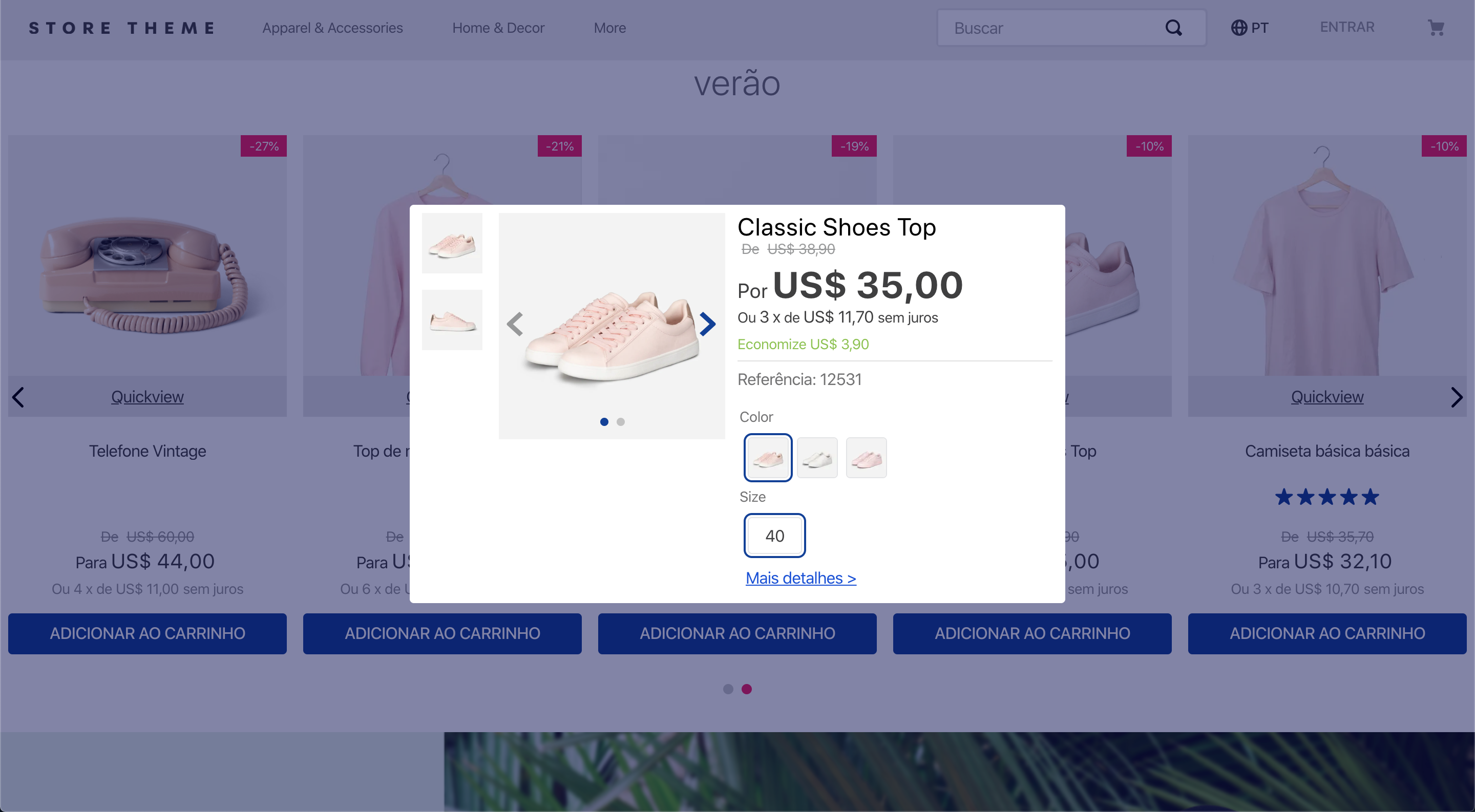
| `modal-trigger` |  Defines how the modal content will be triggered through its children blocks. |
| `modal-layout` |  Defines how the modal content will be rendered through its children blocks. You can declare the `modal-header` and `modal-content` blocks, described below, as children to create a modal with a header and footer. |
| `modal-header` | Renders a close button and the blocks listed as its children, building a modal header. Note that it does not automatically render a header for your modal. Instead, you should create the modal header as you desire using the children list of this block. |
| `modal-content` | Defines how the modal content will be rendered through its children blocks. Preferably, this block should be used along with the `modal-header` block in order to create a modal with a header and a footer. |
| `modal-actions` | Logical block that only renders its child blocks that, in turn, render call-to-action buttons inside the modal, such as a confirmation button. |
| `modal-actions.close` | Button that closes the modal when clicked. It is extremely useful when your modal only has a form or a disclaimer box providing information to the users. |
2. Add the `modal-trigger` block in any store template you choose. In the example below, it will be added to the homepage:
```jsonc
{
"store.home": {
"children": [
"modal-trigger#example"
]
},
```
3. Declare the `modal-trigger` block using its prop and configure the children blocks. The first child block of `modal-trigger` must be a block you choose to trigger the modal content. Then, a sibling block called `modal-layout` will be needed to effectively define the modal content through its child block list. For example:
```jsonc
{
"store.home": {
"children": ["modal-trigger#example"]
},
"modal-trigger#example": {
"children": ["rich-text#example", "modal-layout#example"]
},
"rich-text#example": {
"props": {
"text": "Click me"
}
},
"modal-layout#example": {
"children": ["rich-text#modal-content"]
},
"rich-text#modal-content": {
"props": {
"text": "Hello"
}
}
}
```
In the example above, the [Rich Text](https://developers.vtex.com/docs/apps/vtex.rich-text/) block renders the `Click me` text that will trigger the modal content when clicked. The modal content, in turn, is defined by the `modal-layout` block. Based on the example above, the modal content triggered by the `Click me` Rich Text would be a `Hello` text.
### `modal-trigger` props
| Prop name | Type | Description | Default value |
| ---------------------- | -------- | ------------------------------------------------------------------------------------------------------------------------------------------------------------------------------------------------------------------------------------------------------------------------------------------------------------------------------------------------------------- | ------------- |
| `trigger` | `enum` | Defines whether the modal content should be triggered by user click (`click`), when the page is fully loaded (`load`), or when the page is fully loaded, but the modal will appear just once per session (`load-session`). | `click` |
| `customPixelEventId` | `string` | Store event ID that triggers the `modal-trigger` block (hence triggering the opening of `modal-layout` blocks on the interface as well). | `undefined` |
| `customPixelEventName` | `string` | Store event name that triggers the `modal-trigger` block (hence triggering the opening of `modal-layout` blocks on the interface as well). Some event examples are `'addToCart'` and `'removeFromCart'`. Note that using this prop will make the associated `modal-layout` open in **every** event with the specified name if no `customPixelEventId` is set. | `undefined` |
### `modal-layout` props
| Prop name | Type | Description | Default value |
| ---------------------- | --------- | ------------------------------------------------------------------------------------------------------------------------------------------------------------------------------------------------------------------------------------------------------------------------------------------------------------------------------------------------------------- | ------------- |
| `scroll` | `enum` | Defines how users should scroll the modal. Possible values are: `body` (users can scroll the whole modal by normally scrolling the page) and `content` (users can scroll the modal _content_ when hovering over it). | `content` |
| `blockClass` | `string` | Unique block ID to be used in [CSS customizations](https://developers.vtex.com/docs/guides/vtex-io-documentation-using-css-handles-for-store-customization). | `undefined` |
| `disableEscapeKeyDown` | `boolean` | Defines whether the modal should be closed when pressing the `Esc` key (`true`) or not (`false`). | `false` |
| `fullScreen` | `boolean` | Defines whether the modal should fill the whole screen (`true`) or not (`false`). This prop is responsive, i.e., it adapts to the device breakpoints. | `false` |
| `backdrop` | `enum` | Defines whether the modal will have a clickable backdrop (`clickable`) or no backdrop at all (`none`). This prop is responsive, i.e., it adapts to the device breakpoints. | `clickable` |
| `customPixelEventId` | `string` | Store event ID that triggers the `modal-layout` block (hence triggering the closing of `modal-layout` blocks on the interface as well). | `undefined` |
| `customPixelEventName` | `string` | Store event name that triggers the `modal-layout` block (hence triggering the closing of `modal-layout` blocks on the interface as well). Some event examples are `'addToCart'` and `'removeFromCart'`. Note that using this prop will make the associated `modal-layout` close in **every** event with the specified name if no `customPixelEventId` is set. | `undefined` |
### `modal-header` props
| Prop name | Type | Description | Default value |
| ----------------- | --------- | ------------------------------------------------------------------------------------------------------- | ------------- |
| `showCloseButton` | `boolean` | Defines whether the close icon button should be rendered in the modal header (`true`) or not (`false`). | `true` |
| `iconCloseSize` | `number` | Size (in pixels) of the close icon button in the modal header. | `32` |
### `modal-actions.close` props
| Prop name | Type | Description | Default value |
| --------- | -------- | --------------------------------------------------------------------------------------------------------------------------------------------------------------------------------------------------------------------------------------------------------------- | ------------------------------------------------------------------------------------------------------------------------ |
| `label` | `string` | Defines the text to be rendered in the close button. The default value of this prop depends on the store's default language, which is set according to the website [binding](https://help.vtex.com/tutorial/what-is-binding--4NcN3NJd0IeYccgWCI8O2W?locale=en). | `Cancel`, `Cancelar`, or `Cancelar` for stores whose default language is, respectively, English, Spanish, or Portuguese. |
## Customization
To apply CSS customizations in this and other blocks, follow the instructions given in the recipe on [Using CSS handles for store customization](https://developers.vtex.com/docs/guides/vtex-io-documentation-using-css-handles-for-store-customization).
| CSS handles |
| ---------------------- |
| `modal` |
| `backdropContainer` |
| `backdrop` |
| `closeButtonContainer` |
| `closeButton` |
| `container` |
| `contentContainer` |
| `headerContainer` |
| `headerContent` |
| `paper` |
| `topRow` |
| `triggerContainer` |
## Contributors ✨
Thanks goes to these wonderful people:

Beatriz Miranda
💻

weslybrandao
💻

Renan Guerra
💻
This project follows the [all-contributors](https://github.com/all-contributors/all-contributors) specification. Contributions of any kind are welcome!