https://github.com/vtex-apps/overlay-layout
The Overlay Layout app provides blocks that help you create a Dropdown, Select or a Tooltip component.
https://github.com/vtex-apps/overlay-layout
hacktoberfest store-framework vtex-io
Last synced: 6 months ago
JSON representation
The Overlay Layout app provides blocks that help you create a Dropdown, Select or a Tooltip component.
- Host: GitHub
- URL: https://github.com/vtex-apps/overlay-layout
- Owner: vtex-apps
- Created: 2020-01-21T18:16:37.000Z (over 6 years ago)
- Default Branch: master
- Last Pushed: 2025-04-09T20:45:01.000Z (about 1 year ago)
- Last Synced: 2025-04-09T21:38:09.004Z (about 1 year ago)
- Topics: hacktoberfest, store-framework, vtex-io
- Language: TypeScript
- Homepage:
- Size: 579 KB
- Stars: 0
- Watchers: 40
- Forks: 1
- Open Issues: 0
-
Metadata Files:
- Readme: docs/README.md
- Changelog: CHANGELOG.md
- Codeowners: .github/CODEOWNERS
Awesome Lists containing this project
README
📢 Use this project, [contribute](https://github.com/vtex-apps/overlay-layout) to it or open issues to help evolve it using [Store Discussion](https://github.com/vtex-apps/store-discussion).
# Overlay Layout
[](#contributors-)
The Overlay Layout app provides blocks that help you create a Dropdown, Select or a Tooltip component.
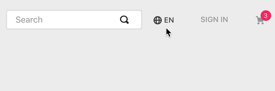
*Example of a [Locale Switcher](https://vtex.io/docs/components/all/vtex.locale-switcher@0.5.5) using the Overlay Layout*.
## Configuration
1. Add the Overlay Layout app to your theme's dependencies in the `manifest.json`, for example:
```jsonc
{
"dependencies": {
"vtex.overlay-layout": "0.x"
}
}
```
Now you can use the two blocks exported by the app:
Block name | Description |
| --------------------| -------- |
| `overlay-trigger` |  Declares a renderable children block responsible for triggering the `overlay-layout` content. |
| `overlay-layout` |  Declares a renderable children block responsible for building the |
2. In any desired theme template, add the `overlay-trigger` and then declare it using a block of your choosing and the `overlay-layout`:
```jsonc
{
"overlay-trigger": {
"children": [
"rich-text#question",
"overlay-layout"
]
},
```
*Notice that the* `overlay-trigger` i*s not rendered. Following the example stated above, the* `rich-text` *block will be the one rendered and responsible for effectively triggering the Overlay Layout content (defined by the children block of* `overlay-layout`*).*
### `overlay-trigger` props
| Prop name | Type | Description | Default value |
| --- | --- | --- | --- |
| `trigger` | `Enum` | Defines whether the `popover-layout` will be opened by click (`click`) or hover (`hover`).| `click` |
3. Configure the chosen trigger [block](https://vtex.io/docs/apps/all) and declare the `overlay-layout` using its props. For example:
```jsonc
"rich-text#question": {
"props": {
"text": "**Click to open the Overlay Layout**",
"blockClass": "question"
}
},
"overlay-layout": {
"props": {
"placement": "left"
},
"children": [
"rich-text#link"
]
},
"rich-text#link": {
"props": {
"text": "\n**Reach us at**\nwww.vtex.com.br",
"blockClass": "link"
}
}
}
```
*The* `overlay-layout` *defines which block will be rendered in order to build the Overlay Layout content. This means that you will have to pass to it a children block to be rendered.*
### `overlay-layout` props
| Prop name | Type | Description | Default value |
| --- | --- | --- | --- |
| `placement` | `Enum` | Defines the Overlay Layout content placement when it is triggered according to the Trigger component positioning. Possible values are: `bottom`, `left`, `right` or `top`. If there is no page space in the placement that you choose, it will fit in a fallback position. | `bottom` |
| `scrollBehavior` | `Enum` | Defines the Overlay Layout content behavior when users try to scroll the page. Possible values are: `lock-page-scroll` (in which users can't scroll), `close-on-scroll` (the block is closed when users start scrolling) or `default` (Scroll does not affect the Overlay Layout content). | `default` |
| `backdrop` | `Enum` | Once the Overlay Layout content is rendered, it defines whether a backdrop overlay will be displayed (`visible`) or not (`none`). When set as `visible`, the backdrop will close Overlay Layout content when clicked on. Otherwise, the content will be closed only if any component from the page is clicked on. | `none` |
| `showArrow` | `Boolean` | Whether an arrow pointing to the `overlay-trigger` component should be displayed on UI(`true`) or not (`false`). | `false` |
| `offsets` | `Object` | Defines the `overlay-layout` component positioning when compared to the `overlay-trigger` (unit used is `px`). For more details, check out the `offsets` object table stated below. | `{ skidding: 0, distance: 0 }` |
- **`offsets` object:**
| Prop | Type | Description |
| --- | --- | --- |
| `skidding` | `Number` | Defines the `overlay-layout` component positioning side by side with the `overlay-trigger`. |
| `distance` | `Number` | Defines the distance between the `overlay-layout` and the `overlay-trigger` components in the UI. A positive number places the `overlay-layout` component farther, while a negative number lets it overlap the `overlay-trigger`. |
## Customization
In order to apply CSS customizations in this and other blocks, follow the instructions given in the recipe on [Using CSS Handles for store customization](https://vtex.io/docs/recipes/style/using-css-handles-for-store-customization).
| CSS Handles |
| --- |
| `arrow` |
| `container` |
| `outsideClickHandler` |
| `paper` |
| `popper` |
| `popperArrow` |
| `trigger` |
## Contributors ✨
This project follows the [all-contributors](https://github.com/all-contributors/all-contributors) specification. Contributions of any kind are welcome!