https://github.com/vtex-apps/shelf
VTEX Shelf app
https://github.com/vtex-apps/shelf
hacktoberfest srv-store-framework store-framework vtex-io xp-developer
Last synced: 5 months ago
JSON representation
VTEX Shelf app
- Host: GitHub
- URL: https://github.com/vtex-apps/shelf
- Owner: vtex-apps
- Created: 2015-10-29T13:21:47.000Z (over 10 years ago)
- Default Branch: master
- Last Pushed: 2025-04-09T17:34:31.000Z (about 1 year ago)
- Last Synced: 2025-04-09T18:42:50.290Z (about 1 year ago)
- Topics: hacktoberfest, srv-store-framework, store-framework, vtex-io, xp-developer
- Language: JavaScript
- Homepage:
- Size: 1.84 MB
- Stars: 12
- Watchers: 53
- Forks: 22
- Open Issues: 16
-
Metadata Files:
- Readme: docs/README.md
- Changelog: CHANGELOG.md
- Codeowners: .github/CODEOWNERS
Awesome Lists containing this project
README
📢 Use this project, [contribute](https://github.com/vtex-apps/shelf) to it or open issues to help evolve it using [Store Discussion](https://github.com/vtex-apps/store-discussion).
# Shelf
>⚠️ With the goal of displaying a flexible product list, the `shelf` and `shelf.relatedProducts` blocks are deprecated and now configured using the [Product Summary List](https://developers.vtex.com/docs/guides/vtex-product-summary-productsummarylist), the [Product Summary Shelf](https://developers.vtex.com/docs/guides/vtex-product-summary), and the [Slider Layout](https://developers.vtex.com/docs/guides/vtex-slider-layout) blocks. To learn how to configure it, please refer to [Building a Shelf](https://developers.vtex.com/docs/guides/vtex-io-documentation-building-a-shelf).
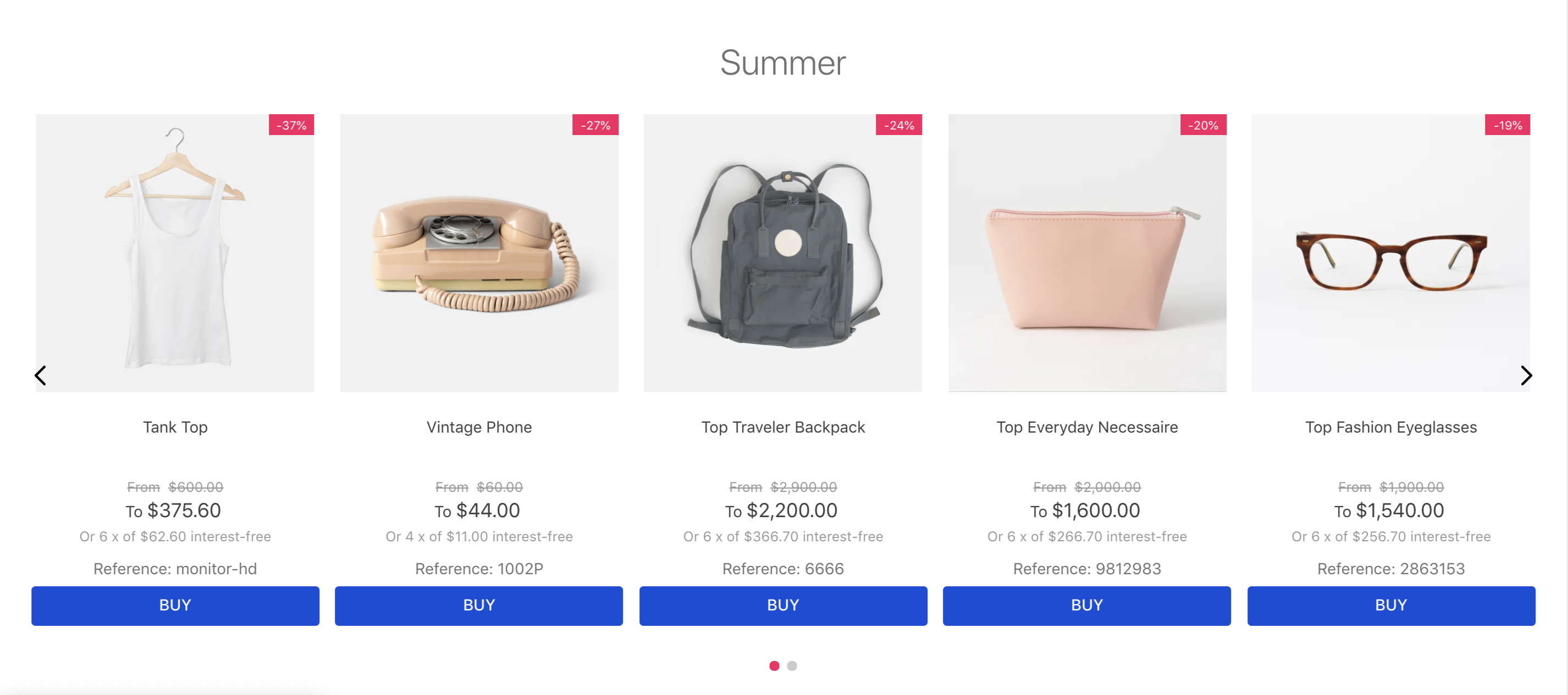
The Shelf app displays a list of products on your store pages, helping you build your shop window and work on your visual merchandising.
## Configuration
1. Add the `shelf` app to your theme dependencies in the `manifest.json` file:
```json
"dependencies": {
"vtex.shelf": "1.x",
}
```
Now, you can use all the blocks exported by the `shelf` app. See the full list below:
| Block name | Description |
| - | - |
| `shelf` |  Renders a list of products in the store home page. |
| `shelf.relatedProducts` |  Renders a list of related products in the product details page. |
2. Declare the `shelf.relatedProduct` in the product template (`store.product`) using its props. For example:
```json
{
"store.product": {
"children": [
"breadcrumb",
"flex-layout.row#main",
"shelf.relatedProducts"
]
}
}
```
>⚠️ Warning
>
> Note that for hiding unavailable/out-of-stock items, there are 2 different props: `hideUnavailableItems` and `hideOutOfStockItems`. They do the same thing, but each is used by a different component: `Shelf` and `RelatedProducts`, respectively.
### Shelf
| Prop name | Type | Description | Default value |
| ---------------- | ------------------- | ------------------------------------------------------------------------------------------------------------------------------------------------------ | --------------------------------- |
| `category` | `String` | The category ID |
| `collection` | `String` | The collection ID |
| `orderBy` | `Enum` | `OrderByTopSaleDESC`, `OrderByPriceDESC`, `OrderByPriceASC`, `OrderByNameASC`, `OrderByNameDESC`, `OrderByReleaseDateDESC`, `OrderByBestDiscountDESC` |
| `hideUnavailableItems` | `Boolean` | Whether out of stock items should be hidden (`true`) or not (`false`) | `false` |
| `paginationDotsVisibility` | `Enum` | `visible`, `hidden`, `mobileOnly`, `desktopOnly` |
| `productList` | `ProductListSchema` | Product list schema. See `ProductListSchema` | - |
| `trackingId` | `String` | Name to show in the Google Analytics. If nothing is passed it will use the name of the block instead |
| `maxItems` | `Number` | Max items |
### RelatedProducts
| Prop name | Type | Description | Default value |
| - | - | - | - |
| `recommendation` | `enum` | Type of recommendations that will be displayed on the shelf. Possible values: `similars`, `suggestions`, and `accessories` (these depend on the product information given in the Admin Catalog); and `view`, `buy`, and `viewandBought` (these are automatically generated according to the activity of the store). | `similars` |
| `groupBy` | `enum` | Defines if you are ot nog going to group your recommendations by: `PRODUCT` (only display individual products and not SKUs, limited by 12 products) or `NONE` (if you want to display all registered SKUs, limited by 50 products). | `PRODUCT` |
| `hideOutOfStockItems` | `boolean` | Whether out of stock items should be hidden: (`true`) or (`false`). | `false` |
| `productList` | `ProductListSchema` | Product list schema. See `ProductListSchema`. | - |
`ProductListSchema`:
| Prop name | Type | Description | Default value |
| - | - | - | - |
| `maxItems` | `number` | Maximum number of items to be displayed on the related product shelf. | `10` |
| `scroll` | `enum` | Slide transition scroll type. Possible values: `BY_PAGE`, and `ONE_BY_ONE`. | `BY_PAGE` |
| `arrows` | `boolean` | Whether the arrows should be displayed on the shelf (`true`) or not (`false`). | `true` |
| `showTitle` | `boolean` | Whether a title should be displayed on the product-related shelf (`true`) or not (`false`). | `true` |
| `titleText` | `string` | Related product shelf title. | `null` |
| `gap` | `enum` | Space between items being displayed. Possible values are: `ph0`, `ph3`,`ph5`, and `ph7`. | `ph3` |
| `minItemsPerPage` | `number` | Minimum number of items per shelf slides. This prop defines how many items will be displayed on the related product shelf, even in the smallest screen size. Its value can be a float, which means that you can choose a multiple of `0.5` to indicate that you want to show a *peek* of the next slide on the shelf. | `1` |
| `itemsPerPage` | `number` | Maximum number of items per shelf slides. This prop defines how many items will be displayed on the related product shelf, even in the largest screen size. Its value can be a float, which means that you can choose a multiple of `0.5` to indicate that you want to show a *peek* of the next slide on the shelf. | `5` |
| `summary` | `object` | Schema declaring the desired related product shelf items. This prop object must contain the [`product-summary.shelf` block props](https://developers.vtex.com/docs/guides/vtex-product-summary#configuration). | `undefined` |
' `infinite` | `boolean` | Determines whether the list should be infinite (`true`) or not (`false`). When this prop is set as `false`, the slider will have an explicit end for users. | `true` |
## Customization
To apply CSS customizations to this and other blocks, follow the instructions in [Using CSS Handles for store customization](https://developers.vtex.com/docs/guides/vtex-io-documentation-using-css-handles-for-store-customization).
| CSS Handles |
| ----------------- |
| `relatedProducts` |
>⚠️ The CSS Handles list above refers to the `shelf.relatedProducts` block. Since the `shelf` block is deprecated, your shelf customization must be done using the CSS Handles available for the [Product Summary List](https://developers.vtex.com/docs/guides/vtex-product-summary-productsummarylist), the [Product Summary Shelf](https://developers.vtex.com/docs/guides/vtex-product-summary), and the [Slider Layout](https://developers.vtex.com/docs/guides/vtex-slider-layout) blocks.
## Contributors ✨
Thanks goes to these wonderful people ([emoji key](https://allcontributors.org/docs/en/emoji-key)):

Sahan Jayawardana
💻

Lucas Pacheco
💻
This project follows the [all-contributors](https://github.com/all-contributors/all-contributors) specification. Contributions of any kind welcome!