https://github.com/vtex-apps/slider-layout
A flexible solution for building block sliders in VTEX Store Framework
https://github.com/vtex-apps/slider-layout
hacktoberfest srv-store-framework store-framework vtex-io xp-developer
Last synced: 5 months ago
JSON representation
A flexible solution for building block sliders in VTEX Store Framework
- Host: GitHub
- URL: https://github.com/vtex-apps/slider-layout
- Owner: vtex-apps
- Created: 2019-09-10T23:35:26.000Z (almost 7 years ago)
- Default Branch: master
- Last Pushed: 2025-08-27T19:20:36.000Z (10 months ago)
- Last Synced: 2025-08-28T04:15:58.246Z (10 months ago)
- Topics: hacktoberfest, srv-store-framework, store-framework, vtex-io, xp-developer
- Language: TypeScript
- Homepage:
- Size: 656 KB
- Stars: 5
- Watchers: 43
- Forks: 34
- Open Issues: 11
-
Metadata Files:
- Readme: docs/README.md
- Changelog: CHANGELOG.md
- Codeowners: .github/CODEOWNERS
Awesome Lists containing this project
README
📢 Use this project, [contribute](https://github.com/vtex-apps/slider-layout) to it or open issues to help evolve it using [Store Discussion](https://github.com/vtex-apps/store-discussion).
# Slider Layout
[](#contributors-)
Slider Layout is a flexible solution for building block sliders in VTEX Store Framework, such as a carousel component.

> _To use the Slider layout as a substitute for the [Carousel app](https://github.com/vtex-apps/carousel), read the [Building a Carousel through lists and Slider Layout](https://developers.vtex.com/docs/guides/vtex-io-documentation-building-a-carousel-using-slider-layout) documentation._
## Google Analytics 4 Integration
Slider Layout enables you to integrate your component with [Google Analytics 4](https://developers.google.com/analytics/devguides/collection/ga4).
The integration happens through the [`GA4 view_promotion`](https://developers.google.com/analytics/devguides/collection/ga4/reference/events?client_type=gtm#view_promotion) event, which is typically associated with the promotion banners carousel displayed by the Slider Layout.
By integrating with Google Analytics 4, you can set the `Product ID` and `Product Name`, and position of your promotion on [Site Editor](https://help.vtex.com/en/tutorial/site-editor-overview--299Dbeb9mFczUTyNQ9xPe1) to be shown on a Google Analytics dashboard.
To set this up, go to the VTEX Admin, access **Storefront > Site Editor**, and open the image settings of the internal promotion you want to track. These settings are displayed on the right side of the page.
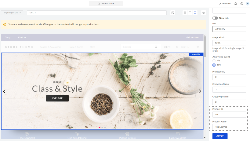
> For more information about managing your page content, read [Managing page and template content](https://help.vtex.com/en/tutorial/managing-page-and-template-content--3tMbx6HXy4Fy5r9EhboG37).
After setup, Google Analytics can track your internal promotions and generate reports of their views, clicks, click-through rate, conversions, and revenue.
## Configuration
1. Add the `slider-layout` app to your theme dependencies in the `manifest.json` file:
```json
"dependencies": {
"vtex.slider-layout": "0.x"
}
```
Now, you can use all blocks exported by the `slider-layout` app. See the complete list below:
| Block name | Description |
| --------------------- | -------------------------------------------------------------------------------------------------------------------------------------------------------------------------------------------------------------------- |
| `slider-layout` |  Builds block sliders for your store through its `children` list blocks. |
| `slider-layout-group` | Enables you to keep a group of `slider-layout` blocks synched with each other. For more information about this, see the Advanced configuration section below. |
2. Add the `slider-layout` block to your template. For example:
```json
"slider-layout#text-test": {
"props": {
"itemsPerPage": {
"desktop": 1,
"tablet": 1,
"phone": 1
},
"infinite": true,
"showNavigationArrows": "desktopOnly",
"blockClass": "carousel"
},
"children": ["rich-text#1", "rich-text#2", "rich-text#3"]
},
"rich-text#1": {
"props": {
"text": "Test1"
}
},
"rich-text#2": {
"props": {
"text": "Test2"
}
},
"rich-text#3": {
"props": {
"text": "Test3"
}
},
```
| Prop name | Type | Description | Default value |
| ---------------------- | ------------------- | ------------------------------------------------------------------------------------------------------------------------------------------------------------------------------------------------------------------------------------------------------------------------------------------------------------------------------------------------------------------------------------------------------------------------------------------------------------------------------------------------------------------------------------------------------------------------------------------------------------------ | -------------------------------------- |
| `label` | `string` | `aria-label` attribute value to be used by the `` component when rendered. The `aria-label` value should explicitly tell users what the inspected HTML element does. | `slider` |
| `showNavigationArrows` | `enum` | Indicates when navigation arrows should be rendered. Possible values are: `mobileOnly`, `desktopOnly`, `always`, or `never`. | `always` |
| `showPaginationDots` | `enum` | Indicates when pagination dots should be rendered. Possible values are: `mobileOnly`, `desktopOnly`, `always`, or `never`. | `always` |
| `infinite` | `boolean` | Determines whether the slider should be infinite (`true`) or not (`false`). When this prop is set as `false`, the slider will have an explicit end for users. | `false` |
| `usePagination` | `boolean` | Determines whether the slider should use slide pages (`true`) or not (`false`). When this prop is set as `false`, the slider will use smooth scrolling for slide navigation instead of arrows. | `true` |
| `itemsPerPage` | `object` | The number of slider items to be shown on each type of device. For more information about this, see the `itemsPerPage` object section below. | `{ desktop: 5, tablet: 3, phone: 1 }` |
| `navigationStep` | `number` / `enum` | The number of slider items that should be displayed when users click one of the slider arrows. It is also possible to set this prop value as `page`, meaning that the number of slider items to be displayed when one of the arrows is clicked is equal to the number of slider items set per page (in the `itemsPerPage` prop). | `page` |
| `slideTransition` | `object` | Controls the transition animation between slides based on [CSS attributes](https://developer.mozilla.org/en-US/docs/Web/CSS/transition). For more information about this, see the `slideTransition` object section below. | `{ speed: 400, delay: 0, timing: '' }` |
| `autoplay` | `object` | Controls the autoplay feature behavior. For more information about this, see the `autoplay` object section below. | `undefined` |
| `fullWidth` | `boolean` | Determines whether the slides should occupy the full page width, making the arrows appear on top of them (`true`) or not (`false`). | `true` |
| `arrowSize` | `number` / `object` | Slider arrows size (height and width) in pixels. This is a responsive prop, which means you can pass to it an object with different values for each breakpoint (`desktop`, `mobile`, `tablet`, and `phone`). | `25` |
| `centerMode` | `enum` / `object` | Defines positioning of the slider elements on the screen. Possible values are: `center` (elements are centered, allowing users to see a peek of the previous and next slides), `to-the-left` (aligns elements to the left side, allowing users to see a peek of the next slide, but not the previous one), and `disabled` (disables the feature, rendering elements on the whole screen without showing a peek of the previous and next slides). Note: This is a responsive prop, which means you can pass to it an object with different values for each breakpoint (`desktop`, `mobile`, `tablet`, and `phone`). | `disabled` |
| `centerModeSlidesGap` | `number` | Number of pixels between slides when `centerMode` is set to `center` or `to-the-left`. | `undefined` |
- **`itemsPerPage` object**
| Prop name | Type | Description | Default value |
| --------- | -------- | -------------------------------------------------------- | ------------- |
| `desktop` | `number` | The number of slides to be displayed on desktop devices. | `5` |
| `tablet` | `number` | The number of slides to be displayed on tablet devices. | `3` |
| `phone` | `number` | The number of slides to be displayed on phone devices. | `1` |
- **`slideTransition` object**
| Prop name | Type | Description | Default value |
| --------- | -------- | ----------------------------------------- | ------------- |
| `speed` | `number` | Transition speed (in `ms`). | `400` |
| `delay` | `number` | Delay between slide transition (in `ms`). | `0` |
| `timing` | `string` | Timing function. | `''` |
- **`autoplay` object**
| Prop name | Type | Description | Default value |
| ------------- | --------- | -------------------------------------------------------------------------------------------------------------- | ------------- |
| `timeout` | `number` | Timeout (in `ms`) between each slide. | `undefined` |
| `stopOnHover` | `boolean` | Determines whether the autoplay should stop when users are hovering over the slider (`true`) or not (`false`). | `undefined` |
## Advanced configuration
The `slider-layout-group` block synchronizes the slides rendered by each `slider-layout` block declared in it.
Therefore, the `slider-layout-group` does not render any specific component on the store UI. It is really a logical block that only expects to receive a `children` block list containing the desired `slider-layout` blocks that should be rendered. For example:
```json
{
"slider-layout-group#test": {
"children": ["slider-layout#1", "slider-layout#2", "slider-layout#3"]
}
}
```
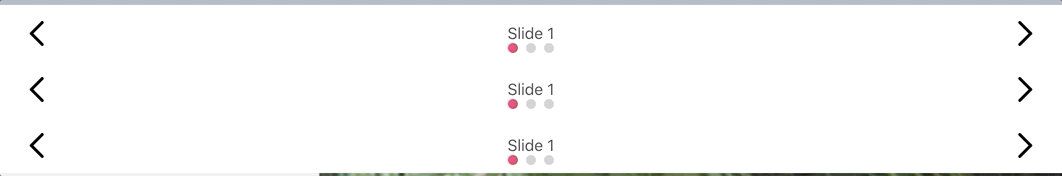
Below, you can find a practical example using three `slider-layout` blocks inside of a `slider-layout-group`. Each `slider-layout` received three `rich-text` blocks as `children` to serve as individual slides:
> ⚠️ **\*All `slider-layout` blocks declared in the `slider-layout-group` must have the same configuration, meaning the same props and values**. Due to implementation rules, they can only differ in their `children` block list. Keep in mind that declaring `slider-layout` blocks with different configurations will result in unexpected behavior, leading to errors that are **not** supported by the VTEX Store Framework team.\*
## Customization
To apply CSS customizations to this and other blocks, follow the instructions given in the recipe on [Using CSS handles for store customization](https://developers.vtex.com/docs/guides/vtex-io-documentation-using-css-handles-for-store-customization).
| CSS handles |
| ------------------------- |
| `paginationDot--isActive` |
| `paginationDot` |
| `paginationDotsContainer` |
| `slide--firstVisible` |
| `slide--hidden` |
| `slide--lastVisible` |
| `slide--visible` |
| `slideChildrenContainer` |
| `slide` |
| `sliderArrows` |
| `sliderLayoutContainer` |
| `sliderLeftArrow` |
| `sliderRightArrow` |
| `sliderTrackContainer` |
| `sliderTrack` |
## Contributors ✨
Thanks goes to these wonderful people:
This project follows the [all-contributors](https://github.com/all-contributors/all-contributors) specification. Contributions of any kind are welcome!