https://github.com/vtex-apps/store-header
VTEX Header app for IO Stores
https://github.com/vtex-apps/store-header
hacktoberfest srv-store-framework store store-framework vtex-io xp-developer
Last synced: 3 months ago
JSON representation
VTEX Header app for IO Stores
- Host: GitHub
- URL: https://github.com/vtex-apps/store-header
- Owner: vtex-apps
- Created: 2018-09-14T14:44:30.000Z (almost 8 years ago)
- Default Branch: master
- Last Pushed: 2025-11-26T17:45:29.000Z (7 months ago)
- Last Synced: 2025-11-29T11:49:39.259Z (7 months ago)
- Topics: hacktoberfest, srv-store-framework, store, store-framework, vtex-io, xp-developer
- Language: JavaScript
- Homepage:
- Size: 909 KB
- Stars: 6
- Watchers: 45
- Forks: 10
- Open Issues: 5
-
Metadata Files:
- Readme: docs/README.md
- Changelog: CHANGELOG.md
- Codeowners: .github/CODEOWNERS
Awesome Lists containing this project
README
📢 Use this project, [contribute](https://github.com/vtex-apps/store-header) to it or open issues to help evolve it using [Store Discussion](https://github.com/vtex-apps/store-discussion).
[](#contributors-)
# Header
[ Source code](https://github.com/vtex-apps/store-header)
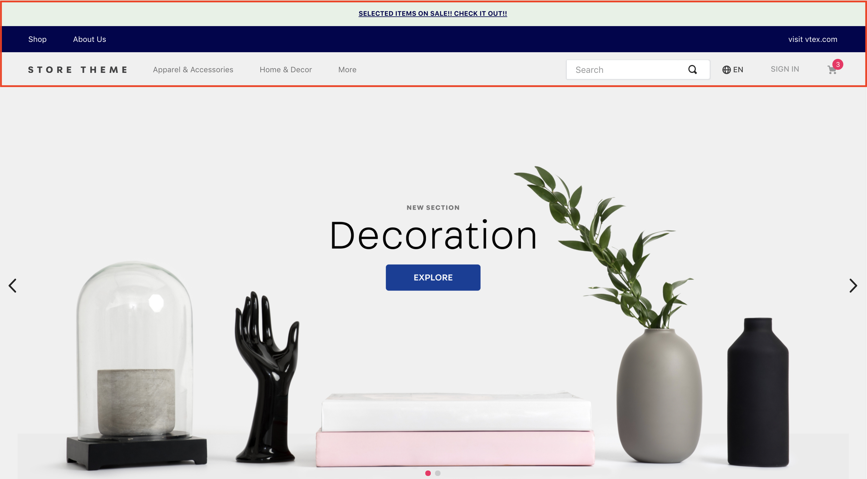
The Header app displays a navigation bar at the top of your store pages. It serves as the central hub for essential navigation elements, such as your store [logo](https://developers.vtex.com/docs/apps/vtex.store-components/logo), the [minicart](https://developers.vtex.com/docs/apps/vtex.minicart), user [login](https://developers.vtex.com/docs/apps/vtex.login), and the [search bar](https://developers.vtex.com/docs/apps/vtex.store-components/searchbar).
## Installation
1. Add the `store-header` app to your theme's dependencies in the `manifest.json` file:
```json
dependencies: {
"vtex.store-header": "2.x"
}
```
You can now use all the blocks exported by the `store-header` app. The following table lists the available blocks:
| Block name | Description |
| -------- | ------------ |
| `header-layout.desktop` |  Defines the Header layout for desktop devices through `header-row` blocks. |
| `header-layout.mobile`| Defines the Header layout for mobile devices through `header-row` blocks. |
| `header-row` |  Create Header lines according to your store needs. |
| `header-border` | Adds a `1px` margin to a Header row. |
| `header-force-center` | Centralizes its children blocks in a Header row. |
| `header-spacer` | Adds spacing between blocks throughout a Header row. |
## Configuration
1. Declare the `header-layout.desktop` and `header-layout.mobile` blocks in your `header.jsonc` file. This allows you to define different header structures for desktop and mobile devices.
```json
{
"header": {
"blocks": [
"header-layout.desktop",
"header-layout.mobile"
]
},
```
>ℹ️ The Header is a default store interface element defined in the `interfaces.json` file, so you don't need to declare it in every template. Store Framework automatically applies your configuration across all store pages. To customize the header for specific pages, see the [Advanced configuration](#advanced-configuration) section.
2. In your `header.jsonc` file, define `header-row` blocks inside `header-layout.desktop` and `header-layout.mobile`. The number of rows depends on your store design.
```json
{
"header": {
"blocks": [
"header-layout.desktop",
"header-layout.mobile"
]
},
"header-layout.desktop": {
"children": [
"header-row#1-desktop",
"header-row#2-desktop",
"header-row#3-desktop",
"header-row#4-desktop"
]
},
```
>⚠️ The example above uses four rows for the desktop header. This setup allows replicating the header to include telemarketing functionalities (when activated), notifications, page links, and other blocks, such as a logo and menu.
3. Configure each `header-row` by adding props and declaring the desired blocks as children. The most commonly used blocks are [Logo](https://developers.vtex.com/docs/apps/vtex.store-components/logo), [Minicart](https://developers.vtex.com/docs/apps/vtex.minicart), and [Menu](https://developers.vtex.com/docs/apps/vtex.menu).
In the example below, we'll add a [Telemarketing](https://developers.vtex.com/docs/apps/vtex.telemarketing) bar to the first row:
```json
"header-row#1-desktop": {
"children": [
"telemarketing"
],
"props": {
"fullWidth": true
}
},
```
- `header-row` props:
| Prop name | Type | Description | Default value |
| ---------- | --------- | ------------------------------------------------------------------------------------ | ------------- |
| `zIndex` | `Number` | Controls the vertical stacking order of elements for overlapping. | `0` |
| `sticky` | `Boolean` | Determines if the header row remains fixed at the top of the screen during scroll (true) or not (false). | `false` |
| `fullWidth` | `Boolean` | Determines if the header row should span the full width of the screen. | `true` |
| `inverted` | `Boolean` | If true, the row uses the inverted base color defined in styles.json. | `false` |
⚠️ Repeat this process for all `header-row` blocks in both `header-layout.desktop` and `header-layout.mobile`, configuring each block with the necessary props.
### Layout customization blocks
You can use the `header-border`, `header-force-center`, and `header-spacer` blocks as children of `header-row` to customize your header layout.
- **`header-border`**
Adds a `1px` margin to a header row.
```json
"header-row#2-desktop": {
"children": [
"header-border",
"notification.bar#home"
],
"props": {
"fullWidth": "true"
}
},
"notification.bar#home": {
"props": {
"content": "SELECTED ITEMS ON SALE! CHECK IT OUT!"
}
},
```
- **`header-force-center`**
Centralizes its child blocks within a header row.
```json
"header-row#4-desktop": {
"props": {
"blockClass": "main-header",
"horizontalAlign": "center",
"verticalAlign": "center",
"preventHorizontalStretch": true,
"preventVerticalStretch": true,
"fullWidth": true
},
"children": ["header-force-center"]
},
"header-force-center": {
"children":[
"logo#desktop"
]
},
"logo#desktop": {
"props": {
"title": "Logo",
"href": "/",
"url": "https://storecomponents.vteximg.com.br/arquivos/store-theme-logo.png",
"width": "180"
}
},
```
- **`header-spacer`**:
Adds a flexible space between blocks in a header row. Blocks declared before `header-spacer` are pushed to the left, and blocks declared after are pushed to the right.
```json
"header-row#3-desktop": {
"children": [
"vtex.menu@2.x:menu#websites",
"header-spacer",
"vtex.menu@2.x:menu#institutional"
],
"props": {
"blockClass": "menu-link",
"inverted": "true"
}
},
```
### Advanced configuration
By default, the header configuration is applied to all store templates. To override this behavior and apply custom configurations to different templates, you can modify the `interfaces.json` file.
For detailed instructions, see the guide [Customizing the Header and Footer blocks by page](https://developers.vtex.com/docs/guides/vtex-io-documentation-customizing-the-header-and-footer-blocks-by-page).
## Customization
To apply CSS customizations to these and other blocks, follow the instructions in [Using CSS Handles for store customization](https://developers.vtex.com/docs/guides/vtex-io-documentation-using-css-handles-for-store-customization).
| CSS Handles |
|----------------------|
| `container` |
| `leanMode` |
| `topMenuContainer` |
| `topMenuLogo` |
| `topMenuSearchBar` |
| `topMenuIcons` |
| `topMenuCollapsible` |
| `forceCenter` |
| `forceCenterInnerContainer` |
| `headerBorder` |
| `headerSpacer` |
| `headerStickyRow` |
| `headerRowContentContainer` |
## Contributors ✨
Thanks goes to these wonderful people ([emoji key](https://allcontributors.org/docs/en/emoji-key)):
This project follows the [all-contributors](https://github.com/all-contributors/all-contributors) specification. Contributions of any kind welcome!