https://github.com/wdevore/gradient_colorstops_control
Custom Dart color gradient widget.
https://github.com/wdevore/gradient_colorstops_control
Last synced: 11 months ago
JSON representation
Custom Dart color gradient widget.
- Host: GitHub
- URL: https://github.com/wdevore/gradient_colorstops_control
- Owner: wdevore
- License: mit
- Created: 2014-07-23T18:00:42.000Z (almost 12 years ago)
- Default Branch: master
- Last Pushed: 2014-07-29T01:27:13.000Z (almost 12 years ago)
- Last Synced: 2025-03-28T16:36:06.614Z (about 1 year ago)
- Language: Dart
- Size: 172 KB
- Stars: 1
- Watchers: 2
- Forks: 0
- Open Issues: 0
-
Metadata Files:
- Readme: README.md
- License: LICENSE
Awesome Lists containing this project
README
# Dart Gradient Color Configurator
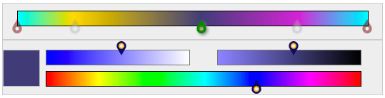
This control creates a simple color gradient configurator. It is designed purely in CSS/SVG/Dart; there is no Canvas rendering occurring. This control works in conjunction with the [Color Slider Control](https://github.com/wdevore/color_slider_control).
The control is appears as the `Top` portion of the compounded control as shown below. The `Bottom` section is the `Color slider control`.
##pubspec
Start by adding a dependency for both the Gradient Color Configurator [configurator](https://github.com/wdevore/gradient_colorstops_control) and the Color Slider Selector [selector](https://github.com/wdevore/color_slider_control) in pubspec.yaml
```yaml
dependencies:
color_slider_control:
git: git://github.com/wdevore/color_slider_control.git
gradient_colorstops_control:
git: git://github.com/wdevore/gradient_colorstops_control.git
```
Import the libraries into your project
```dart
import 'package:color_slider_control/color_slider_control.dart';
import 'package:gradient_colorstops_control/gradient_colorstops_control.dart';
```
The two controls need to created and joined together. This is done by:
```dart
void main() {
...
gradientWidget.colorWidget = colorWidget;
}
```
Below is an example. The example is present in the `Web` directory.
```dart
void main() {
ColorSliderWidget colorWidget = new ColorSliderWidget();
_targetColorContainer = querySelector("#color_pickerId");
_targetColorContainer.nodes.add(colorWidget.container);
// We want the gradient widget to only send the colorstop of the marker
// not the marker's color stop on the bar.
GradientColorStopWidget gradientWidget = new GradientColorStopWidget(colorWidget.externalColorChange);
gradientWidget.colorWidget = colorWidget;
_targetGradientContainer = querySelector("#gradient_pickerId");
_targetGradientContainer.nodes.add(gradientWidget.container);
colorWidget.colorChangeCallback = gradientWidget.externalColorChange;
colorWidget.bind();
gradientWidget.bind();
}
```
The selector defaults to a light teal color.
##Usage
The active `marker` is highlighted as darkgreen. Unselected `marker`s are blurred, grayscaled and translucent. The end `marker`s are highlighted in darkred and not movable.
##Example
A complete example on how to use the control can be found in the `Web` directory accompany the pub package.