https://github.com/wqweto/ninepatch
Nine Patch PNGs for VB6
https://github.com/wqweto/ninepatch
9patch button keyboard nine-patch on-screen transparent vb6
Last synced: 7 months ago
JSON representation
Nine Patch PNGs for VB6
- Host: GitHub
- URL: https://github.com/wqweto/ninepatch
- Owner: wqweto
- License: mit
- Created: 2018-04-23T09:49:01.000Z (over 8 years ago)
- Default Branch: master
- Last Pushed: 2024-10-25T13:10:18.000Z (over 1 year ago)
- Last Synced: 2025-03-08T20:43:40.524Z (over 1 year ago)
- Topics: 9patch, button, keyboard, nine-patch, on-screen, transparent, vb6
- Language: Visual Basic 6.0
- Size: 555 KB
- Stars: 21
- Watchers: 9
- Forks: 10
- Open Issues: 1
-
Metadata Files:
- Readme: README.md
- License: LICENSE
Awesome Lists containing this project
README
## NPPNG
Nine Patch PNGs for VB6
### Description
NPPNG project includes `cNinePatch.cls` for 9-patch parsing/handling and `ctxNineButton.ctl` custom user-control for transparent animated buttons with states based on 9-patches.
### Source usage
Just include `src/cNinePatch.cls` in your projects to be able to load and draw 9-patches in user-defined sizes.
Add `src/ctxNineButton.ctl` and `src/mdNineButton.bas` for the transparent windowless button control, with states based on nine-patches.
In `ctxNineButton` you can set conditional compilation constant `ImplHasTimers` to `False` to disable control state-transition animations. In this case `src/mdNineButton.bas` will not be depended on anymore and the control becomes self-contained in `src/ctxNineButton.ctl`.
### Preset `ctxNineButton` styles
| Type | Style | Preview |
| --------------- | -------------------------- | ----------------------------------------- |
| Buttons | Simple buttons ||
| | `ucsBtyButtonDefault` | 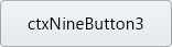 |
| | `ucsBtyButtonGreen` |  |
| | `ucsBtyButtonTurnRed` | 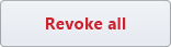 |
| Flat Buttons | Flat buttons based on bootstrap ||
| | `ucsBtyFlatPrimary` |  |
| | `ucsBtyFlatSecondary` | 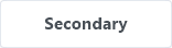 |
| | `ucsBtyFlatSuccess` |  |
| | `ucsBtyFlatDanger` |  |
| | `ucsBtyFlatWarning` | 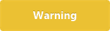 |
| | `ucsBtyFlatInfo` |  |
| | `ucsBtyFlatLight` | 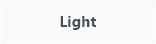 |
| | `ucsBtyFlatDark` | 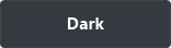 |
| Outline Buttons | Outline buttons based on boostrap ||
| | `ucsBtyOutlinePrimary` |  |
| | `ucsBtyOutlineSecondary` |  |
| | `ucsBtyOutlineSuccess` | 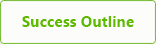 |
| | `ucsBtyOutlineDanger` |  |
| | `ucsBtyOutlineWarning` |  |
| | `ucsBtyOutlineInfo` | 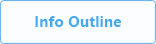 |
| | `ucsBtyOutlineLight` | 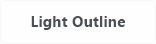 |
| | `ucsBtyOutlineDark` | 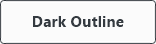 |
| Cards | Static cards that can be owner-drawn with information ||
| | `ucsBtyCardDefault` |  |
| | `ucsBtyCardPrimary` |  |
| | `ucsBtyCardSuccess` | 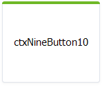 |
| | `ucsBtyCardPurple` | 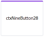 |
### Supported button states
| State | Description |
| -------------------- | ----------- |
| `ucsBstNormal` | Normal state |
| `ucsBstHover` | Optional mouse hover. Otherwise `ucsBstNormal` is used |
| `ucsBstPressed` | Optional mouse pressed. Otherwise `ucsBstHover` is used |
| `ucsBstHoverPressed` | Optional mouse pressed over the control. Otherwise `ucsBstPressed` is used |
| `ucsBstDisabled` | Optional disabled state |
| `ucsBstFocused` | Optional focus rectangle which is composited before current state |
Each state can have a different 9-patch image, text and shadow properties.
### Supported state customizations
| Property | Description |
| --------------------- | ----------- |
| `ButtonImageArray` | Nine-patch image as byte array |
| `ButtonImageOpacity` | Image transparency incl. composited text and shadow |
| `ButtonTextFont` | Text font |
| `ButtonTextFlags` | Text alignment and wrapping |
| `ButtonTextColor` | Text color |
| `ButtonTextOpacity` | Text transparency on image before applying image transparency |
| `ButtonTextOffsetX` | Additional text horizontal offset after alignment |
| `ButtonTextOffsetY` | Additional text vertical offset after alignment |
| `ButtonShadowColor` | Text shadow color |
| `ButtonShadowOpacity` | Text shadow transparency on image |
| `ButtonShadowOffsetX` | Shadow horizontal offset from text |
| `ButtonShadowOffsetY` | Shadow vertical offset from text |
### Global customizations
| Property | Description |
| ------------------- | ----------- |
| `AnimationDuration` | Duration of state transition (in seconds) |
| `Opacity` | Global control transparency |
| `Enabled` | Uses disabled state settings to paint control |