https://github.com/wysher/svelte-overlay
Fully customizable Svelte overlay. Great for creating dropdowns, tooltips and popovers
https://github.com/wysher/svelte-overlay
dropdown overlay popover svelte tooltip
Last synced: 4 months ago
JSON representation
Fully customizable Svelte overlay. Great for creating dropdowns, tooltips and popovers
- Host: GitHub
- URL: https://github.com/wysher/svelte-overlay
- Owner: wysher
- Created: 2020-03-28T17:04:03.000Z (over 5 years ago)
- Default Branch: master
- Last Pushed: 2023-01-05T17:36:12.000Z (over 2 years ago)
- Last Synced: 2025-03-12T07:26:54.847Z (4 months ago)
- Topics: dropdown, overlay, popover, svelte, tooltip
- Language: JavaScript
- Size: 1.07 MB
- Stars: 22
- Watchers: 1
- Forks: 1
- Open Issues: 12
-
Metadata Files:
- Readme: README.md
Awesome Lists containing this project
README
# Svelte overlay
> Fully customizable Svelte overlay which fits to available space
> Great for creating dropdowns, tooltips and popovers
Svelte overlay is wrapper copmponent which makes all difficult stuff for you, but you decide when to open/close it and how it looks.
## Features
- may be nested
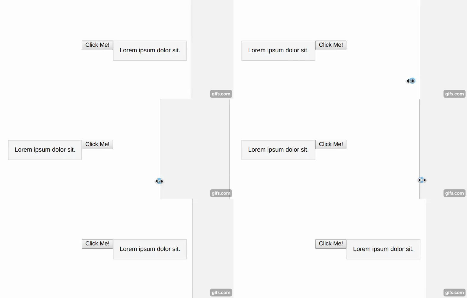
- if content has not enough space on one side it will try to render on other side. For instance if position is set to `top-left` and there's no room on top position will be set to `bottom-left`. This feature listens to window resize event
- may be open/closed on every trigger and content event or from outside
- you decide how trigger and content looks
- may be closed on click outside, window keydown, or body scroll
- may update position on scroll
- dispatches toggle event when open state changed
[](http://doge.mit-license.org)
## Example [REPL](https://svelte.dev/repl/59ae56c6e9f544c7a098bb961843a310?version=3.22.2)
```javascript
import Overlay from 'svelte-overlay';
Click Me!
Lorem ipsum dolor sit.
```
---

---

## Installation
```npm install --save svelte-overlay```
or
```yarn add svelte-overlay```
---
## Props
**Important**
To get it work component requires two slots:
- `parent`
- `content`
**Overlay props**
| Prop name | Type | Default | Description |
| --- | --- | --- | --- |
| isOpen | Boolean | false | isOpen state |
| position | String | `bottom-right` | `top-left`
`top-center`
`top-right`
`bottom-left`
`bottom-center`
`bottom-right`
`left-top`
`left-center`
`left-bottom`
`right-top`
`right-center`
`right-bottom`
Uses default position when wrong position was passed.
You may import array of all positions with:
``` import { positions } from 'svelte-overlay'; ``` |
| zIndex | Number | 1 | value of z-index for overlay and content |
| class | string | "" | global class name |
| style | string | "" | style string which will be added at the end of component style attribute |
| closeOnClickOutside | Boolean | false | if true - click outside will close overlay |
| closeOnScroll | Boolean | false | if true - scrolling outside content will close overlay |
| updateOnScroll | Boolean | false | if true - scrolling will update content position |
| onWindowKeyDown | Function | undefined | triggers when overlay is opened and user hit any button.
Gets Event as first argument and object of { open, close, toggle, isOpen } |
| on:toggle | Function | undefined | Event dispatched on overlay toggle.
Gets Event as first argument and object of { open, close, toggle, isOpen } |
**slot props**
Each slot gets theese props, available through let:propName
| Prop name | Type | Description |
| --- | --- | --- |
| isOpen | Boolean | isOpen state |
| toggle | Function | allows to toggle open state. Gets current isOpen value as argument |
| open | Function | allows to open overlay |
| close | Function | allows to close overlay |
---
## Usage
### Close on escape keydown and click outside [REPL](https://svelte.dev/repl/08a2a569d1354426ab747445ece60fcb?version=3.22.2)
```javascript
import Overlay from 'svelte-overlay';
let isOpen = false;
function handleWindowKeyDown(event) {
if (event.key === 'Escape') {
isOpen = false;
}
}
Click Me!
Lorem ipsum dolor sit.
Close
```
### Close from content [REPL](https://svelte.dev/repl/a13dde11268a4ec6a560add54287c8f2?version=3.22.2)
```javascript
import Overlay from 'svelte-overlay';
Click Me!
Lorem ipsum dolor sit.
Close
```
---
### Open/close on mouseenter/mouseleave [REPL](https://svelte.dev/repl/d04cf212c9a8406aad8932ca039634ac?version=3.22.2)
```javascript
import Overlay from 'svelte-overlay';
Hover Me!
Lorem ipsum dolor sit.
```
---
### Open from outside [REPL](https://svelte.dev/repl/f96379b640d74556bf415ae8d74b2598?version=3.22.2)
```javascript
import Overlay from 'svelte-overlay';
let isOpen = false;
function toggleFromOutside() {
isOpen = !isOpen;
}
Toggle from outside
I am a parent
Lorem ipsum dolor sit.
```
---
### With backdrop, disabled scroll and animations [REPL](https://svelte.dev/repl/cf3db92312394dd1a6efaf3374118b2c?version=3.22.2)
```javascript
import Overlay from 'svelte-overlay';
import { fly, fade } from 'svelte/transition';
let isOpen = false;
function handleToggle(event) {
if (event.detail !== isOpen) {
isOpen = event.detail;
document.body.classList.toggle('no-scroll', isOpen);
}
}
{#if isOpen}
{/if}
Click Me!
Lorem ipsum dolor sit.
:global(.no-scroll) {
overflow: hidden;
}
.backdrop {
z-index: 99;
position: fixed;
top: 0;
right: 0;
bottom: 0;
left: 0;
width: 100%;
height: 100%;
background: rgba(0, 0, 0, 0.2);
}
.content {
border: 1px solid #ddd;
background: #f7f7f7;
padding: 1em;
width: max-content;
}
```
---
### Nested with click outside and close on esc key [REPL](https://svelte.dev/repl/284b4a09eddc4b64b5bd6734712d30ee?version=3.22.2)
```javascript
import Overlay from 'svelte-overlay';
let isOpen = false;
function toggleFromOutside() {
isOpen = !isOpen;
}
Toggle from outside
I am a parent
Lorem ipsum dolor sit.
```
---
## License
[](http://badges.mit-license.org)
- **[MIT license](http://opensource.org/licenses/mit-license.php)**